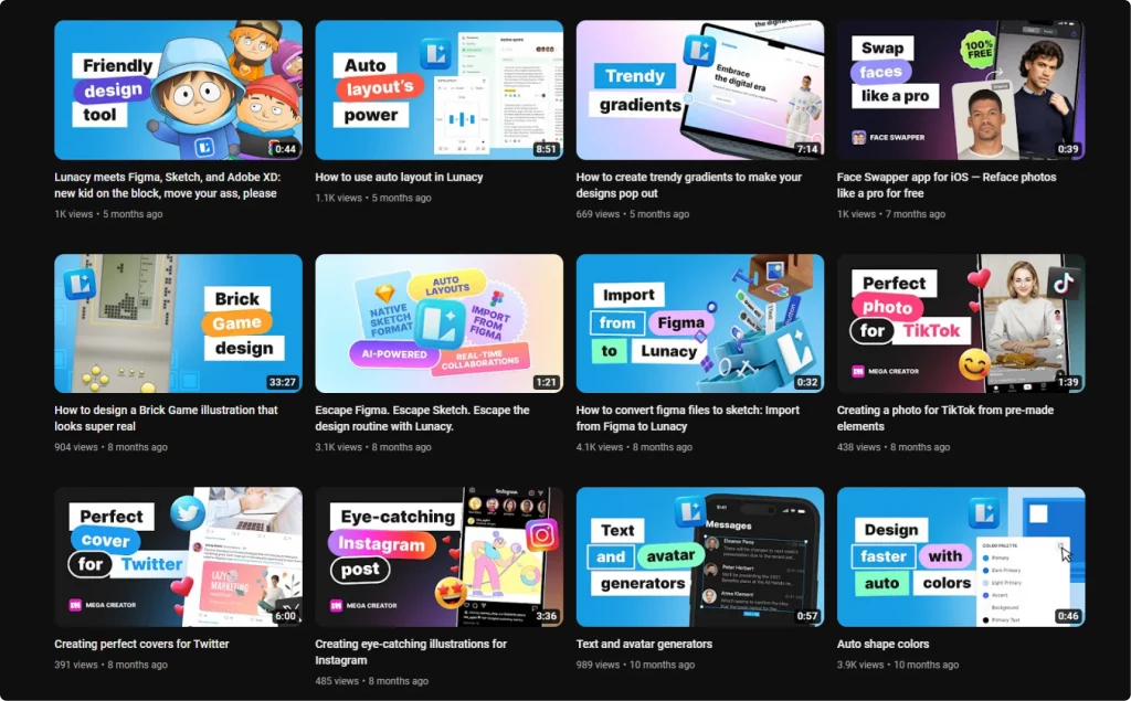
Unlock the secrets to captivating YouTube thumbnails: learn sizes, design tips, and tools for stopping the scroll and boosting views.
In YouTube’s dynamic realm, a video’s thumbnail acts as a beacon, guiding viewers through a sea of choices. It’s not merely a static image but a gateway to your actual content. We’ll explore the craft of developing thumbnails that don’t just capture attention — they engage and convert. With the right thumbnail template and design strategies, your thumbnails will transform into click-worthy assets.
Table of contents
- Understanding YouTube thumbnails
- Designing an effective thumbnail
- Technical aspects of thumbnail creation
- Obtaining thumbnails from YouTube videos
- Advanced tips and tricks
- How to add a thumbnail to a video on YouTube?
Understanding YouTube thumbnails
What is a thumbnail on YouTube? It’s your first handshake with the viewer. This visual cue is more than a preview; it’s a potent tool to snag attention, encapsulate your video’s story, and elevate your click-worthy content. Think of it as your YouTube channel’s digital storefront.
Thumbnails are more than just aesthetic elements; they are pivotal in steering viewer choices. Their design is as vital as the promotional content itself, turning them into cornerstones of your video marketing strategy.
Designing an effective thumbnail
Crafting an effective YouTube thumbnail means balancing accurate representation with magnetic allure. A thumbnail should be a visual synopsis of your video, creating a thumbnail background design that’s both authentic and engaging.
Misleading thumbnails might initially attract viewers, but they can quickly erode trust if they don’t align with the content.
Your content competes for attention on YouTube, even if it’s severe or informative. Each thumbnail should spotlight the most vibrant and captivating moments, using YouTube Thumbnail Backgrounds that intrigue and draw in viewers.
On YouTube, the charm of your thumbnail, often amplified by a pop of color or an easy-to-read font, is crucial. Your thumbnail is not just an image; it’s a compelling headline.
Here are recommendations from our designer:
- Use thumbnail background images that accurately reflect your video’s story.
- Misleading thumbnails can damage trust; authenticity is key.
- Compete for attention with a thumbnail design that highlights the most engaging moments.
- Choose consistent fonts and colors for brand recognition.
- Make sure your text is readable on all devices, using an easy-to-read font.
Technical aspects of thumbnail creation
Creating a YouTube thumbnail isn’t just about creativity; it’s also about adhering to specific technical requirements and utilizing the right tools.
Size and format specifications
- The ideal YouTube thumbnail size is 1280×720 pixels.
- Maintain a 16:9 aspect ratio, which is standard for YouTube.
- Acceptable file formats include JPG, PNG, or GIF.
- Keep the image file size under 2MB for optimal loading and quality.
Design placement considerations
- Avoid placing crucial design elements in the bottom right corner. This area typically displays the video’s duration, which can obscure important details of your thumbnail.
- Here’s a video from the YouTube team that explains some technical details:
Using advanced tools
Background Remover by Icons8
Selecting the image. Choose a high-quality image relevant to your video content. This could be a still from the video or a separate photo.
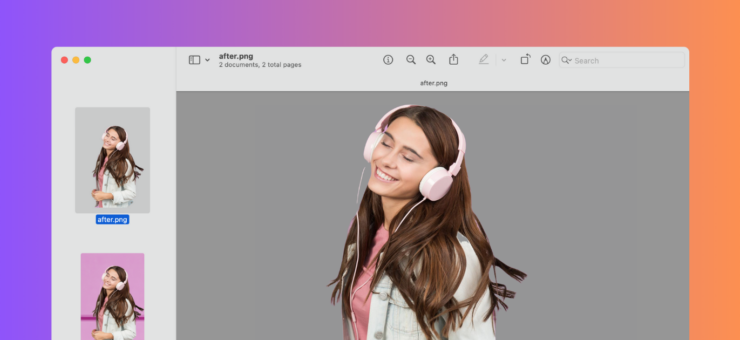
Removing the background. Upload your chosen image to a tool like Icons8’s Background Remover. These tools typically use AI to automatically detect and erase the background, leaving only the main subject.
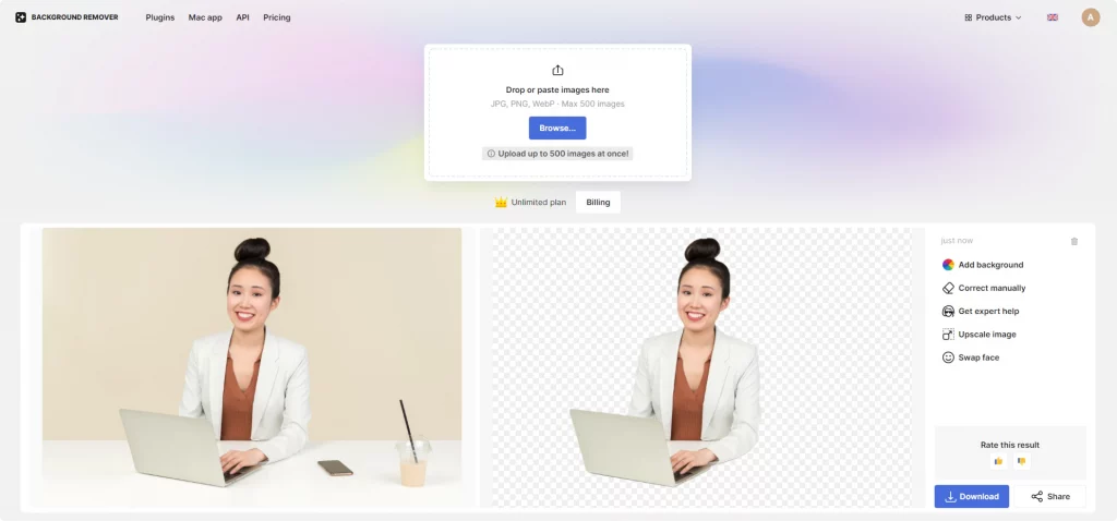
Customizing the thumbnail. Once the background is removed, you can customize the thumbnail by adding a new background, text, or other graphics. This step is crucial for aligning the thumbnail with your brand and making it stand out.
Mega Creator by Icons8. An excellent resource for designers, Mega Creator allows you to craft custom thumbnails. With a library of design elements and the ability to mix and match, it offers flexibility and creative freedom. This is particularly useful for maintaining a consistent visual style across your YouTube content.
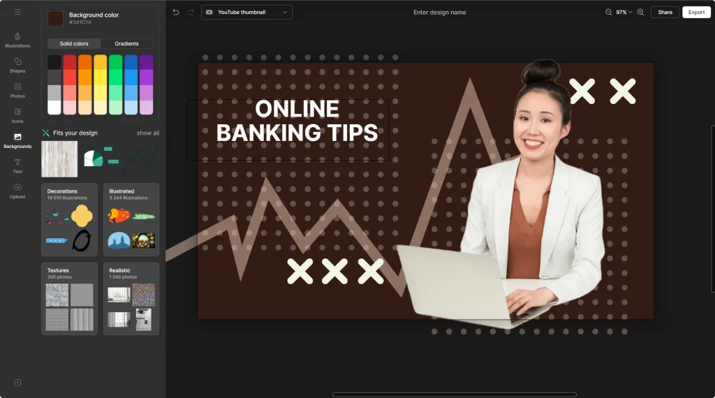
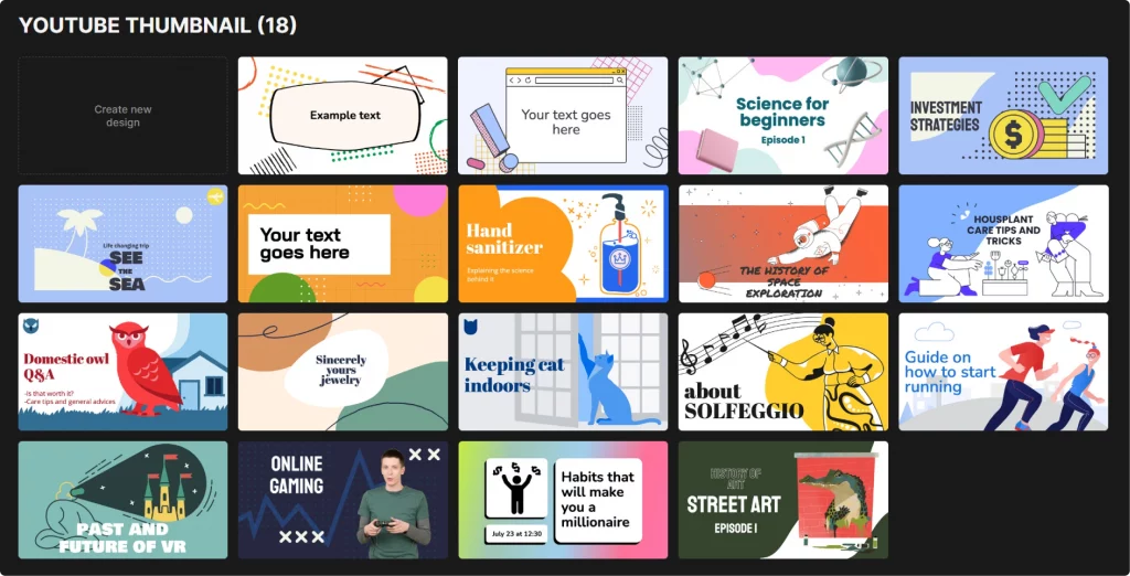
Or go for the fun and unique templates you can tweak to fit your aesthetic.
- Adobe Photoshop. The go-to for detailed editing and customization. Ideal for designers seeking full control over their thumbnails.
- Canva. A user-friendly option with templates, perfect for quick, effective designs, especially if you’re short on time or new to design.
- Snappa. Great for beginners, offering easy-to-use features and pre-designed templates.
Remember, technical precision in thumbnail creation is as important as its visual appeal. By following these guidelines and leveraging powerful tools like Background Remover and Mega Creator, you can ensure your thumbnails are visually striking and technically optimized for YouTube.
Obtaining thumbnails from YouTube videos
Ever wondered how to get a YouTube video thumbnail?
Extracting thumbnails from existing YouTube videos can be useful, whether for analysis, inspiration, or repurposing content you own. Here’s how to do it effectively and ethically:
- Using online tools:
- Websites like ‘Thumbnail Grabber’ or ‘SaveThumbnail’ allow you to enter a video’s URL and download its thumbnail. These tools are straightforward and require no software installation.
- YouTube Studio for your own content:
- If you’re retrieving thumbnails from your videos, YouTube Studio is the most direct method. You can download the thumbnails you’ve previously uploaded in the video manager.
- Screen capture for analysis:
- A simple screen capture of the thumbnail can work for studying design trends or getting inspired. This method is especially useful when you’re not planning to republish the image but to use it for reference.
- Legal considerations:
- Remember, using someone else’s thumbnail without permission can infringe on copyright laws. Always use these methods within legal boundaries, especially if you plan to repurpose an existing thumbnail for your content.
- Quality considerations:
- When downloading thumbnails, be aware that the quality might not match the original upload, especially if you use screen capture methods.
Incorporating these practices ensures you’re effective in obtaining thumbnails and respectful of the original content creators and copyright laws. Whether for inspiration or repurposing your content, these methods provide a pathway to access YouTube thumbnails efficiently.
Advanced tips and tricks
Enhancing your YouTube thumbnail game requires a blend of creativity and strategic thinking. Here are some advanced tips to elevate your thumbnails:
- Color psychology
- Utilize color theory to evoke specific emotions. Bright, contrasting colors can grab attention, while a more muted palette might suit serious topics. Understand the mood each color sets.
- Dynamic typography
- Beyond readability, font choice communicates mood. Bold, sans-serif fonts convey modernity and directness, while serif fonts might suggest sophistication. Experiment with size and style for emphasis.
- Visual storytelling
- Treat your thumbnail as a mini-story. Can it tease a narrative or pose a question? Effective visual storytelling in a small space can pique curiosity and increase click-through rates.
- Brand consistency
- Consistent use of colors, fonts, and styling helps build a recognizable brand. This consistency aids viewers in quickly identifying your content amidst a sea of videos.
- Leveraging negative space
- Don’t overcrowd your thumbnail. Use negative space wisely to highlight the main subject, making your thumbnail look cleaner and more professional.
- Incorporating faces and emotions
- Thumbnails with faces, especially showing emotions, perform well as they create a human connection with viewers.
- Analyzing competitors and trends
- Regularly check what competitors in your niche are doing. This can provide insights into current trends and what’s resonating with audiences.
- Testing and iterating
- Experiment with different thumbnail styles and track their performance. Use YouTube analytics to see which thumbnails are driving more views.
- Optimization for mobile viewing
- Remember that a significant portion of users browse YouTube on mobile devices. Ensure your thumbnail is clear and engaging, even on smaller screens.
Explore a step-by-step guide on creating a thumbnail for your videos.
How to add a thumbnail to a video on YouTube?
To add a thumbnail to a YouTube video:
- Sign in to YouTube Studio: Go to studio.youtube.com and log in with your Google account.
- Select ‘Content’: On the left menu, click ‘Content’ to see your uploaded videos.
- Choose your video: Click on the video to which you want to add a thumbnail.
- Upload thumbnail: In the video details, look for the thumbnail section. Click on ‘Upload Thumbnail’ to choose an image from your computer.
- Save changes: After selecting your thumbnail, click ‘Save’ in the upper right corner to apply the changes.
Your YouTube thumbnails are vital in drawing viewers to your awesome content. They’re the first engagement point and set the tone for the following fresh content. Experiment, iterate, and always align your thumbnail design with the heart of your video. Remember, on the digital highway of YouTube, your thumbnail is more than an image — it’s a promise of the value within.
Learn how to edit your YouTube videos for higher rankings, which song to choose for the background, or how it influences your video’s perception.

