Cringy design isn’t always a failure. It can help you stand out and fulfill your needs. Here’s why.
Clean interfaces, rounded corners, and eye-pleasing gradients are everywhere. Conventionally, we treat them as “good design.” Modern websites are more content-focused, so their designs appear to be plain.
Together, the monotony of drilled designs and the exponential growth of content reduces the user’s attention span. Thus, some designers consciously violate common standards, trying to trigger a reaction. Can it capture users’ attention? Let’s see.
Bad design is a way to hype
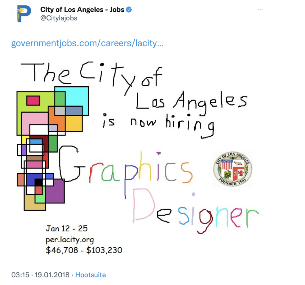
What could be more boring than a hiring ad? However, the city of Los Angeles has boomed in the media with its advertisements for graphic designers.
They got 65,000 likes, over 24,000 retweets, and hit major media headlines. Not bad for an MS Paint-like design!
Bad design is a protest against imposed standards
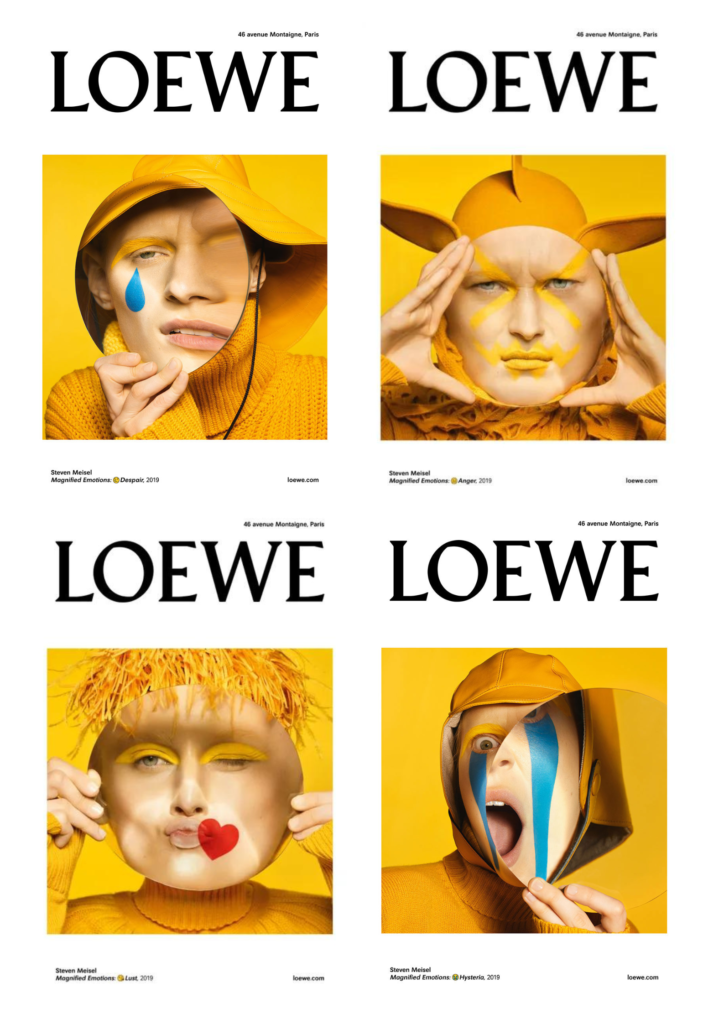
Fashion and beauty brands get used to touching up the skin tone and shaping the face lines so everything looks perfect.
However, fashion house Loewe decided to challenge the established rules. They launched a provocative campaign using disturbed human face proportions. Human faces resembling emojis look unusual, but such a daring move made the fashion community talk about the brand.
It’s not a bad design. It’s a cultural trait
A stereotypical Asian web design with chaotic overloaded interfaces and raging colors usually looks weird to the western eye. Who could imagine a website, made with all that cliché, would be so popular in Britain?
Lingscars, ladies and gentlemen! In 2016, Newsweek named it one of the best websites on the Internet. Until now, the site’s owner faithfully sticks to this approach and doesn’t care about design trends.

Bad design or smart move, where’s the line?
Today, in 2022, websites with outdated designs work just fine. Check out this eye-bleeding Norwegian classified:

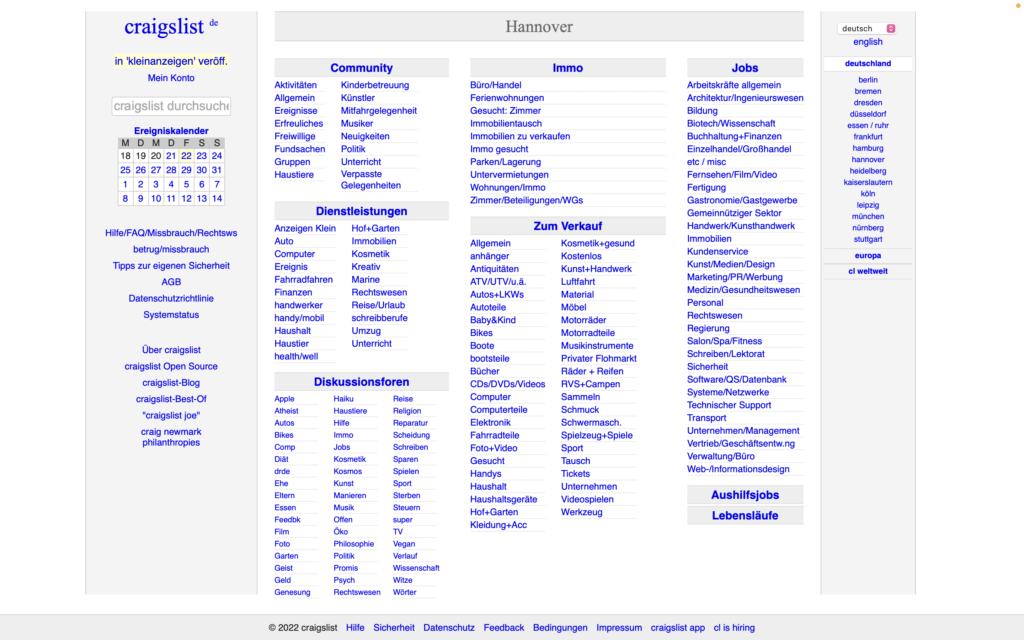
The legendary Craigslist:
And Pacific Northwest X-Ray:
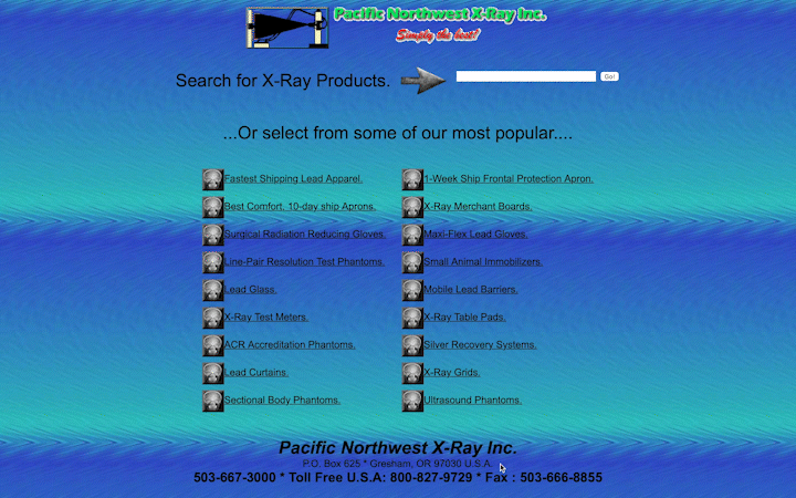
If you look closer, you could recognize it as a deliberate decision. These websites are alive and professionally made despite all the visual absurdity. It has a proper composition and responsive design; all the elements fit the grid. Most importantly, the websites fulfill their purpose, attract visitors, and drive sales.
Users see lots of similar designs every day, so anything that stands out can be a good idea. What’s ugly to one is avant-garde to another. So, what about thinking out of the box, fellas?
Read also: