User experience is one of the crucial components of modern business. An average customer wants to browse your website smoothly and enjoy aesthetically pleasing features, which maximizes the importance of design and colors.
According to the report, more than 90% of first impressions about a business are design-related. At the same time, almost 60% of users say they don’t want to recommend a company that has a poorly-designed site.
It is the reason why marketers invest more time in website creation, trying to find color solutions that can inspire visitors to stick around longer. This is exactly where gradients step in as the essential element of contemporary web design.

Gradient in web UI concept by Surja Sen Das Raj
Gradients are slowly replacing flat colors because they look more natural and appealing. Let’s discuss how to create the perfect gradient.
The Logic of Making a Beautiful Gradient
Flat colors have been dominating design in the last decade, but the situation is now changing due to the emergence of gradient color schemes. The reason is simple – gradients give brands the opportunity to express ideas more freely, making subtle transitions between the pairs of basic colors.
Mark Greenberg, a UX specialist at Resumes Planet, explains it briefly: “After a long period of flat-focused design, gradients come as a natural choice because they offer a variety of styles and improvisations. They introduce another dimension and bring that much-needed depth, which becomes an anchor of modern web design.”
But how can you create the perfect gradient? The first thing to do is to look at the color wheel. It gives you a plethora of ideas, but almost always the most effective option is to pair neighboring colors. As you go down the wheel, you can notice how colors that stand next to each other represent a natural transition.
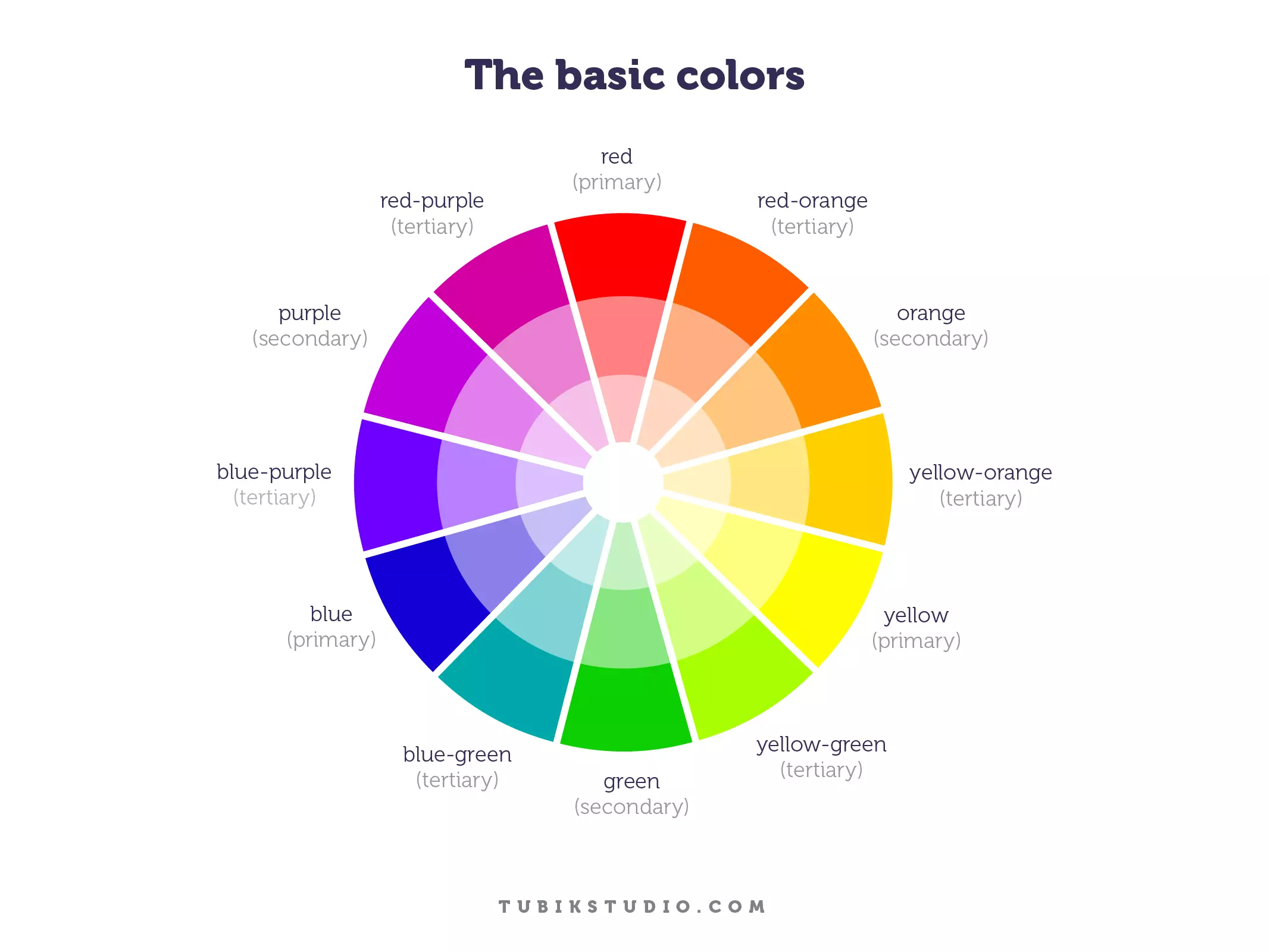
Color wheel infographic by Tubik
However, some designers don’t want to do it so simply or need to follow a specific branding requirement of a company. To put it simply, they have to mix colors that are far away from each other on the color wheel. In this case, it is necessary to introduce an in-between element to create a good-looking gradient.
It’s a so-called 3-stop gradient that uses a new color as the connecting point between the two original colors. You can experiment with transparency, shades, and opacity to find the ideal combination for your site.
Another option is to create soft linear gradients simply by adjusting RGB values of the primary colors. When you make a small change in color elements and bring them closer to each other, you get a perfectly polished soft linear gradient.
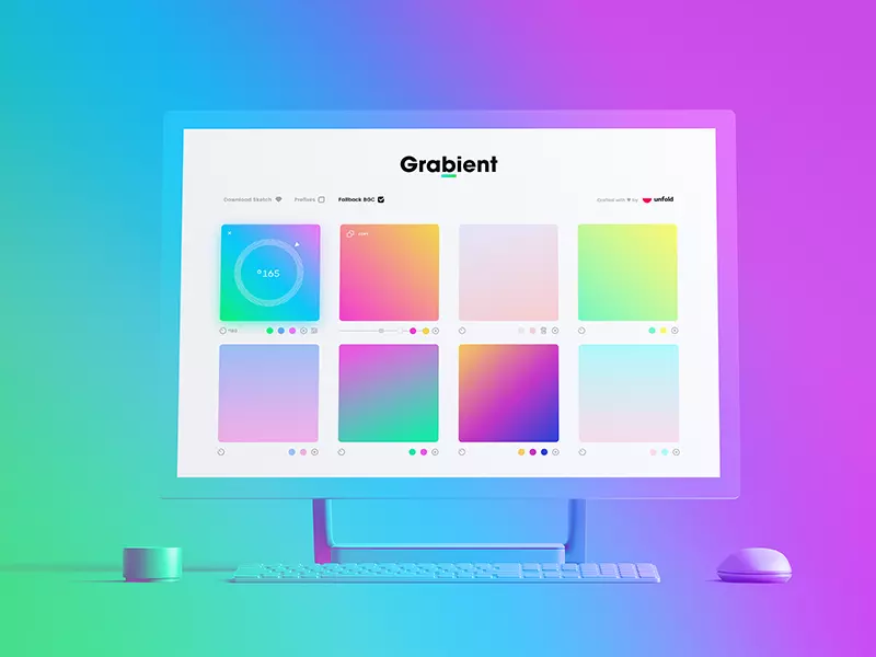
Grabient service by Unfold
Things to Avoid in Gradient Creation
The worst thing to do is to create ugly gradients that simply cannot fulfill aesthetic norms. Feel free to go back to the color wheel and check all options – you will see that some colors just don’t fit together.
If you consider it, you will realize that it’s best to follow patterns that already exist in nature. For instance, you can hardly ever find a transition between red and green anywhere. The two colors just don’t fit, so you should try to act wisely in this case.
The same goes for orange and blue. Each one is incredibly eye-pleasing, but they just can’t function properly together. Therefore, you should stay away from controversial options and find a combination that can guarantee outstanding UX results.
Where to Find Inspiration for Gradients
There are two ways to find inspiration and ideas for gradients – observe nature or search for good examples online. The first option is easy because you can find some incredible scenes every day. We are talking about the sky, clouds, forests, flowers, etc.
Nature is so incredibly beautiful that you can’t find better examples of gradient colors anywhere else. Whenever you watch sunrise or sunset, you can see so many hues and shades that you can easily use in web design practice.


On the other hand, a lot of websites already crafted their own versions of gradients that look very well. There are many examples out there, but we decided to present you only three of those:
- Impossible Bureau: As soon as you open Impossible Bureau’s homepage, you will notice a full-page gradient that makes wonderful transitions between red, pink, and purple.
- Melanie.F: Melanie. F has created a website header that covers the “green to purple” spectrum. The gradient is not pushy, but it grabs users’ attention immediately.
- Symodd: Symodd is digital and audiovisual production agency. Its homepage varies from orange to pink, making a smooth and wonderful color transition.
We showed you only a few nice examples, but don’t be afraid of running your own search if you need more inspiration. There are hundreds of great sites to see and get inspired.
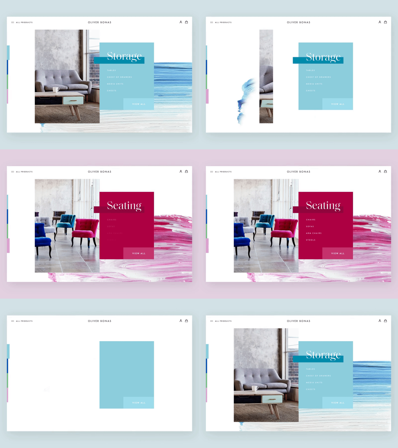
The artistic approach to gradients by Nathan Riley
Conclusion
A website is the first thing users see when they want to explore a certain company. In such circumstances, it is extremely important to design your site properly and use beautiful color schemes. Gradients play a major role in that respect because they allow you to come up with more appealing solutions that inspire visitors to hang around a little longer.
In this post, we showed you how to create the perfect gradient. Did you ever use gradients instead of flat colors? Do you have other valuable web design tips to share with our readers? Let us know in the comments – we will be glad to see your opinion about this topic!
Interface illustration by Icons8
About the author: this is the guest post by Warren Fowler, whose lifestyle is full of hiking adventures as well as blogging and leaps through social media. You can meet him on Twitter and Facebook.
Check Ouch, the collection of free vector illustrations for UX
Check the article on the most hated UI/UX pattern in 2018, learn about the popular UI design trends on Dribbble and review the case study of Airbnb app redesign for user goals.
Have an interesting article to share with our readers? Let’s get it published.