The most prominent type of communication is a conversation. To communicate, we use the knowledge of the language and some secondary attributes such as tone, intonation, volume, gestural, and body language. That helps add an emotional appeal to a story and highlight the key points correctly. Similarly, we integrate a certain sense, emotion, idea, and essence into a visual artwork. In today’s article, the experienced digital artist and designer Tory Polska, the illustrator for Disney Publishing and Magic Hill Animation, shares tips and best practices for creating strong visual storytelling.
What Is Visual Storytelling?
To let the viewer see and understand your creative message, the secondary attributes should be applied: composition, contrast, a language of shapes, rhythm, color, and light. All that is done to engage the viewer emotionally, intellectually, and aesthetically.
Knowing how to communicate with the viewer visually and achieve some goals in this process, we can convey to them the information with the emotional implication we need in this particular case or project.
The visual storytelling (narration) is a way of communicating with a viewer without using words, but through visual images only.

Let’s consider the main principles that allow for achieving that goal.
Basic Principles of Visual Storytelling
Graphics design, advertising, and motion pictures interact with a consumer silently. Do not be confused by the presence of sound in some of them since the visual part should be clear without it as well.
This is exactly the way of communication that is basic for animated movies.
Making a cartoon targeted at a public screening, the creators build in certain problems, a moral which they hope to convey to young viewers.
But to allow the cartoon to ”communicate” with a child, first of all, their parent should be convinced that the cartoon will not teach the kid bad things. Even prior to this, the cartoon should ”communicate” with a cinema director to let him or her see that the project is likely to succeed and wished to show it.
And even before that, it needed to go through a commission that would verify the ethicality and appropriateness of the topic covered in the cartoon. In total, we have the widest possible target audience, consisting of people of different ages, genders, and social layers.
All the mentioned makes the cartoon to communicate in a universal language of images and associations, referring to the psychology of an average viewer’s perception.

So, who is responsible for searching for a suitable and clear image?
The designer is engaged in the development of the movie’s visual content. The main task is to:
- collect an input data (script, director’s vision, technical production capabilities)
- rework them (systematize, analyze, do research on the topic)
- produce the result which is an attractive, clear, understandable design that meets the needs of the story.
Case Study: “Brave” by Pixar Studio
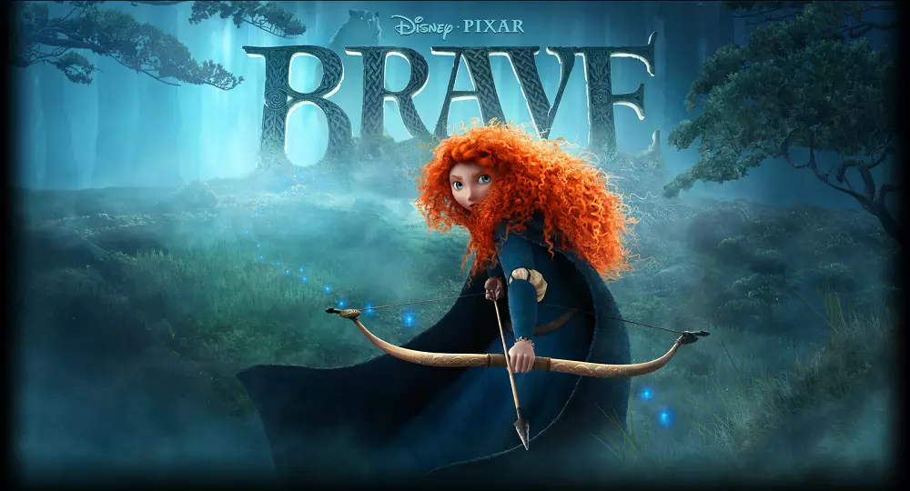
Let’s consider an example of the ”Brave” (2012), a cartoon by Pixar studio.

The idea of the cartoon was very clear: it had to show that to change circumstances, it is necessary to start with changing yourself and your attitude toward them. A great moral on fighting selfishness and egocentrism.
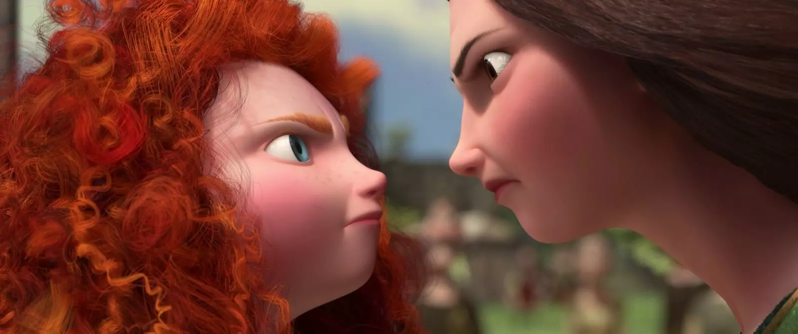
Viewers love specific examples. The Pixar offered a conflict between the mother and daughter, built on different views about the daughter’s future.

For a conflict to be and feel logical, the viewer must be led to it. The main moral of the movie is visualized showing how the heroines are trying to change each other instead of changing themselves:

Concept art for the cartoon
The mother tries to curb her daughter’s blustery temper, symbolized by her fleecy, unruly hair, while the daughter turns her mother into a bear using a magical potion.
So, we have a reason for the conflict. Remember about the sound turned off? It is not enough for the heroines to just shout at each other and shoot with hateful glances.
How to add some drama using visual tools?
Cartoons love symbolism. The significant detail in the ”Brave” was a tapestry:

First of all, pay attention to a big distance between the mother and daughter. Do you understand why that is so?
And secondly, the symbol of family relations is destroyed to support a conflict line. Is it possible to come up with a better example of visual narration?
All these design choices performed the story by visual means. All the symbolism is clear to adults and children, an American and a European. The design helped solve communication problems that could appear between the movie and the viewer.
Points to Remember
Let’s summarize and highlight the main principles:
- The visual storytelling requires a clear understanding of WHAT and WHY you want to say;
- Its main task is to supplement the story, to replace the text with a picture, to establish a strong trusting contact with a viewer;
- Visual communication is done through images. To make the right design choice, you need to collect information, analyze and process it;
- Remember about the secondary attributes of a speech. Use shape, line, rhythm, color, light, and composition laws. But at the same time, don’t be afraid to break those laws from time to time.
- Remember about the psychology of the viewer’s perception, their expectations, and what they not even expect. And you will be the one to offer it.
Communicate with viewers in a familiar and understandable language. In this case, they will surely “read” your message.

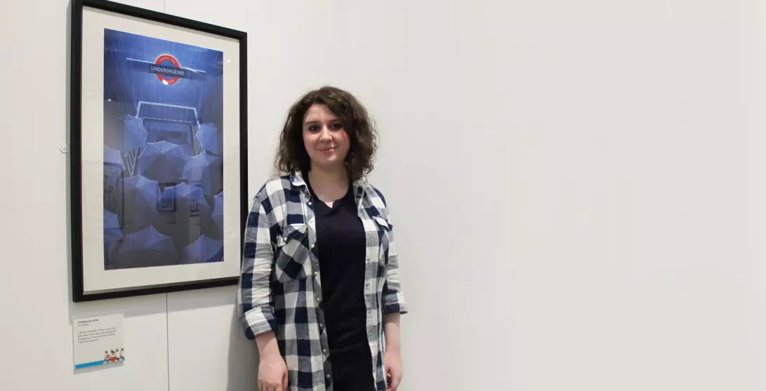
Find out more about works by Tory Polska at her official website.
The title image is a sneak peek on the creative process for the project Pippi Longstocking by Tory Polska
The original article was published on Telegraf Design
Check Ouch, the collection of free vector illustrations for UX
Read the interview with French illustrator Mathieu Freak City and review how to amplify UI design with illustrations.