We’re forgetting how to tell a story with our images. We write articles, opinions, and guidelines where title images serve as a filler. But every time your story gets shared on social networks, the image pops up on someone’s feed. What story does it tell?
Well, let’s make sure there is a story, for starters. And every story needs a hero.
Hero
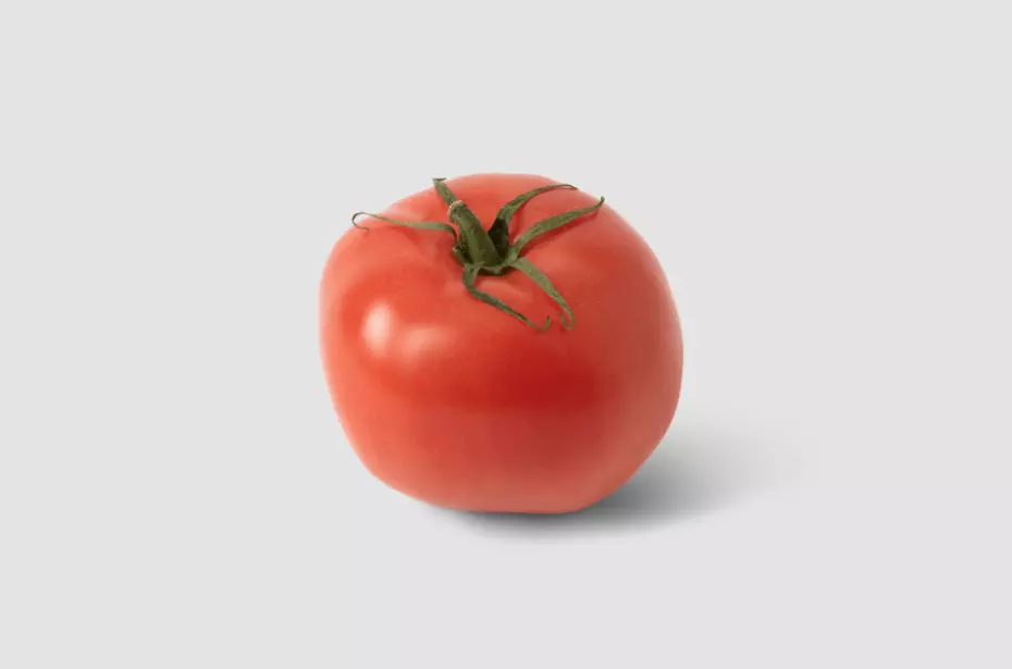
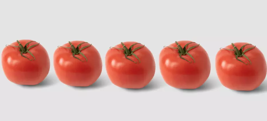
Whether you want it or not, even if it’s just one tomato in the frame, it will be saving the universe.
But if you want to totally mind-bend your viewers and add just one more tomato, suddenly, no one knows what’s going on.
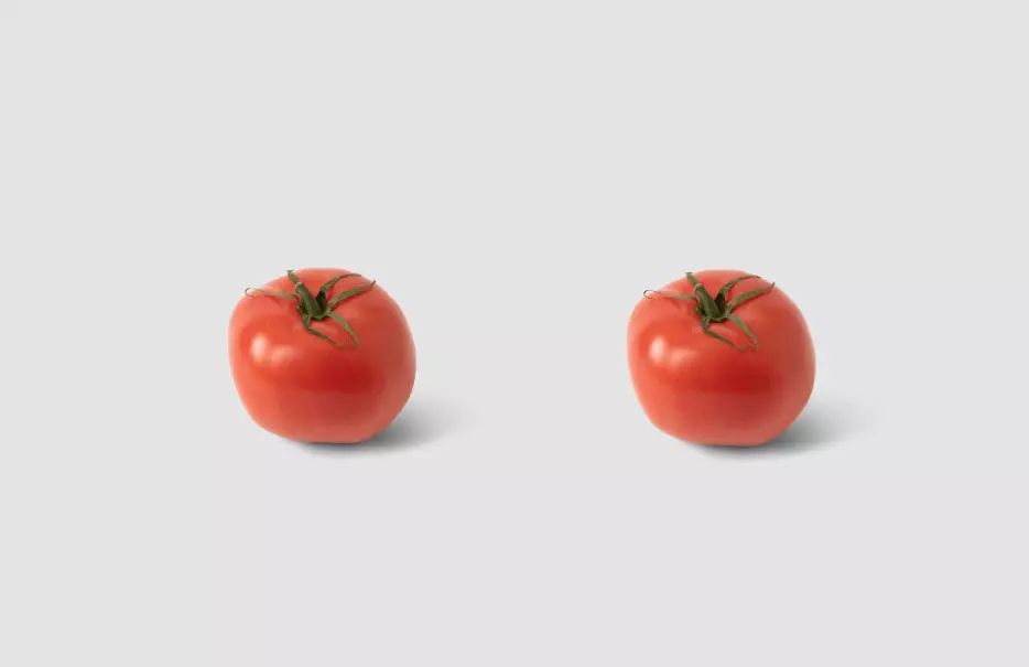
Thankfully, in visual storytelling, we’ve got a few tools at our disposal to help viewers instantly recognize who won the boxing tournament and who was training them.
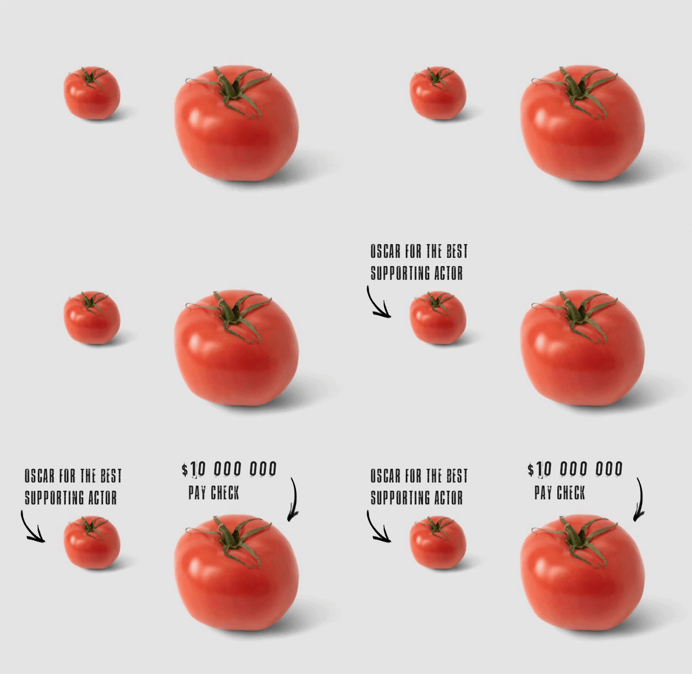
First of all, size matters. It helps us to establish what’s important and what’s… not so much.

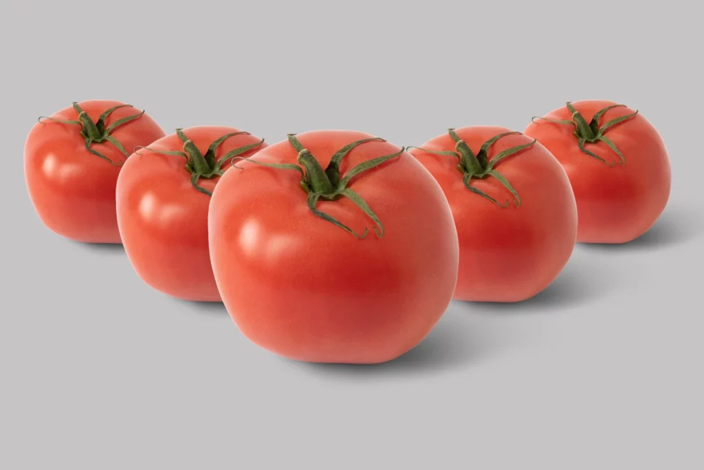
However, often, size may not be enough. Tell me who’s the main hero of the story below:
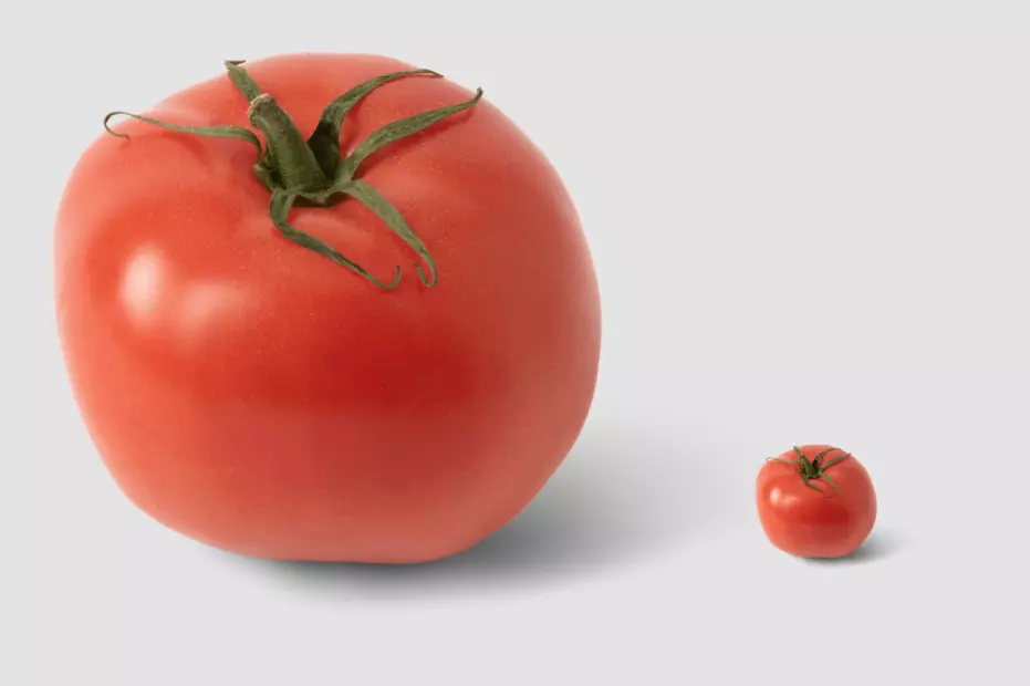
Is that a King Kong story or a Jurassic Park story? Because I have no idea who to root for.
Even though size matters a lot, there’s something else we can use to make us focus our attention on one of the tomatoes. Position.
We tend to perceive things that are closer to us as more impactful and, subsequently, more important. In the following shot, position, and size combined instantly help us establish who is who.
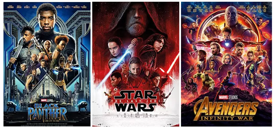
Hollywood promoters have been using these tricks for a long time because they work. No wonder most of the movie posters look like this:
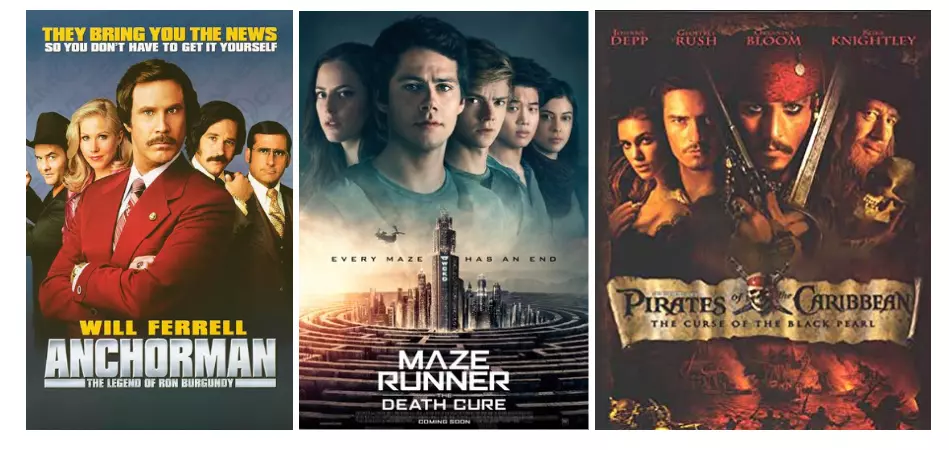
However, varied combinations of size and position can produce a very subtle hierarchy, and trying to figure out who to place where in the poster is the art in itself.
Every character’s position is determined by their relationship with other characters and their position. This is especially true when you can’t decide who’s more important among support role actors or whether there’s a strong antagonist present.
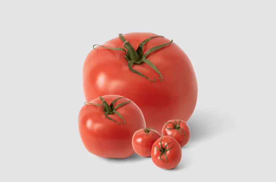
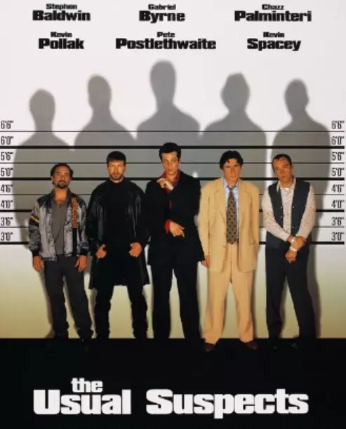
If you, however, don’t want to spoil who killed the cook…
The next thing we thoroughly use in visual storytelling is composition.
Composition
One of the most famous rules of composition is the rule of thirds. And let me tell you what it is.
It’s an overused formula that serves as an excuse to divide anything you see into nine rectangles.
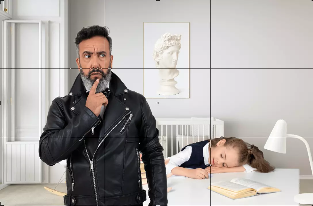
Just kidding.
Important compositional elements should be placed along these lines or their intersections – Photography Tips
So it helps with positioning important elements/characters in the frame. It just feels right.
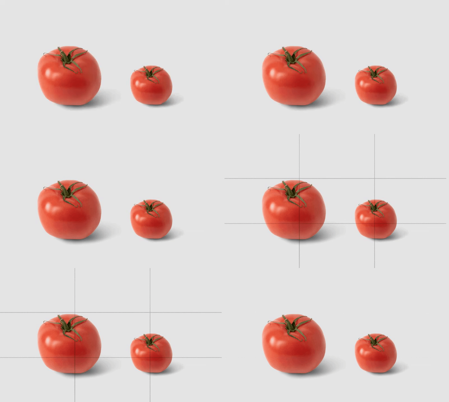
The strange part comes when you break the rule. It creates tension. Something is off.
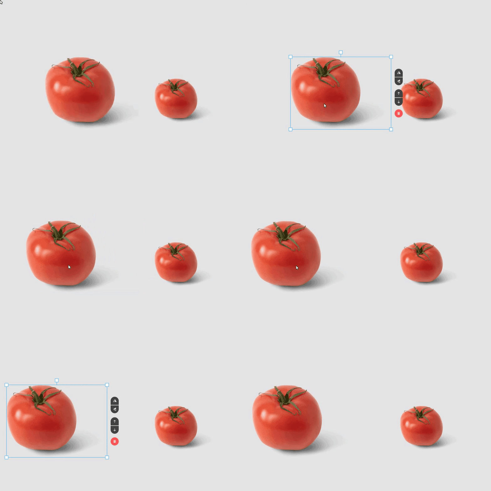
So if your visual story needs tension, break composition rules.
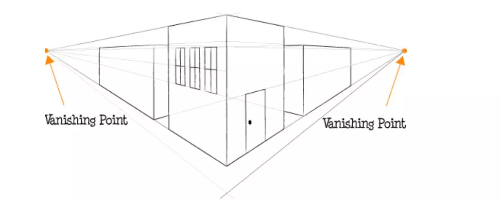
Another composition tool is guiding lines. Scenes rarely exist in a vacuum – there is always a background with some patterns (we’ll talk about context more thoroughly in a bit).
Those are usually perspective lines, and they tend to converge to so-called vanishing points.
Our eyes are naturally drawn to these points, and if objects follow along these converging lines, we inevitably focus more attention on them.

There are plenty of composition rules that you can adhere to, and explaining all of them would demand a separate article – so learn them, break them, and experiment. Or don’t, if you want to play it safe.
Story
We established heroes and controlled our viewer’s focus. Do we tell a story? Not yet. Our picture so far is a bunch of characters and objects that randomly ended up in the same frame. We need to tell a story.
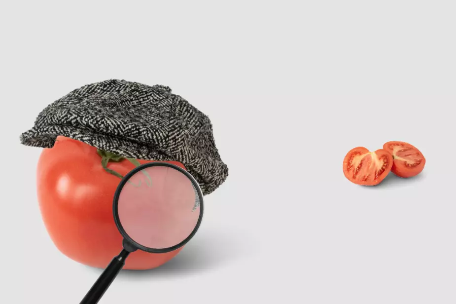
If your picture tells a story without paragraphs of text and introductions, then it’s good visual storytelling. Examples follow…
Detective:
Mystery:

Drama:
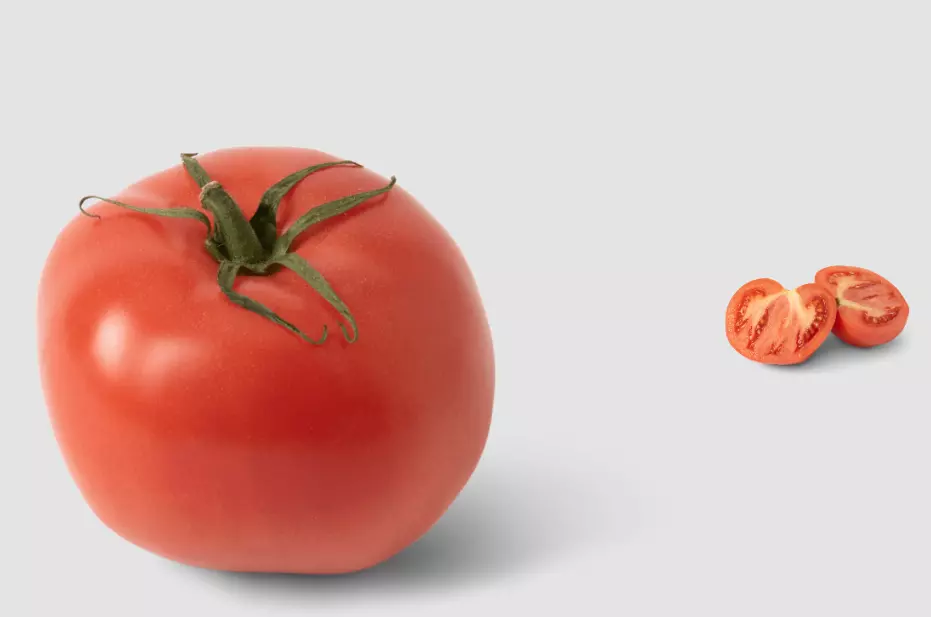
Horror:
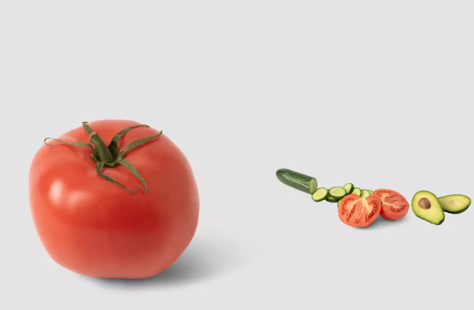
Politically correct horror:
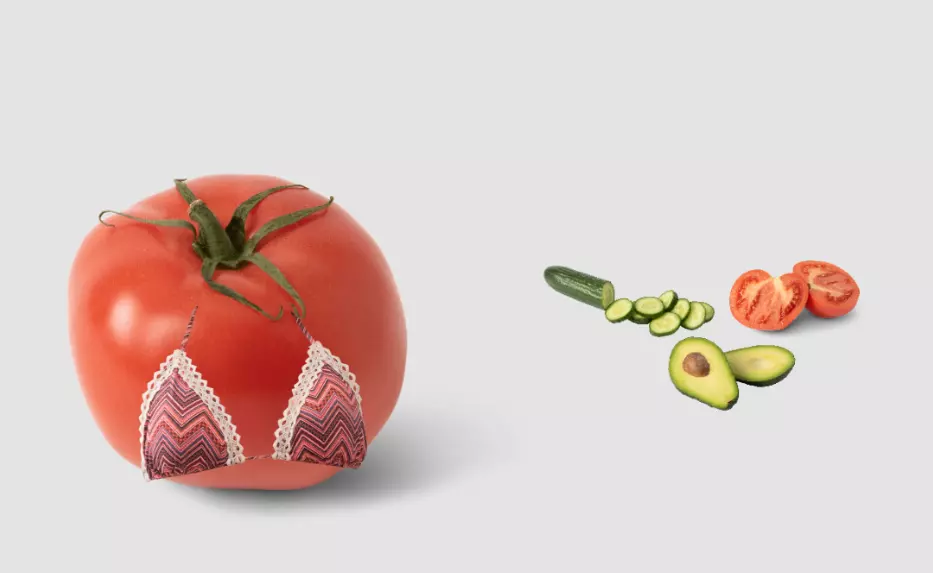
Comedy:
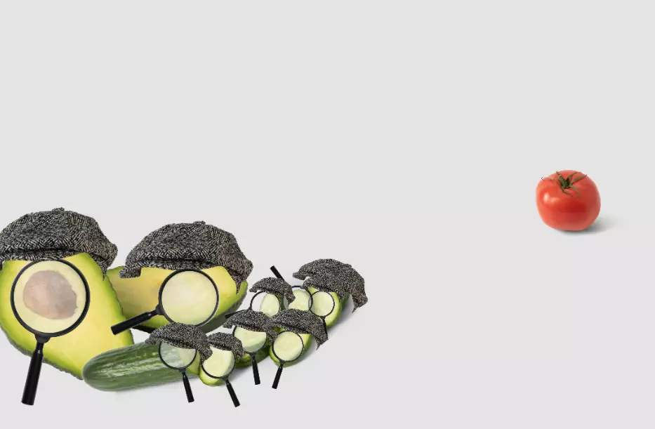
Try to establish a certain movie genre with your image – that way, you will be sure that there is consistency in what you’re trying to tell. The simpler the visual story, the better. Don’t get bogged down too much in details because most people will likely ignore them. Especially in their social feed. Go for simplicity and clarity.
Context
Context (or background) is an actor in itself. Everything in the frame interacts with it, and our perception of what’s going in the front is hugely shaped by what we see behind.
Tomato tribe:
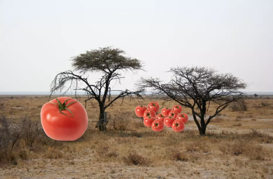
Tomato avalanche:
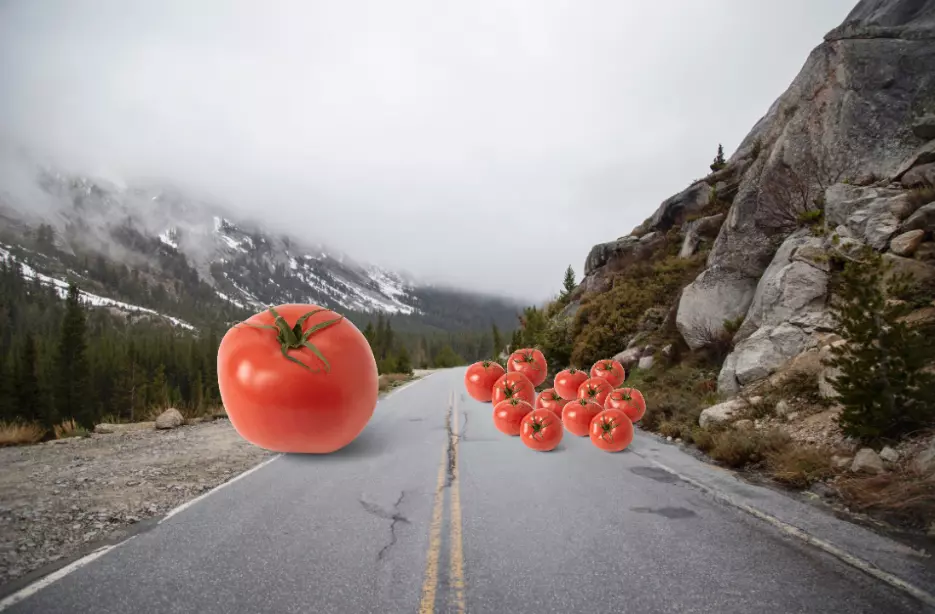
A group of tomato fugitives escaping from a Siberian prison:

Don’t treat context as a filler; treat it as an actor. It will bring your stories to life.
Afterword
I think people underestimate the impact visual storytelling has on an article. Often, someone will decide whether to read your article based on one title image and a short sentence accompanying it. If the image is blunt and generic, so must be the material, people might think.
We were telling stories long before we learned how to read. And we were looking at pictures even longer before that. A visual story pleases our brain, so why not add some extra effort and come up with something better than a hand holding a cell phone or a happy family on the beach?
About the author
Andrew started at Icons8 as a usability specialist, conducting interviews and usability surveys. He desperately wanted to share his findings with our professional community and started writing insightful and funny (sometimes both) stories for our blog.
Review the tips on how to cope with banner blindness, check the hot trends of mobile UI design in 2019, and get the lists of free vector software and free photo editing software
The visuals were created with Mega Creator
