Finding the right balance between user experience and limitations is one of the most exciting parts of our job.
Here’s a short story about turning a limitation into a user-friendly feature.
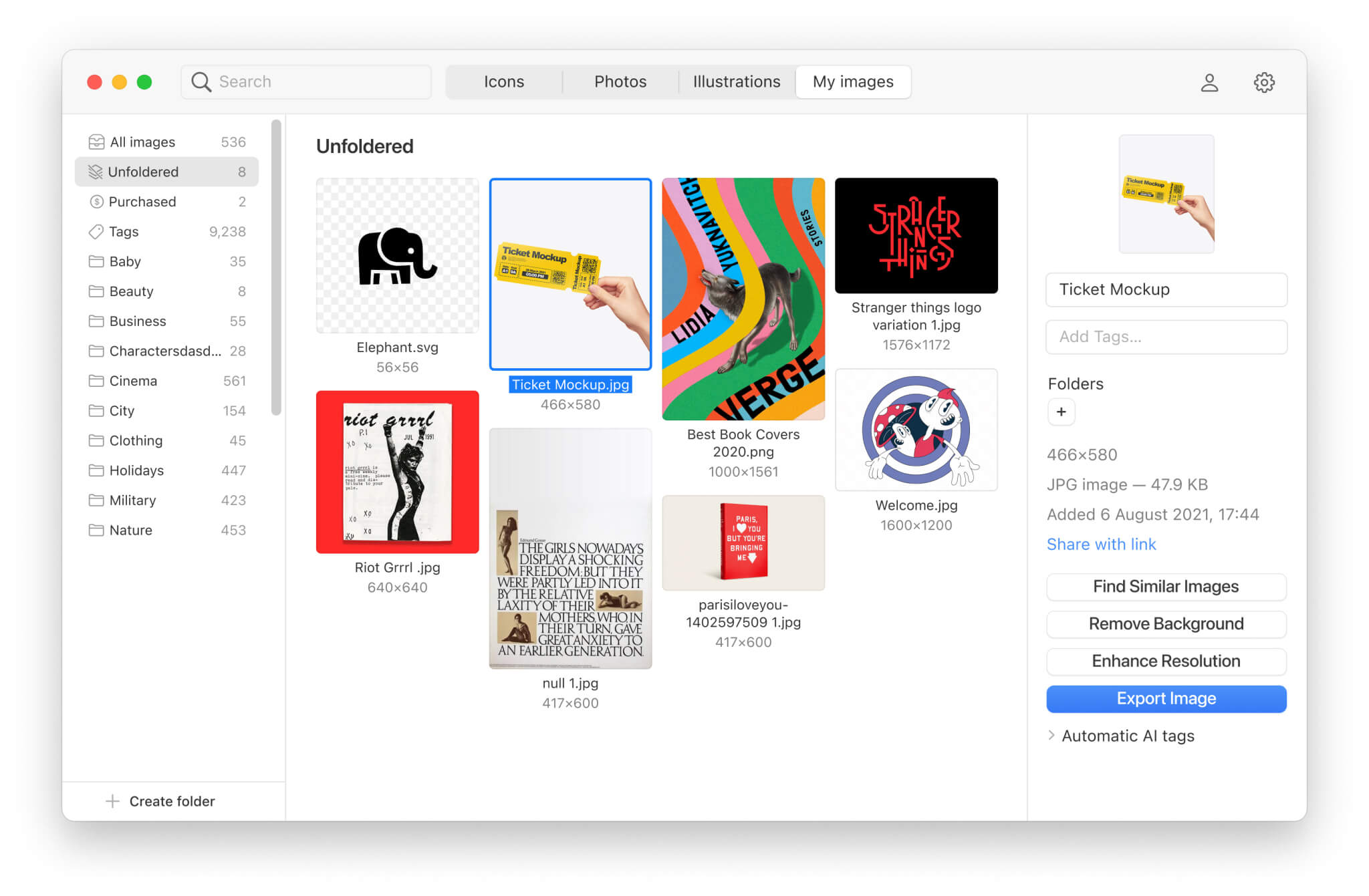
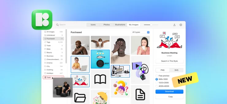
Over the past few months, we’ve been working on a new Pichon for Mac. In short, the app’s current version is a great source of quality icons, illustrations, and photos, which can save designers tons of googling time. One can open it next to their favorite design tool and simply drag and drop the required visuals onto the canvas.
At the same time, all designers have their own graphic assets and references that they store on the computer, on Pinterest, or elsewhere. So, anyway, they would have to jump between Pichon and Pinterest or local folders while working. Why not allow them to keep everything in one place?
That’s why we’re making an image storage space in the new Pichon. It’s going to be a place where people can keep their references and other graphic treasures that they have been collecting for years, right next to Icons8 graphics.
If you hate spending hours organizing files in folders, our AI will automatically recognize and tag the content so that you can find any needle in your graphic stack.

The limitation
We decided not to limit the cloud storage space available to users. At the same time, we needed to somehow prevent users from uploading excessively large files. Otherwise, we would soon be short of storage servers.
The obvious solution
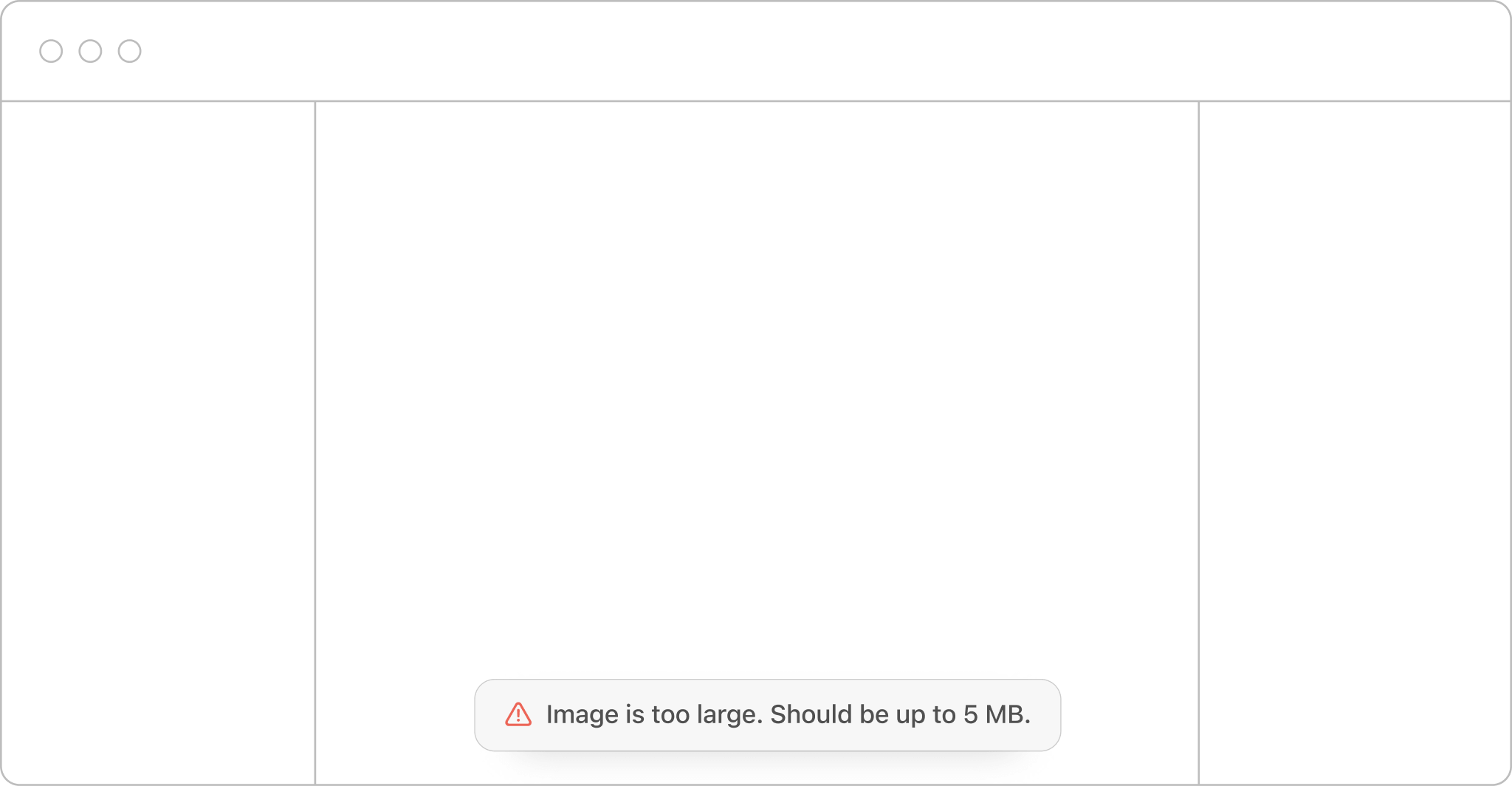
We set the max file size limit of 5 MB. If a user tries to drop a larger file into Pichon, they will get a message that the file cannot be uploaded and why.

Is it really a good way?
That would definitely work for us. But would it work for users? In fact, with this barrier, we protected ourselves and created difficulties for the people.
Ideally, instead of notifying the user of any error, we can try to fix it quietly. The machine should adapt to the human, not vice versa.
For example, when you make a typo in Google, it just corrects it.

The good way
Putting aside all the f-words accompanying the procedure, the user will probably try to compress the image and upload it once again. But if we know what the user will do, why not help? We can automatically downsize files larger than 5 MB. From the technical point of view, it will cost us almost nothing. From the UX perspective, it is way better.
Of course, we must inform users about the changes that we’ve made. It may be important if they want to keep an image in its original quality. So, Pichon will notify users about the downsizing right after the upload.
![]()
Pichon now allows uploading of images larger than 5 MB but downsizes them.
As a result, people will be able to upload images without any barriers. The limitation is still there, but the user experience is much friendlier.
What if a picture is too small
We downsize large files, but what if user images are small, and they might want them in better resolution? We already have an image upscaler with unique face enhancement technology. And we’ll certainly integrate it with the new Pichon for Mac.
Want to be the first to try the new Pichon for Mac? Subscribe in the form below to learn when it is out.
About the author
Den D., product designer for Icons8.


