We all know the power of the first contact. The first date may turn into the love of your life – or get forgotten in a couple of hours.
Tasting a new meal for the first time, you may get delighted – or hate even hearing its name ever after. The first contact with a teacher may get a student amazed at a subject – or deathly bored. Still, that’s not a lottery, that’s far from luck: in most cases, the first contact leads to success in case you are well-prepared. Today we are going to discuss one of the ways to organize the first date of your app with users with an onboarding tutorial.
What Is Onboarding?
Basically the term origins from HR sphere: it marks techniques and approaches whose aim is to help newcomers quickly adapt to the new conditions so that they could perform well. The area of user experience design took the idea together with the term. In UX design, onboarding is a set of techniques and interactions aimed at comforting users and give the initial introduction of the product. As the Material Design guide states: “Onboarding is one point in a longer journey that begins in the app store and ends with the user taking the first key retention-correlated action in your app.”
When you work on an app onboarding, your task is setting a clear visual hierarchy on the screen. Keep in mind that users are rarely ready to devote much of their precious time to learning a new product before real interactions start. What’s more, the capacities of working memory are also limited, so it’s vital to prioritize information thoughtfully for this stage of interaction with the product.
The role of onboarding is well-checked in practice, and often onboarding UX issues are what separates the successful product from a market failure. For example, in one of the articles in Adobe Creative Cloud Blog, UX researcher, and cognitive psychologist Rob Youmans, YouTube’s Head of UX Research Sciences, says “When it comes to design, the place that I see primacy and recency, in particular, is in terms of onboarding. When you start to learn about a new product there’s often a tutorial, wizard, instructions or something. It’s wise for designers to consider primacy and recency in this context because you’re going to want to put the most important information first or last if you’re hoping that someone is going to remember them later as they use your product or system.”
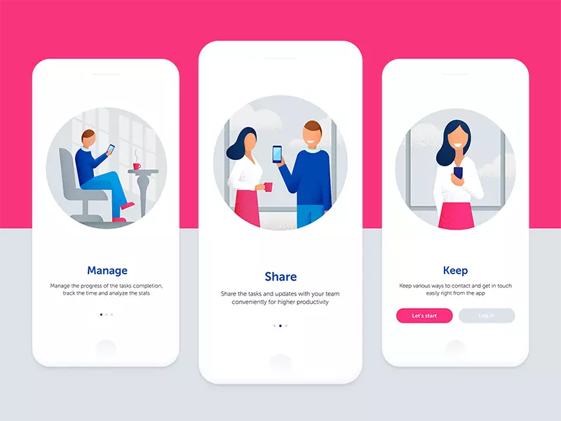
Airy and elegant app onboarding screens by Lana Marandina
What Are the Functions of App Onboarding?
There are three main goals behind app onboarding: it greets, informs and engages a user.
Greeting
Onboarding screens set the first contact between the user and the app. It is a sort of introduction that somehow imitates communication in the non-virtual world with a greeting. It is especially clear if the app uses a mascot or character that is chosen to reflect a flow of direct communication with a user. However, the greeting should be short and concise to avoid distracting users from the essential information.
Information
Another part of the onboarding mission is informing a user about the benefits they get with this product or basic operations they are going to do. User research and clearly defined USP of the product will help the creative team to find an effective solution that will highlight the vital points quickly to the users.
Engagement
One more important aspect of app onboarding is the foundation it lays for the desirability of the product. Well-designed onboarding tutorials engage users to try the beneficial features of the app. It helps a user tolerate the first steps into the unknown. In addition, onboarding screens provide the first introduction into the style and looks of the app. Based on the analysis of the target audience, it may become another hook for user’s interest to see more. One more factor to keep in mind is that most users are visually driven and even aesthetically driven creatures: we tend to get interested in what appeals to our ideas of beauty and harmony or sets particular emotions with its visual performance. So, onboarding screens become a favorable way to activate this approach from the first seconds.
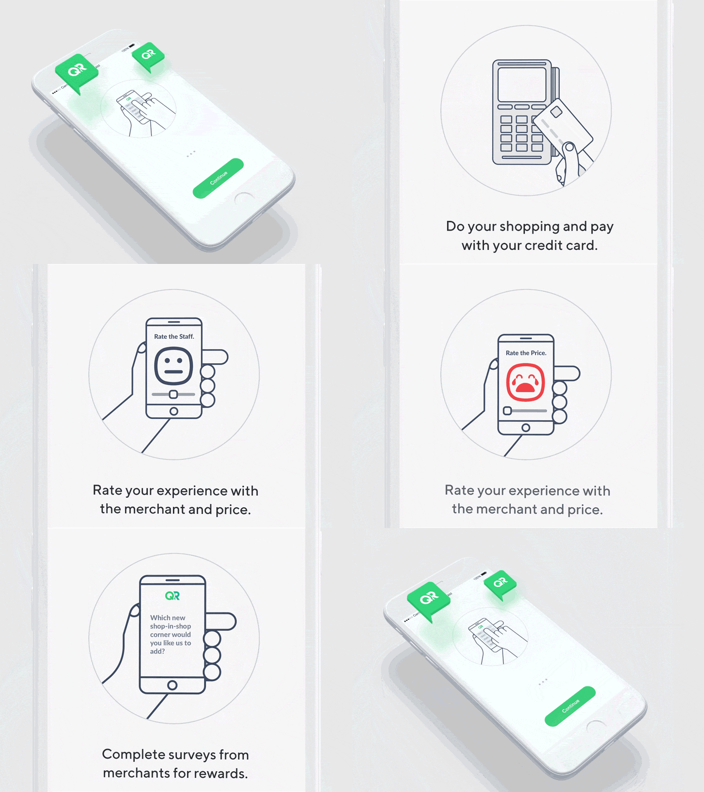
Onboarding tutorial by Virgil Pana applies visual storytelling to introduce the app functionality to users.
Types of User Onboarding
Three types of onboarding popular for modern applications usually reflect the following:
- top benefits: the most important advantages of the app are shown to users convincing them to try
- personalization: users can customize their experience before they start real interaction (remember choosing the areas of interest before you start pinning in Pinterest?)
- quick start: users get prompts to start interactions easily.
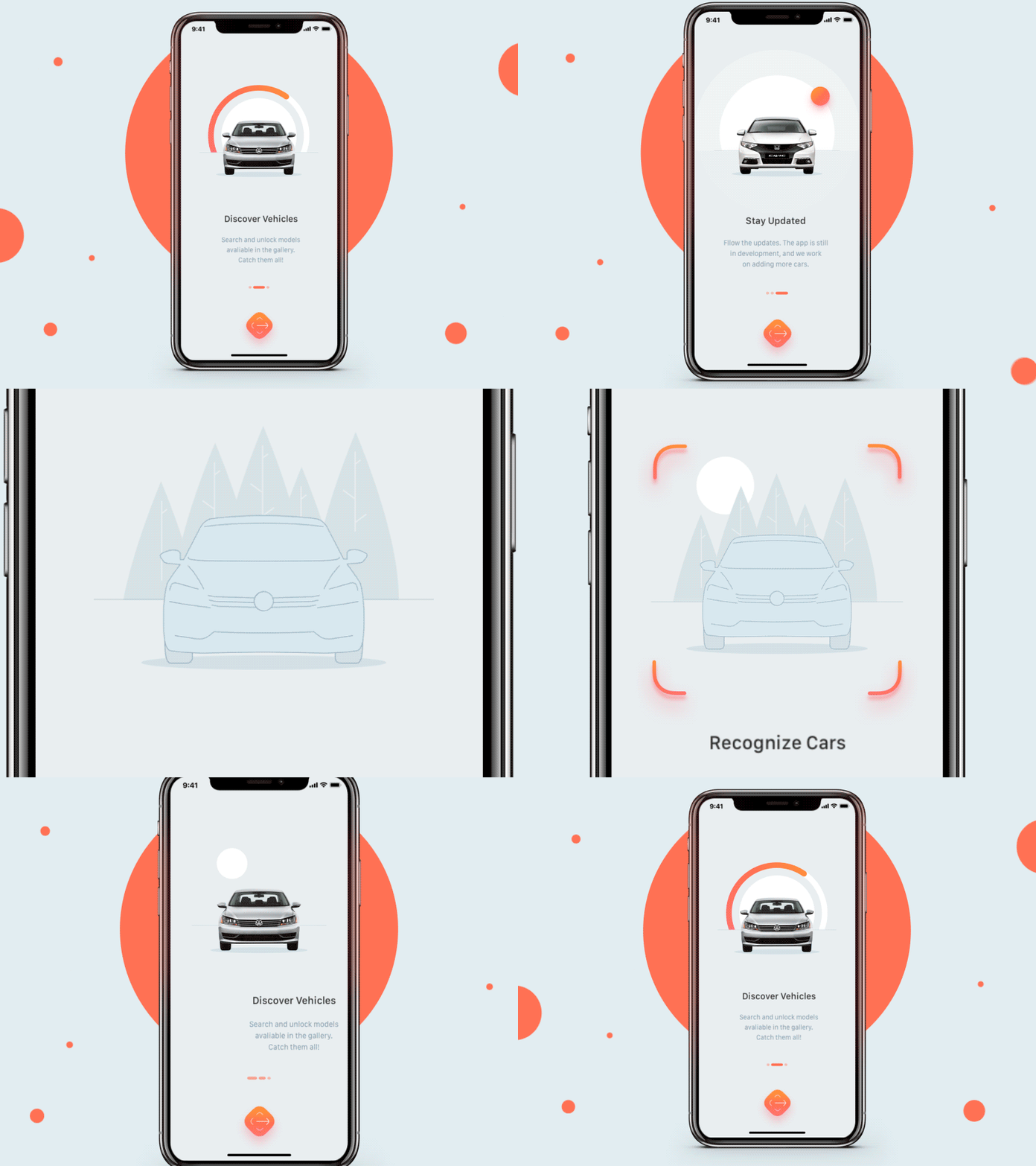
Onboarding designed by Netguru for the app that lets users recognize cars on the streets. That’s the example of top-benefits onboarding.
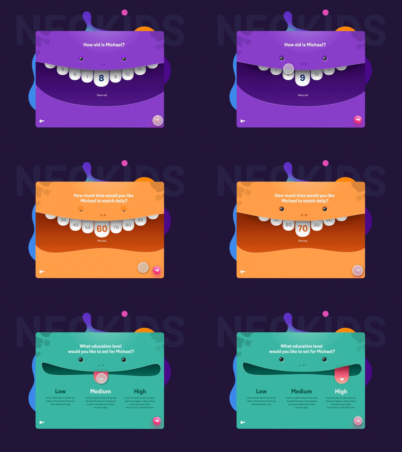
This UI concept of a video app for kids by Minh Pham shows the great example of personalization type of onboarding.
7 Design Tips for App Onboarding
Show onboarding to first-time users
Onboarding is usually the set of screens shown during the first interaction with the app. It is recommended not to show it to returning users as it will just waste their time.
Don’t use too many screens
Typically, UX designers apply 3-4 screens for onboarding. It’s enough to give a quick insight into the app benefits or functions without making this pre-interaction stage too long. And of course, it is good to boost usability from the first minutes of interaction. What’s important, don’t forget to consider the screens that came before onboarding and the ones that will come after it. This will help to make the flow natural and avoid duplication of data.
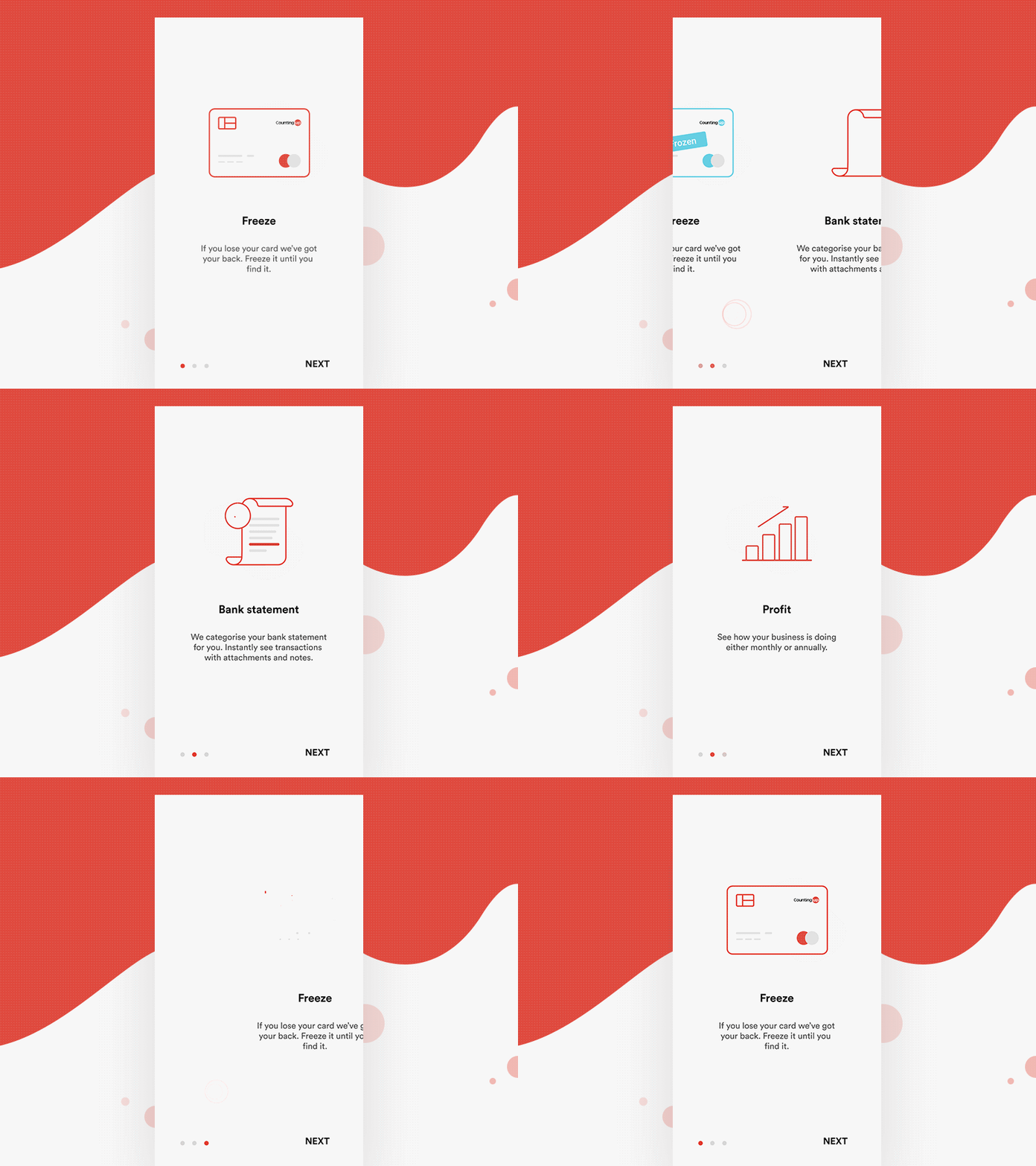
Onboarding UI concept for a financial app by Divan Raj applies 3 clean and minimalist screens with animated graphics and short copy blocks.
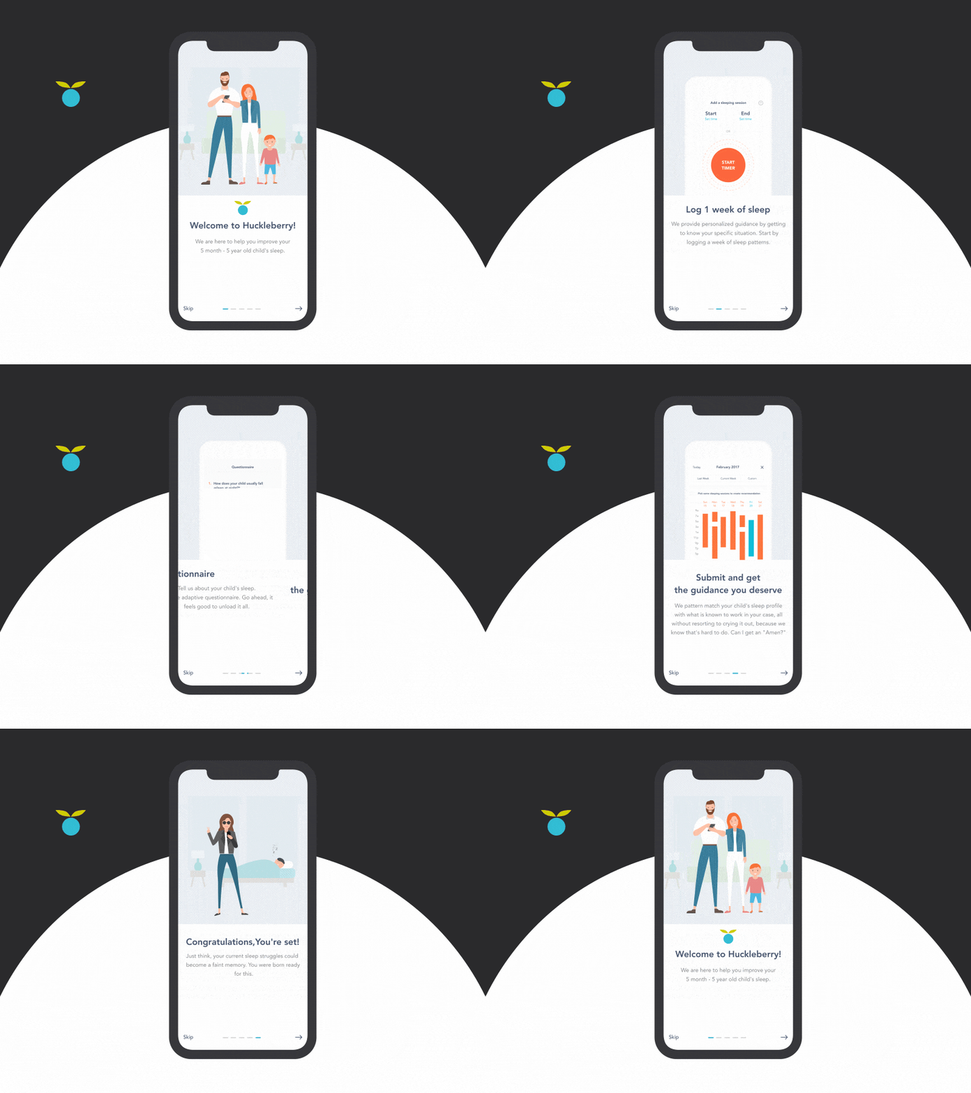
Mobile app onboarding concept by Sochnik applies 5 screens but allows users to skip it at any stage.
Apply catchy illustrations
Visual content is processed much faster than textual by human brains. Onboarding supported with meaningful interface illustrations allows for a quicker explanation of the features and makes the UI lively.
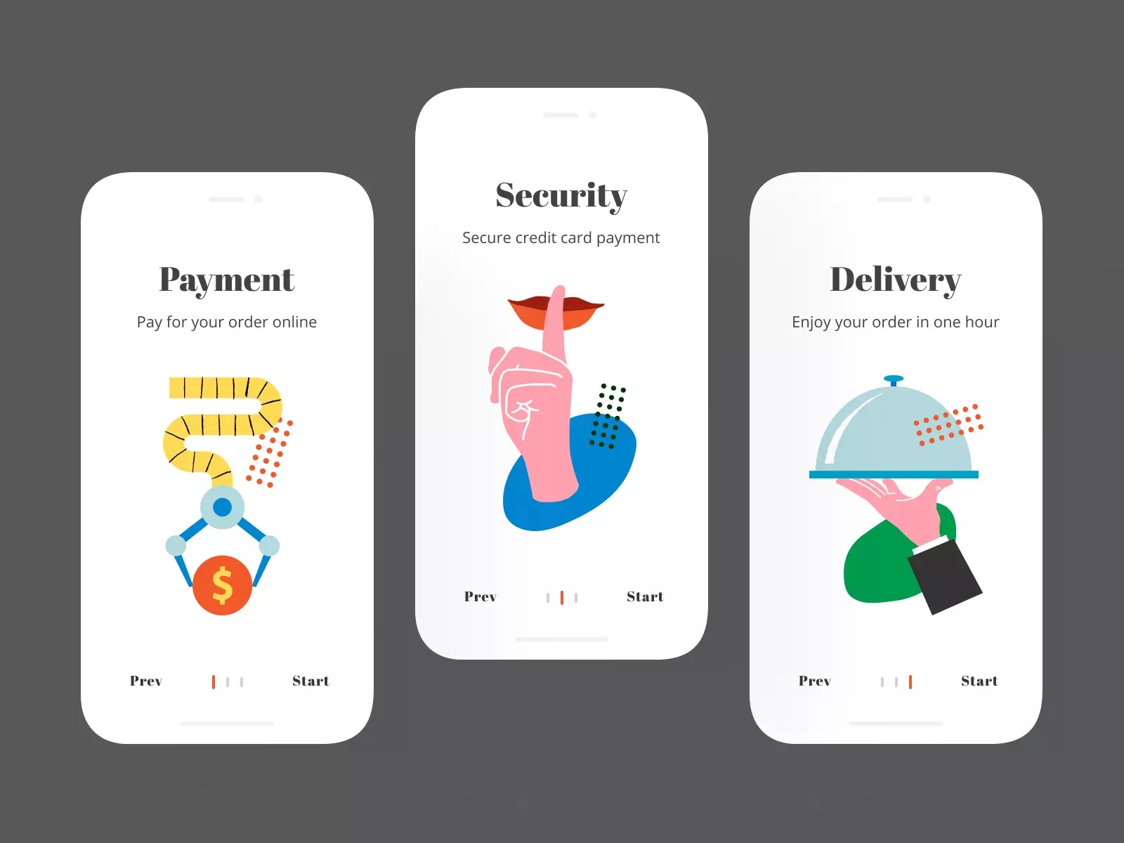
Onboarding screens by Icons8 showcase how interface illustrations work for mobile UI design.
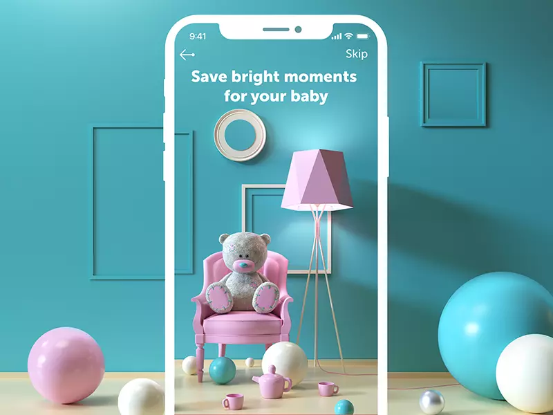
The onboarding of an app for parent’s diary by Tubik applies 3D graphics to make the screen cute and atmospheric.
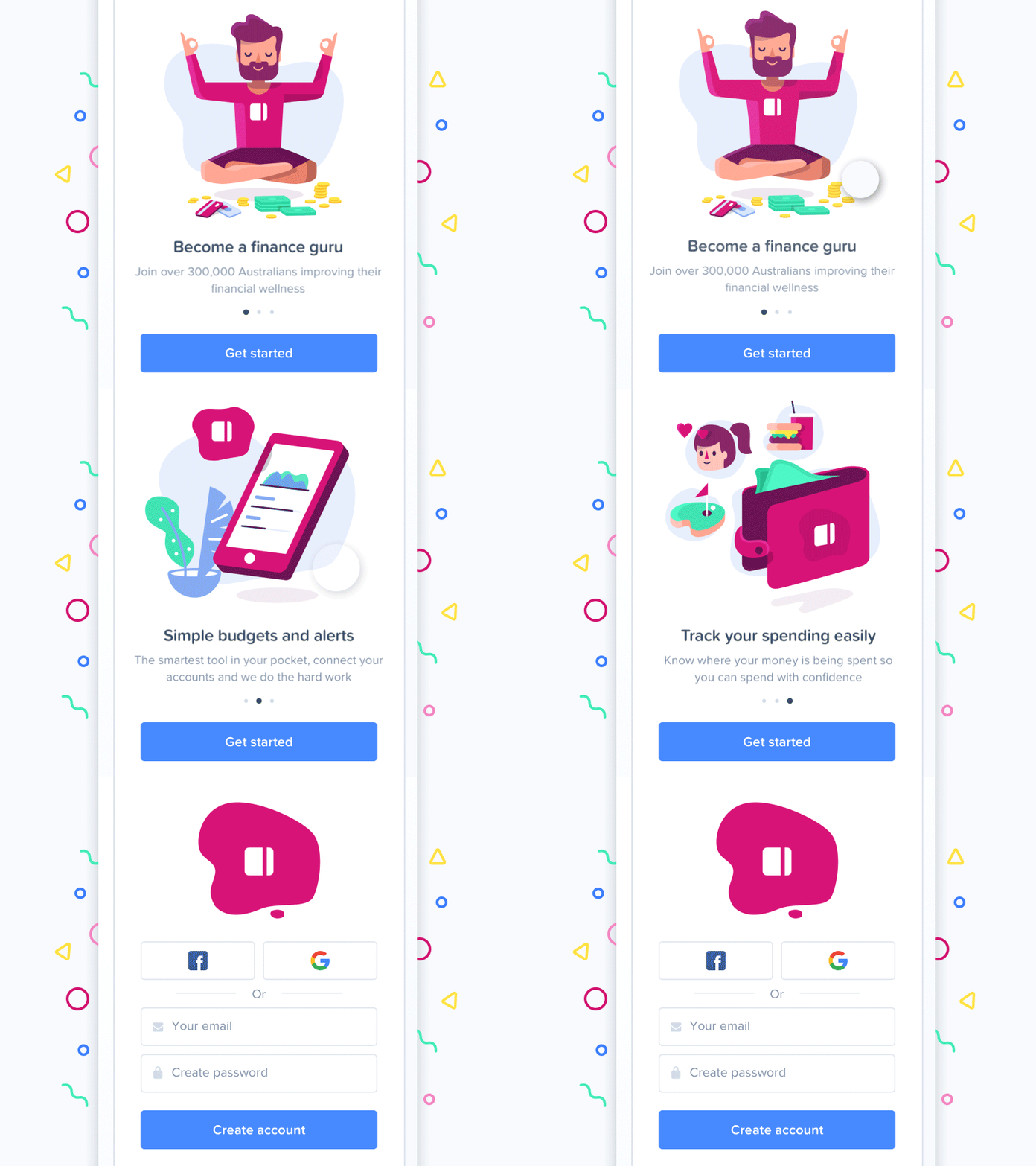
Onboarding redesign for PocketBook app by Andrew McKay features bright illustrations for key benefits of the product.
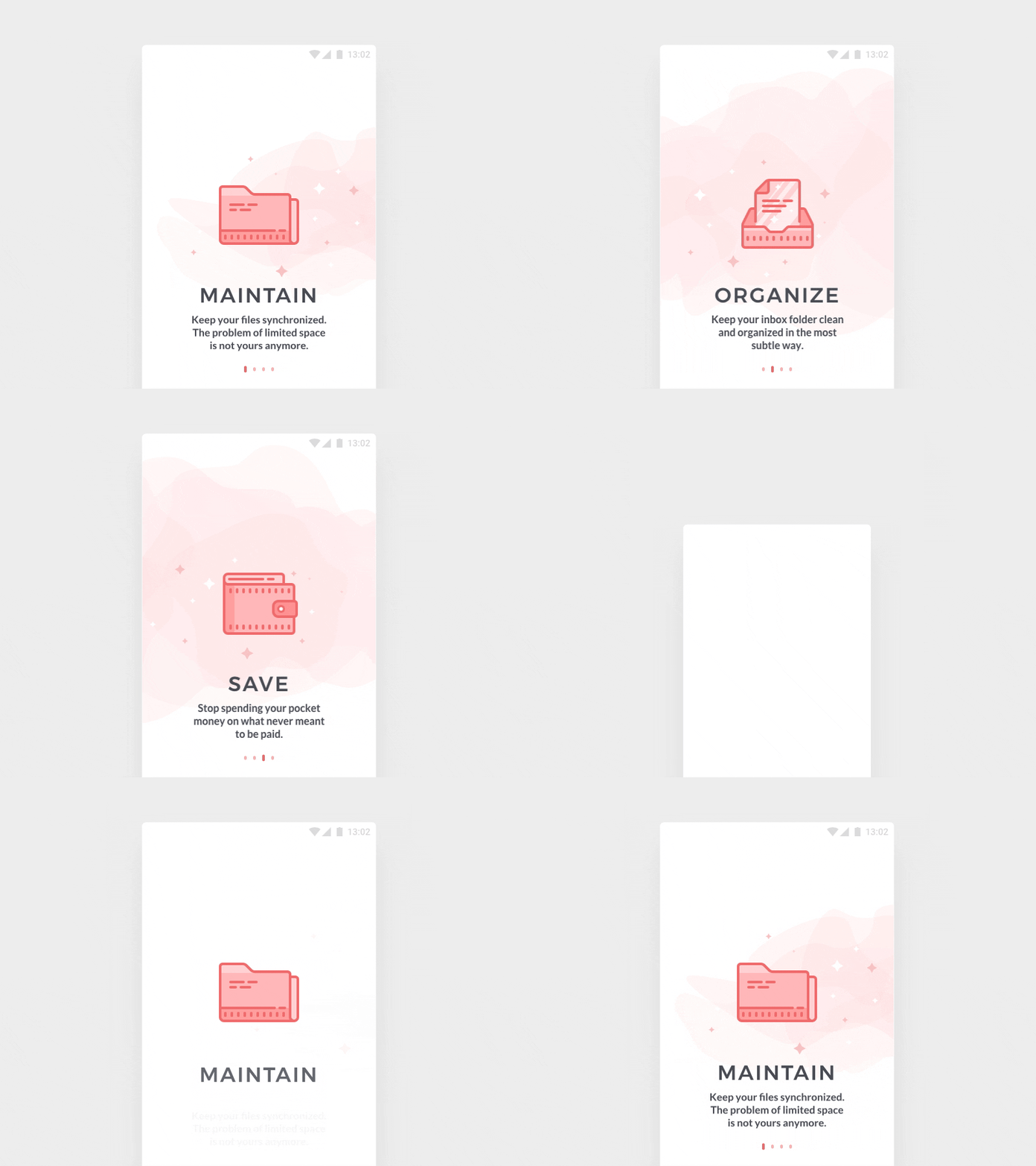
App tutorial concept by Icons8 is built on quite a minimalist approach focused on simple and informative illustrations in combination with instantly readable keywords reflecting the app functionality.
Breathe life into it with animation
Another trick making an app tutorial not only informative but also lovely and engaging is animation. Motion makes interaction more dynamic, delights users, catches attention at once. Interface animation can make the essential details quickly noticeable.
However, motion can increase the time and traffic to get it loaded, so discuss it with developers in the aspect of its technical realization.
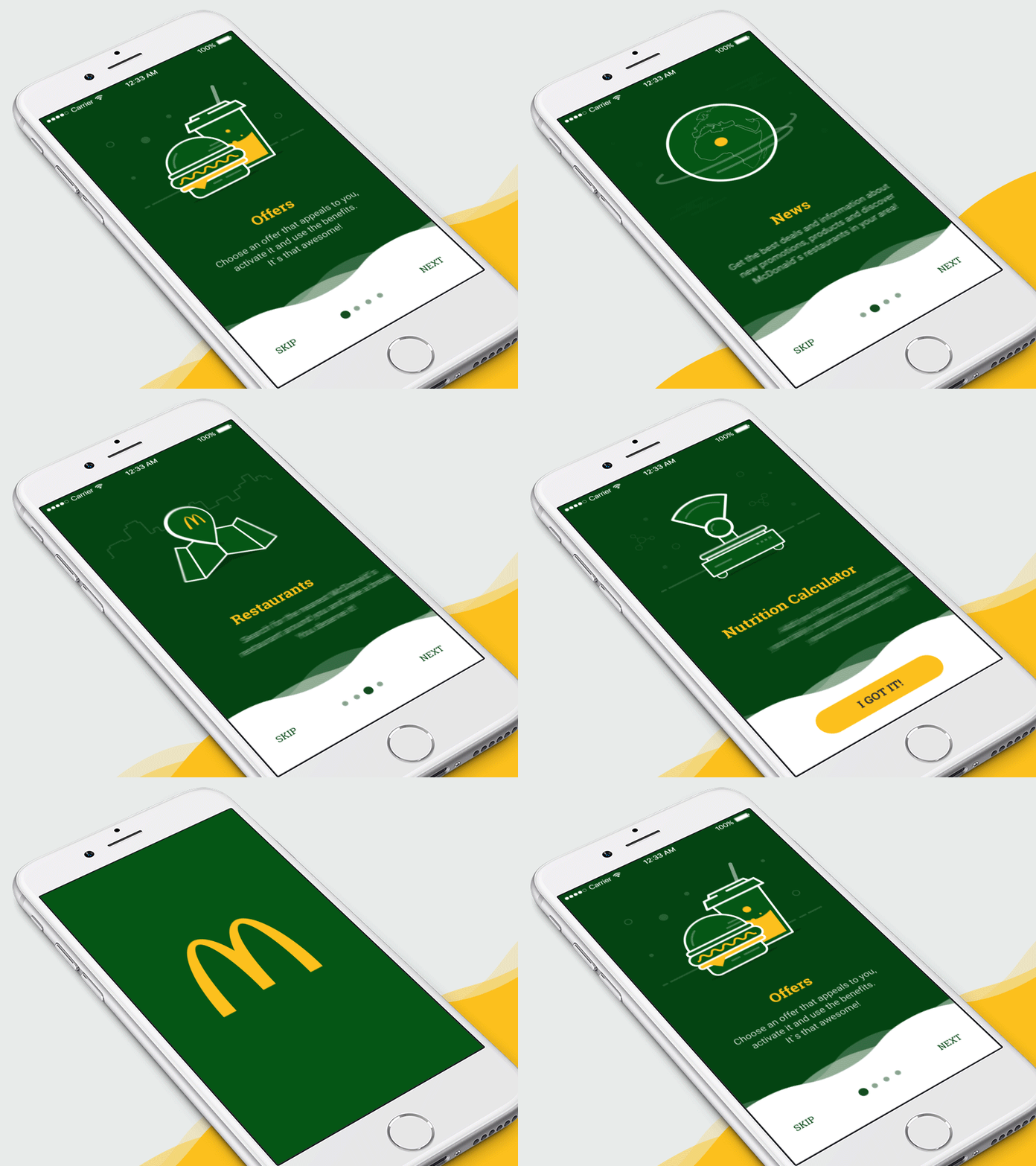
Onboarding screens for McDonald’s app by Dmitry Mokhar looks lively and dynamic due to animations.
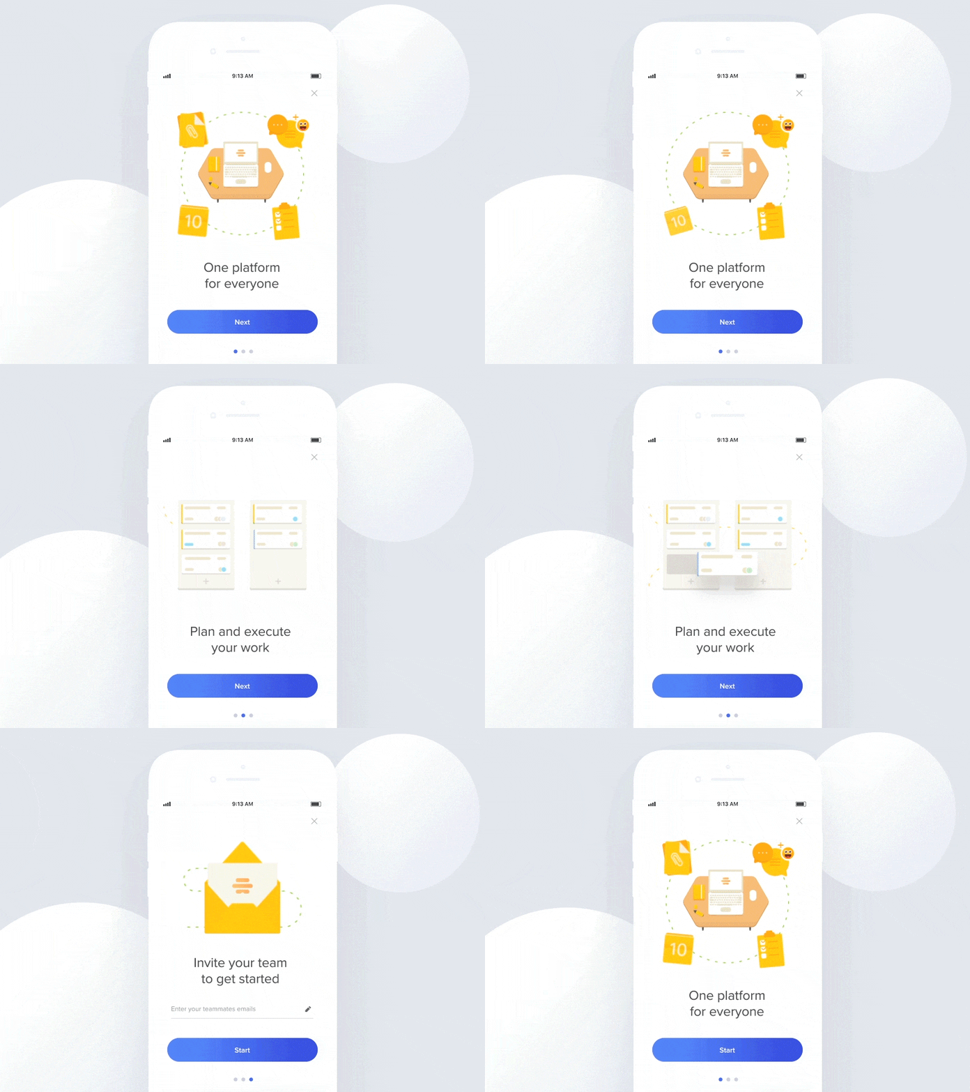
This app tutorial by Netguru shows how animation helps to show more information on each screen.
Make the copy focused and readable
As for any guidelines or presentations, in the onboarding tutorial, words are power. Yet, there are two simple rules to make them work: tell them short and make them helpful. It’s vital to find an effective way not to waste the precious seconds which the user is ready to devote to checking the screens. If possible, involve the copywriter who will help to create the interface copy that makes every single letter count. The outcome has to be an attractive and clear copy that applies the language appealing to the target audience and corresponding to the objectives set for the product.
Based on that, one more aspect to check well is choice of types and fonts, background, and placement of the copy. All those factors influence the readability of the text: if they aren’t done and tested properly, the text performance decreases, even if it’s well-written.
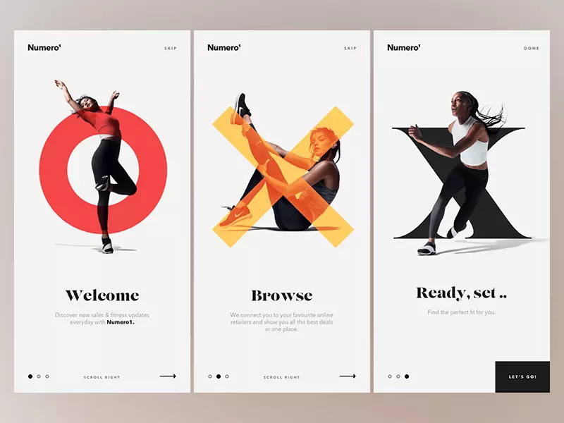
The onboarding concept by MakeReign features stylish and dynamic photo content elegantly combined with good-looking copy.
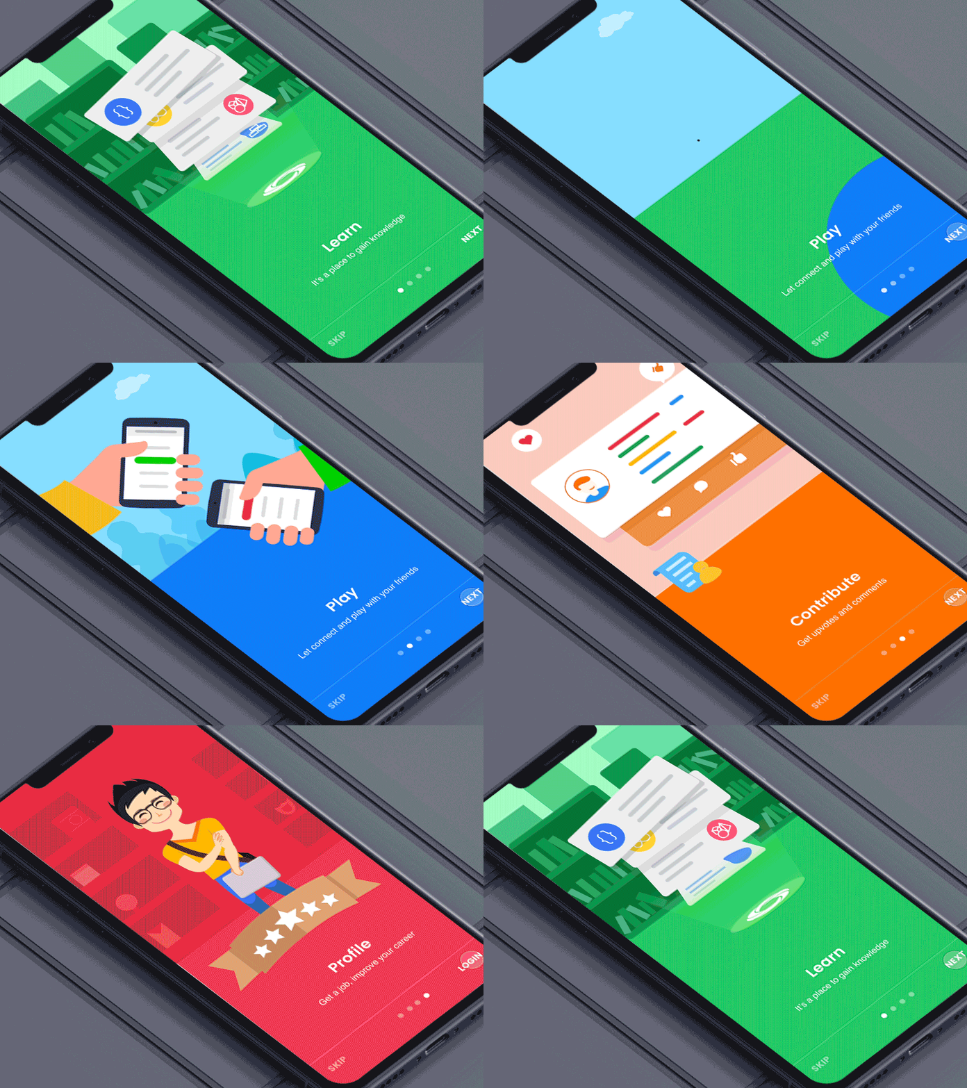
App onboarding designed by Johny Vino is focused on bright and catchy animated graphics supported with short and clear text explanations.
Use progress indicator
From the very start of the interaction, users need to know where they are and how long is the whole process. A screen indicator is an effective way to inform users about the flow which gives more confidence and therefore makes the user experience positive.
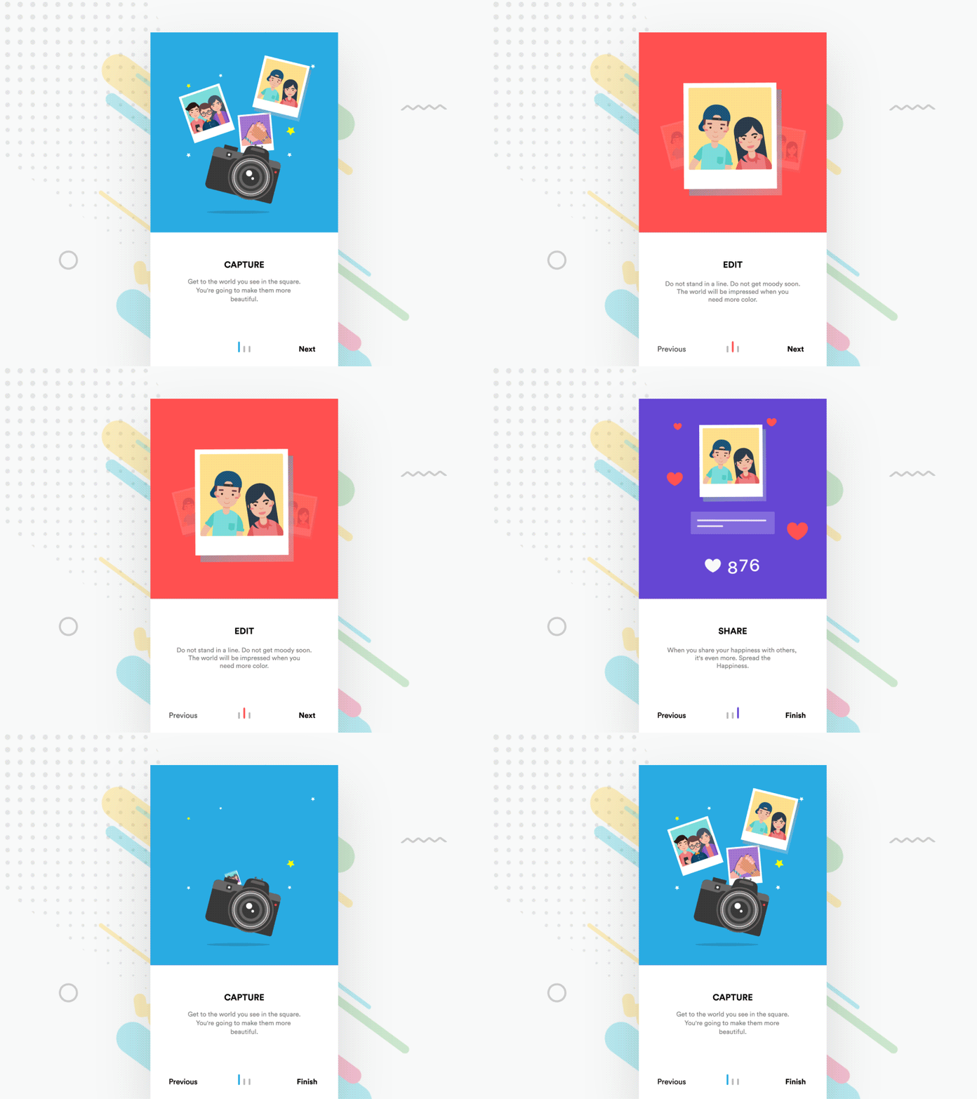
The UI concept by Divan Raj features the screen indicator that changes the color of bars to synchronize with the background color of the illustration part. This is the good trick to enhance general visual consistency of all the app tutorial.
Make skipping possible
One more thing to keep in mind is enabling the user to skip the tutorial. Not everyone needs it, even using the product for the first time, so in many cases, it’s reasonable to let them skip the onboarding screens and save their time. The decision upon this function has to be done on the basis of testing and analysis of the target audience.
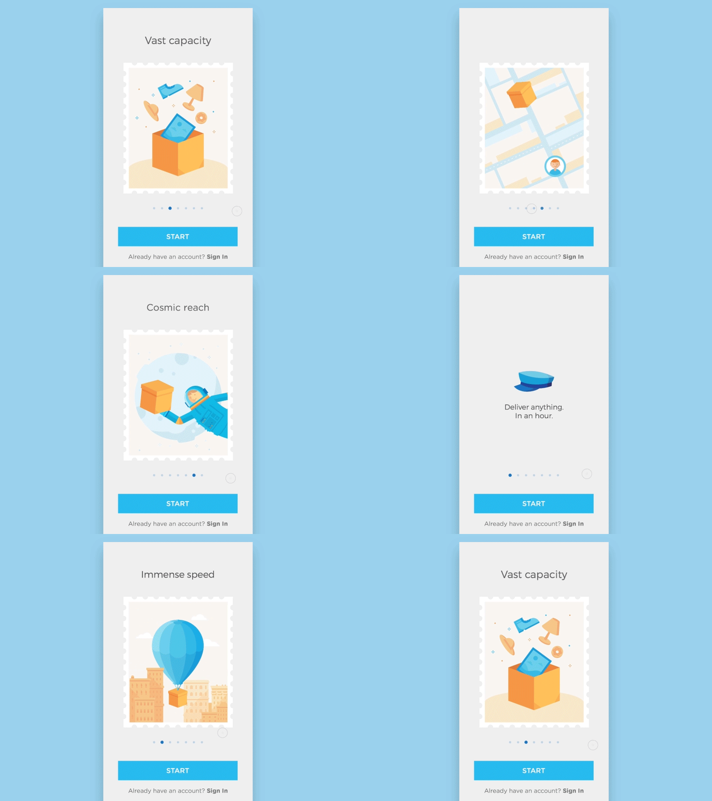
Animated onboarding UI by Anastasiia Andriichuk connects all the screens into an integral structure with concise copy and motion graphics. The button at the bottom of the screen allows for skipping the tutorial at any stage and start interaction immediately.
You never have a second chance to make the first impression. This is the main aim behind any onboarding tutorial – not to miss the chance to impress the user and make a good card of invitation.
About the author: Marina Yalanska, tech/design writer and researcher, editor of Icons8 Blog
Title image designed by Kyrylo Kazachek with the vector graphics from Flamenco pack on Ouch
Check the most hated UI and UX patterns, learn the practical definition of usability, and review 7 basic types of UI animation.