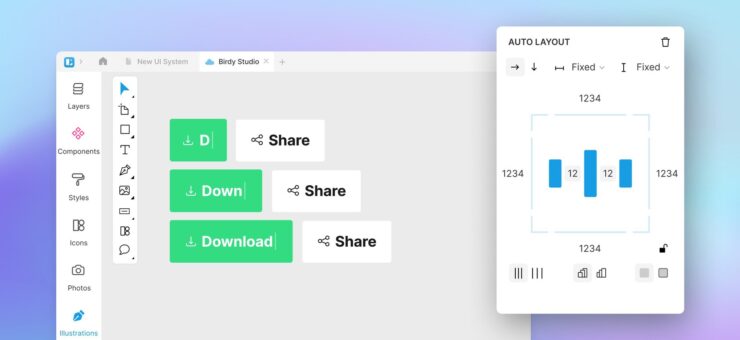
It doesn’t take an experienced designer to say what’s wrong with one overused Internet photo.

The text is viciously close to the logo.

Ah, much better now. But if the owner is a trained therapist, we have another problem. It goes by…
Kerning:
a process of adjusting the spacing between characters in a proportional font, usually to achieve a visually pleasing result.
What Is Kerning
The more the text becomes a point of focus, the more our eyes perceive small imperfections in it. And one of the most common imperfections often lies in the space between letters, or font kerning.

The key word here is “perceive”. If you were to simply set an equal size of a blank space between all letters in the word, that wouldn’t do the trick. See for yourself:

Now if we apply kerning, your type will be perceived as more balanced and legible, even though the space between letters, geometrically speaking, is distributed unequally. In typography, it’s sometimes called horizontal rhythm.
Every font has a unique rhythm to it, and key factors to the rhythm are:
- letters—every letter has a unique visual footprint in the word
- elements—serifs, line weight, and line length can significantly alter the size of the same letter
- pairs—the interplay between two adjacent letters is unique to every font
Letters
There are 5 types of letters:
- Rectangular: M, H, N – have vertical elements on both sides
- Rounded: O
- Half-rounded: B, D
- Half-Opened: L, E, C, K, J
- Opened: X, T, W
If all the letters were rectangular, we could actually use the equal space approach:

However, as soon as combinations of different letter types come into play, we need to do some tweaking:

Typically, the space between rectangular characters will be the widest, while the characters with an open shape will require less of it.

Elements
There are countless elements in every typeface that make any letter unique. And they all have names! Descenders, hairlines, loops, serifs, terminals… The angle of the letter, the line weight etc.–everything can contribute to the way we perceive it.
Compare these two words in different fonts:

The dynamic between the first two characters “I” and “n” is completely different in both cases. Due to serifs and the overall angle, the letter “I” falls out in the former case. If we wanted to improve visual perception and readability we would have to bring it closer.

Pairs
Essentially, every ready-to-use font is a set of thousands of letter combinations or kerning pairs. Font designers try to anticipate every pair possible, and most of the time, that’s enough. For web fonts and word editors… However, certain pairs are always troublesome in almost every font, especially in larger sizes. Which means you almost always are going to have problems with those:

How To Kern
There is so much geometry that goes into kerning, but we’ll leave that to font designers. In this article, we’ll use a simple kerning technique: trios.
This is the word we’re going to kern:

Step 1. Let’s find the most complex pair of letters and adjust the spacing between them:

The space between two characters should not be too wide that they fall apart and not too narrow that they glue.

The kerning of this pair will determine the rest of the horizontal rhythm. Being one of the complex ones, it usually will have the least space between the two letters compared to the other pairs.
Step 2. Now we add another character adjacent to our base AT pair. Let’s take “I”

Step 3. Let’s again form the next trio of characters, two of which we’ve already kerned.

Step 4. By working with three characters at a time, we eventually kern the whole word.

When to Kern
There may be circumstances when people don’t need kerning.

However, more often than not we need it. Kerning affects both readability and perception. Proper kerning is like proper interface design – if it’s done well, you don’t even notice it. If, however, something is off…

It’s not just about dirty jokes, though. Often reading badly kerned text may feel like torture:

The book can easily be reviewed badly just because its text had a bad kerning. The marketing ad may convert poorly for the same reason.

Yet, sometimes, unusual kerning can be intentional. Especially in logo design.
Take a Continental logo:

Here’s how it would look with proper kerning:

What Is Not Kerning
There’s another concept in typography very closely connected to kerning and it’s called tracking. Often people confuse them. This is tracking:

After you’ve figured the space between individual characters, you can uniformly increase it or decrease it throughout the whole word. If you’ve done kerning properly, the visual perception will still be favorable.
However, tracking plays a huge part in how the word will be perceived.

I found these two logos on the Internet. While there is a slight difference in the fonts, the real difference lies in the space. It’s uniformly stretched in the second example. Feels like two different messages from the same company.
Just remember – that’s not kerning. That’s tracking. Here’s a useful visualization:

CSS Kerning
It’s harder to control kerning for websites than to control it in your design mockups. This is one of the many reasons why people prefer to use established fonts on the web rather than self-made.
Thankfully, we have a few CSS kerning parameters to control the typography on the web.
The first is font-kerning and it basically controls whether you want to use the built-in kerning pairs that the font-designer established for the web. In most cases, you use a default parameter auto.
These are available values:
font-kerning: auto;

font-kerning: normal;

font-kerning: none;
Sometimes you may find int useful to disable font kerning with css for a specific portion of your text:
<span style="font-kerning:none">AV</span>
AV
<span style="font-kerning:normal">AV</span>
AV
Another css parameter is letter-spacing.
This parameter manipulates tracking rather than kerning. It uniformly increases the space between your letters:
<span style="letter-spacing:5px">AV</span>
letter spacing
<span style="letter-spacing:1px">AV</span>
letter spacing
For more advanced web font kerning you can use plugins, such as Lettering.js and Kerning.js
Lettering.js enables you to identify each character in the word and set margins for it.
Kerning.js has even more features regarding font kerning. For example, you can set behavior for specific kerning pairs. Authors have plans to provide a visual kerning tool that will generate CSS rules automatically as you kern the text in the browser.
Afterword
Even with the staggering amount of kerning best practices, it’s still done mostly by a designer. The more you do it, the better you’ll become. You can use this game for your practice sessions: Kern Game
Just don’t spend too much time learning that. In a few years, it’ll probably be done by computers. But we’re not there yet, so make sure now that your logo looks nice. Or Clint’s birthday cake.

About the author: Andrew started at Icons8 as a usability specialist, conducting interviews and usability surveys. He desperately wanted to share his findings with our professional community and started writing insightful and funny (sometimes both) stories for our blog.
Title image: Oleg Shcherba for Icons8 illustration project
Check the collection of font pairings for badass designers or fonts that designers actually use, and read about typography logo design.


