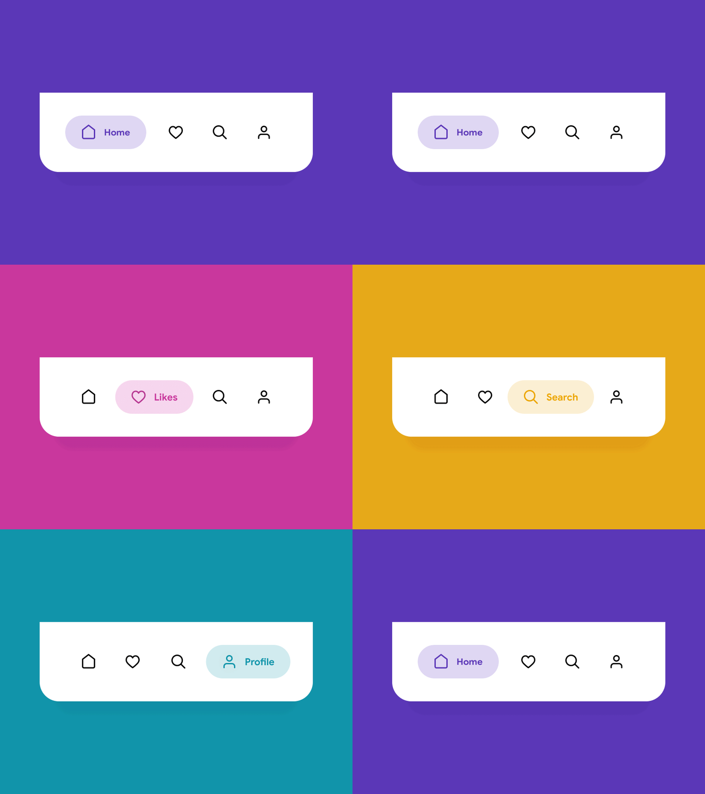
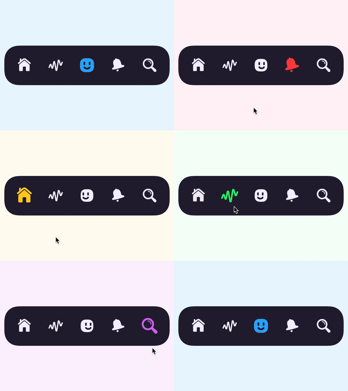
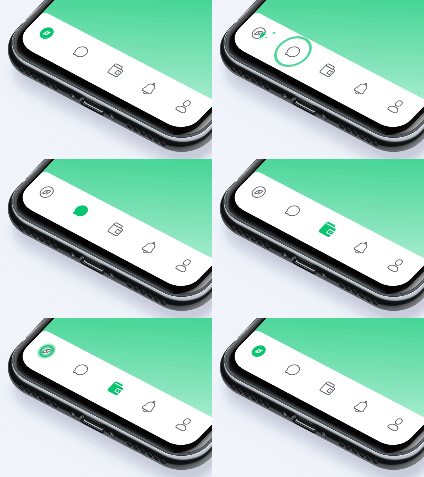
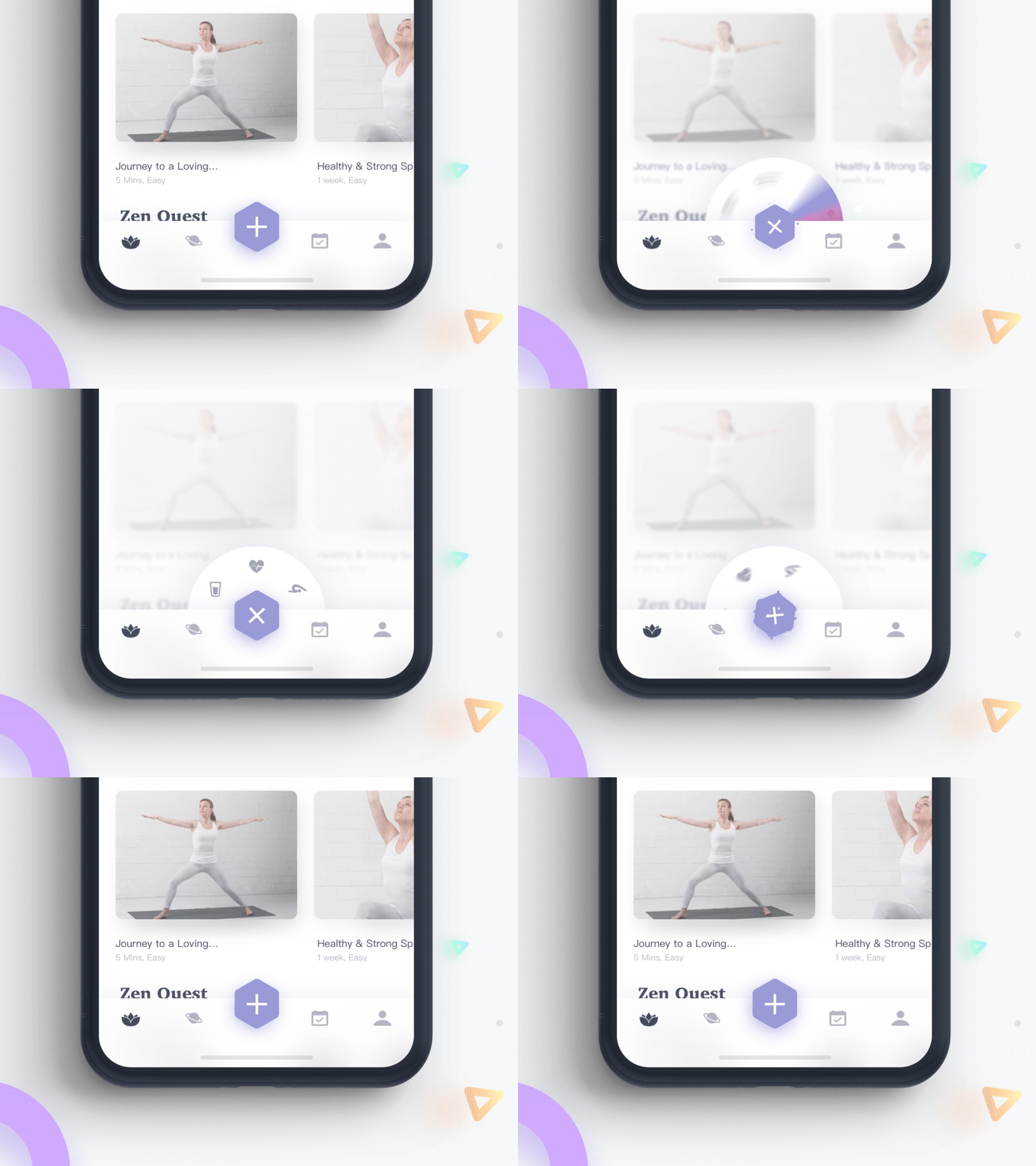
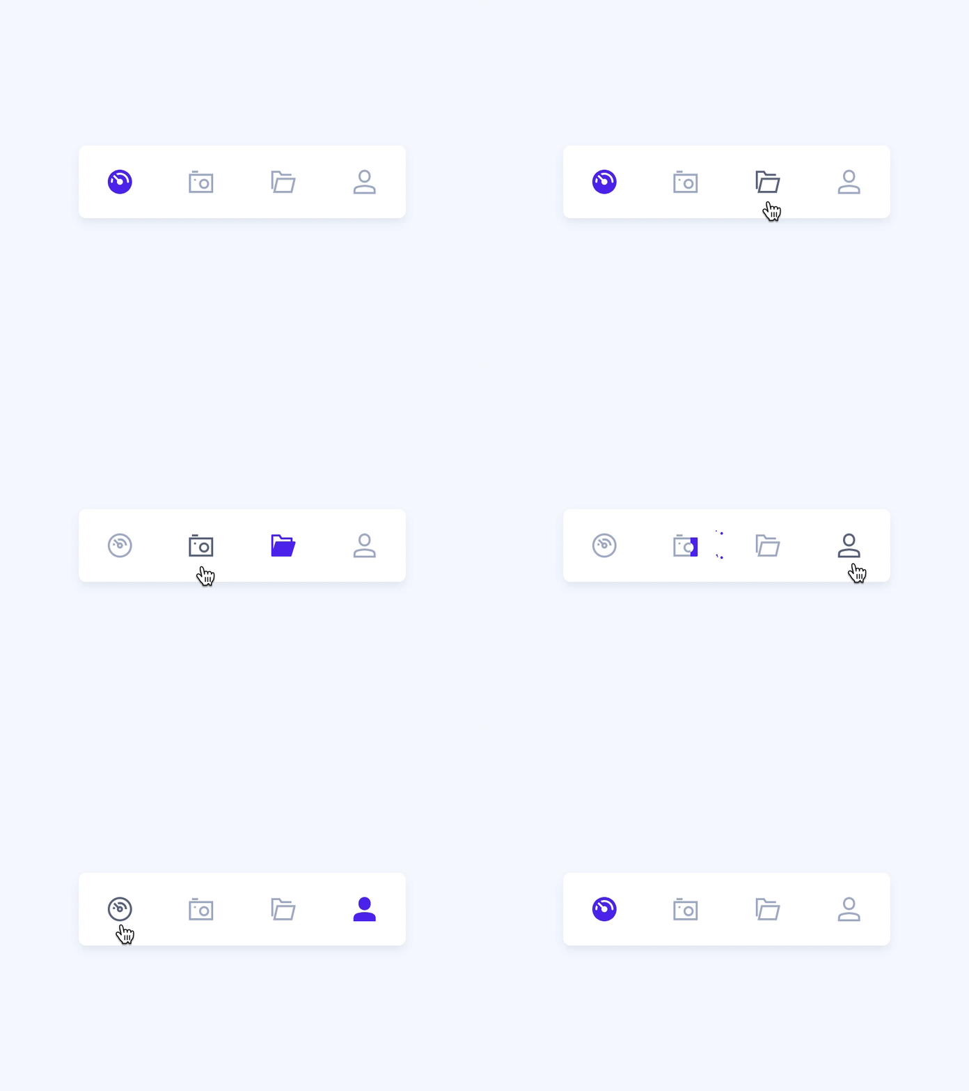
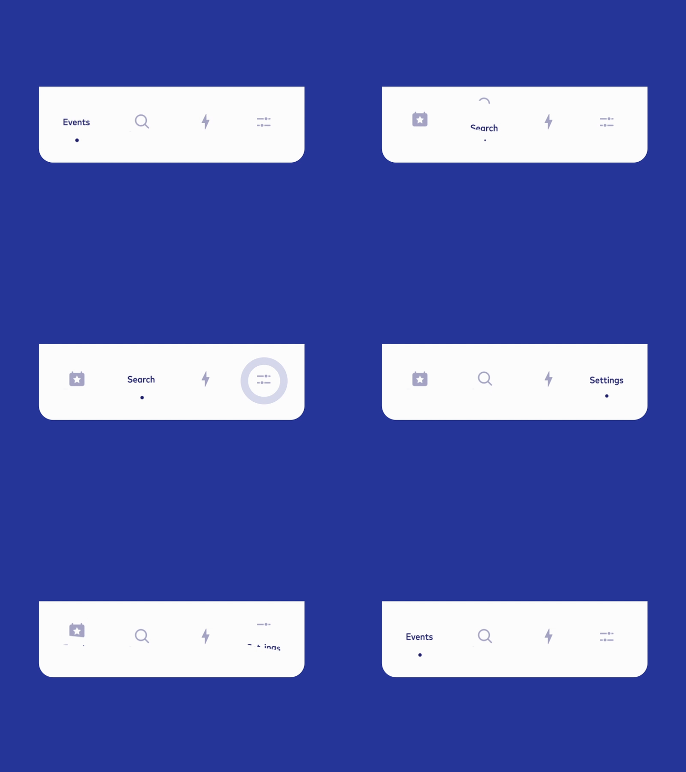
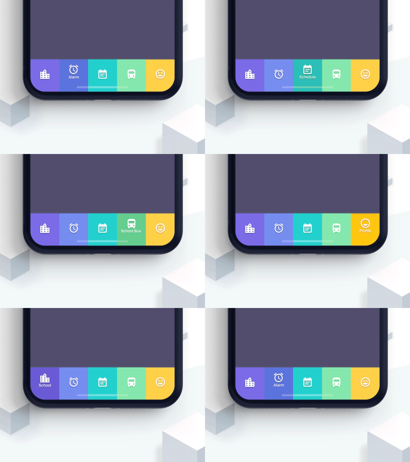
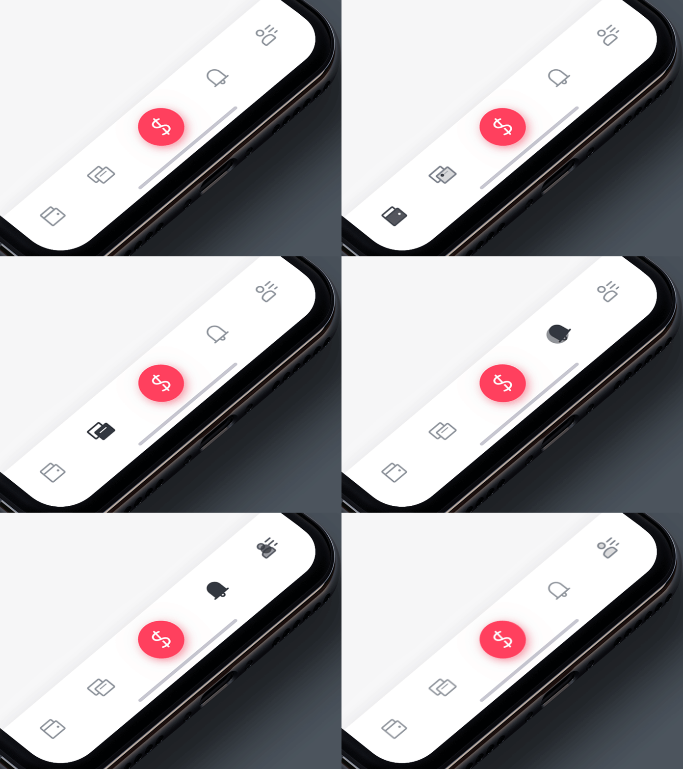
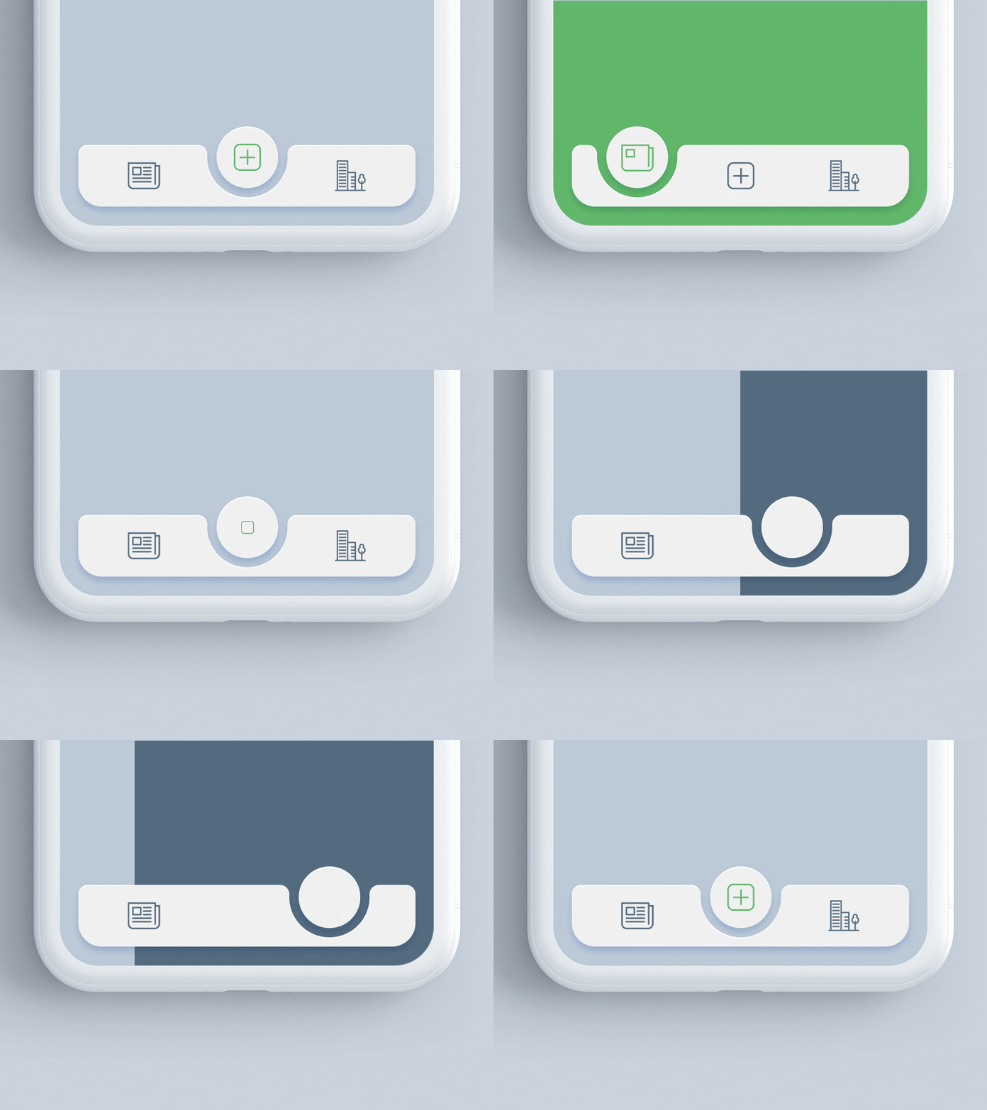
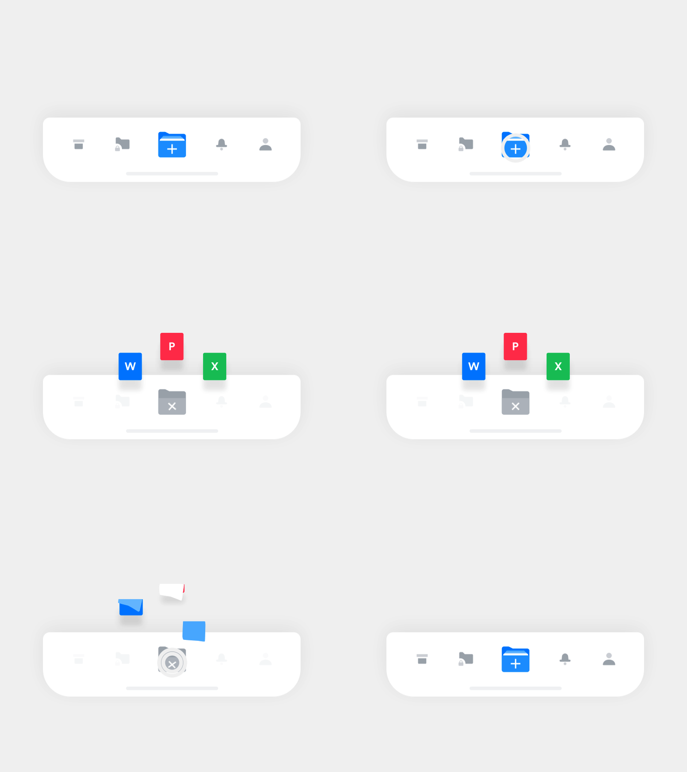
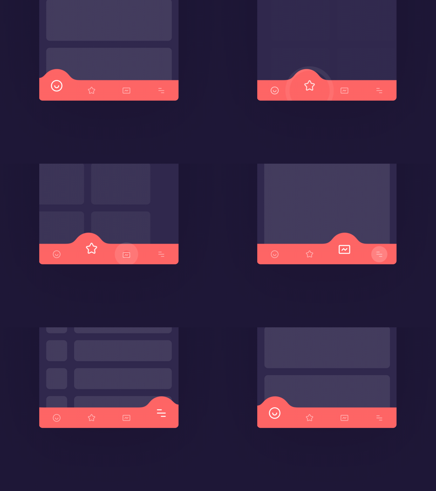
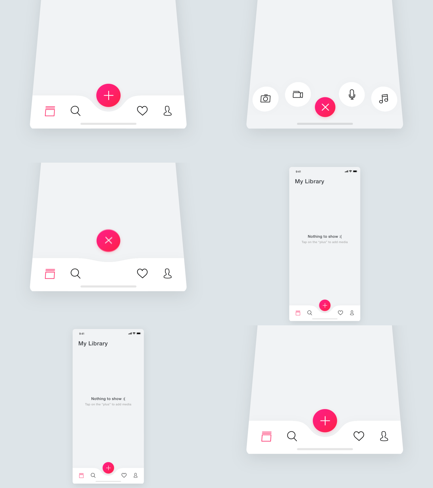
Today we’ve collected another set of inspiring animated designs, this time devoted to UI animation in a tab bar. Let’s check how different designers add creative vibes to app navigation.
According to the Human Interface Guidelines by Apple, a tab bar is an app control that appears at the bottom of the screen and enables a user to switch between the key sections of the mobile application quickly. Tab bars keep the same height in all screen orientations and hide away when the keyboard appears. The goal behind the tab bar is the organization of the information on the global app level: this interactive element of a mobile user interface allows designers to simplify the hierarchy of UI for users and provides access to several information categories, functions or modes at once. UI designers are recommended to use tab bar only for navigation rather than performing actions. Tab bars usually feature simple minimalist icons that should look consistent and be highly legible.
These days, the tab bar also presents the field of creative experiments, especially in the domain of UI animation. The collection of app design concepts below will let you catch how it goes with the motion for interactions and animated icons. Some designers play with color and shape, the others practice transitions between tabs or animated combinations of icons and labels. And some are just a sort of creative fun!
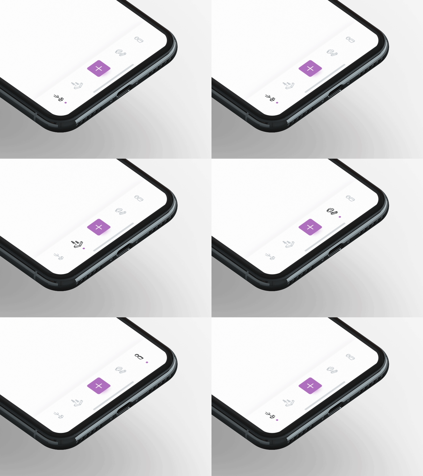
By Hoang Nguyen
Want to get free icons in a variety of styles for your UI design projects? Check the Icons8 web app – fresh icons are added daily.
About the author: Marina Yalanska, content writer and design researcher, Managing Editor for Icons8 Blog.
Title image by Ryan Johnson
Check the 30+ icon packs in diverse styles, download 400 free animated icons, review the free software for drawing and editing and learn more about the types of UI animation.

