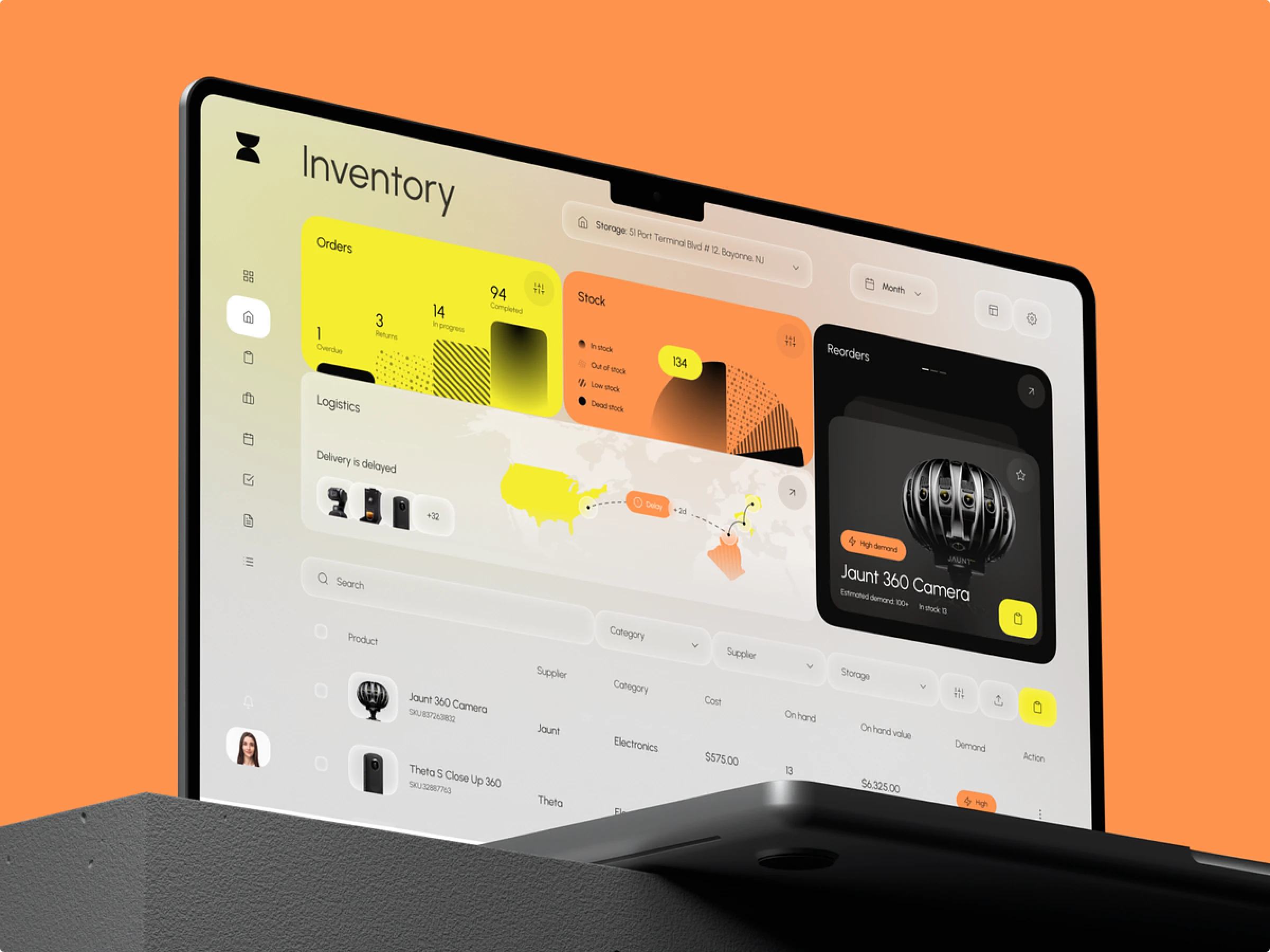
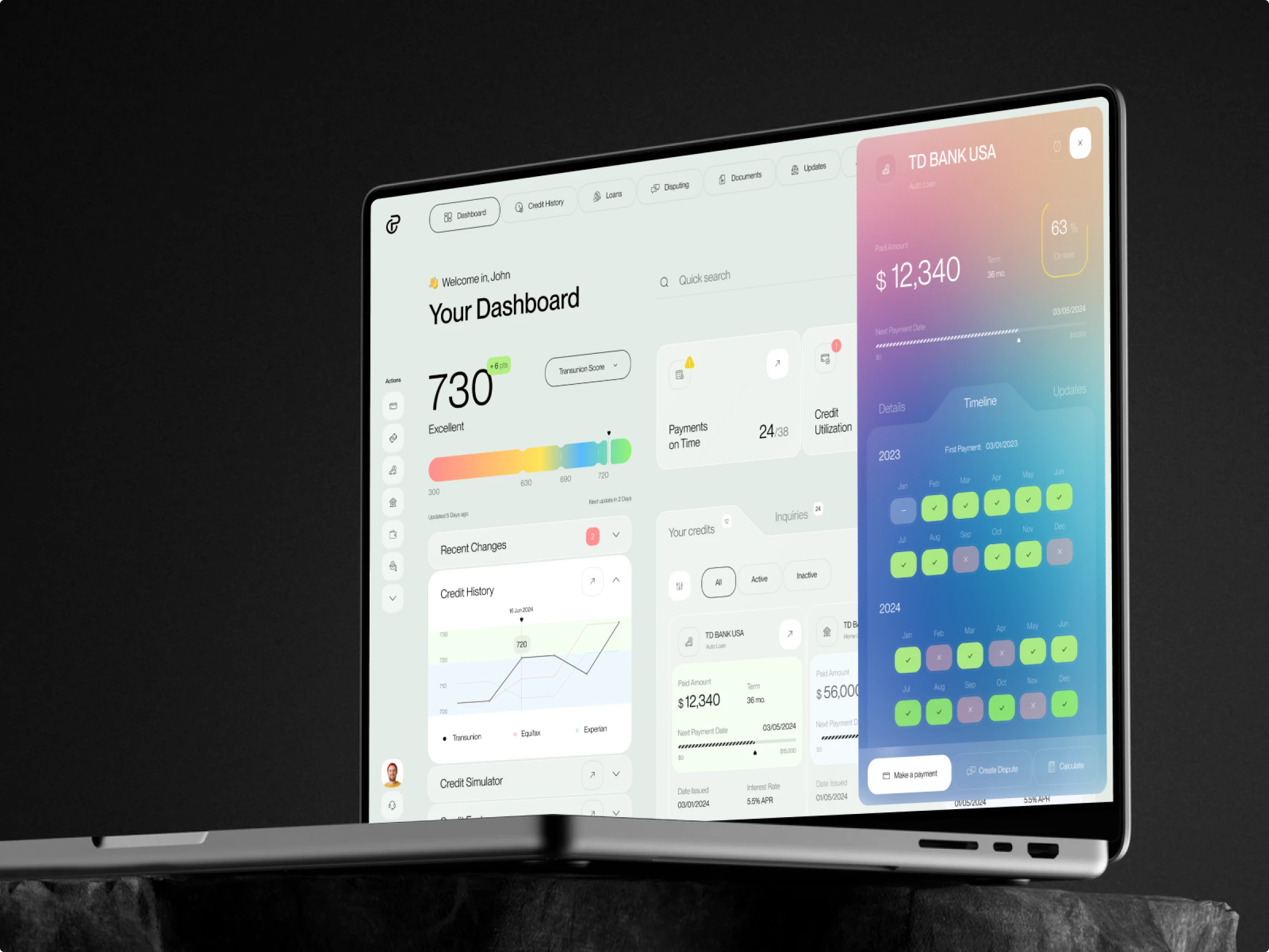
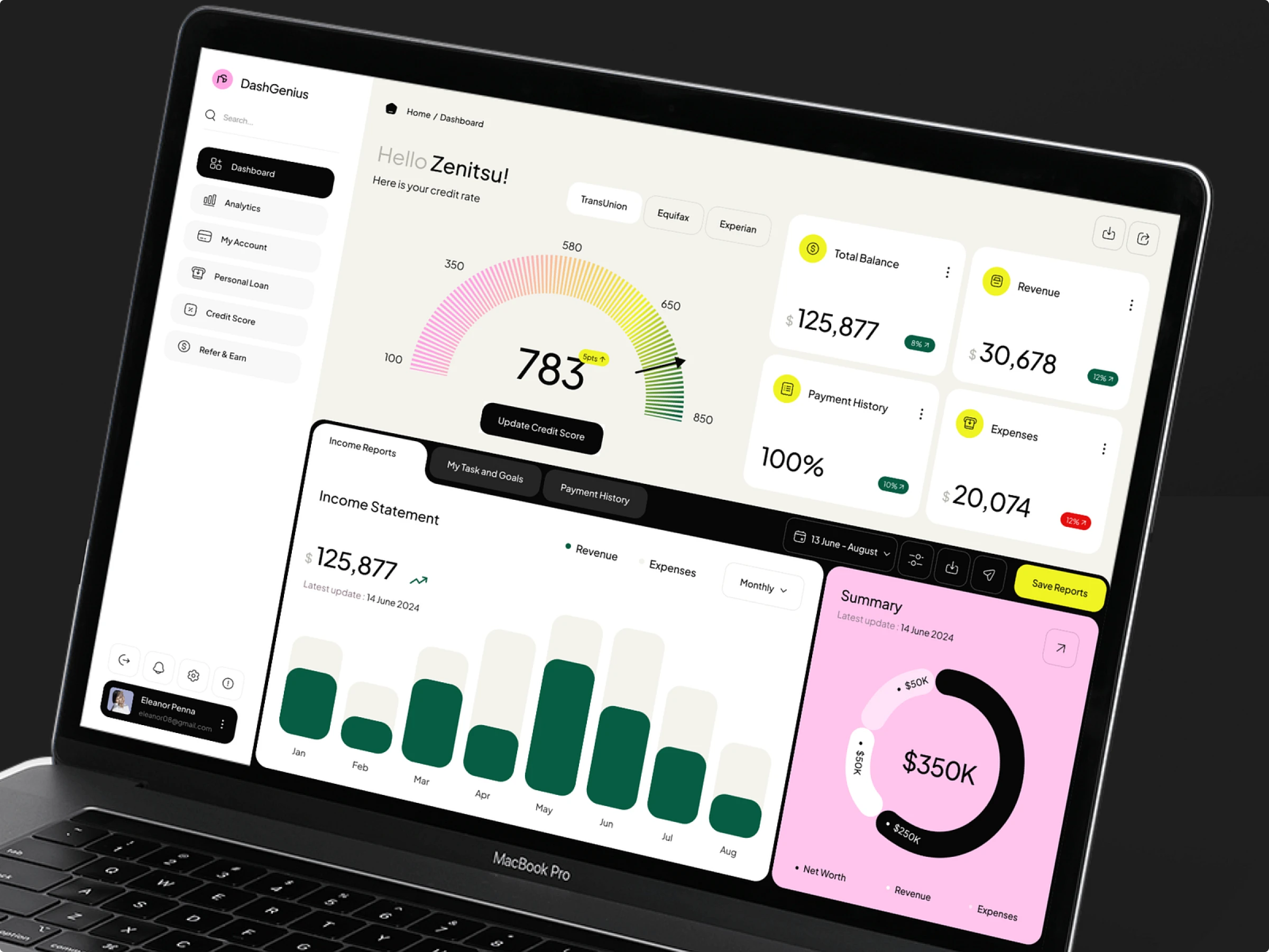
For UI/UX designers, dashboard design is always challenging in arranging lots of data effectively and aesthetically. Explore dashboard designs that work.
A dashboard user interface brings key performance indicators (KPIs) to life through engaging visuals. It is your data’s best friend, turning complex numbers into digestible insights with charts, diagrams, status bars, and progress bars. Dashboards are designed to give users a quick overview of performance metrics, spot trends, and measure efficiencies at a glance.
However, fitting all this valuable information onto one screen can be a design challenge. To spark your creativity, we’ve compiled some examples of how designers master this task in custom web design. Buckle up!
Productivity tools
Routine
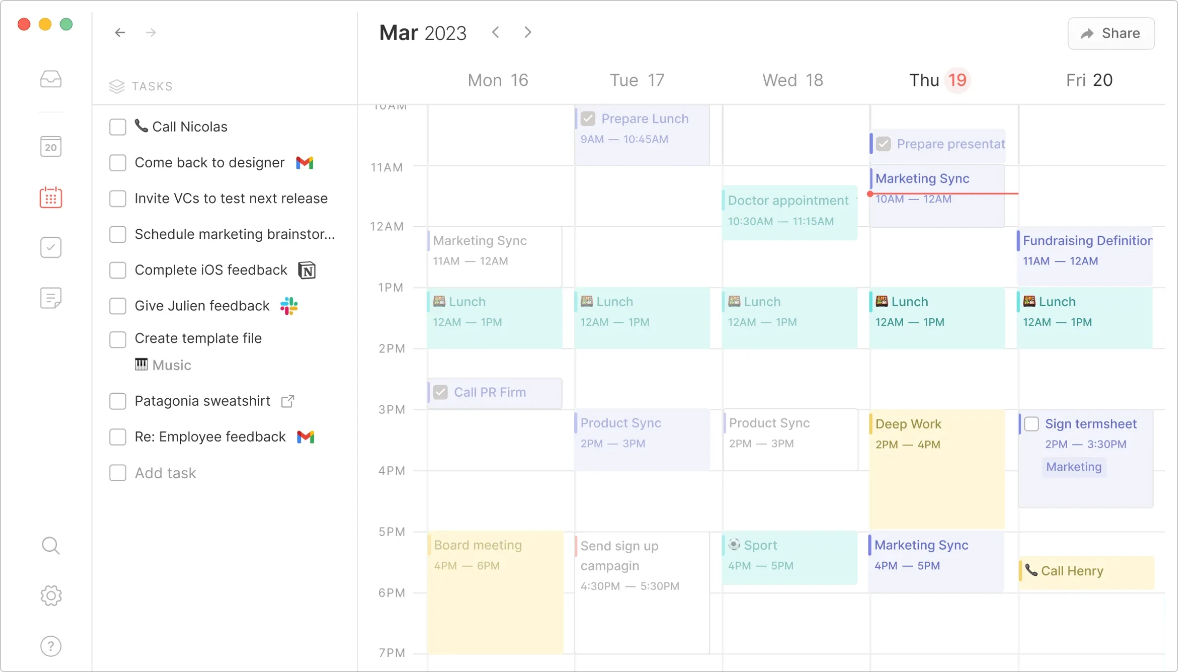
What’s cool
- Calendar + To-Do list on the same screen. Seamlessly integrate your schedule and tasks.
- Tiny icons in event cards. Instantly visualize categories with small, intuitive icons.
Routine brings your calendar and to-do list into one cohesive view, helping you manage your time and tasks without switching contexts. The subtle icons on event cards provide quick visual cues about the nature of the tasks, making it easier to prioritize.
Loopin
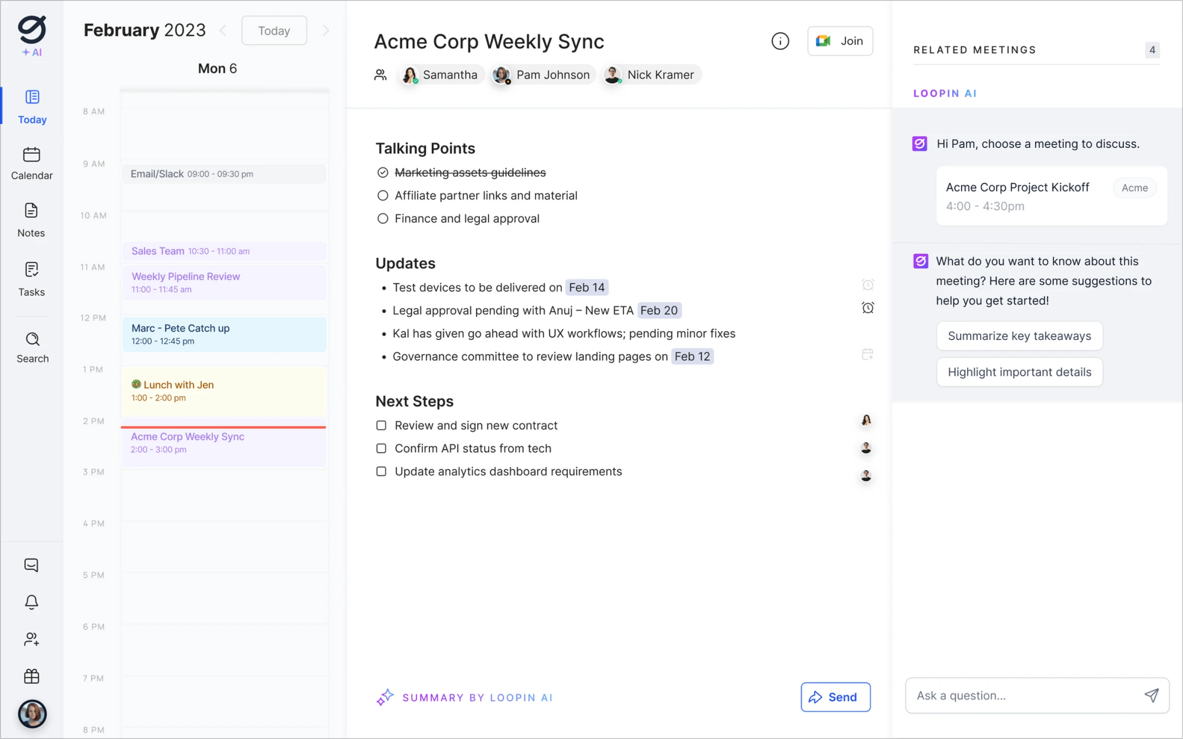
What’s cool
- Three-page ‘Brochure’ layout. A unique three-pane view that organizes information efficiently.
- Native AI UI integration. Smart suggestions and automation powered by AI.
- Differentiation of event cards by color. Easily distinguish different categories with a color-coded timeline.
- Profile pics in the To-Do list. Quickly assign tasks and see who’s responsible.
Loopin stands out with its brochure-style layout, providing a clear, segmented view of your day. The AI integration enhances productivity, while color-coded events and profile pics keep everything organized and personalized.
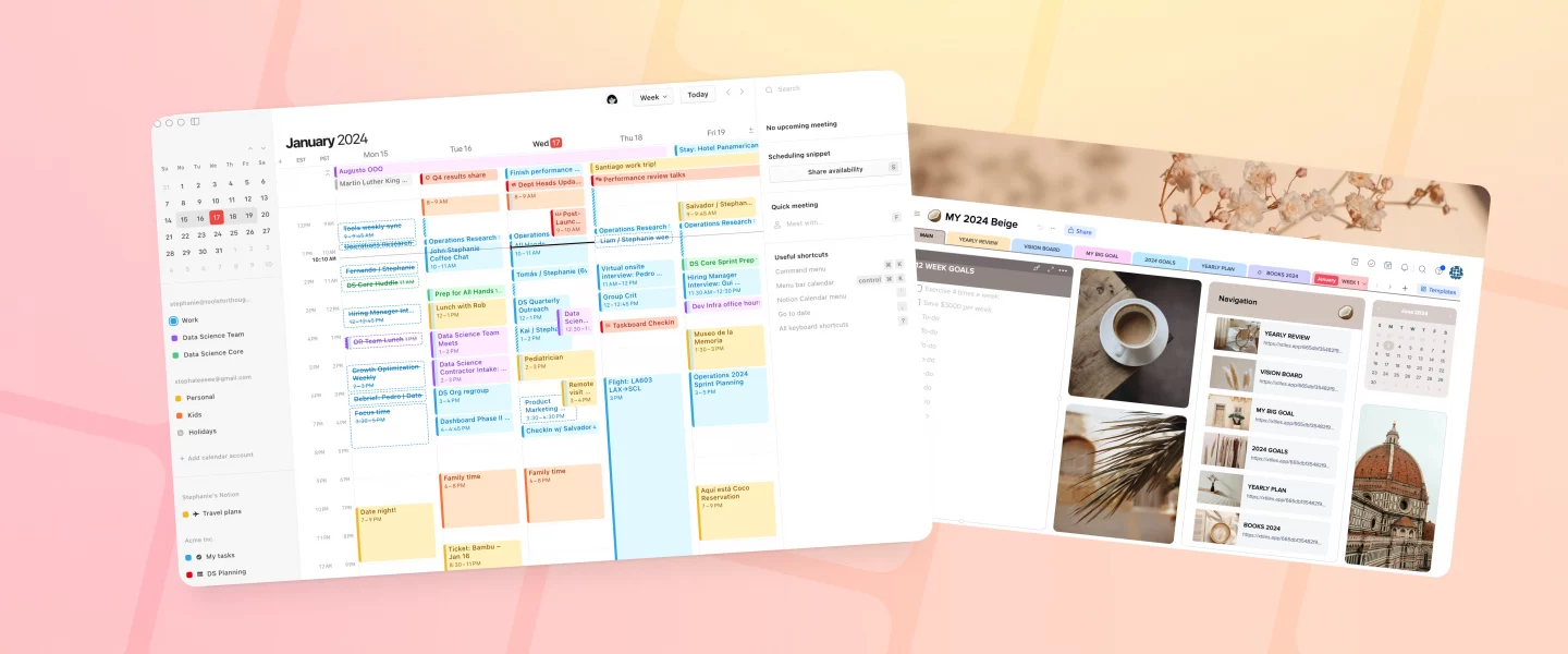
Notion Calendar
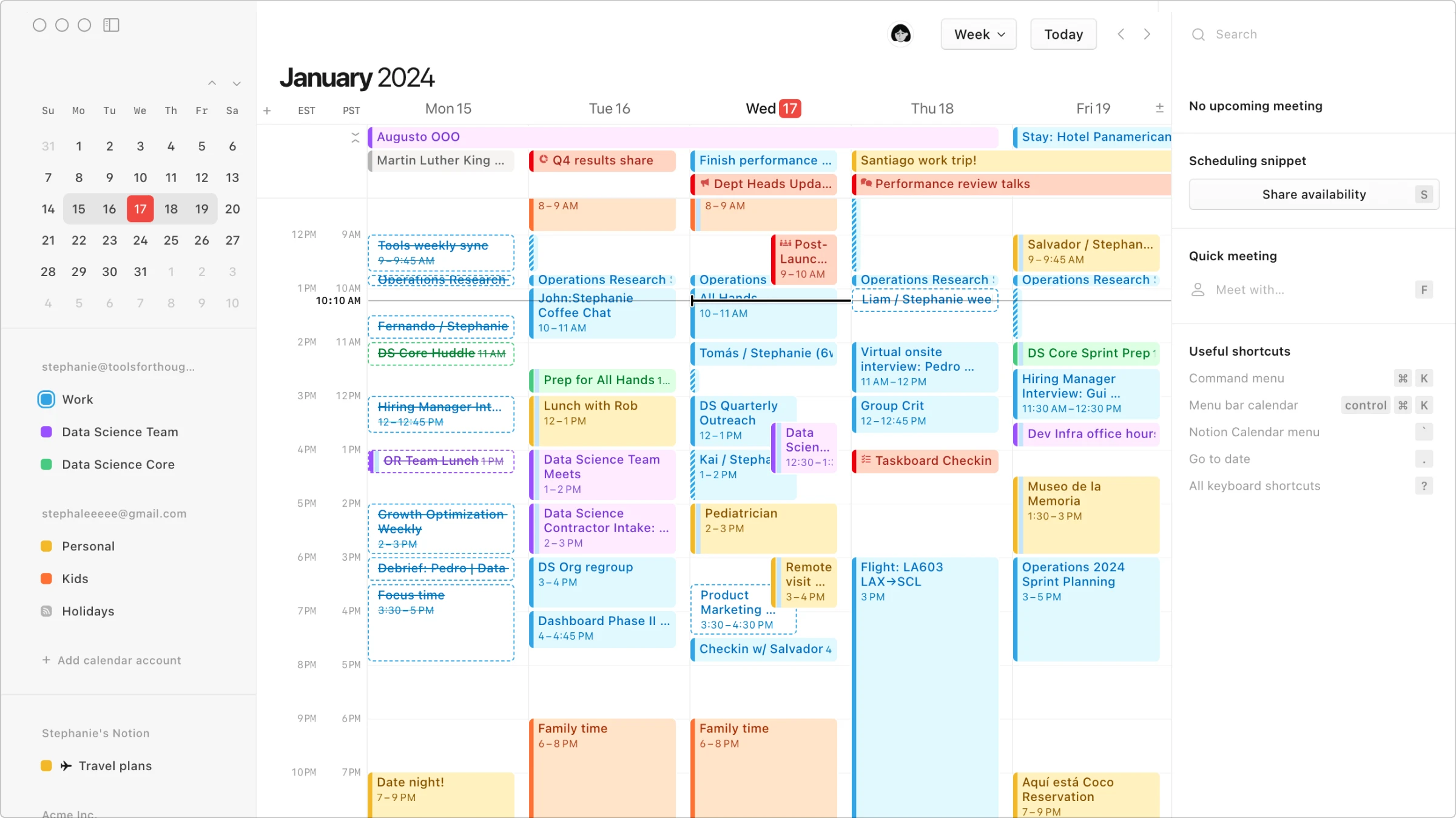
What’s cool
- Upcoming events view in the right panel. Keep track of what’s next without clutter.
- Quick meeting creation. Easily set up meetings with a few clicks.
- Icons/labels on event card previews. Quickly identify the content type at a glance.
Notion’s calendar view is all about clarity and efficiency. The right panel gives you a snapshot of upcoming events, and the ability to create meetings on the fly ensures you’re always prepared. Icon labels add an extra layer of quick understanding.
Notion Second Brain
What’s cool
- Minimalist design. A clean, distraction-free layout with ample white space.
- Quick capture tools. One-click buttons for fast note-taking, task creation, and resource management.
- Area segmentation. Categorize and access different life areas at a glance.
The Notion Second Brain dashboard nails the balance between simplicity and functionality. Its minimalist aesthetic feels like a breath of fresh air, while the quick capture buttons make adding tasks or notes feel effortless. The intuitive area segmentation is like having your life neatly organized into compartments, ready at your fingertips.
Heydai
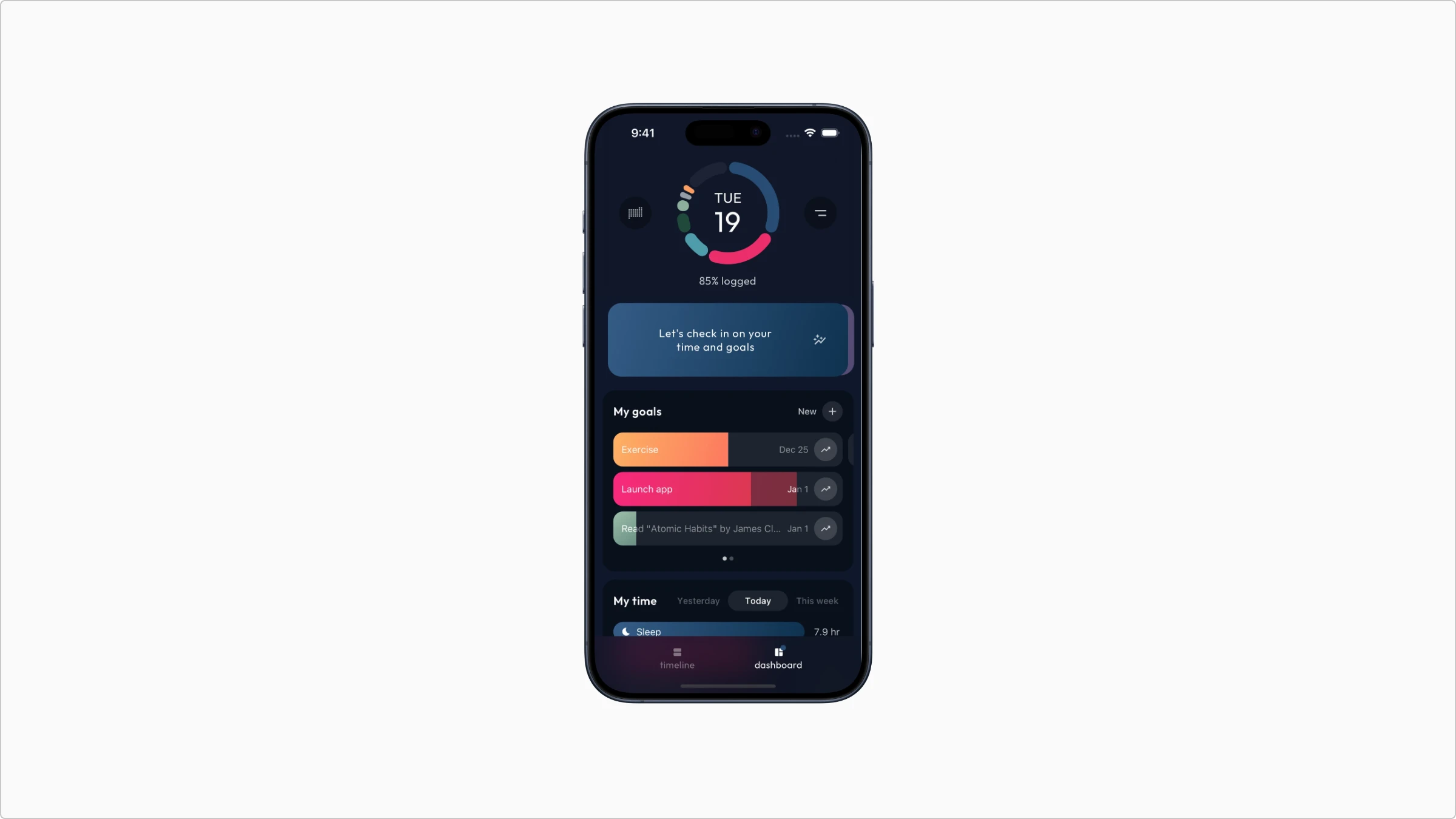
What’s cool
- Nice component sizing. Components are perfectly sized for mobile, balancing visibility and compactness.
- Diagram section visualization. Visual summaries that make data easy to digest.
- Colored bar diagram visualization. Clear and colorful data representation.
- Icon labels in the Menu section. Space-saving icons that are intuitive and informative.
Heyday App’s dashboard excels in mobile-friendly design, ensuring all components are readable and accessible. The visualizations provide a quick overview of key metrics, and the icon labels keep the interface clean and user-friendly.
xTiles
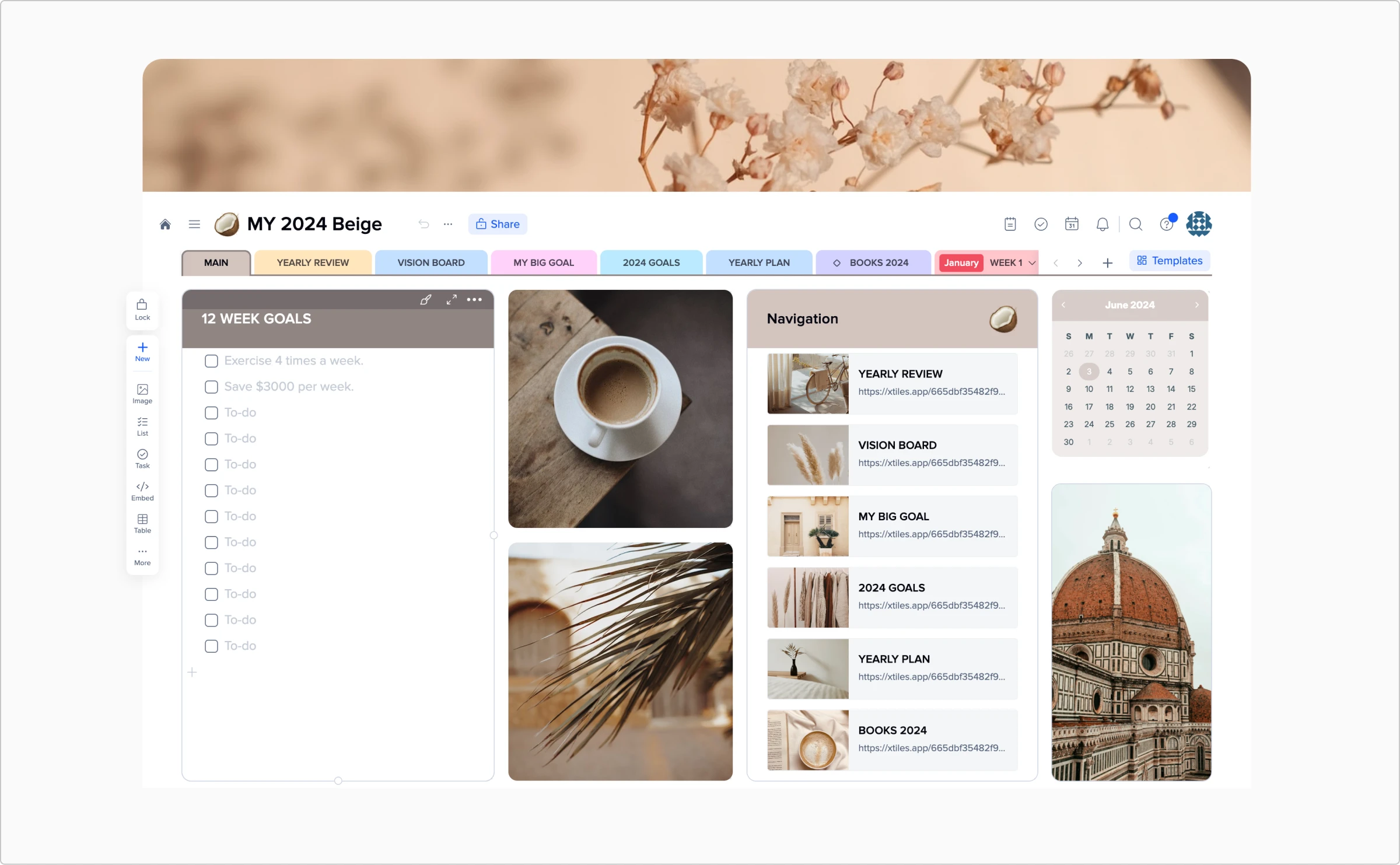
What’s cool
- Free-form widgets layout. Customize your dashboard with drag-and-drop widgets.
- Soft-colored palette. A visually appealing and soothing color scheme.
- Customization controls on hover. Easy-to-access customization options without cluttering the UI.
xTiles offers ultimate flexibility with its widget-based layout, allowing you to tailor your dashboard to your specific needs. The soft colors create a calm workspace, and hover controls make customization a breeze.
Team management tools
Swit
What’s cool
- Appearing effect that tracks your scanning eye path. Engaging visual effects that follow the user’s eye movement for an intuitive experience.
- Diagrams animation. Smooth animations that bring data to life.
- Cross-panel drag and drop. Move items seamlessly between panels.
- Cross-format drag and drop. Versatile handling of different data types.
Swit’s dashboard is all about flexibility and ease of use. It enables you to organize your projects effortlessly, and the drag-and-drop functionality across different panels and formats makes project management more intuitive.
Perspect
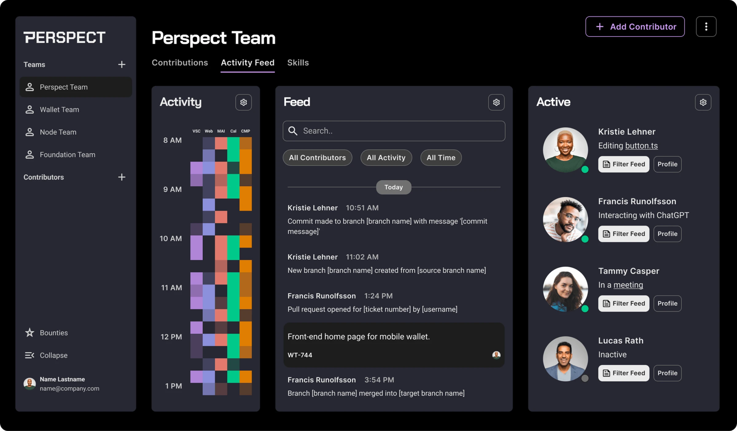
What’s cool
- Activity visualization with colored points on a timeline. Easily track team activity with a visual timeline.
- Quick feed filter by a team member. Filter actions and updates by team members for focused information.
Perspect’s activity feed uses colored points to visually represent team activities over time. Filtering the feed by team members helps you keep track of individual contributions and overall progress.
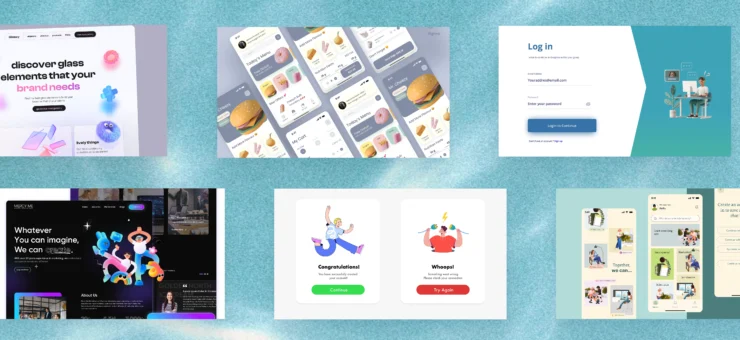
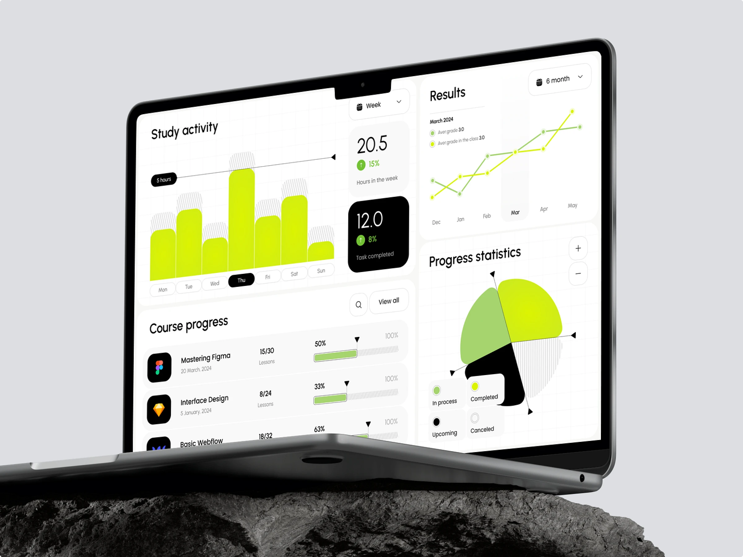
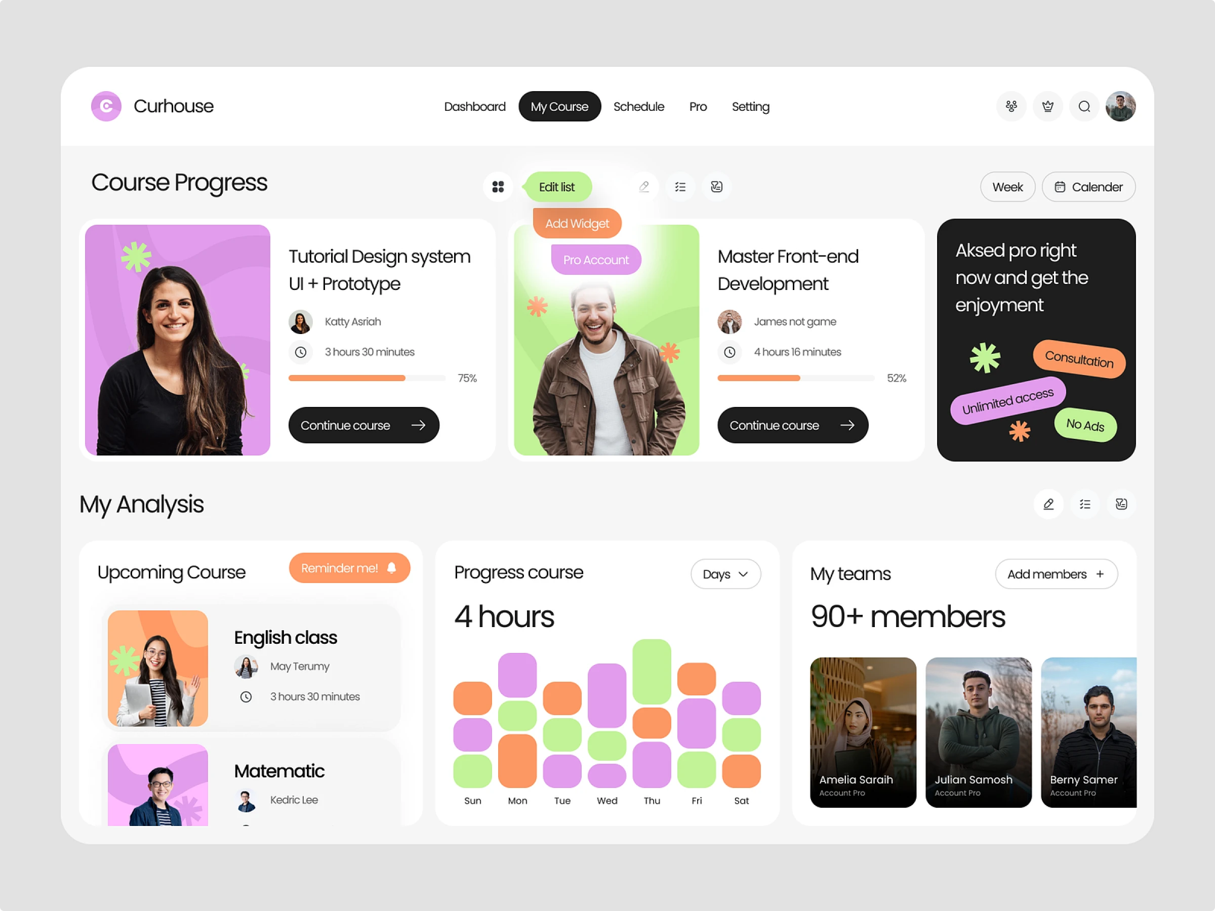
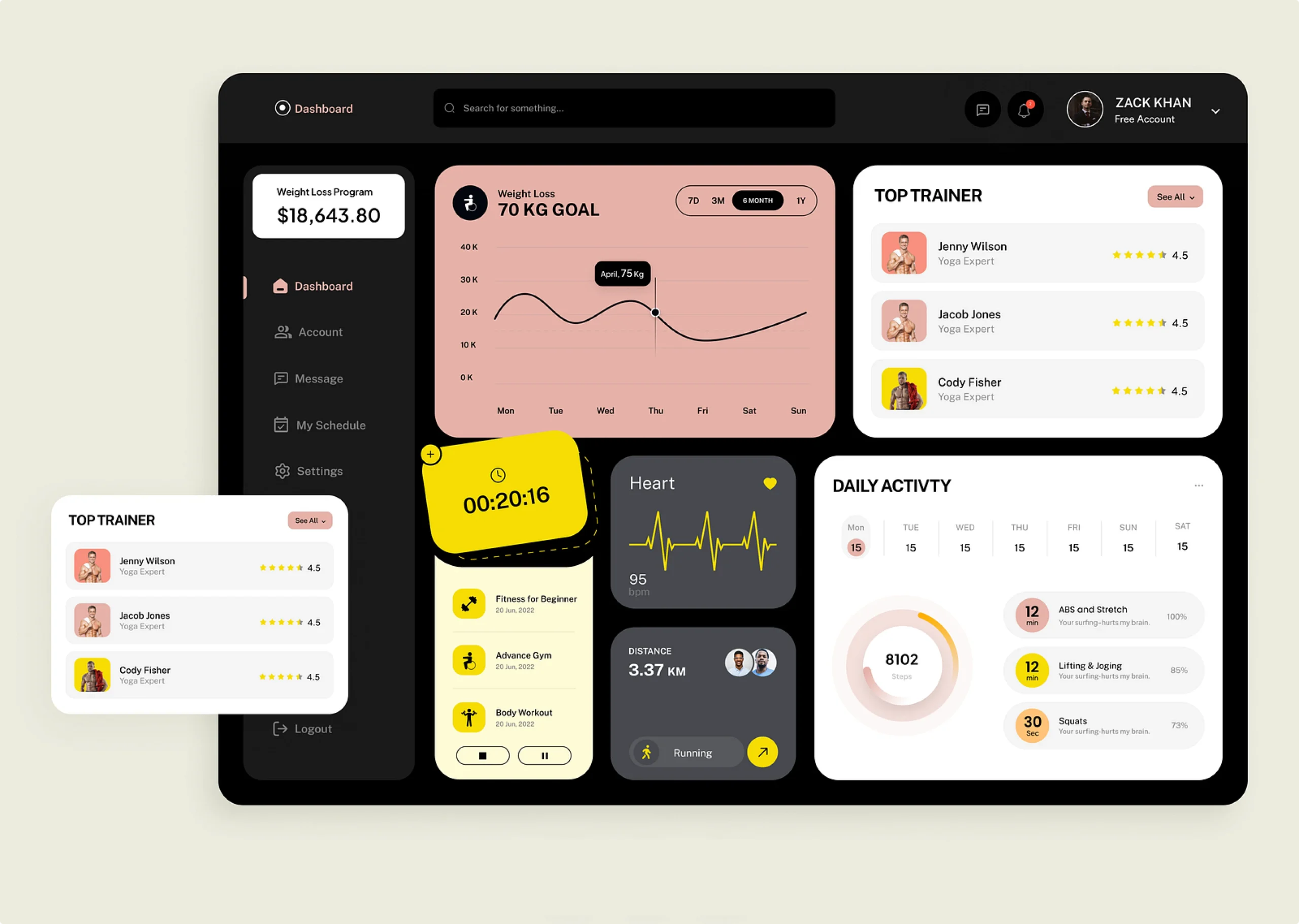
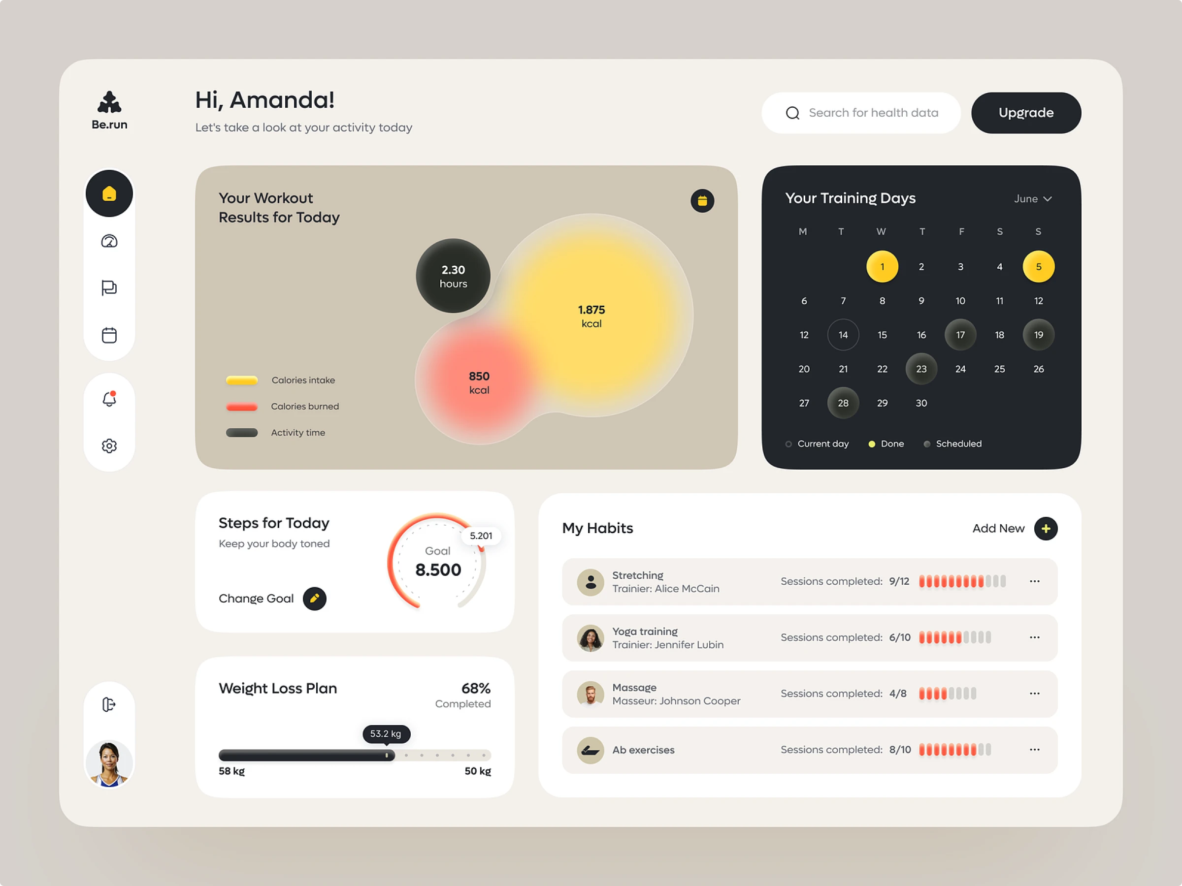
Concepts for inspiration
Wrapping up
Great dashboard design is all about nailing that perfect mix of functionality and flair. Whether you’re juggling your own tasks or managing a team, these examples show how smart UI design can boost efficiency and make your life a whole lot easier. Dive into these tools, soak up the inspiration, and prepare to take your projects to the next level.
Also, check the review of popular UI design trends and inspiring sets of tab bar animations, loading animations, and web designs with hero illustrations.
About the author
Adeline Knight is a content writer at Icons8. She started as a professional photographer before falling for design. She enjoys experimenting with new tools and uncovering tips and tricks to simplify her life and boost her creativity.