Design trends are definitely one of the hot topics when a new creative year starts. Sure, we can’t help sharing our ideas and add our two cents to the theme of UI design trends. So, in addition to logo design trends, let’s quickly review what seems to be trendy in user interface design for websites and mobile apps in 2020.
Decorative Fonts
Well-designed and attractive typography doesn’t lose its positions on the list of trends. It opens the diversity of ways to make the text content not only meaningful but also beautiful. Carefully chosen fonts transfer the needed mood and build up a strong visual hierarchy. And Dribbble shots show that designers aren’t tired to play with fonts.
Decorative fonts for a photographer’s portfolio website by Tom Anderson
https://cdn.dribbble.com/users/688456/screenshots/9532586/media/40e8637a538ff4c90ac6498f469a2c55.mp4
Webdesign by Nathan Riley features the combination of fonts attracting attention
Decorative font chosen to support the style of web design for cake bar by Tubik
Animated Graphics
The creative experiments on the crossroads of illustration and animation get more and more daring and impressive. UI designers add sophisticated and sometimes even crazy motion to all types of visuals, from icons to logos and complex illustrations. Although the practicability of UI animation still provokes hot debates, users do expect motion integrated into interfaces, so designers present a kind of the demonstration trail constantly updated with new catchy motion designs.
Webpage designed by Studio VOR features graphics performing in motion that makes a scrolling process not only beautiful but also dynamic and emotional.
Nuance animation for the website interactions by Buzzworth Studio
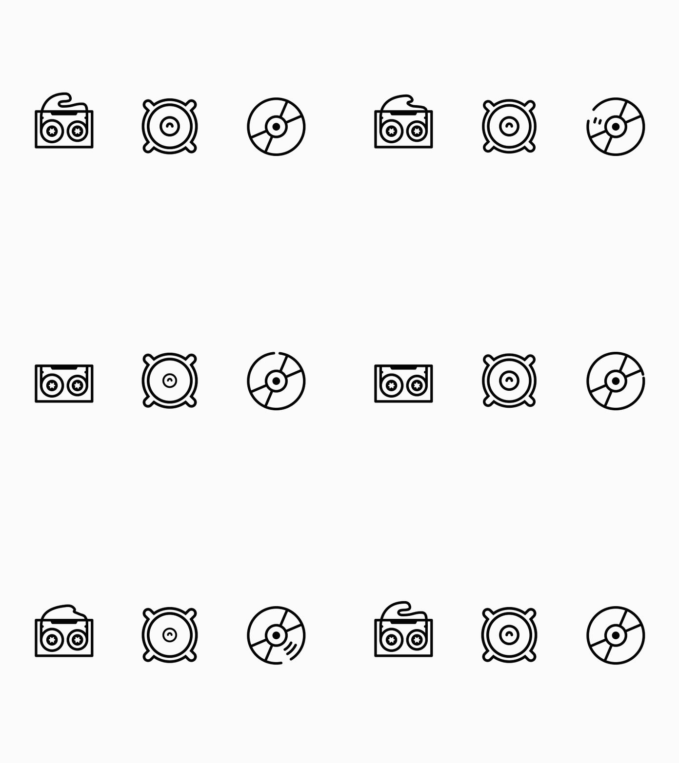
 Animated icons for Media theme by Icons8
Brutalism
For recent years, the brutalist approach demonstrated steady growth and now seems to increase the speed of gaining popularity. In general, web brutalism is believed to be inspired by the brutalist architecture of the 1950s, characterized by the heavy and ‘ruthless’ appearance of the buildings. In digital design, brutalism is a style that intentionally uses a number of stylistic tricks to look raw, haphazard, or unadorned. It may echoes early 1990s-style websites, be expressed as bare-bones, almost naked HTML. Now the diversity of such web designs grows as it allows them to appear out of the box and impress users in terms of tight competition with well-designed, elegant, and “coiffured” websites.
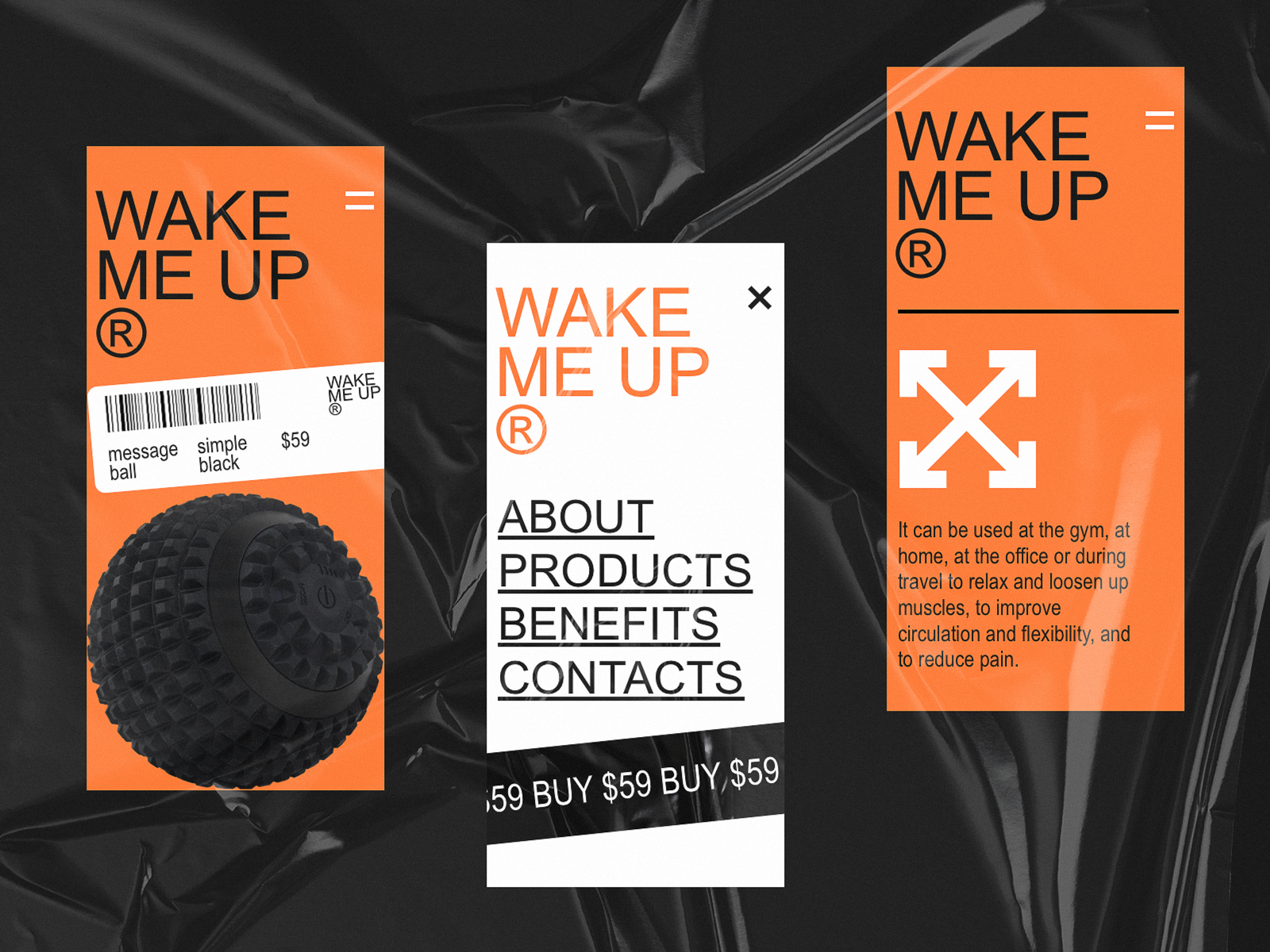
 Mono-ecommerce website designed by Tubik in a brutalist manner
![]() Brutalism in web design for the Miriam Peters portfolio website
Brutalism in web design for the Miriam Peters portfolio website
Interactivity for Fun
One more trend to mention is the additional interactive fun designers strive to provide users with. In contrast to the idea of super functional pages or screens promoted for user interfaces for many years, now designers tend to try different cases of playful pages engaging users to interact just for fun, now to solve the problem.
Website design concept with classic vibes by Tom Bogner allows visitors to use the cursor as a flashlight highlighting different zones of the sculpture
Interactive webpage by Sochnik
Full-Screen Video and Photo Backgrounds
Full-screen images as a background for webpages, especially in the case of photo content, have continued winning more and more positions in the list of popular design approaches. What’s more, many designers started stepping even further and trying full-screen video backgrounds. Graphics or video content applied this way effectively set the needed theme and atmosphere from the first seconds of interactions. This technique is also helpful if a designer strives to create a poster-like webpage. On the other hand, full-screen background images and videos demand thorough considerations and testing so that navigation and copy content looked natural, scannable and legible enough.
![]() CANALS website uses the editorial-looking website design with a full-screen photo background and decorative font
CANALS website uses the editorial-looking website design with a full-screen photo background and decorative font
![]() Dreamers and Makers website design by Squarespace uses full-screen photo and video backgrounds, minimalist navigation and different directions for copy lines
Dreamers and Makers website design by Squarespace uses full-screen photo and video backgrounds, minimalist navigation and different directions for copy lines
![]() Ultima Gstaad website applies catchy photo background instantly setting the atmosphere and evoking the necessary emotions
Ultima Gstaad website applies catchy photo background instantly setting the atmosphere and evoking the necessary emotions
![]() Website Ultraviolet Way sets the atmosphere and theme with stylish full-screen background photos and videos
Website Ultraviolet Way sets the atmosphere and theme with stylish full-screen background photos and videos
Dark Theme
The last year showed the new wave of popularity for the dark themes in interface design for both mobile and web, and it seems to stay actual and get new faces this year. Many users prefer dark themes when they have a choice of a color scheme in their apps and software, as it’s less contrast and this way more pleasant and less straining for eyes. Designers also like a dark theme, especially in cases of design based on visuals.
![]() Stylish music player interface concept by Riotters based on dark theme
Stylish music player interface concept by Riotters based on dark theme
![]() Portfolio website design Crucelli is based on the dark theme and is super interactive
Portfolio website design Crucelli is based on the dark theme and is super interactive
Textures and Materials
Another trend to observe more and more often is using page or screen backgrounds that reflect real life-textures like paper, fabric, wood, sand, and so on. The approach allows designers to step away from traditional nice-and-clean, purely digital layouts and create a fast visual connection with some objects, associations, and feelings from the physical world.
![]() Web design concept by Nathan Riley features the background that resembles the crumpled paper
Web design concept by Nathan Riley features the background that resembles the crumpled paper
Limited Color Palettes
After the years of brightness, mottling, gradients and the like, now designers tend to turn to moderation and limits in the aspect of color choice. This year we are expecting more limited or even monochrome palettes, bold clean colors, and color contrast as a way to both attract and increase usability.
![]() File explorer app design by Cuberto
File explorer app design by Cuberto
![]() The monochrome color palette in self-motivation app design concept by Fireart
The monochrome color palette in self-motivation app design concept by Fireart
![]() Book festival website by Tubik designed with the limited bold color palette and decorative catchy fonts
Book festival website by Tubik designed with the limited bold color palette and decorative catchy fonts
Text-Based Webpages
This trend presents the opposition to the previously popular and very logical tendency to use images as the main hook catching users’ attention: more and more web and app designers are turning to pages that do not contain any images at all. The webpages or screens of that kind are usually typography-based and use the characteristics of fonts – size, boldness, serifs vs san-serifs, etc, – as the main element of beauty and attraction. Sometimes, smooth and catchy animation helps to strengthen their expressiveness. Such an approach is one more way to stand out from the crowd of artistic pages composed around images.
![]() Super interactive portfolio website of Andrew Leguay is based on typography as the main visual attractor
Super interactive portfolio website of Andrew Leguay is based on typography as the main visual attractor
![]() Another portfolio website, this time for front-end developer Jesper, also features the typography-based home page whose stylistic concept is based on the contrast of colors
Another portfolio website, this time for front-end developer Jesper, also features the typography-based home page whose stylistic concept is based on the contrast of colors
Grids Experiments
The diversity of grid experiments is also increasing day by day. Not only do designers try irregular and broken grids, various experiments providing impressive layouts, but also add even more wow-feeling due to the special effects integrated into the process of interaction.
David William Baum photography website features experimental and interactive grid combined with some brutalist vibes
Elegant and original web design by Green Chameleon features cool interactions with the grid of photos and different directions for copy elements
Catchy interaction with a grid of posts in web design by Sochnik
Sure, it’s only a small part of creative experiments we expect to see in the year that only started uncovering itself. Would you like to add any trend that wasn’t mentioned in the list? Welcome to join the discussion in the comments.
About the author: Marina Yalanska, design researcher and content creator, editor of Icons8 Blog
Title image from Clip pack on Ouch, the diverse vector illustration library
Check the review of logo design trends, the big collection of graphic design tools, and have some design fun of making memes