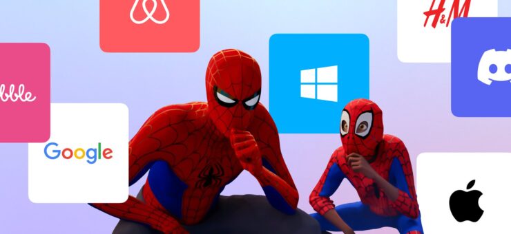
The year 2019 kicks into high gear and it’s a good time for a logo trends review from Logaster. Let’s take a look at what design trends are popular and what to expect soon. Ready! Steady! Go!
Simplification
Many large companies are freeing their logos of minor details, so we can say that the simplification trend is here to stay. The main idea behind simplification is that the logo must stay perfectly readable across different surfaces (printed materials, screens, etc.) and from any distance. In the examples below, we can see that the simplification of logo amplifies the brand name and makes it more distinctive.

Omitting Details
This is a continuation of the previous trend. Sometimes less is more, and this is especially true in the design world. Removing some details from a logo does not necessarily mean losing the logo’s important details. On the contrary, it makes the emblem more memorable and original. The human brain fills in the gaps and reproduces the complete picture. Thus, the logo is inviting the audience to visually engage without them even noticing that fact. The main challenge is to not overdo it by sacrificing readability to experimentation.

Logotypes
In a logotype, letters are everything. This year, dozens of big-name brands have redesigned their combination marks and made them into logotypes, creating a fresh and edgy look. In 2019, designers will continue their creative search by experimenting with new typography.

Focus on Detail
This relatively new trend uses visual tricks to draw attention to a specific part of a logo. As a result, you get a slightly asymmetrical and unbalanced composition that is sure to catch your customers’ eye. We don’t know about you, but we hope to see more of this amazing trend in 2019!

Gradients
A potent design tool, gradients can make a head-turner out of the most uninteresting logo. By playing around with gradients, designers create unique hues and magnetic visual effects. Although not a newcomer, this trend still has much to offer. We hope that designers will continue using gradients to add volume and depth to their artwork.

Neon Colors
If you’re following modern design trends, you must have noticed that unnaturally bright colors made their first appearance in gradient logos. With time, neon colors evolved into a standalone trend. Neon colors look great on plain logos that have large, bulky elements. It will be interesting to see how professionals utilize this trend in 2019.

Letter Stacking and Vertical Logos
It’s no exaggeration to say that letter stacking has become a true hit of 2018. In 2019, the trend will be getting increasingly complicated, as letters will be paired with graphic elements. At the same time, letter stacking logos can hardly be called versatile, as they’re unfit for a number of surfaces (e.g., website headers). Whether this trend will stick around, only time can tell.

Corners and Curves
Geometric shapes are hardly an innovative design solution. However, if you want to convey trust and stability through your emblem, geometry can become your best friend. While corners and curves can be applied in a number of different ways, they’re particularly good at creating a negative space effect. Need something more eye-catching? Be sure to add gradients!

Circles
Let’s focus on geometry-related trends for a while. Designers like using circles and their segments to create logomarks and combination marks. Smooth and flowy, such artwork creates the feel of flexibility and adaptability, which is just what some companies need.

Stripes
Due to their distinctive and expressive nature, stripes should be used with great care. Parallel stripes create direct associations with speed and innovation, emphasizing the company’s pursuit of growth and improvement.

Hand-drawn Logos and Watercolor Imitation
Hand-drawn artwork stands out on our list of designhill logo design trends. You can use a wide variety of tools, from pencils to watercolors, and still get a great result. With blurry lines and natural colors, hand-drawn logos stand for all things unique and subtle. It’s a great choice for businesses (design studios, beauty salons, event companies, etc.) wishing to demonstrate their creative vision.

Heraldry
Using coats of arms and shields is one of those long-term, consistent tendencies that have remained unchanged throughout the years, without borrowing anything from other trends. If you’re thinking about conveying your loyalty to tradition and historical heritage, a heraldry logo is definitely one way to go. We hope to see more educational institutions, state agencies, and sports organizations capitalizing on this trend in 2019.

Thin Lines
Amidst the general strive for simplification, a tendency to use thin, exquisite lines seems like an act of defiance. Don’t go overboard with sophisticated details or you’ll risk ending up with an indecipherable emblem. If you manage to maintain the balance, you’ll get an elegant yet clean design that will evoke sighs of admiration.

This is not a complete list of trends that will shape the logo design industry in 2019. Nonetheless, the ideas that this article covers are enough to create a top-notch emblem using the Logaster logo maker! Also, check them all in one infographic to save the set via Pinterest or whatever way is convenient for you.

Title image by Ramotion
Read about typography logo design, learn how cheap and expensive logos differ, and check how to remove background from logo.


