You are likely familiar with the phrase “follow the breadcrumbs”. However, what exactly does it mean?
This phrase refers to the scattered clues that take you back to a specific place. In UI, “breadcrumbs” works similarly. The trail of breadcrumbs serves as a navigation tool for users.
This article will help you to get familiar with how breadcrumbs can improve the user experience.
Table of contents
- What is breadcrumb navigation?
- Types of UI breadcrumbs
- Tips for designing top-notch breadcrumbs
- How to use the breadcrumb to enhance the UX?
- Benefits of using breadcrumbs
- Prominent examples of UI breadcrumbs
- Final thoughts
What is breadcrumb navigation?
When visiting a new place, you might get lost without proper navigation. There are also high chances of a user getting lost on the website. Here, breadcrumbs act as a pathway that helps the user to reach the desired place.
Breadcrumb navigation acts as a visual guide located across the top of a web page, often below title bars or headers, that leads the user through the website or application.
Types of UI breadcrumbs
We can split UI breadcrumbs into three categories.
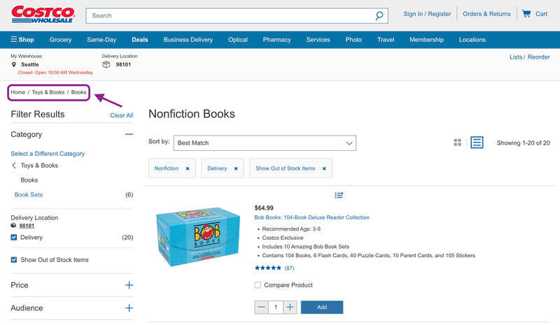
Location-based
They help the user within the interface to highlight its location. It looks like this:
Home page > Section page > Subsection page
This is a perfect example of location-based breadcrumbs that usually can be seen on most E-commerce websites:
Attribute-based
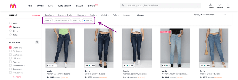
Attribute breadcrumbs help users orient themselves by indicating information categorized on the same page. This type of breadcrumbs is commonly used in online marketplaces. For example, when you shop online, you see filters that help you find your desired choice of clothes.
Pathway-based / History-based
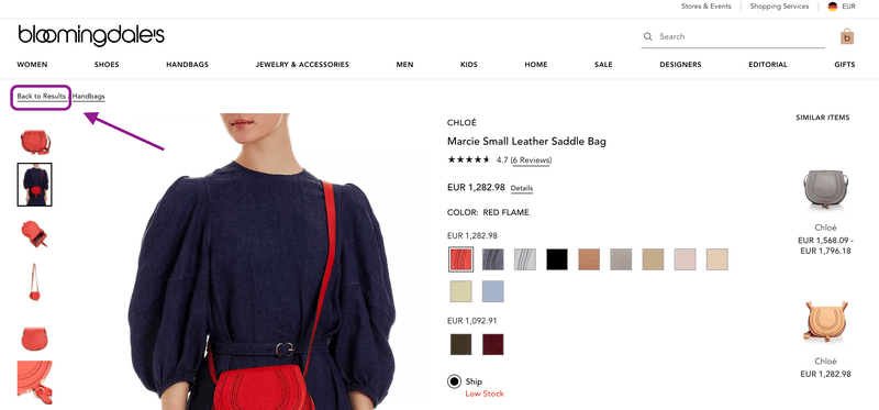
Pathway-based, as well known as history-based breadcrumbs, help the user to return to the current page at every step. They are dynamic and show a unique history experience to the user. In this way, the “back to results” feature allows the user to jump between two sections without getting lost on the website.
Tips for designing top-notch breadcrumbs
Below are a few tips to design high-quality UI using breadcrumbs:
- Only use breadcrumbs navigation if it makes sense to your site structure.
- Don’t make the breadcrumbs too large.
- Make them consistent with the design of the entire interface.
- Keep it clear, clean, and uncluttered.
- Consider choosing the type of breadcrumbs that adds more sense to your site.
- Know who your audience is.
- Always keep your breadcrumb titles consistent with the title of your page.
- Progress from the highest level to the lowest.
- Add an entire navigation pathway.
How to use the breadcrumb to enhance the UX?
Use it as a secondary navigation
The thumb rule of using breadcrumbs works as an addition to primary navigation. Use breadcrumbs above the page heading. This is where users expect to find the breadcrumbs (buttons).
Consider starting a breadcrumb trail with the link to the homepage
Sometimes, the user wants to jump to the homepage without going back to so many pages. Putting the home button or link at the beginning of the trail makes the user jump directly to the homepage in a single click. This helps maintain the flow of the user and works as a logical start to keep the trail from the website’s main menu.
Make the current location look non-clickable
There are two different approaches to the last item of the breadcrumb trail. Either show the current page’s name or the previous step. It’s better to show the whole pathway but keep the current location looking non-interactive to avoid users’ pointless clicks.
Separate the breadcrumbs elements
It is important to use arrows, dashes, or any other symbols that define and separate the elements. This will help the user to perceive the elements easier.
Benefits of using breadcrumbs
Increasing findability
The more complex the website is, the more difficult it is to find the direction on it. However, breadcrumbs are touchpoints of the content.
Less amount of clicks
Surprisingly, if you use breadcrumbs on your website, the user will use fewer clicks. This helps the user jump from one level to another without effort. Like the above example, you can go directly to the homepage without going to every page you have visited.
Effective use of screen space
Breadcrumbs can replace several links and buttons at once, and at the same time, they are compact. A narrow horizontal block doesn’t require much space, and the interface stays simple and attractive.
Lower bounce rate
One of the most common reasons for a high bounce rate is that the users do not understand where to click to go to the section they need. Breadcrumbs point in the right direction and solve that problem.
Do you know that deploying breadcrumbs also improve the rankings of your site? Read more about it here. Adding these tips to your website navigation will aid your business in growing. Your audience will love your user experience and return to your site again.
No misinterpretation
Designers have used breadcrumbs for decades, and this pattern is well-known among users. People rarely mistake these elements for anything else.
Prominent examples of UI breadcrumbs
Adidas
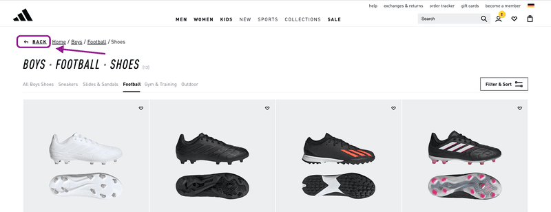
Adidas uses a “back” element at the beginning of each trail. This gives users an easy retrace of their steps. This is an example of pathway and attribute-based breadcrumbs.
Walmart
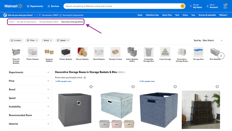
Walmart holds thousands of products. Each of its products comes with its product page, including corresponding categories and subcategories. This makes Walmart’s UI an excellent example of breadcrumbs.
HP
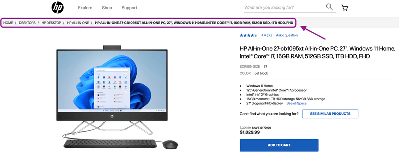
The user interface of HP’s website shows a good example of attribute-based breadcrumbs. You can find everything at the top of the page wherever you go.
Waterstones
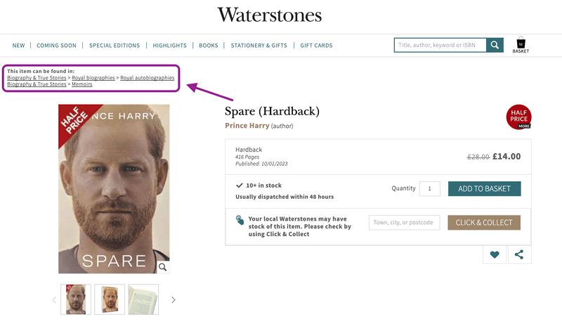
Waterstones goes against the grain and displays all possible paths to a particular book. These breadcrumbs look a bit more cumbersome, but they show more options to the user — a perfect example of attribute-based breadcrumbs.
Final thoughts
Ultimately, breadcrumbs navigation is an effective tool to make your site easy to navigate. It is considered one of the best practices to enhance the user experience for every website, especially if it’s an e-commerce site.
Ensure you follow the best practices while building your website by keeping all the above examples in mind. A site with poor navigation makes users bounce back. Consider the tips above and use breadcrumbs to improve your UX.


