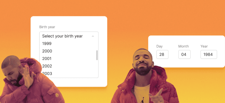
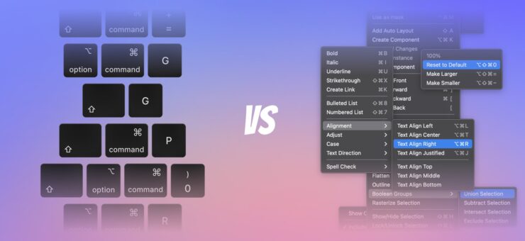
Your product’s success is based on a combination of factors, but the overall user experience tops them all. When it comes down to designing a new app or a site, sticking to best practices is a solid way to go, but during the creation of the big picture, it’s fairly easy to skimp over design elements that feel like nice to have but not necessary. However, the difference between good and bad experiences often comes down to how thoughtful we can design these small details.
Visual Feedback
Visual feedback might be easily overlooked in the greater design scheme, but it actually hold the entire experience together. When there’s no feedback there’s no proper interaction. Imagine talking to someone who doesn’t respond in any way — you can’t communicate at all. Same goes for your app.
Lack of visual feedback is able to confuse users.
You must ensure that there is always some feedback for user actions, because it makes users feel in control. Visual feedback
- Acknowledges that the app has received a user’s action.
- Communicates the results of interaction, making it both visible and understandable. Gives the user a signal that they (or the app) have succeeded or failed at performing a task.
Make buttons and other controls tangible
In real life, buttons, controls and objects respond to our interaction, and this is how people expect things to work. People expect a similar level of responsiveness from app elements.
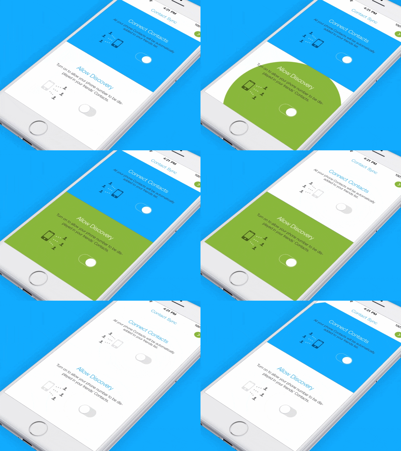
Image credits: Ramotion
Result of operation
Visual feedback is also helpful when you need to inform users about results of an operation. You can use existing elements to deliver a feedback.
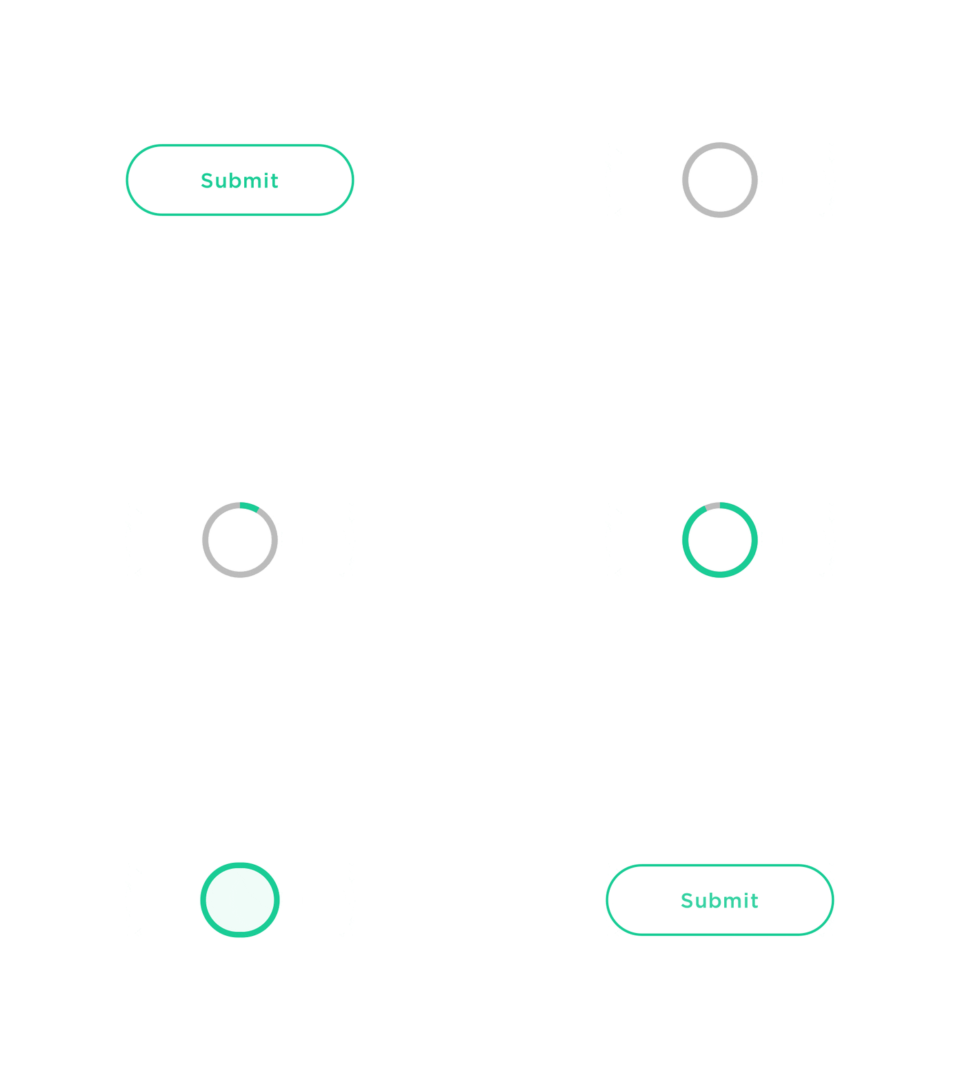
Image credits: Colin Garven
System should tell users its state
Users want to know their current context in a system at any given time and apps shouldn’t keep them guessing — they should tell the user what’s happening via appropriate visual feedback. For frequent and minor actions, the response can be modest, while for infrequent and major actions, the response should be more substantial.
-
- Animated notification makes it possible for a user to quickly understand the current status.

Image credits: Eddy Gann
- Loading animations provides real-time notification of app’s process status, enabling the user to quickly understand what is going on.
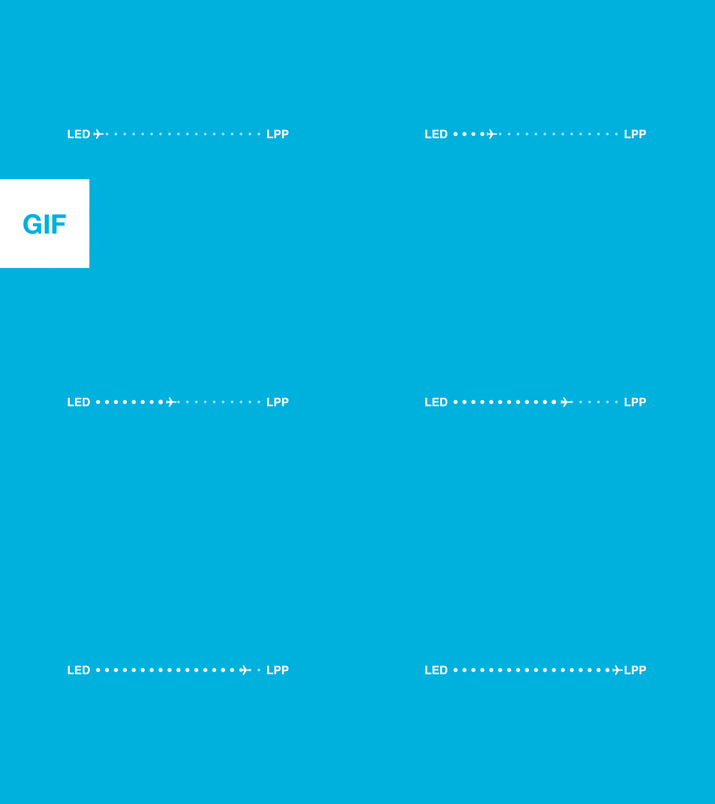
A loading bar engages the user and prevents confusion when app is busy loading data. Image credits: Mark
Microcopy
Microcopy is the little bits of text that guide users through an experience. Microcopy examples are error messages, button labels, hint text. At a glance, these tiny clusters of words seem insignificant when compared to the overall app design. But surprisingly, they have a huge impact on conversions.
Writing good microcopy in your app is just as important as having the app work correctly and the user interface being easy and efficient to use.
Show that you’re human
A quick way to make your UI warmer and less mechanical is a human tone in the copy. If your product sounds human, it’s easier for people to trust you.

Yelp shows they have real humans in charge.

Airbnb sound human and conversational
Use friendly and helpful copy in a moment of failure
How errors are communicated can have a huge impact on the way someone experiences your product. Often overlooked, an ill-constructed error message can fill users with frustration.
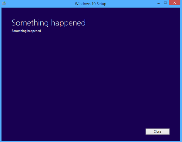
An alert message such as “An error occurred” is mystifying to all users and is likely to annoy experienced users.
A well-crafted error message, on the other hand, can turn a moment of frustration into a moment of delight. Thus, make error messages human, not technical, and suited to your audience.
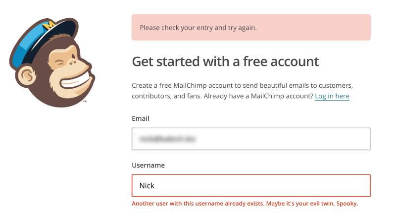
Error states must incorporate concise, friendly, and instructive copy as to what to do next.
Alleviate users concerns
Microcopy is extremely contextual. That’s why it’s so valuable. It answers a very specific question people have and speaks to their concerns right on the spot. For example, microcopy can be fundamental in reassuring your users at the point of subscribing or sharing details. Whilst ‘not to spam/auto-tweet’ might be taken for granted by good marketers when asking for email address/access to the social network account connections, the user is less than sure. Thus, when people add their emails or connect their Twitter accounts, say “we hate spam as much as you do.”
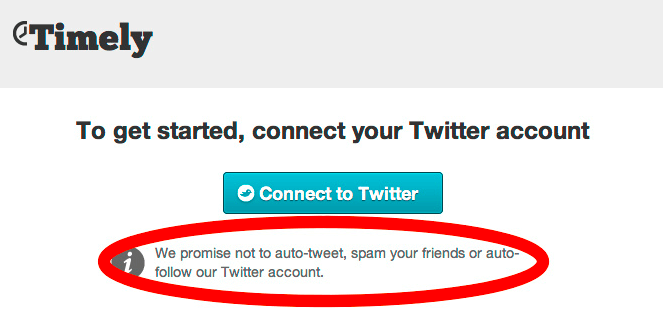
This microcopy covers all the potential user concerns in one tight little sentence.
Whitespace
Whitespace (or negative space) is the areas of a design where there is no element placed by a designer. Elements of whitespace are space around images, margins, paddings, line-spacing and letter-spacing within text content. Although many may consider it a waste of valuable screen estate, whitespace is an essential element in user interface design.
Improve UI comprehension
Clutter is bad. Cluttering your interface overloads your user with too much information: every added button, image, and line of text make the screen more complicated. If you don’t think any part of your design should be intentionally blank, take a look at example below and you’ll see what happens when too many objects competing for your attention.
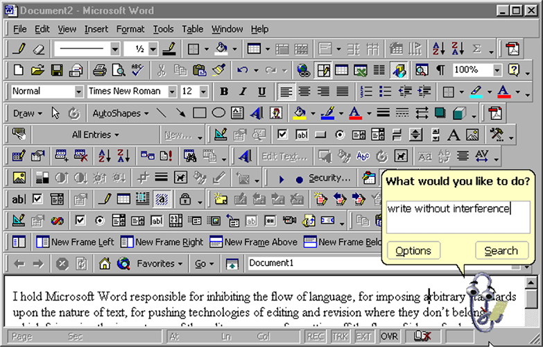
A cluttered UI is unattractive and doesn’t make users want to scan it, especially when there’s no visual hierarchy within the view.
The power of white space comes from the limits of human attention and memory. Our short-term memory can hold a small amount of information (typically around 7 items or even less) in mind in an active, readily-available state for a short period of time (typically from 10 to 15 seconds, or sometimes up to a minute).
User attention is a precious resource, and should be allocated accordingly.
If cluttering your interface overloads your user with too much information, then reducing the clutter will improve comprehension. Generous whitespace can make some of the messiest interfaces look inviting and simple. Whitespace reduces the amount of elements users see all at once and makes scanning much easier. The skill of using whitespace lies in providing your users with a digestible amount of content (chunks of content), then stripping away extraneous details.

Medium is a great example of using whitespace to improve content and UI comprehension.
Draw attention to elements
Whitespace creates the spaces around elements in the design to help them stand out or separate from the other elements. It helps communicate what’s most important and needs attention.
The more space you provide around the element, the more focused it becomes.
Google Search homepage is a great example of using whitespace. The layout immediately facilitates the user goal by placing primary interaction element (search box) in front and center, with plenty of white space on either side to add emphasis.
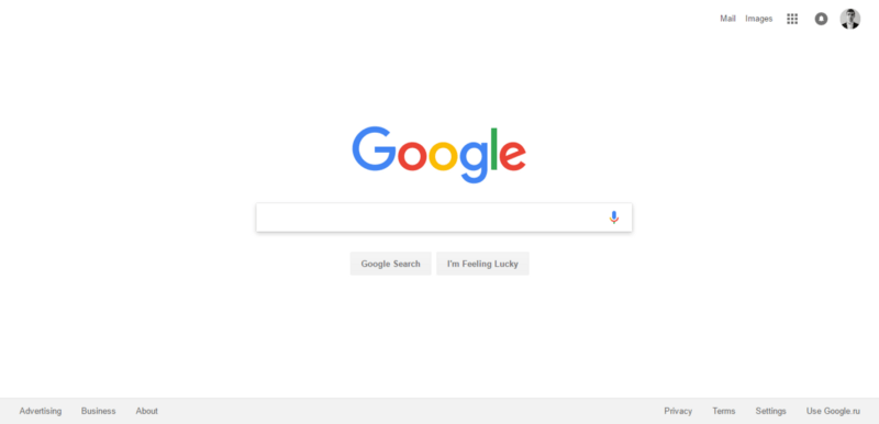
The lack of other elements will make existing elements stand out more.
Clarifying relationships
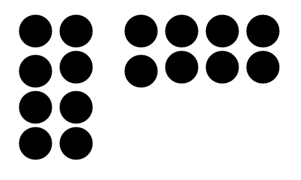
The law of proximity describes how the human eye perceives connections between visual elements. It states that objects near to each other appear similar. We can use whitespace to build perceived relationships between different elements. Take a look at this picture. Almost everyone sees two groups of dots, rather than simply 16 dots.
Breaking the information up into appropriate groups can help make it feel more scannable and readable. In the form on the right, categorising the 15 fields into three groups makes the process feel easier. The amount of content is the same, but the impression on users is much different.
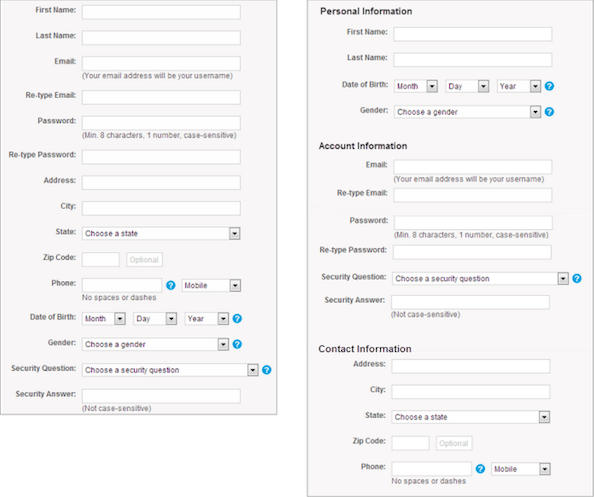
Image credits: NNGroup
Conclusion
Design with care. Each minor detail in your app’s UI deserves close attention because UX is the sum of all details working harmoniously:
“The details are not the details. They make the design.”
―Charles Eames
The article was originally published at babich.biz
About the Author
Nick Babich is a software developer and author of a blog dedicated to usability

