Overview of how microinteractions can work for you and why they are trending now.
When designing a user experience, the key is in the subtleties. Microinteractions can do that. These visual cues level up standalone tasks within your app or website. They can be something as simple as a “click” sound when tapping the mouse to something that streamlines intuition, like a transition to the Similar Products Customers Browsed page. It shows your users that you are listening to their input and what they have to say.
Why microinteractions boost your UX/UI satisfaction rate
They sell personality
When customers arrive at your brand’s application or website, they still want the personality that a real storefront would provide. Sell them the experience with a responsive conversation.
This animation takes the customer through the process of booking their room. In a few seconds, they can watch a time lapse of a simulated experience with an in-person travel agency. Unmute before watching!
Booking Interaction by Mauricio Bucardo
This animation visualizes the steps this company performs to deliver its services to the client. While the content loads, it entertains the customers and explains what they are paying for.

They pique curiosity
Microinteractions can boost user retention rates because of the subliminal dopamine responses triggered in our brains. Without really knowing why these little animations make users smile, they will associate that positive feeling with your brand.
This can be as simple as a magnifying glass that stretches into a search bar.

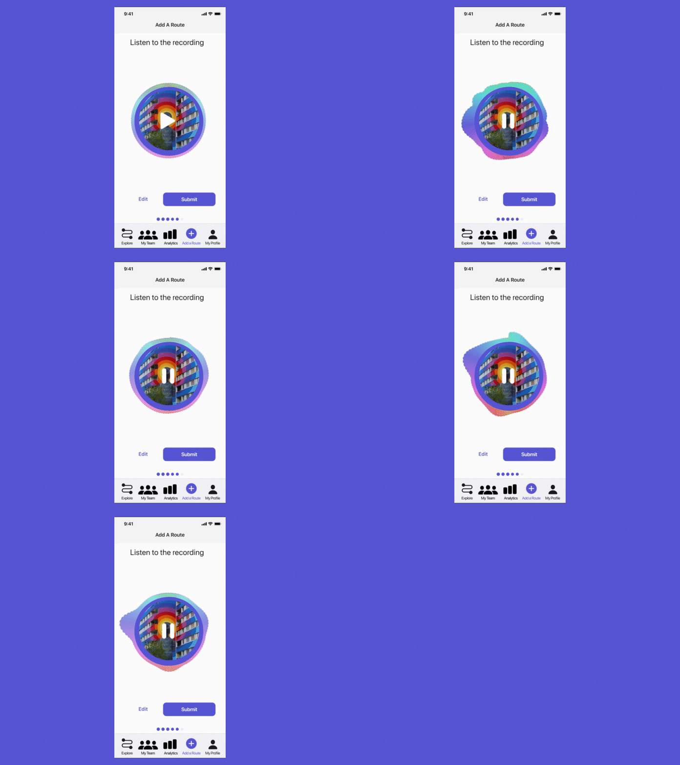
Or as involved as a visualization of what your product does, like this podcast app that animates the sound waves from a recording’s playback.
They provide traction and momentum
Capture users’ attention and propel them forward. These are some examples that can help encourage users to stay longer and explore the product:
- animating the mouse hover to encourage clicking,
- enticing thumbs to push buttons and scroll,
- giving the eye something to look at as things load,
- changing the page background as one scrolls down the page.
They make things seamless and thoughtless
Make the experience easy for your user, anticipate their logic, and reward them for their sense. Visualizations that illustrate the utility of every swipe, scroll, and tap can subtly guide users in a way that reinforces their self-sufficiency.
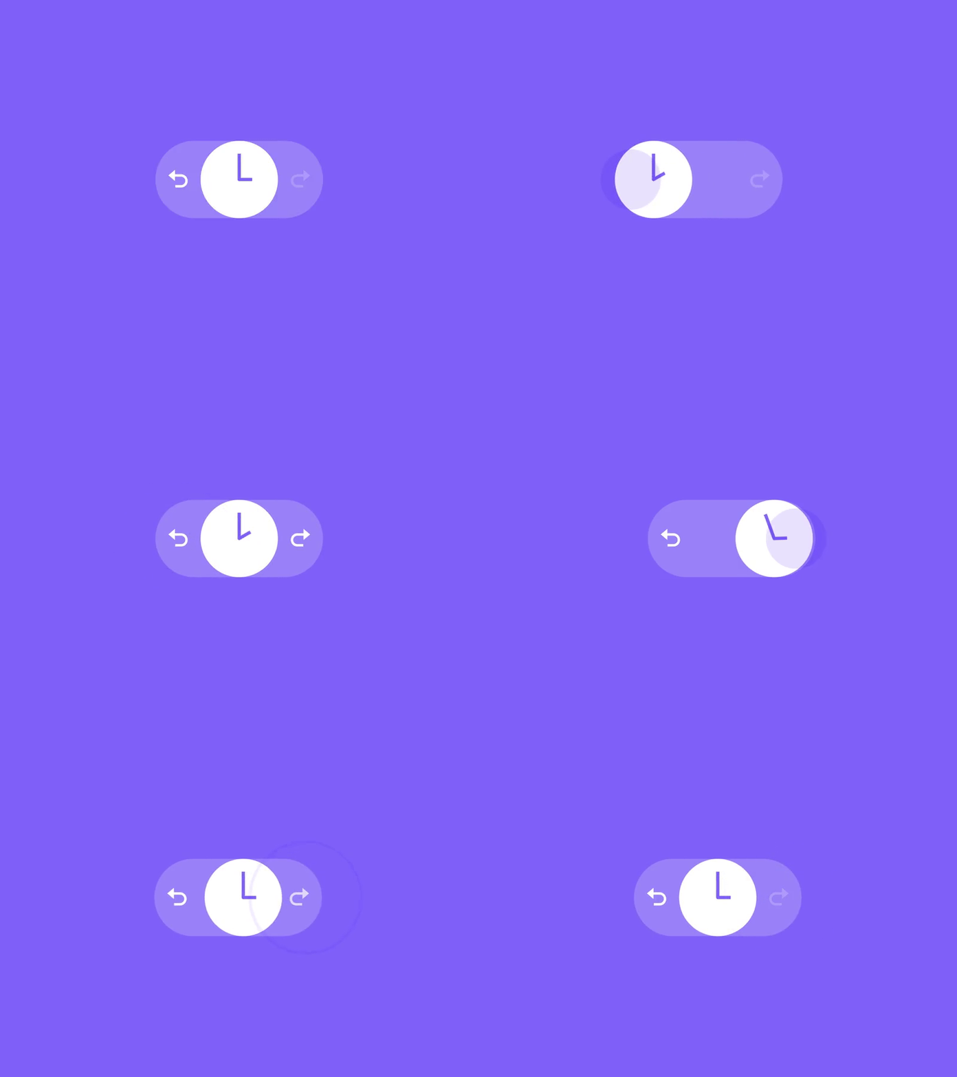
This Undo/Redo slider animates a clock turning back or forward in time depending on which option you hover over, making a choice more intuitive.
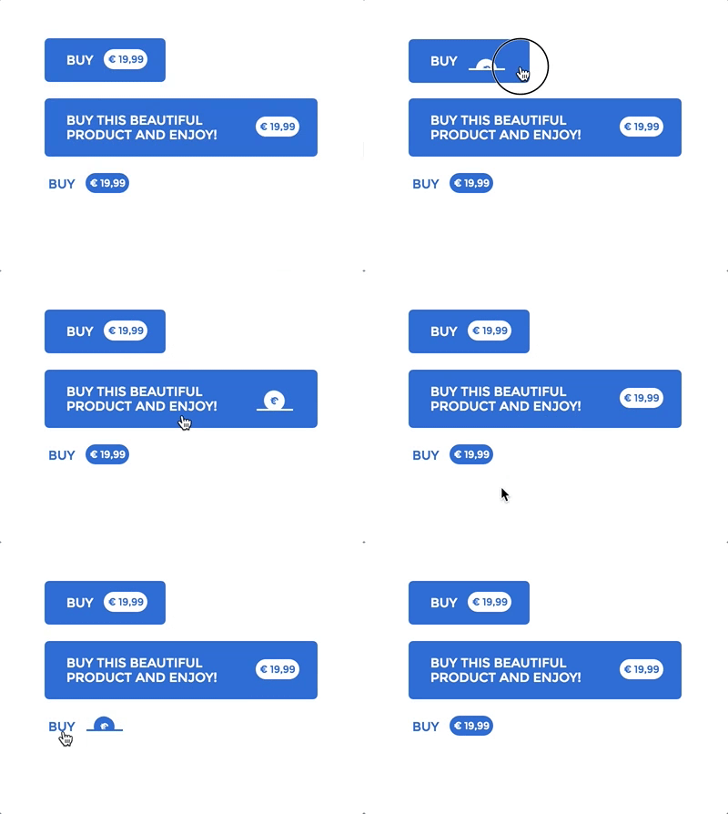
Emphasize your purchase button with a rolling coin animation.
They soften the blow of external issues
Microinteractions can also alleviate potential frustration that could come from technical difficulties. When the Internet is slow, and things take too long to load, your microinteraction visual for loading calms the user down.

If a customer types something that doesn’t match the prompt, the way you communicate the error can determine their reaction.

They reward and celebrate
Provide your customers with positive reinforcement whenever they engage in target behaviors. Take the emotional path in boosting conversion rates, and your users will start returning for more.
What microinteractions make sense for your brand?
Every brand and platform is going to have different microinteraction needs. Find out what makes the most sense for you.
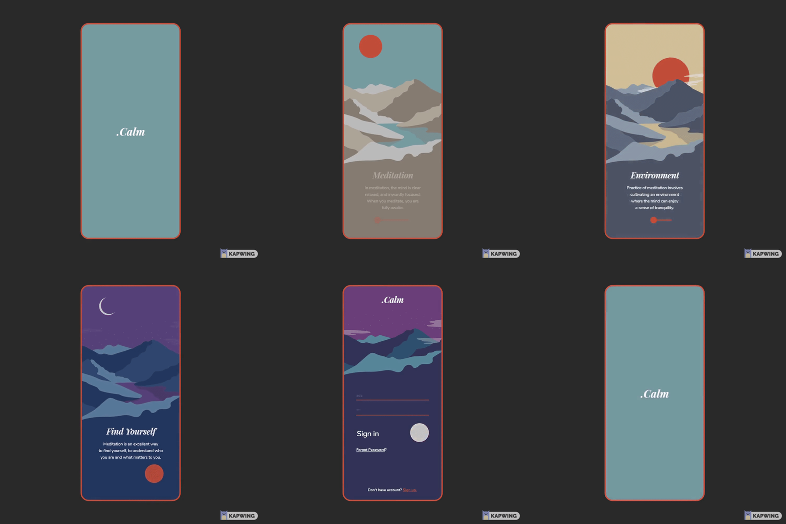
For example, Calm’s app introduction guides users through an engaging visual scene that aligns with their aesthetic goals while communicating their product purpose.
Give more personality to the things that excite you most about your product. This is how you can streamline tasks that perhaps confused users before.
To get the team on board, talk to them about how design details as small as microinteractions can raise your customer retention and conversion rates, turning clicks into sales.
Do’s and Don’t’s
- Don’t prioritize animation over functionality.
- Don’t overwhelm the user with options.
- Don’t make microinteractions that take too many steps. They should be one and done.
- Do ensure parallel experiences between mobile devices and laptop screens.
- Do create shortcuts where user research data suggests they are needed.
- Do point users in a clear direction.
Get inspired and use resources
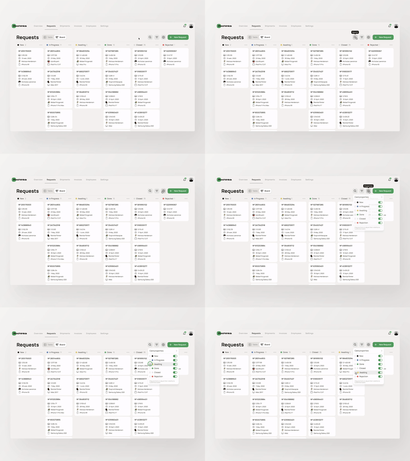
Surf regularly Dribble and Behance to surround yourself with lots of creative inspiration within the UX/UI designer community.
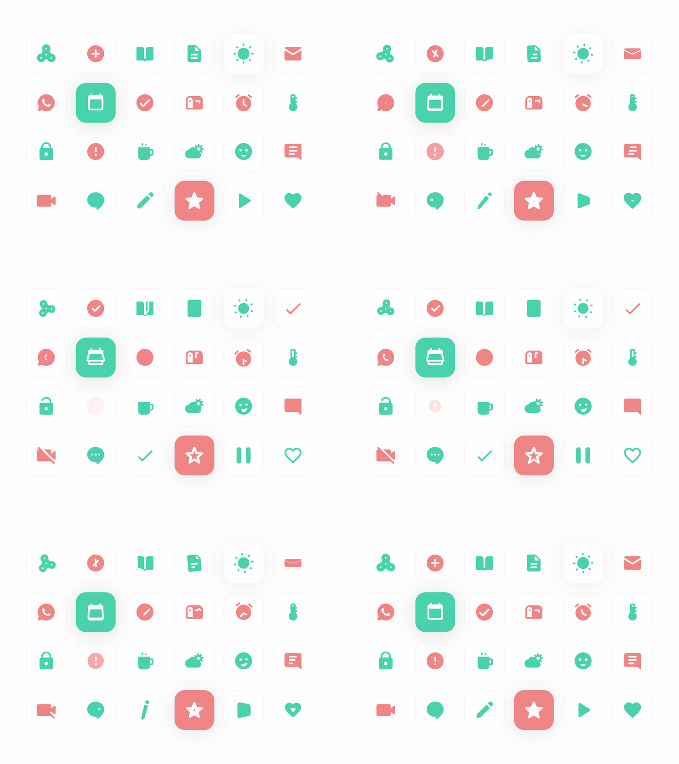
There are plenty of premade assets for microinteractions. Icons8 has animated icons that are easy to integrate into your designs.
Go forth and create
Microinteractions are just that: small and interactive. And that is exactly what makes them so useful: their responsiveness and their ability to fade into the background of UX/UI design. As users become more accustomed to the product experience accounting for their desire to be entertained, make sure that your service is up to par with what the market is offering.
