Developing a mobile application is a multi-stage and complicated process. So how do you begin and ensure you create a user-centric app design?
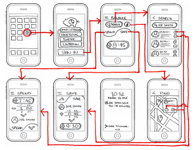
Regardless of how excellent your idea for a mobile app is, if you don’t know where to start and how to go about it, it will fail. Our consistent response to such confusion is – wireframe!
Once you have finalized the idea of your mobile app, your next step should be to wireframe your app. It is the best and most effective way to plan and organize your procedures and identify the starting point to begin working on your app.
Read on if you want to learn:
- The concept behind wireframe
- Steps of creating mobile app wireframe
- The importance of creating a wireframe
What Is Wireframing?
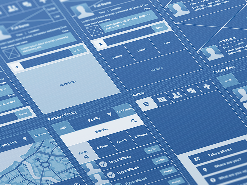
If you are new to the concept of wireframing, let’s resolve this mystery for you first. Wikipedia defines it as a screen blueprint or a page schematic that is created as a visual guide to help us establish the skeletal framework of an app/website.
Credits: Eddie Lobanovskiy
The concept was initially applicable on web design only and was later adopted by app design too. In simple words, a wireframe is a two-dimensional illustration of a screen to give a more precise visual concept to the app. It does not draw or design the app but shows how the application will work in a simplified manner.
If you have ever seen a building project, you will probably see architectural blueprints that are created before the construction process begins. It is exactly what a wireframe does for developing a mobile app.
What Does Wireframe Show?
As mentioned above, it’s a two-dimensional skeleton of what your future mobile app will look like. It shows:
- Content prioritization
- Space distribution
- Intended actions
- Available features and functions
- Transitions between screens
A wireframe is like creating a mind map of steps and procedures on how to begin a mobile app development. It gives you a clear idea about content hierarchy, object categories, screen elements, possible actions, and visual brand elements. What you shouldn’t expect to see on this blueprint includes colors, design elements, fonts, actual images, and logos.

Credits: Jeff Broderick
Step by Step Process of Creating Mobile App Wireframe
Now that you are familiar with the concept, I’m here to help you with your wireframe project. Make sure you keep all these tips and strategies relevant to the type of app design you want to create.
Step 1: Know what you are developing
Apps these days are expected to be user-friendly and simple to use. A few clicks are enough to navigate between screens. These factors make us believe that creating a mobile UX design is going to be easy.
If you have a great user experience in mind, you must put in a lot of effort to make sure it is effortless.
First and foremost, don’t even consider the design aesthetics for now. The colors, themes, fonts, and images can be taken care of later. Focus on the more integral aspects of your design first.
Important aspects like chat features, the search bar, clickable social media links, and the like should be dealt with first. You must have a clear understanding of the features you need in your final product. Prepare a list and include all the things you actually need in your app. It can make the process much more manageable.
In short, think about your destination first to focus on a roadmap that takes you there.
Step 2: Divert your focus towards user experience (UX)
Isn’t that the ultimate goal of your app design?
Of course, you need to aim at excellent user experience with your app. What’s the first thing users will see after launching your app? How will this screen guide them for further navigation? How can users take specific actions? Is it going to be easier for them to figure out?
UX can be abstract and complicated. Because, just like everything else on the Internet, the UX is also evolving at a tremendous pace. You can’t achieve everything with your app. The second step is to understand that even broad concepts have limitations.
UX is about identifying your audience, creating a relevant experience for it, and allowing it to use their common sense. As you want your app to be easy, let the users also explore it.
With projects as large as a mobile app, it is easy to get carried away. Designing a wireframe doesn’t mean you will design the entire app from scratch. It only means highlighting the basic functions of your app so that users are able to interact with it and make sense out of it.
Credits: UI8
Step 3: Look for inspiration
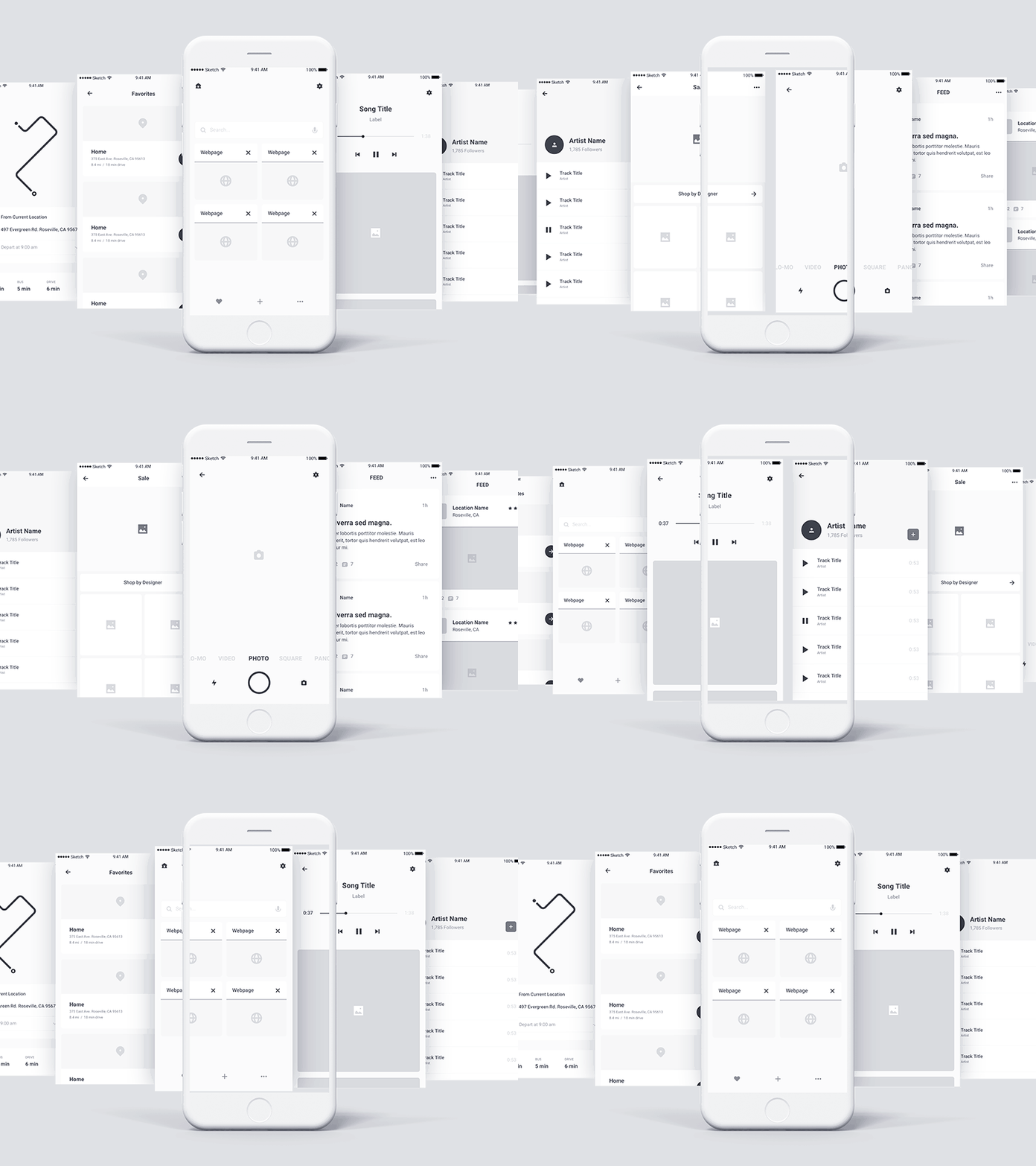
With the first two steps done, you are now prepared to finally start putting all these ideas down. But why would you do old school sketching everything on a blank canvas when you have tons of apps and websites floating around to help you do that?
That gives you an opportunity to see others’ work and use it as an inspiration. You can always turn things rounds, add your own creativity, and make it relevant to your app to create something entirely new.
You can easily find many UX design templates to get started. All you need is to search through the sheer variety to get exactly what you want. You can reduce your work and narrow down your options by simply picking a template that aligns with your app.
You can always make changes to see what’s more suitable.
Step 4: Start building your wireframe
Your journey through maps and designs is over. You can now directly jump to wire that frame!
Luckily, you have various options to wireframe your app design. You can do it online or manually. You can use a large chart paper or whiteboard to design different app pages one by one and sketch the wireframe.
You can also turn to your online options and explore the best online wireframing tools to do the same job with less hard work. Also, these free tools ensure there’s no added cost attached to your wireframing process.
Get started, design, develop, and impress yourself and everyone with a professional user-centric app design you have just created.
Credits: PLATFORM
Step 5: Put it to work
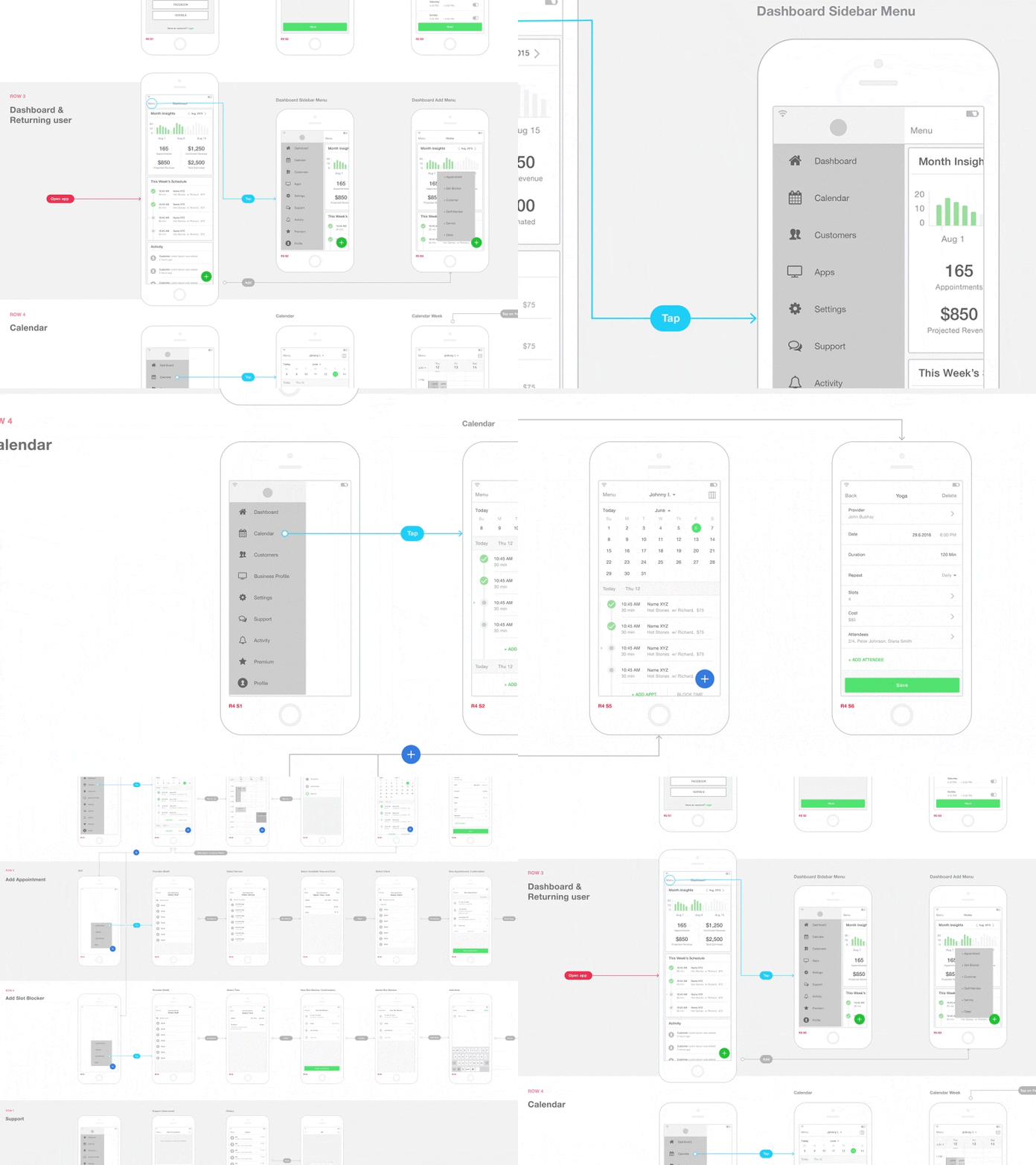
The next step to ensure your wireframing works perfectly is to prototype it. That will instantly upgrade your work from simple text boxes you have taken days to create. Prototyping is the process where you connect all these boxes to see if your wireframe is working. For instance, connecting specific images and buttons to their drop-down menus, features, landing pages, etc.
Just like wireframe, prototyping is an essential tool that helps you pinpoint blind spots and hidden flaws, especially if you test with target users on prototype testing software. It enables you to align the design with user expectations and fix the design bugs before presenting the final wireframe project, saving you both money and time.
Step 6: Present your idea
Are you satisfied with the results of the prototype? Did you just pat your back for the wonderful work you have done? If yes, then it’s time to present it to your managers and clients so the actual app building process could begin. Be prepared to justify your decisions and ideas.
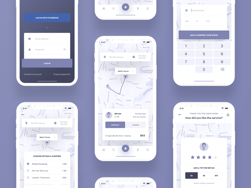
Credits: Michał Roszyk
Is Wireframing for Mobile Apps Essential?
Wireframing definitely plays a major role during the development process of your app. You can totally skip this step but it’s going to affect your planning and organizing in the long run.
Here are some top reasons why you should give wireframing a thought:
- It gives you a clear idea of how your final product will turn out. It highlights function, features, and basic design elements.
- It eases down the processes involved in app development. Project transitions look clear and logical.
- It’s cheaper because you can simply handover this blueprint to your app developers and get the work started. You don’t have to pay them extra to do this for you from scratch.
Final Word
A few quick tips before you are ready to implement the blueprint:
- Create multiple backup plans for designs you are not entirely sure about
- Ask for feedback and input, accept criticism
- Remind your colleagues and stakeholders that this is just the skeleton version of the app you will be developing
- Highlight your favorite parts and check if they could be expanded
- Be confident!
With all that information in hand, you can now set out to your wireframing project for user-centric app design.
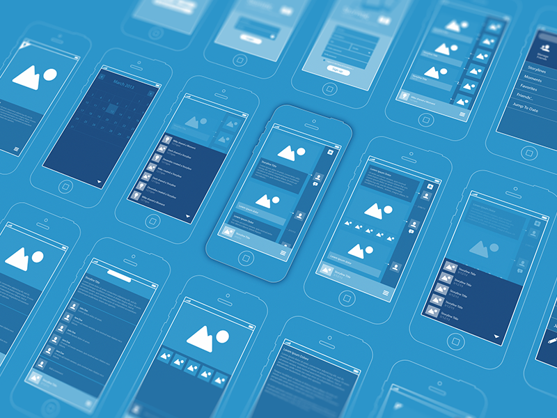
Credits: UI8
About the author: this is the guest post by Mehul Rajput, CEO and co-founder at Mindinventory, a mobile app design and development firm. He does blogging as hobby and loves to write on mobile technologies, app design, and app development.
Title illustration by Gustavo Zambelli
Read more about the difference between UX and UI, learn how to become a UX designer and check the practical definition of usability.


