Making sure your pics are on point is super important for your Shopify store. Getting the right sizes can make your store look awesome, keep your users happy, and even help you climb those search engine rankings.
In this post, we’ll discuss the best Shopify image size for different parts of your store, such as the gallery, product, background, blog feature, and slideshow pictures.

Image size for Shopify products
Product images are crucial for your Shopify store. They’re the show’s stars, helping to show off your stuff and get people to buy.
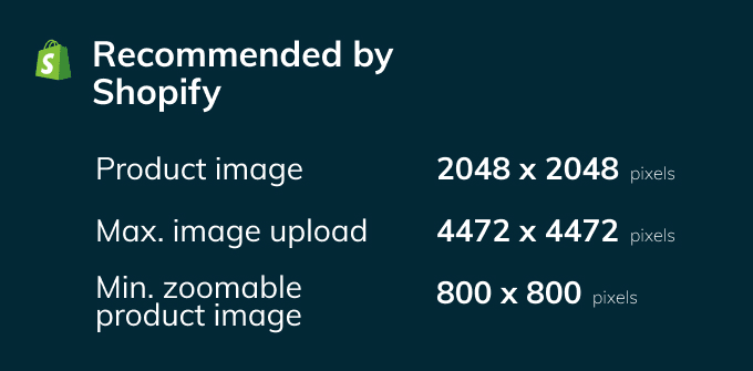
The perfect size and shape for product pics can differ depending on your theme and what you’re selling. But Shopify says you should go for images at least 2048×2048 pixels, with a 1:1 aspect ratio. That way, your pics will be nice and clear, letting customers get a good look at what you’re offering.
How to set and edit product image sizes in Shopify
Setting and editing product image sizes in Shopify is a straightforward process. Here are the steps:
- Log in to your Shopify admin dashboard.
- Go to Settings > Files.
- Upload your product images, ensuring they meet the recommended dimensions (2048×2048 pixels or larger).
- When adding a product, click on the ‘Images’ section and upload the appropriate image.
- In your theme settings, adjust the size of the product image displayed on the product page to fit your desired layout and design.
Some Shopify themes might need some extra tweaking or custom CSS to fix product image sizes. If you need help, check your theme’s information or contact the theme creator.

Shopify gallery image size
Gallery pics are all about showing off your store’s collections and grabbing the attention of potential buyers. These images’ perfect size and shape can vary based on your theme’s look and setup.
A good rule of thumb is to go for about 1024×1024 pixels, with a 1:1 ratio. This image size ensures that your gallery images are crisp and eye-catching, helping customers spot the products they’re into quickly.
Tips for creating eye-catching gallery images
- Go for top-notch images: Make sure your gallery images are clear and bright and show off the collection or product category. Awesome images make your store look professional and encourage customers to stick around and explore.
- Keep it consistent: Try to have a similar vibe across all your gallery images, like using the same backgrounds, lighting, and angles. This consistency makes everything look nice and neat and gives customers a smooth browsing experience. You can use GoProd to remove the background from many photos to speed up the process of getting a crisp white background.
- Put products in real-life situations: If you can, show your products being used or in everyday settings. This helps customers picture the products in their own lives, which can lead to more sales.
- Play with color and layout: Be creative with colors and how you arrange your gallery images to make them pop and grab customers’ attention.
Shopify background image size
Background pics can make or break the look of your Shopify store. A go-to size is around 1920×1080 pixels, with a 16:9 ratio. This ensures the image covers the whole page width without messing up load times.
Remember, huge background images can slow down your site, which isn’t good for user experience or SEO. So, find the right balance between size and quality.
Tips for picking awesome background images:
- Keep it chill: When choosing a background pic, go for something simple that matches your brand’s colors and style. Stay away from super busy or complicated images that might steal the spotlight from your content.
- Think about contrast: Make sure the text on your site is easy to read against the background. If you need to, add a semi-transparent overlay to help the text stand out. This keeps everything looking nice and consistent.
- Align with your brand’s image: Choose a background image that aligns with your brand’s image and values. This creates a cohesive and professional appearance for your store, enhancing brand recognition and customer loyalty.
Image size for Shopify slideshow
Shopify slideshow pics are great for showing off your products or deals in a cool and attention-grabbing way. Using dimensions like 1920×1080 pixels and a 16:9 ratio ensures the images look fab without messing up your page load times.
When you’re picking slideshow images, go for ones that match your content and really show what your brand is all about.
How to set and edit slideshow image sizes in Shopify
To set and edit slideshow images in Shopify, follow these steps:
- Log in to your Shopify admin dashboard.
- Go to ‘Online Store’ > ‘Themes’.
- Click on ‘Customize’ next to your selected theme.
- Navigate to the ‘Slideshow’ section.
Shopify blog featured image size
A cool size to try out is about 1200×800 pixels, with a 3:2 ratio. This ensures the image looks excellent without bogging down your page load times.
To set and edit featured images in Shopify, follow these steps:
- Log in to your Shopify admin dashboard.
- Go to ‘Online Store’ > ‘Blog Posts’.
- Create a new blog post or edit an existing one.
- Click on the ‘Featured image’ section and upload the appropriate image for the blog post.
- Adjust the image size and position as needed.
Best tips for Shopify images to make users and SEO happy
Go for high quality
Using awesome images is a must for making your Shopify store look amazing. Great pics improve user experience, make your store look professional, and show off your products in style. When choosing images, consider how they match your content, represent your brand, and look visually appealing.
Edit your images
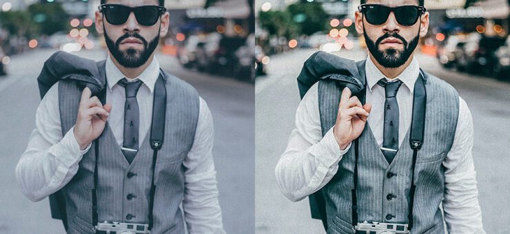
Remember to edit your pictures to make them even better—adjust brightness, contrast, and colors to create a consistent look. Consider cropping or resizing to fit your theme, and use tools like Photoshop or Image Upscaler to enhance image quality. A little bit of editing goes a long way in making your images stand out and ensuring your store looks top-notch!
Get the size right
Finding the perfect image size helps balance quality and load times. Shopify suggests 2048×2048 pixels or bigger for product pics to get high-quality images with a 1:1 ratio. For background and slideshow images, aim for about 1920×1080 pixels, with a 16:9 ratio. Optimizing size keeps users happy and helps search engine performance.
Make it responsive
Using responsive design ensures that your images look great on any device and screen size. CSS media queries tweak image sizes and positions based on the user’s device and screen. Responsive design gives customers a smooth and good-looking browsing experience.
Name and tag those pics
Descriptive file names and alt tags help search engines figure out what your images are all about. Use keywords in the file name and alt tags to give search engines a clue. This will help your store’s search rankings and make your images easier to find for potential customers.
Show off products with multiple pics
Using a bunch of images for each product helps customers get a better feel for it and increases the chances they’ll buy. Try including pics from different angles, with product details and variations (like colors or sizes). Multiple images make shopping more fun and informative for your customers.
Add image zoom
A zoom feature on your product pages lets customers see all the details up close and helps them make smart buying choices. Image zoom makes browsing even better and can boost sales, so it’s an excellent addition to your Shopify store.
Conclusion
To wrap things up, getting image size and quality is super important for making your Shopify store look unique and user-friendly. Picking the right size and quality for all types of images, like product, background, slideshow, and blog feature pics, is critical to drawing in customers, making their experience great, and boosting sales.
Follow this article’s tips to create a stunning Shopify store that keeps customers engaged and makes them want to buy.


