Design should not feel sham. It should reflect a real-world experience, with a lot of attention to dimensions. One way to do it is to work with shadows.
Don’t stick to defaults, customize
A lot of design software will have a default shadow option. Don’t fall into this trap. The amateur move is to draw an object and drop a template shadow. But these shortcuts are easy to spot, appear dated, and will take away from the modern look you want to achieve.
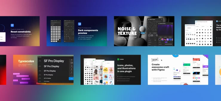
Beautiful Shadows, a Figma plugin, will help you create elegantly compiled shadows. There is feathering around the edges, a nice blend out, and the object really pops.

To master your shadowing skills, you should consider the following.
Layering
Don’t just create one shadow. This doesn’t allow for any visual transition between the object and the surface, making the illustration style seem overly simplistic. Layering shadows together creates a smoother, softer look that reflects the reality of gradients that a natural light source might cause. This example shows how layering achieves that effect:

To better understand light sources against objects, use this website.
Coloring
Shadows, while dark, are not black! Using a black box definitely requires less thinking. But if we want to keep coloring true to reality, shadows are the same color as their background, just toned down.
If you have an object popping out of a pink surface, your shadow should be deepening shades of magenta!

Sizing
Shadows can also create a hierarchy within your objects. As we add dimension, we elevate certain design elements above others. The bigger the shadow, the more lifted the object, and the more attention is called to that element.

Beware of overdesign
Remain cautious of overexerting the tips above. There are also UX/UI design community trends that are over-eager to shadow every object.
Here, you can see a nice case, but every element of the design is shadowed to the point that the dimension of the experience is hard to understand:

These elements all feel like they have conflicting relationships with the background, and the excessive shadowing takes away from the legibility of the objects:

Shadow toolkits and packages
Returning to Material Design examples, we can understand why they seemed more structured and formulaic. Their shadows were created based on measurements of the actual shadows when a lamp is pointed straight at a piece of paper.
It is a clean, good, and nice design guideline. Their resources prove valuable to many different styles and aesthetics. However, the result is stilted, lacking the natural light variant in real life, and doesn’t account for the translation into digital visuals. The current trend in design is to pay more attention to shadows being softer, smoother, and less strict.
One more thing
Creating realistic and modern shadows in design requires more than just a click on “drop shadow” in Figma. There are many factors to consider, which can be a complex process.
Our team at Lunacy is working on a new feature that will make the process easy for you. A new Lunacy tool will give you a solution that already accounts for the three major steps to good shadows that you just learned about coloring, layering, and sizing. Create effects that pair well with the background and are feathered with layers. Here’s a sneak peek of a future tool:
Stay tuned to Lunacy Twitter to be updated about this feature.


