Expert tips on how to build “date of birth” inputs for your forms.
This is a part of the book “Re:Form” written Victor, who has been working as a frontend and backend developer for more than 10 years and has 3+ years of experience in UX design. Here we are covering only one type of input, more interesting and applicable insights you can find in the full version.
Date of birth
You can ask users for their date of birth in many different ways.
First of all, it can be a side note.
We shouldn’t forget that the format of the date varies in different countries. It might be MM/DD/YYYY or DD/MM/YYYY. This should be taken into account.
Let’s review typical mistakes and then devise a plan for designing a perfect date of birth input.
Using dropdowns for age
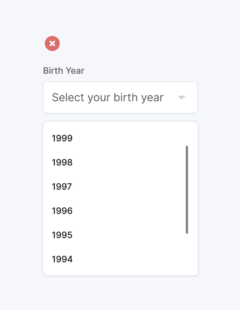
While for days and months, it might be more or less okay to use a dropdown, the year is not a good fit at all.
Dropdowns don’t work well with a large number of options. In the case of the year, the question is: how many years should we display? 80? 90? 120? In any case, the number will be huge.
Incidentally, sooner or later, many of us get the feeling that we’re getting too old because we need to scroll more.
Also, remember that users probably know precisely how to write their birth date in their local format. It’s almost like a signature. It comes to people right away.

If you use a dropdown, users will need to scroll instead of type, and this is not as natural as typing what you already know and have written down many times while living in your country.
Calendars
There is no point in using calendars because you don’t know what initial date to set, and, in any case, users will need to click or tap way too many times. So calendars are not suitable for this.
Using masks and placeholders
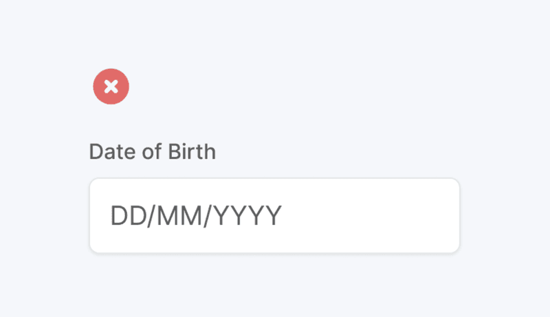
Using placeholders and masks looks like a decent solution. The problem here is that not everybody knows what the “DD”, “MM” and “YYYY” are.
Apart from this, it might take some time to realize if you should or shouldn’t set the leading number at zero. For example, should it be 05 or 5 for a month? Yes, we have two letters “M”, but users probably need to spend some small amount of time to get it.

Best solution
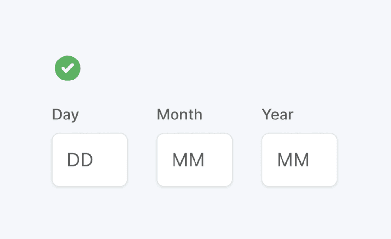
So, the best solution is to have three inputs: day, month, and year. Depending on the user’s locale, you might need to change the order to month, day, and year.
Every input should have a label and a placeholder.
The placeholder hints at the number of digits the user should input. It would also be nice if your system recognized whether the user typed a value with or without the leading zero.
When the first value is filled, the focus should automatically change to the following input.
This is ideal: users already know their date of birth, so they will naturally enter the numbers that they have inputted many times before.
There is almost no interaction cost because users don’t need to open dropdowns or calendars, manually switch between inputs, or perform any other interaction.

About the book
Re:Form is the book for everyone interested in forms usability.
About the author
Victor is a full-stack developer who is passionate about making good UI.


