Curious about the diverse world of nostalgic fonts? Keep reading to explore typography from the early to mid-XX century.
This is the first part of the story.
To read the second one, click here. Also, check out our quick note on really old fonts from XV to XIX centuries on Medium.
Here, we’ll discuss what retro and vintage mean. We also examine the fonts made before the year 1960 and those influenced by them. We’ll go through them decade by decade to see which fonts were created in each era and how they influenced modern typography.
Chronology
- 1900s — clean and straightforward fonts
- 1910s — bold geometry
- 1920s — art deco and bauhaus
- 1930s — unadorned and straightforward
- 1940s — minimalism and clean geometry
- 1950s — the Golden Age of Capitalism
Retro vs. vintage vs. old school
These three terms are similar, but there is a slight difference between them.
Retro. In general, retro is more about the aesthetic. Retro things can be old or new but retro-inspired — what makes them retro is the vibe. They look like things from the past that have a long history.
Vintage. This term is commonly used to describe something genuine, collectible, and often more expensive. The best value of vintage items is their background and condition. The less wear and tear an item has, the more precious it is.
Old school. Old school refers to things that were popular in the past but are not necessarily cool today. It can also refer to fashion, music, or even the way things were done in the past as a whole, such as old-school teaching methods or sports techniques.
What makes a font retro
In fact, you can find a bit of retro in any font. After all, typographers never reinvent the wheel when creating new typefaces. But usually, we can say a font is retro if it has at least one of the characteristics:
- It was actually designed in the past. If it dates back to the 20th century or earlier, it’s technically retro.
- Its design is influenced by a particular style of the past. If it directly references, say, the Art Nouveau designs, it has every right to be called retro.
- In an ironic way, some fonts are called retro when they become overused and a bit outdated.
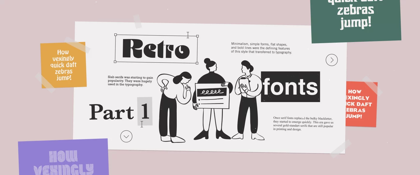
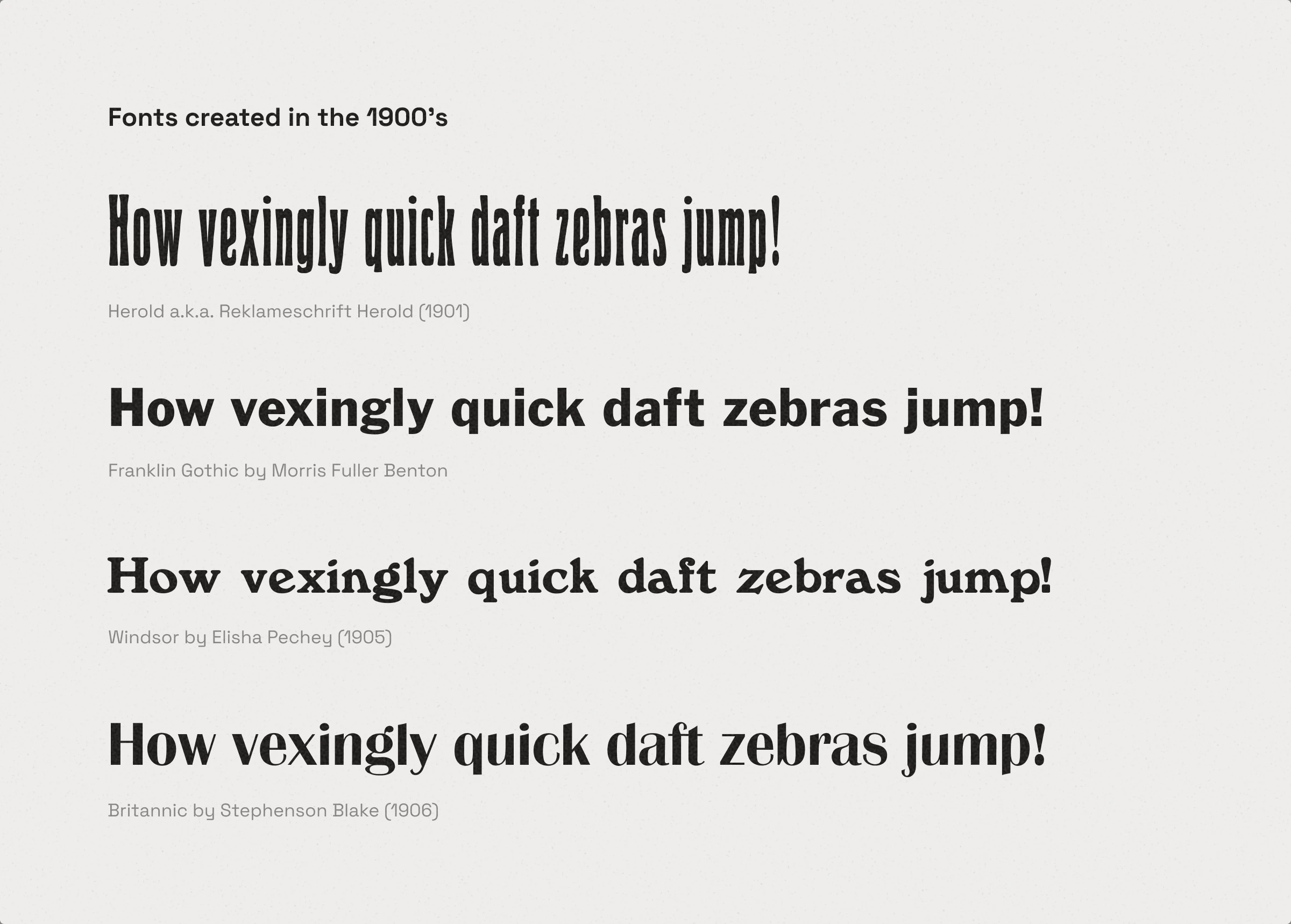
1900s — clean and straightforward fonts
Influenced by industrialization, typographers slowly started to move away from decorative fonts.
Fonts created in this era
- Reklameschrift Herold (1901)
- Franklin Gothic by MFB (1902)
- Windsor by Elisha Pechey (1905)
- Britannic by Stephenson Blake (1906)
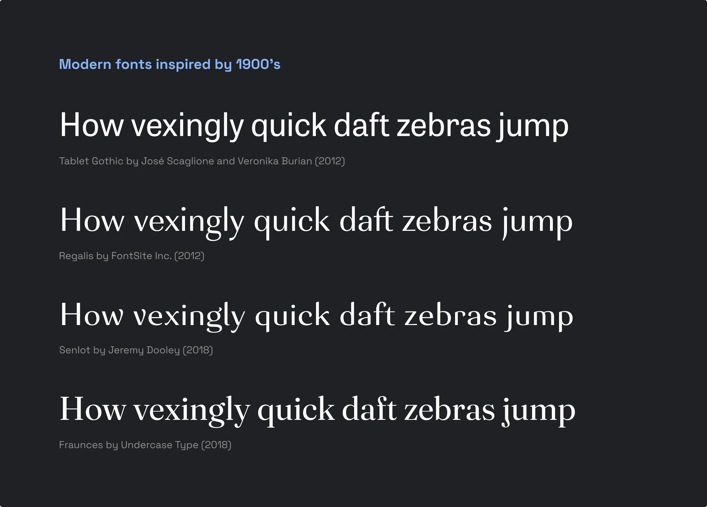
Modern fonts inspired by this era
- Tablet Gothic by V. Burian (2012)
- Regalis by FontSite Inc. (2012)
- Senlot by Jeremy Dooley (2018)
- Fraunces by Undercase Type (2018)
1910s — bold geometry
Cubism, futurism, and constructivism made clean, readable, unembellished sans serifs popular.
Fonts created in this era
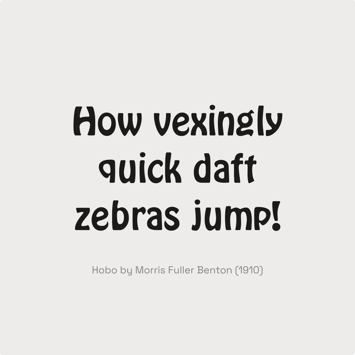
- Hobo by Morris Fuller Benton (1910)
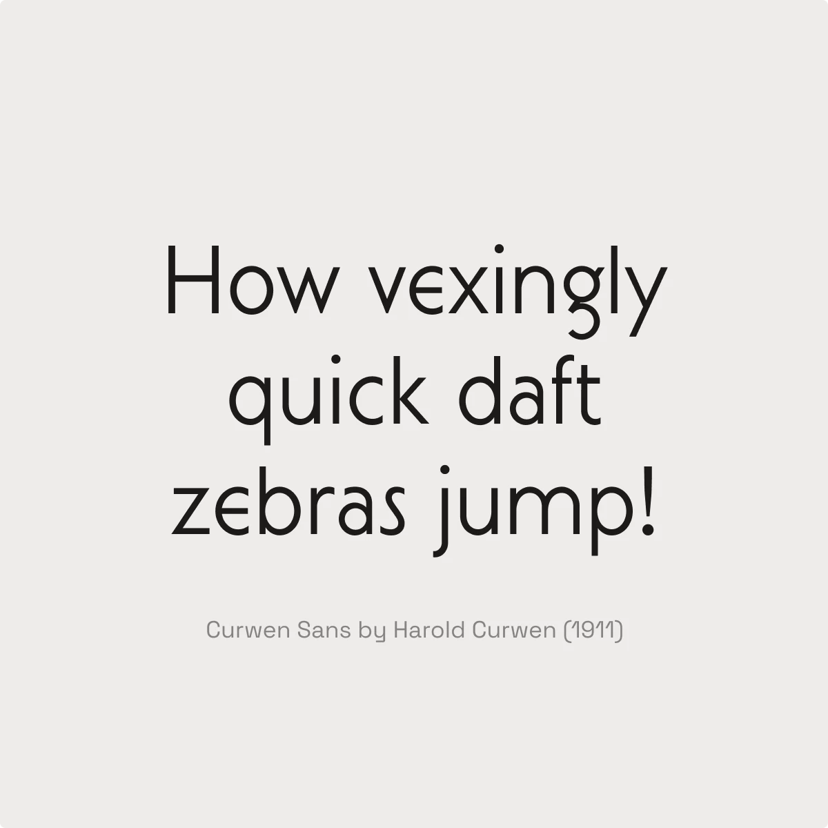
- Curwen Sans by H. Curwen (1911)
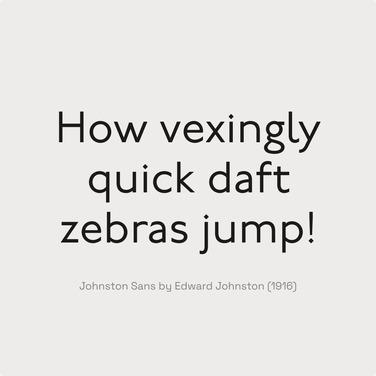
- Johnston Sans by E. Johnston (1916)
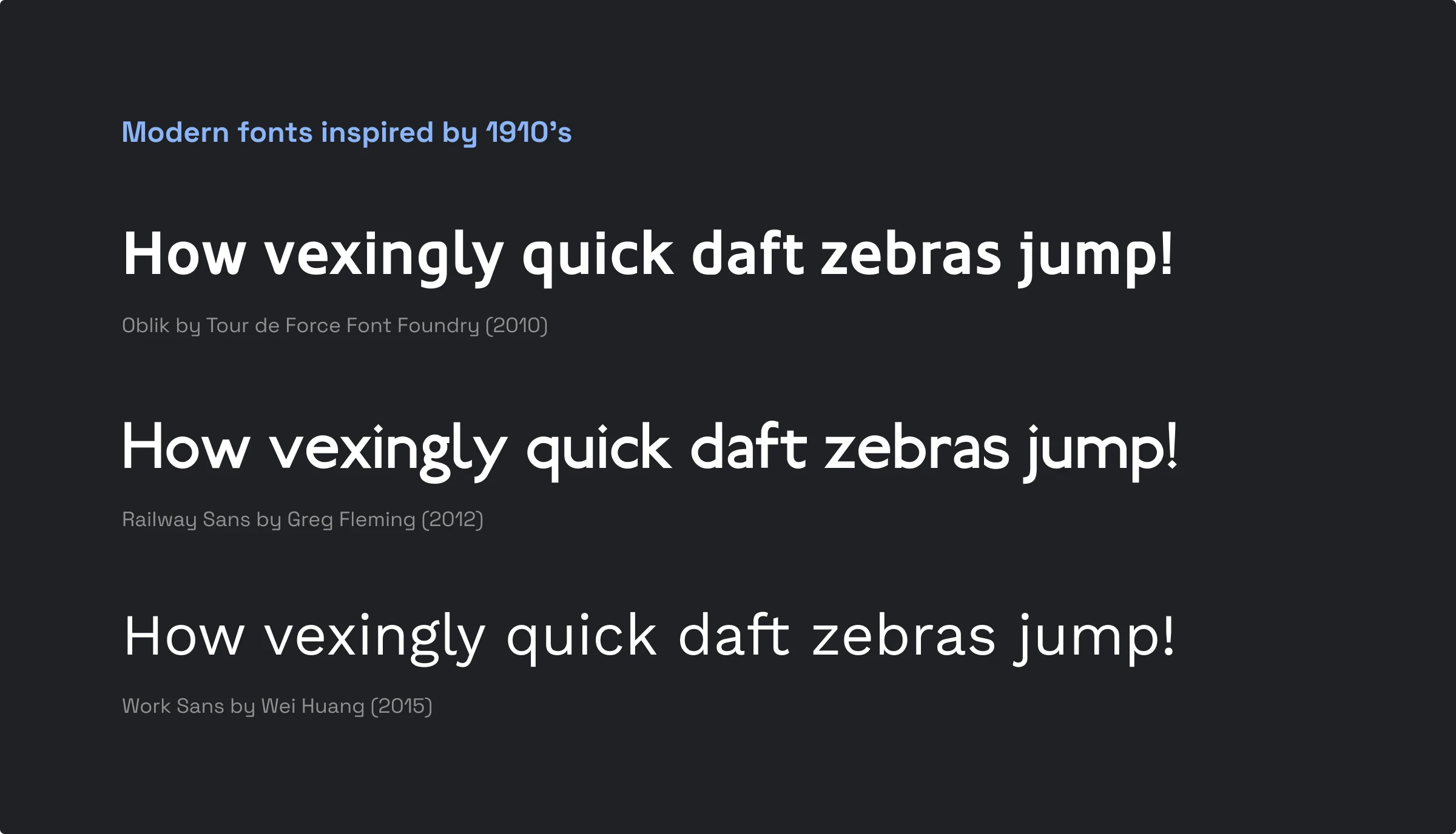
Modern fonts inspired by this era
- Oblik by Tour de Force (2010)
- Railway Sans by Greg Fleming (2012)
- Work Sans by Wei Huang (2015)
1920s
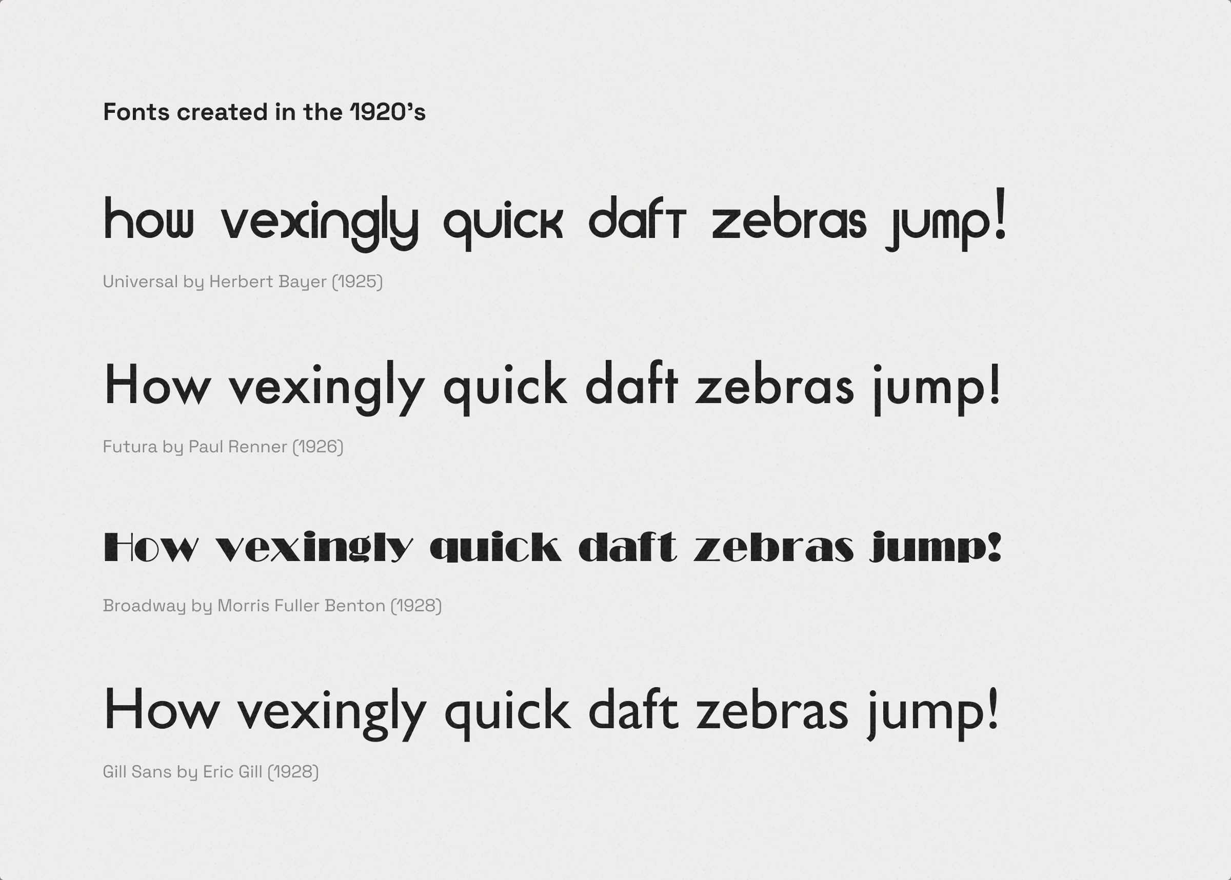
Chic and fancy Art Deco
Chunky or light, Art Deco fonts always had a bougie vibe. The fat face fonts often had extra thin lines to balance out the heavier elements.
Flat and minimal Bauhaus
Minimalism, simple forms, flat shapes, and bold lines were the defining features of this style that transferred to typography.
Fonts created in this era
- Universal by Herbert Bayer (1925)
- Futura by Paul Renner (1926)
- Broadway by MFB (1928)
- Gill Sans by Eric Gill (1928)
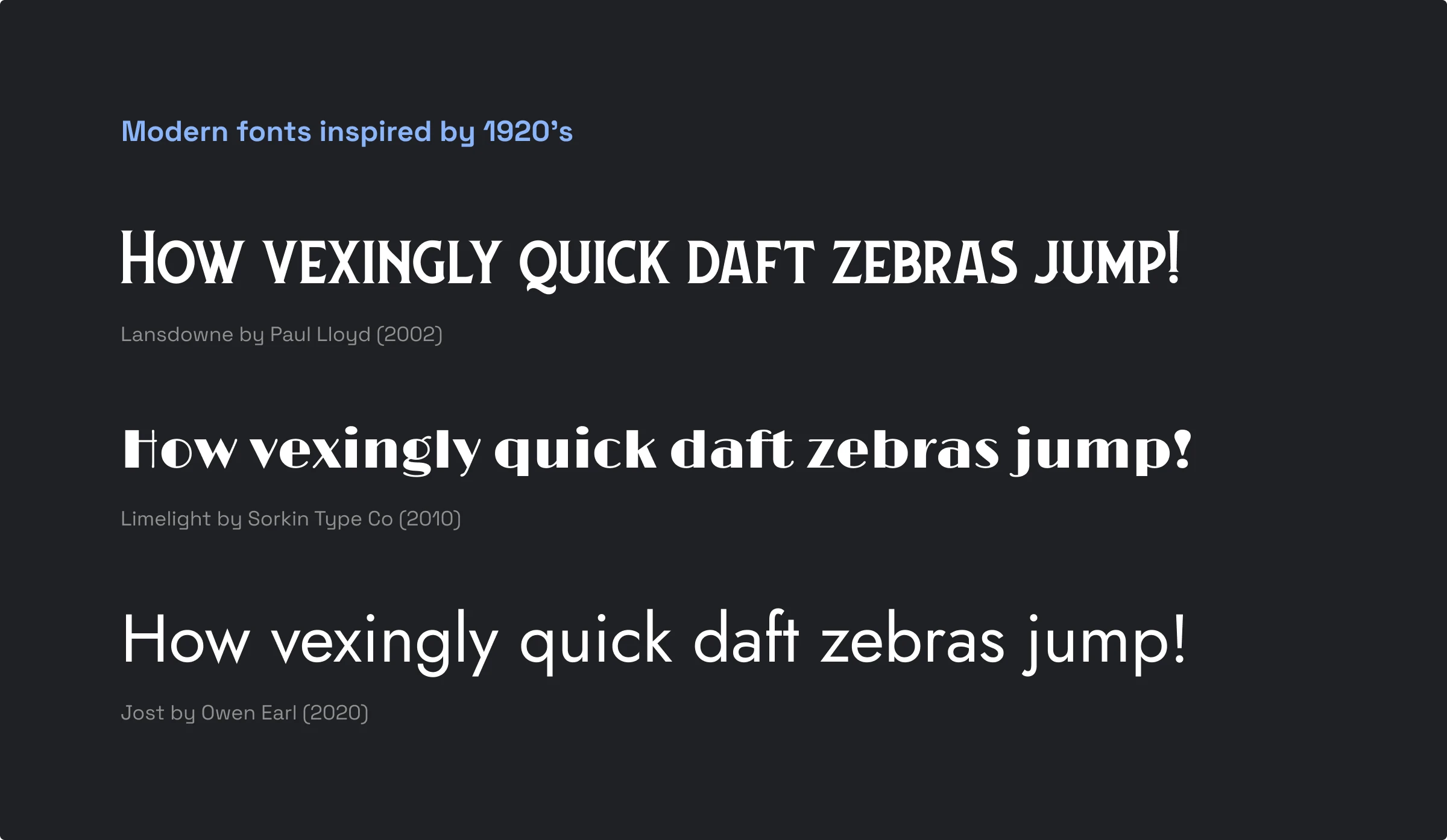
Modern fonts inspired by this era
- Landsdowne by Paul Lloyd (2002)
- Limelight by Sorkin Type Co (2010)
- Jost by Owen Earl (2017)
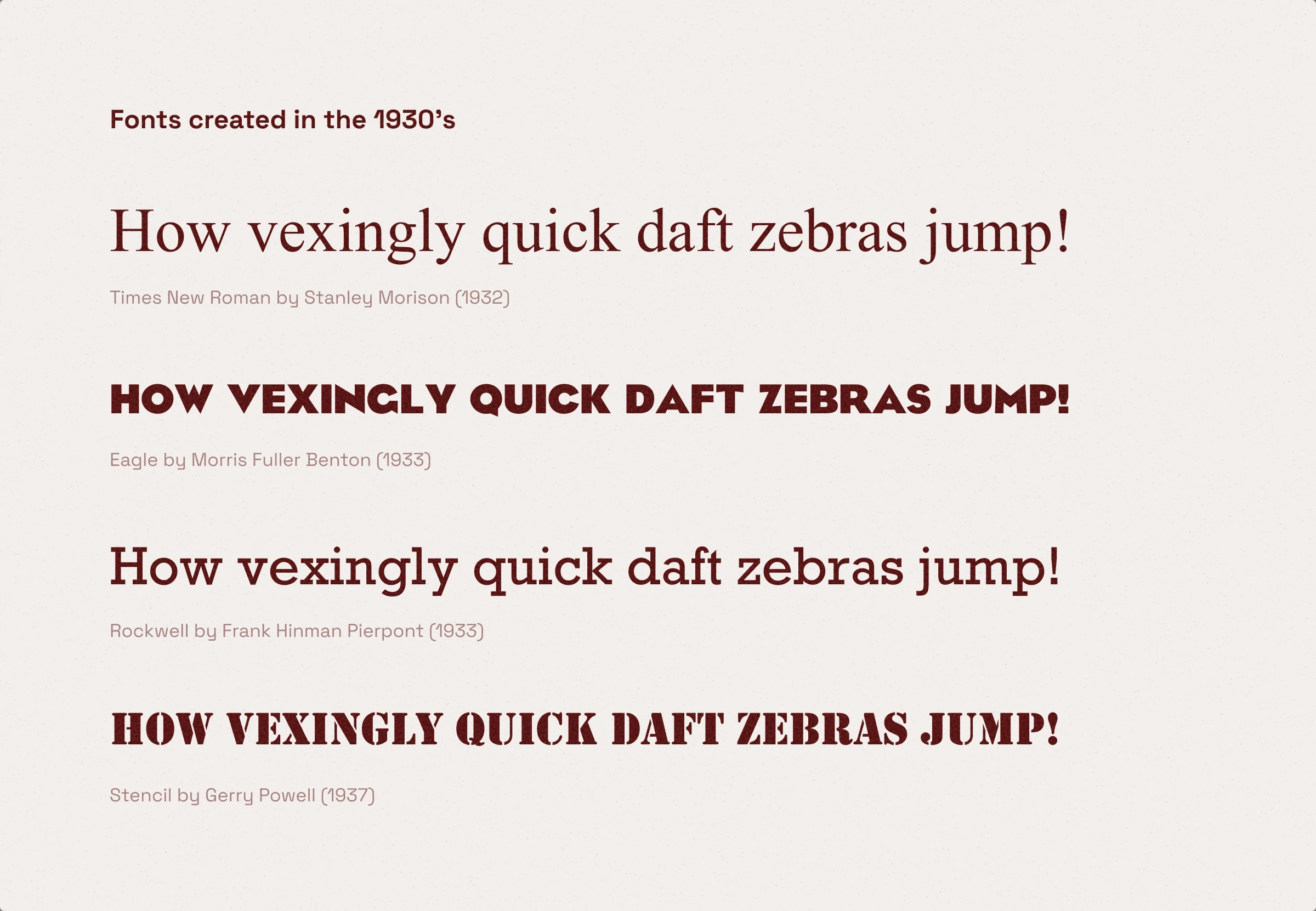
1930s — unadorned and straightforward
The 1930s were a dark period in history: unstable, chaotic, violent, and intense. It was marked by the Great Depression and World War II. Political posters became one of the most prominent forms of expression in graphic design in that era.
Fonts created in this era
- Times New Roman by S. M. (1932)
- Eagle by Morris Fuller Benton (1933)
- Rockwell by F. H. Pierpont (1933)
- Stencil by Gerry Powell (1937)
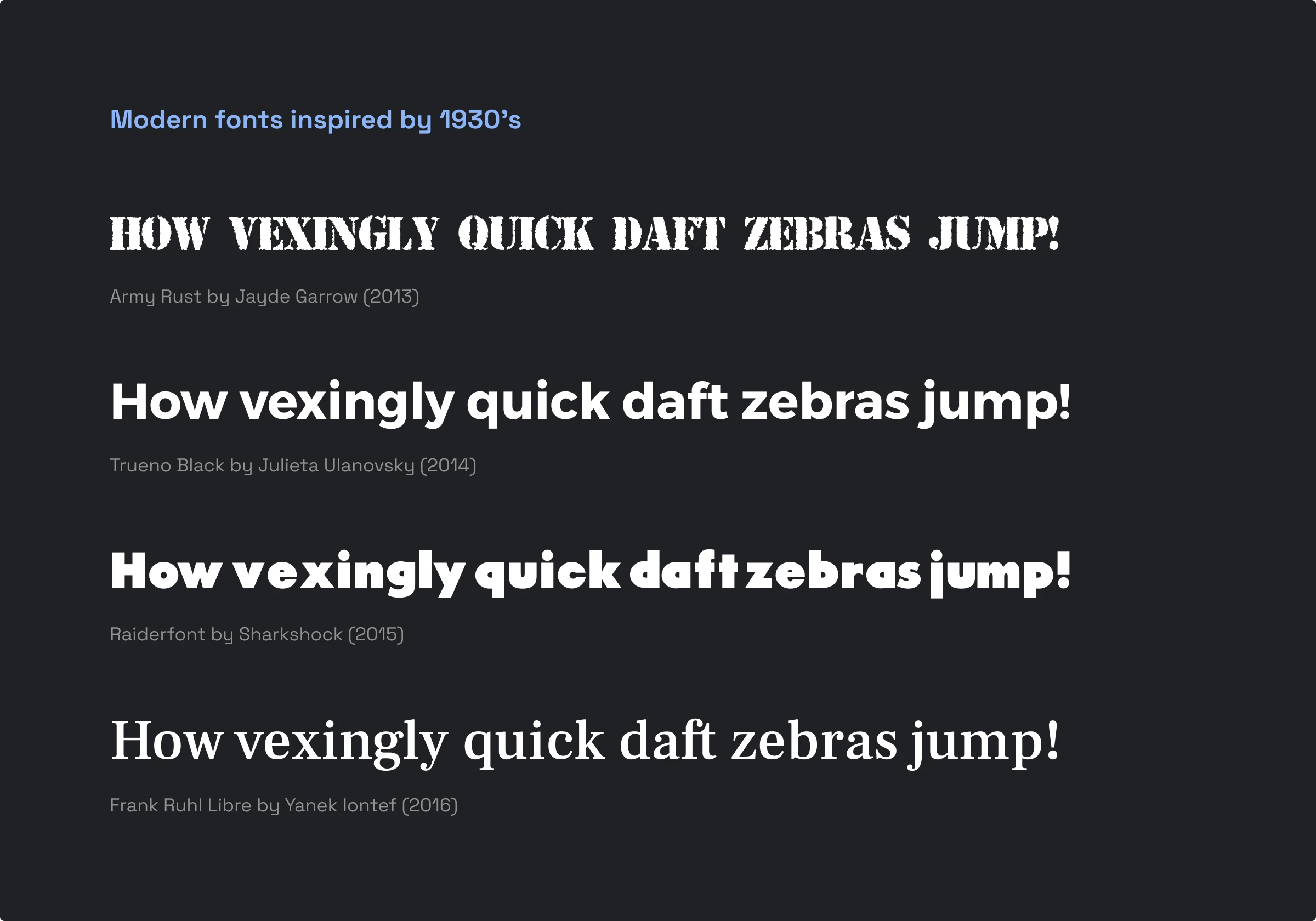
Modern fonts inspired by this era
- Army Rust by Jayde Garrow (2013)
- Trueno Black by J. Ulanovsky (2014)
- Raiderfont by Sharkshock (2015)
- Frank Ruhl Libre by Y. Iontef (2016)
- Hepta Slab by Mike LaGattuta (2018)
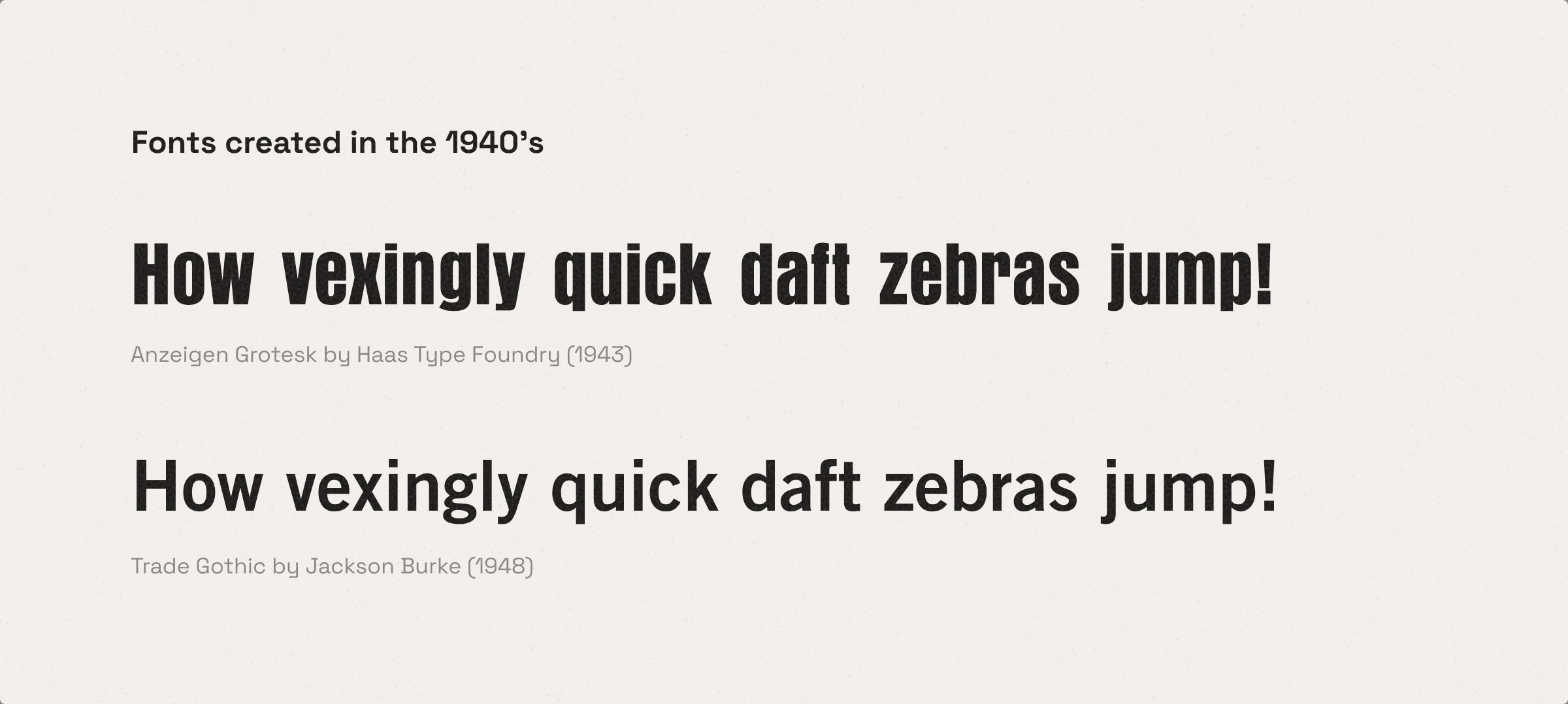
1940s — minimalism and clean geometry
In this era, the International Typographic Style, which prioritized objectivity and simplicity over everything else, was in full bloom.
Fonts created in this era
- Anzeigen Grotesk by Haas (1943)
- Trade Gothic by J. Burke (1948)
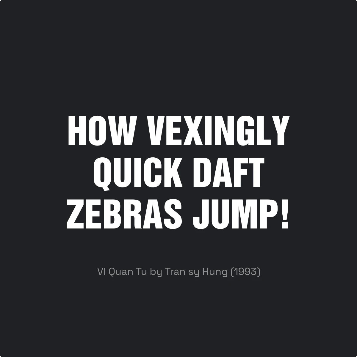
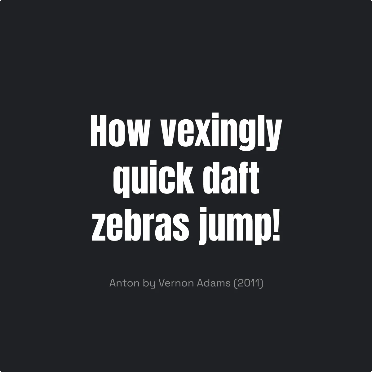
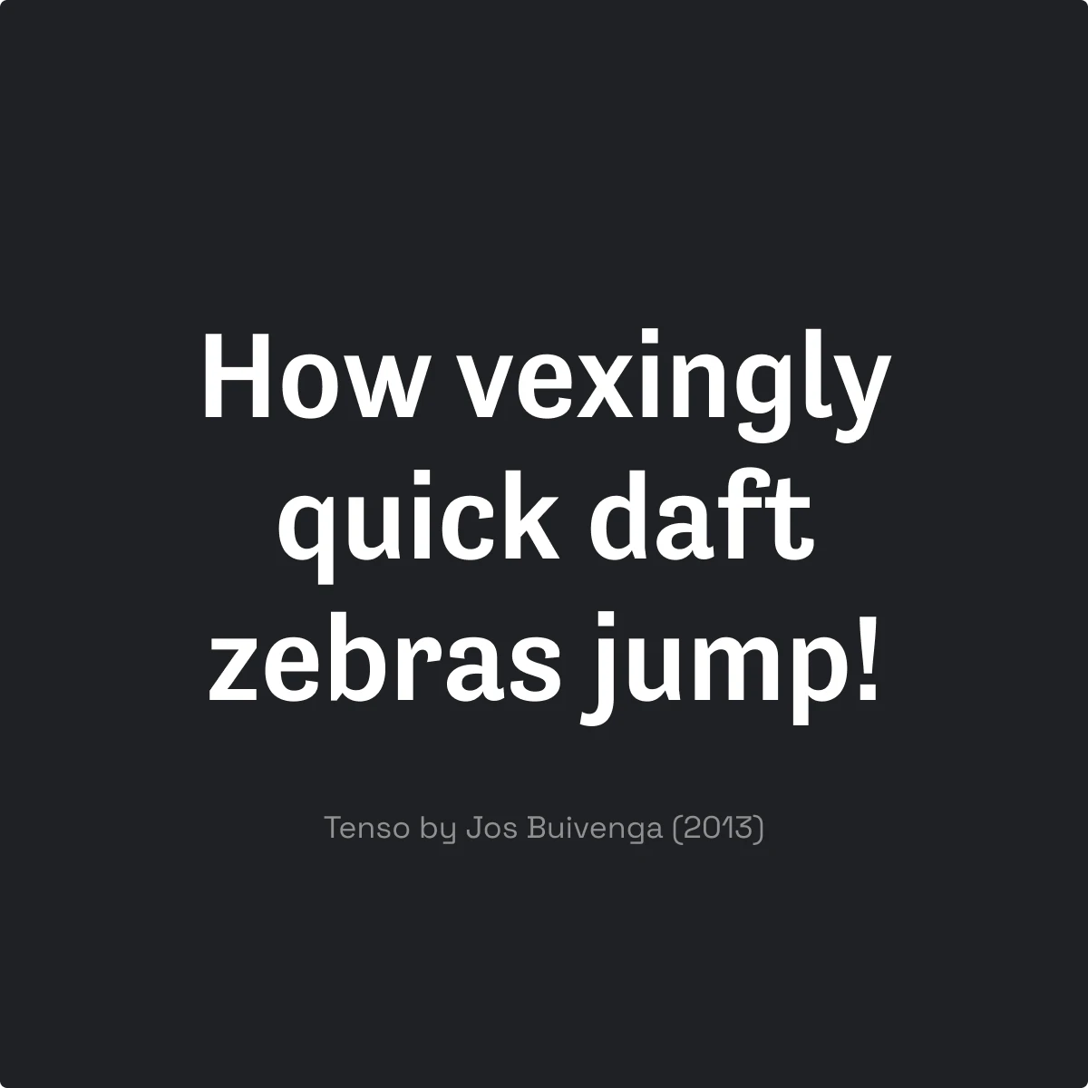
Modern fonts inspired by this era
- VI Quan Tu by Tran sy Hung (1993)
- Anton by Vernon Adams (2011)
- Tenso by Jos Buivenga (2013)
Visual pairing
For such sleek typography, mind your visual also to be quite neat. The best match for fonts from this era is lively but minimalistic graphics. Check out how great Weekday illustration works with Anton font and Trade Gothic font in the example below:
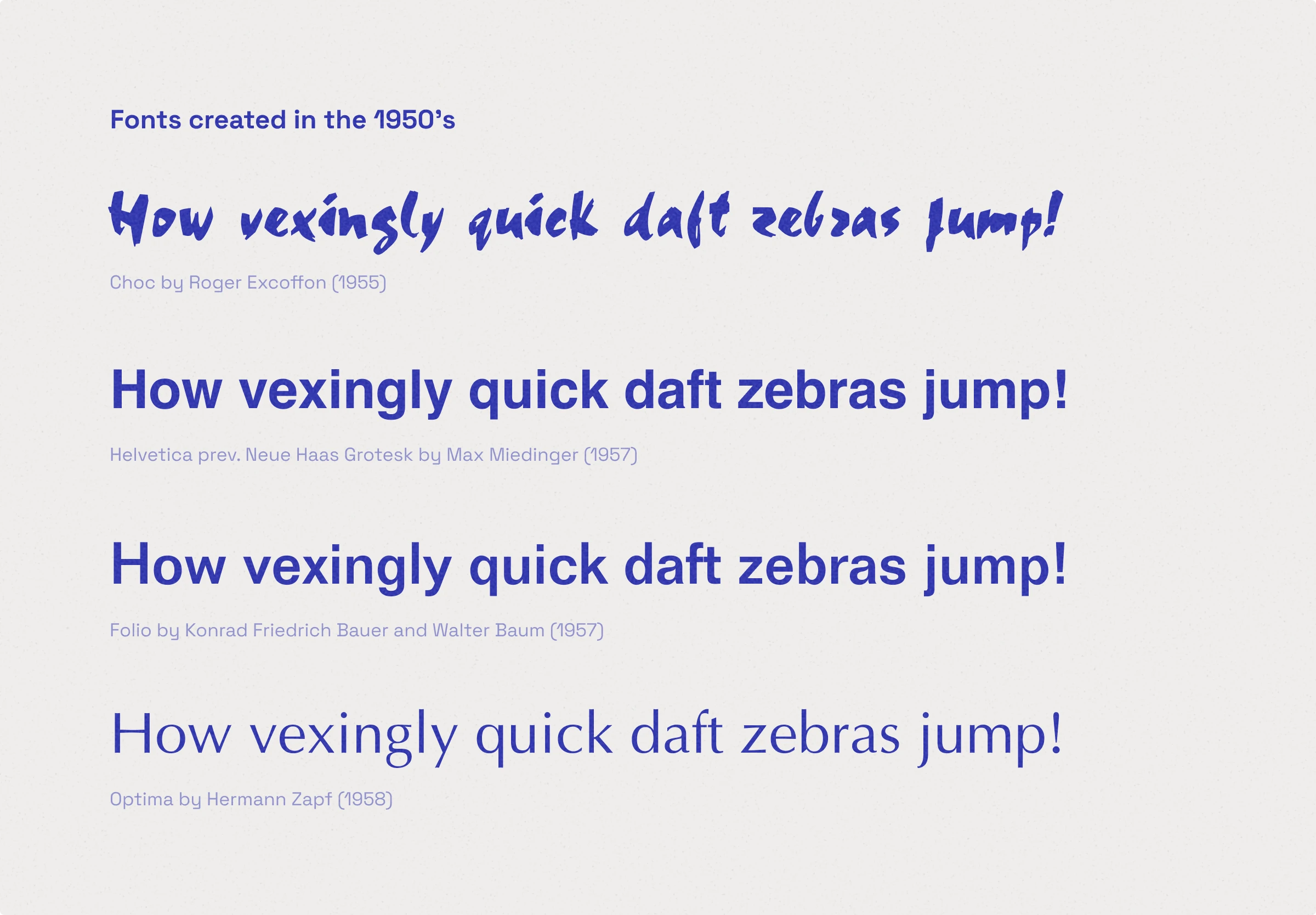
1950s — the Golden Age of Capitalism
Globalization made branding one of the main focal points in graphic design. Logos, product packaging, and marketing posters required unique yet impeccably legible typefaces that would stand out. This period was fruitful for unsophisticated, International Typographic Style-inspired fonts and decorative typefaces.
Fonts created in this era
- Choc by Roger Excoffon (1955)
- Helvetica by Max Miedinger (1957)
- Folio by K. F. Bauer (1957)
- Optima by Hermann Zapf (1958)
Modern fonts inspired by this era
- Koeltoerals by S. Justprince (2018)
- Inter by Rasmus Andersson (2020)
- Helixa by Jean P. Johnson (2024)
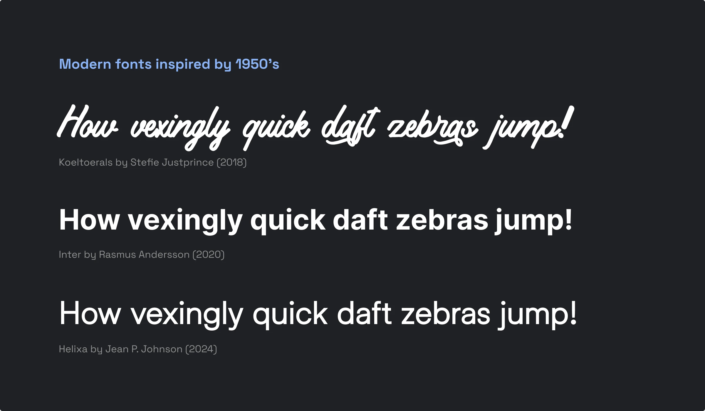
The irony here is that the queen of 50s typography—Helvetica—ruled the digital design world for quite a long time and is now slowly being replaced by another “universal” font: Inter. And it is definitely a modern one that was inspired by Helvetica. Inter is known for its flexibility. It is the variable font. You can literally pull the sliders to adjust the line thickness or the slant level.
Pro tip:
Match variable fonts with variable icons. Icons like that have a wider range of line thickness options. So whichever weight you set for the Inter font, you can always create a good pair of it with the icon. Forma icons + Inter font = perfect match!
To be continued
So, we went through the first half of the XX century here. To continue learning about the history of fonts, read part 2.