Motion in the world of design is used to describe spatial relationships, functionality, and intention with beauty and fluidity. Motion might sound like a big concept, but when used effectively it is subtle and natural. Thoughtful motion in design can enhance the user’s experience over traditional design elements.
So let’s talk about the fundamentals of motion design, why and when you’d want to use it in your UI, and how it can help you make your UX better.
Motion-based Design
Motion tells stories It shows how an app is organized and what it can do. Motion drives the entire UI — it redefines navigation and creates a more natural experience by adding a new level of depth to the interaction design. For every button clicked and screen transition, there is a story that follows and good motion-based design helps you to tell it.
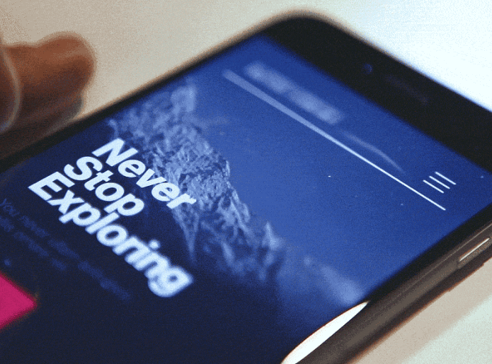
We all want to tell a great interactive story on tiny screens and motion gives us the power to do it. Image credit: Dribbble
Why Does Motion Matter?
When users interact with your product, they might ask the following questions:
- “What’s most important here?”
- “How do I know what to do next?”
- “How do I know I have completed my task?”
Questions like this might reveal opportunities to use motion to enhance the experience. Motion optimize perceived UX and answers the questions:
- It drives user’s attention and hints at what will happen if a user completes a click/gesture.
- It helps you orient users within the interface and provides guided focus between views.
- It provides visual feedback.
Besides that, motion-based design brings another important thing into UX: delight. We all appreciate the value of humane, delightful products over cold and rational. That’s why designers should experiment and find solutions that feel more natural and evoke an emotional connection.
Motion Language
Motion is allowing us to communicate better the interaction, making it easier for the user to understand them. Motion-based design elements can be seen in a variety of forms, including transitions, animations and even on texture to mimic 3D depth.
The main challenge with motion is making it something that doesn’t distract users from the thing they’re trying to do.
Driving Users’ Attention
Motions can draw user’s attention to a specific area — or help to distract from it. Good motion design makes UI more predictable and easier to navigate. It can help the eye see where a new object comes from or where a hidden object goes and it also gives the viewer a clue as to what’s about to happen.
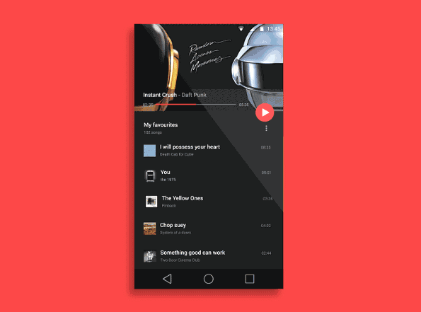
Make your buttons and panels respond to users’ interaction in a delightful and noticeable way. Image credit: Dribbble
Makes UI Spatially Logical
State changes in UI often involve hard cuts by default, which can make them difficult to follow. In cognitive science, this is called change blindness — when a sudden change in the visual stimulus is introduced and the user does not notice it. Users need to understand where things come from and where they can find them again so that it doesn’t feel hard-cut. Simply because hard cuts don’t exist in the real world.
Motion design fills the comprehension gap by defining the spatial relationships between screens and elements. It helps people orient themselves within the interface and establish visual relationships. In the example below, during the transition, the user is guided to the next view and the surface transforms to communicate hierarchy:
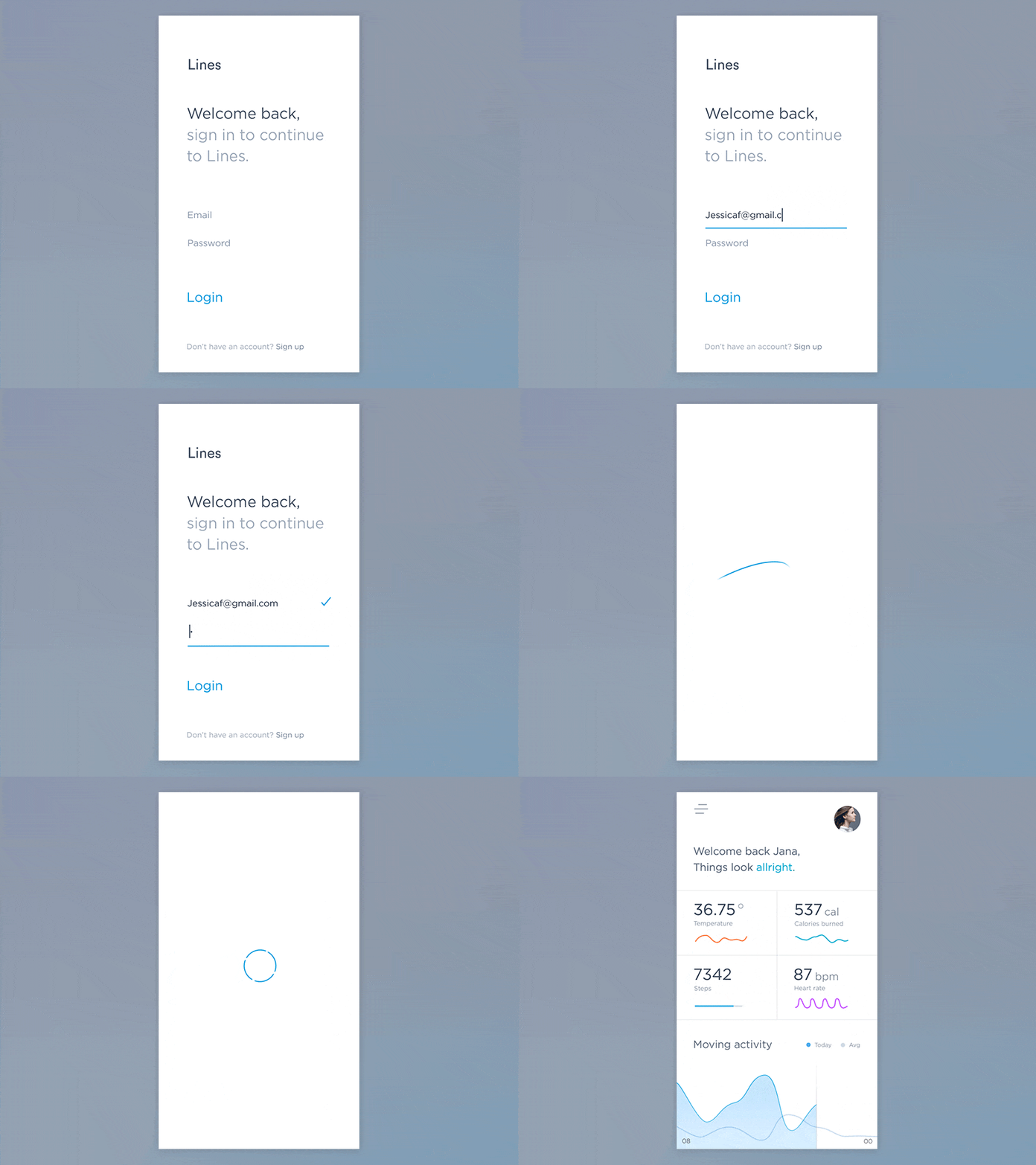
Design consistent UI layers that allow spatially meaningful transitions. Properly created transitions can orient your user really fast. Image credit: Dribbble
Confirming Actions
Motion reinforces the actions a user is preforming. For every button clicked and screen transition, there is an opportunity to use a motion-design. The visual response can increase engagement and delight the user. For example, let’s look at how animation can help when entering a wrong password in iOS:
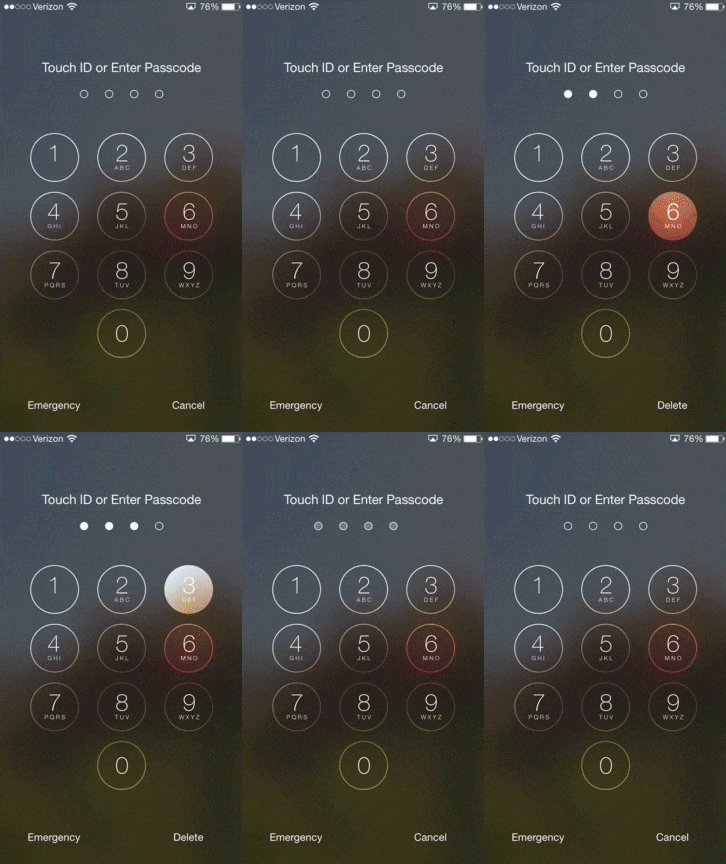
Apple iOS use a horizontal shake animation when denying a password. When users notice the animation they instantly understand the action.
Upon first glance, shake animation on incorrect password entry seems to take more time than instantly displaying a small error badge. However, in reality, a user might spend a couple of seconds trying to locate error message to find out what went wrong, instead of noticing the animation and instantly understanding the problem.
Brings Delight
Motion can make your user experience truly delightful and memorable. As a designer, you should bring a bit of yourself into the design and enchant your motion-based design with a unique appeal that people will love and remember. By injecting subtle motion into the design, you can make users feel like they are interacting with something that’s has a personality.
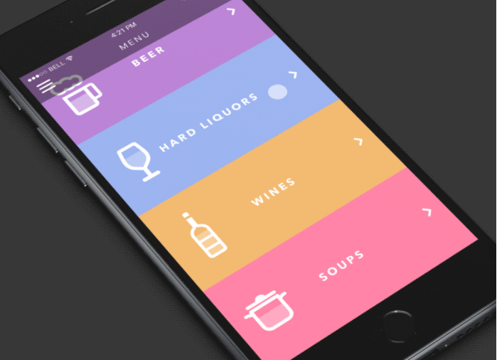
Even small UI elements such as animated icons in your design can bring delight. Image credit: tubikstudio
Conclusion
Motion is the next level of tech. It’s a natural way of interacting with things and it’s absolutely critical to the design of the future. We need to say goodbye to static user interfaces and create interfaces which much more human and alive. Creating a motion language for your app will reinforce your brand and compliment your design.
About the Author: Nick Babich is a software developer and author of a blog dedicated to usability

