30% of all online shopping purchases now happen on mobile phones. And when it comes to shopping, users want immediate, relevant, and frictionless mobile experiences. Therefore it’s simply essential to help users progress through each stage of this process with minimal effort.
There is no section in mobile app that is more critical for conversion than the product screen because customers need adequate information about a product before they will buy it online. In this article, I’ll talk about product screens and highlight a few important elements of each product screen — product images, description and “add to cart” CTA button.
What Is a Product Screen?
Product screens are where users make key conversion decisions, such as add to basket, add to wish list, book now, call now, complete form, etc. Effective product pages use a combination of text and images to show product information, availability, price, and a clear way to purchase the item.
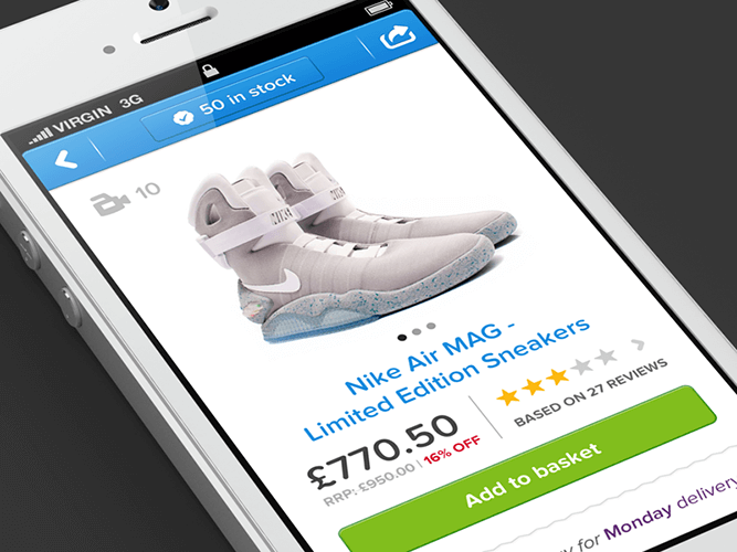
Product screen. Image credit: Murat Mutlu
Product Images
The product images sells the item. As the saying goes, a picture is worth a thousand words. Regardless of your product, whether it be headphones or toys, it’s the most important element on the page. Images can be a powerful way to capture users’ attention and differentiate your product— be both emotional “feel” and rational “utility” part of the product.
Use Hero Image and Place It Above The Fold
A good hero image does all the hard work for you. The main product image should be above the fold in order to merchandise your priority offerings. Don’t make users scroll in order to see the hero image for a product.
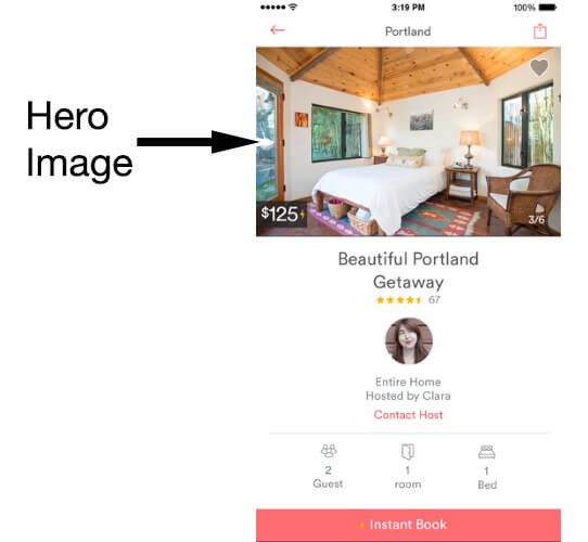
Hero image in Airbnb app for iOS
Provide an Image Gallery
Images are used to get a feel for the product in a way that a product description never can. Thus, the more product images you have within your product screen layout the better:
- It’s important to show all sides of the product.
- Users often rely on the product image to assess features. You should provide images that show detail and features. For example, if you’re selling an audio receiver show the input and output ports at the back to help the user understand it’s’ features.
- To optimize usage of the gallery photos, use images associated with the product details highlighted in the product description.
Horizontal Swipe for Product Images
Users should be able to quickly swipe through an items images horizontally, and not have to scroll down to view a series of images.

Only High Quality Assets
You should provide only high-quality product images, videos, and other assets in order to capture the attention of app users. Make sure your images are appropriately sized for displays and across platforms:
- For Android graphic assets should be XHDPI (or XXHDPI)
- iOS recommends you supply @3x assets for iPhone 6 Plus and @2x assets for all other high-resolution iOS devices.
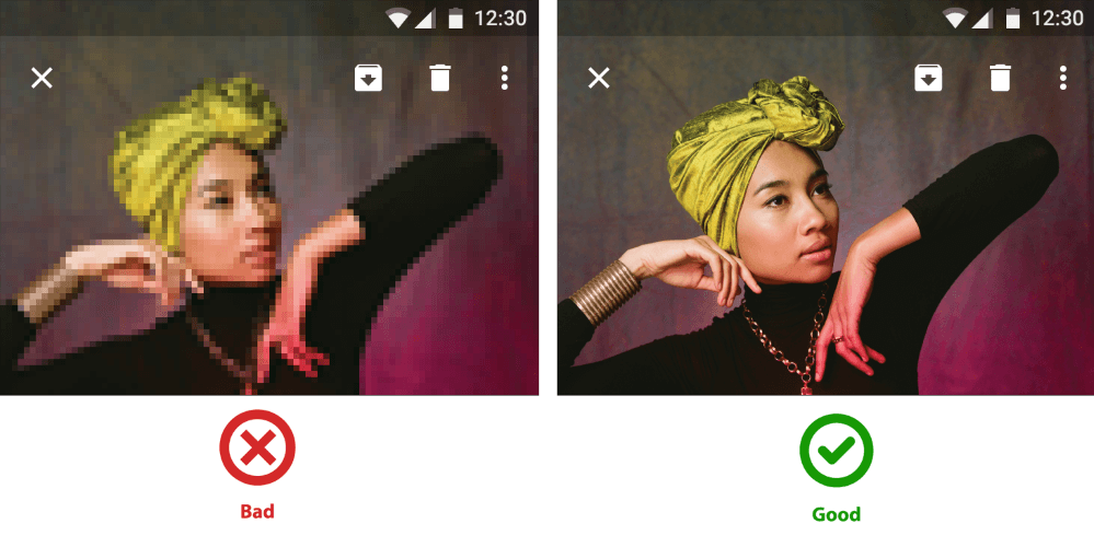
The assets should not appear pixelated. Image credit: Material Design
Image Can Be Easily Zoomed Into
Users should be able to easily zoom into a product image to inspect it in more detail, by double clicking or selecting a zoom button. This is especially important for clothing stores where consumers are more concerned with detail. The zoomed-in images also need to maintain high quality.
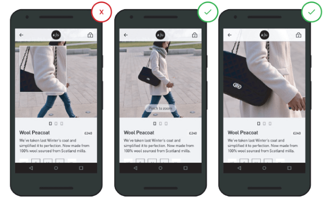
Left: Zoomed-in view forces the user to look at a specific part. Right: Put users in control by allowing them to zoom in as they prefer (both depth and area of zoom is controlled by the user)
Product Description
Product description needs to cover what the product does, how it makes your user feel and how it will make life better for your user. It should be easy to skim (get a general overview) and scan (find a specific info).
Use Clear Format
Product description should have a clear format, such as in list or bulletpoint format, so that it is easy to speed read. The key features of the product should be in focus, to encourage users’ to add it to the basket.
Text Is Easy To Read
The size and layout of your text can make a huge impact on the experience of reading something on screen. It takes the user much longer to process smaller text, small leading and paddings. As result, the users are skipping most of the information. Whether you’re designing a layout, consider approaching the job in this way:
-
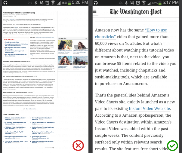
- Font Size. For text to always be legible you should use a font size at-or-above 11 points (even when users select a small text size); and the font used throughout the app should be consistent. A good rule of thumb is to use 30–40 characters per line for mobile.
-
- Contrast. Make sure there is sufficient perceivable contrast between the app content and the background, especially when used outside in sunlight. WC3’s Web Content Accessibility Guidelines set minimum standards for contrast so that users with moderately low vision can read your copy. According to the WC3, the contrast ratio between a color and its background ranges from 1–21 based on its luminance, or intensity of light emitted.

Left: These lines of text do not meet the color contrast ratio recommendations and are difficult to read against their background colors. Image credit: Material Design
- Spacing. When it comes to small screens, space is a key consideration. Good spacing aids readability. Don’t let text overlap. Improve legibility by increasing line height or letter spacing.
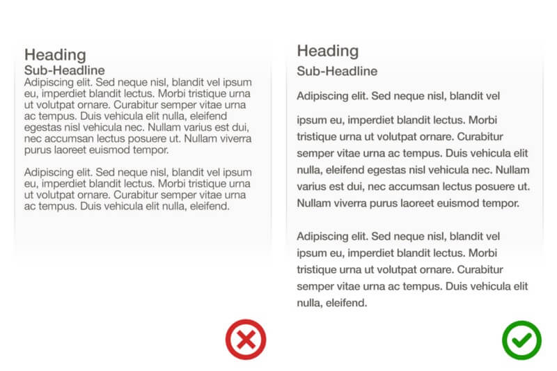
Image credit: Apple
Call-To-Action Button
Users should never have to look for call-to-actions — the primary CTA (e.g. “Add To Basket”, “Book Now”) should be the most prominent button on screen, and users eyes should naturally be drawn to it. Secondary CTAs (e.g. “Share It”, “Add to Wish List”) should be in close proximity to the primary CTA.

Squint Test for a Primary CTA
Use the squint test to see how prominent the button is. Simply squint and blur the page. Does the button stand out more than any other element? If the answer is no, then make it stand out by giving it a unique colour not used anywhere else on the page or make it larger and the text bolder.
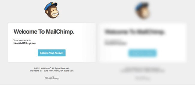
Squint test example
Primary CTA Button Is Sticky
It is good practice to have a call-to-action button above the fold. You should design primary call-to-action button to be persistently visible even when the screen is scrolled, by having it attached at the bottom of the screen. This makes possible to users to act at any given moment.

Hit Targets Are Large Enough
Make it easy for users to interact with controls by making all elements for controls (not only CTAs!) easily tappable:
- Android recommends controls have a touch target size of 48dp for on screen elements such as buttons, icons, tabs with icons, etc.
- iOS recommends tappable controls have a hit target of about 44 x 44 points.
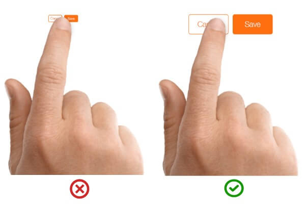
Image credit: Apple
Provide Visual Feedback After a Primary Action
When users add an item to the cart, lack of feedback can cause them to question whether the action has been processed.
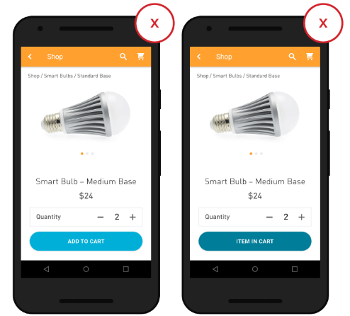
No visual feedback after an action, such as adding to cart, leaves users guessing as to whether it actually happen. Image credit: Google
Feedback acknowledges people’s actions. Apps that provide a subtle animation or another type of visual feedback eliminate this guesswork for the user.
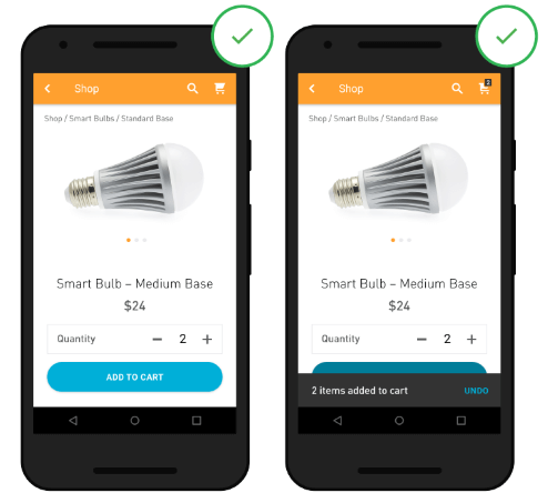
Clear visual feedback (here in form of a confirmation through a toast message) provides assurance that an action has happen. Image credit: Google
Conclusion
Each element on the product screen should be design in order to benefit the user. Keep in mind, when making a buying decision, users assess a product on both an emotional and a rational basis. Successful product screens speak to both — they are excite and reassure the user.
About the Author: Nick Babich is a software developer and author of a blog dedicated to usability


