A new spring is here, which is exciting because it means that we get to learn new things, try out new design tools, and simply have fun while doing what we love to do.
Looking back on 2018, it’s clear that user interfaces are getting more creative, more complex, and with design precision, unlike anything, we have seen in the past. And by the looks of it, 2019 won’t be a year of stagnant innovation either. There are a lot of exciting design trends to look forward to, especially if you work with mobile user interfaces.
Augmented Reality (AR), which was once a futuristic buzzword, has slowly but surely made its way to mainstream design trends. And we are going to see much more AR development in the coming years.
Likewise, Artificial Intelligence (AI) is expanding beyond chatbots and offers concrete solutions for creating deeply personalized user experiences.
All this and much more to be looked at in this in-depth review of mobile UI trends that are setting the tone for 2019.
We would love to hear about the mobile projects you are currently working on; what exciting technologies and new concepts are you applying to make your apps stand out? Let us know in the comments at the end of this article!
Augmented Reality: From Unfathomable to Practical
 This is a real photo taken from Google Maps newest AR integration, currently limited to private-alpha users. Photo credit: Nick Bastone
Google first introduced its plans for AR Maps back in 2018 during the Google I/O Keynote. Less than a year later, Google is starting to unveil its augmented reality tech for maps to a private subset of users.
This newest version of Maps uses your smartphone’s camera to augment the GPS in your immediate surroundings.
The camera can pick up the exact position of where you are and provide real-time augmented feedback on building locations and more.
At this point, AR Google Maps is no longer a question of if, but when.
Warby Parker: Try on a new pair of glasses directly from your phone
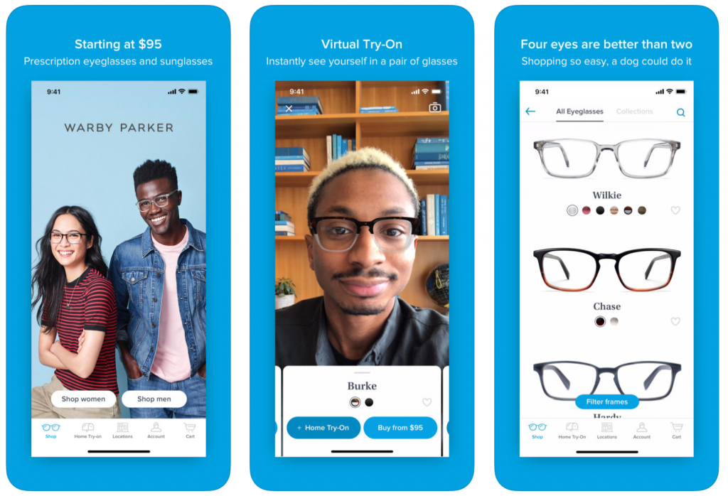
How wonderful, now you have more the reason never to leave the house!
All jokes aside, Warby Parker has been in the AI/AR business for a number of years, and the most recent update to their app introduces a new and exciting AR experience. You can try on glasses and see what they would look like on your face by merely using your phone’s camera!
Warby Parker calls it the ‘virtual try-on,’ which you can activate directly from the in-app dashboard. This is a huge deal for any product company that uses mobile apps to maintain a connection with their customer base.
Check out other brands such as King Children, Topology, Coty, and Ulta; all are actively developing mobile apps with AR tech that let you ‘try-on a product in a virtual environment.’.
Snapchat: More than just silly gimmicks
.@KingJames dunking at Foot Locker through Snapchat AR. 👀
📹 @keiths pic.twitter.com/feJCsn0cHM
— B/R Kicks (@brkicks) February 6, 2019
When you think of Snapchat, one of the first things that come to mind is its gimmicky emojis and overlays.
But, Snap is committed to more than just gimmicks. And this is evident by its strong presence in the AR circles all throughout this year so far.
The company is experimenting with AR-based billboards that can “come alive” when you point your phone’s camera at them.
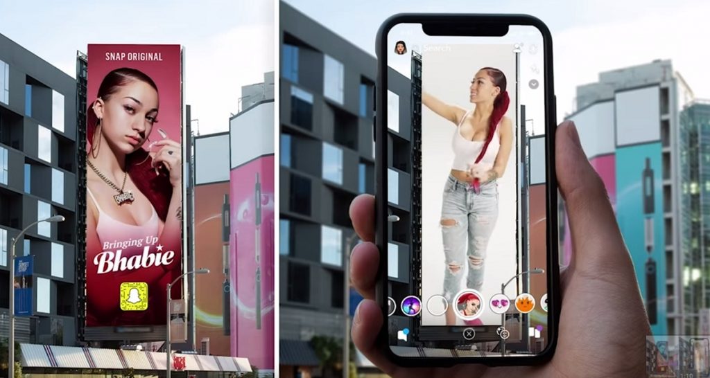
Reddit user mauricebagelstein got actual real-life video footage of this billboard, and you can watch it on the SnapLenses subreddit.
And because AR is such an emerging trend, there is a lot of potential for breakthroughs in “free advertising” so to speak. Come to think of it, Snap could use a little bit of that given its bitter stock market situation. Oops!
How to get started with AR for your next project?
Developing AR mobile apps was a costly venture as little as 2 years ago. But this is quickly changing, thanks to a flood of new AR frameworks and SDK’s becoming available to the general public.
ARCore (Google) and ARKit 2 (Apple) are two of the most popular development kits when it comes to AR development.
Amazon’s AR View app uses both ARCore and ARKit to deliver authentic AR experiences for iOS and Android users.
Additionally, you can check out the following frameworks:
Artificial Intelligence: Voice-based user interfaces
 Credits: Lina Leusenko
It’s kind of crazy to think that it has been less than a year since Google announced its Google Duplex project — an A.I. powered voice-assistant that can perform tasks such as booking a reservation at a hair salon.
Here is the announcement in case you missed it:
In November 2018 — Google started to roll out its Duplex service to a select subset of users who own the Google Pixel smartphone.
 Photo credit: Kyle Wiggers
Google Duplex isn’t the only assistant providing advanced voice-assistance capabilities.
In the fall of 2018, Microsoft announced that it has got a working version of a Neural Text-to-Speech (NTTS) service, which aims to help machines use human-like voice. And soon after, Amazon announced that it would be “upgrading” the voice capabilities of its Alexa smart speaker.
Just to give you an idea of the scope of this upgrade, here are the most recent samples of Amazon’s Alexa voice.
Sample #1: The default Alexa voice
Sample #2: Alexa voice using NTTS
The level of improvement is phenomenal, and Amazon says that this is only the beginning. The company has plans to introduce speaking styles for numerous industries and alternative niches.
Best of all, since this new tech is using neural networks for learning, there are virtually no limitations for the context that a machine could adapt its voice to.
Which brings us back full-circle to voice-based user interfaces:
- Could NTTS be used to capture the brand voice and tone in everyday app interactions?
- Could you adapt NTTS to provide an automated customer support service?
Surely we are going to be seeing apps that can interpret the tone of the customer’s voice and respond accordingly.
For example, an “angry” or “distressed” customer might need an “understanding” and “supportive” answer tone. And by the looks of things, it won’t be that long before this becomes a reality in many industries.
And, it’s not just the big tech giants with deep pockets that are innovating in the field of voice AI.
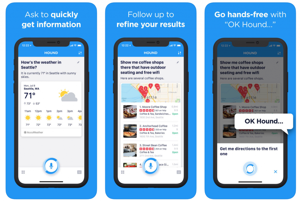
SoundHound, who mostly work with AI for in-car experiences, are now actively working on their smart assistant app HOUND, which is using their custom-built Houndify engine.
“Our Speech-to-Meaning™ engine delivers unprecedented speed and accuracy, while our Deep Meaning Understanding™ technology allows users to ask multiple questions and filter results all at once. With custom wake words and custom domains, you maintain your brand, and you keep your customers. It’s that simple.”
HOUND doesn’t just take requests for finding the nearest convenience store or a coffee shop. The app can help you book Uber rides, look up hotels, make travel arrangements, or find detailed information on the web.
The question is, how can you apply new AI voice technology inside your own mobile app user interfaces?
Rest assured, voice-based AI won’t be the only category of innovation in 2019. Big things are also happening in categories such as emotion recognition, image recognition, and machine learning for enterprise apps.
How to use AI in your next mobile app?
While voice-based AI is definitely going to dominating the innovation this year, it’s not the only area of artificial intelligence that’s seeing substantial growth.
Here’s the most popular AI tech that’s compatible with mobile apps:
- ML: Machine Learning. Fractal Analytics is helping brands understand their visual data through deep-learning. On top of that, you can use ML to understand text-data which can help to create deeply personalized UX.
- NLP: Natural Language Processing. Lexalytics can process big data from social media and provide an in-depth analysis of what people are talking about, their associated emotions, and why the conversation exists.
- IR: Image Recognition. Could the future of digital security lie in the hands of facial recognition? This is the path that SenseTime is trying to thread. The company offers comprehensive solutions for adding deep Image Recognition features to mobile apps.
If you would like to know more about using AI in mobile development, please leave a comment so that we know that there is interest in the topic.
In-App Gestures: A Powerful User Experience
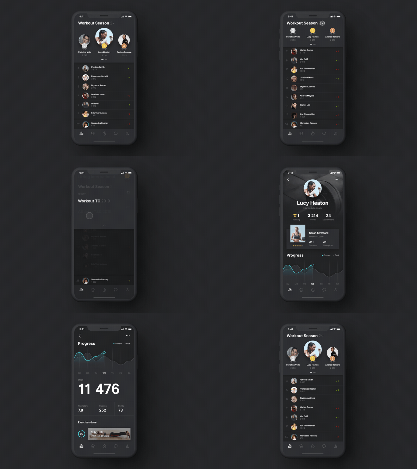 Credit: Shakuro
For years smartphone brands have kept trimming the availability of buttons on their devices. And most big brands — Apple, Google, Samsung — use only 2 or 3 buttons at most; volume up/down, and turn on/off. The home button seems to be a thing of the past.
And this is relevant to any mobile UI designer out there because the lack of buttons means users have to rely on the user interface to achieve certain tasks. With in-app gestures, you can hint at users what a specific button does, or how a certain action produces a specific result.
E.g. Swiping right to delete, or swiping down to view more.
Rolling out this week on the YouTube iOS app (for 6S phones & above)!
From your video player:
👈Swipe left for the next video
👉Swipe right for your previously watched videoIf you prefer, you can still tap for video player controls. More details here → https://t.co/ur4EiHCiii pic.twitter.com/Es2ExHl8m9
— TeamYouTube (@TeamYouTube) January 15, 2019
YouTube has a history of having a notoriously strict UI but looks like even YouTube is bowing down to the latest and greatest.
As of the beginning of the year, the YouTube iOS App supports swipe gestures to move between videos. All of us Android users have to hang tight!
Animations: Not Just Cool, Amazing!
 Credit: Tubik
The first impression counts, so making it as delightful as possible is high up on the priority list. And, since most apps start with an onboarding process, it makes sense that it would also be the place where you begin adding animated content.
The digital representation of the real world, even though tweaked, has to rely on the same perception habits as real objects to avoid being misleading and confusing to users. If we incorporate objects that change their state depending on the user actions, they have to move and transition in a natural or augmented way.
Any new design idea and concept seems extremely enticing at first, as was modern animation when it first came to mobile apps.
But, this is not about “cool effects” or “being better than X.” Instead, you can use animation to engage your users on a fundamentally deeper level.
Prezi released its annual “The State of Attention Report,” in which 79% of the respondents said that “The use of animated visuals is effective in keeping the audience engaged.”
And if you are wondering about the above animation, it’s taken from the Liquid Swipe project page. Liquid Swipe is an open-source project from Cuberto, which lets you add an exciting animation experience to your app.
Content-Oriented Interfaces
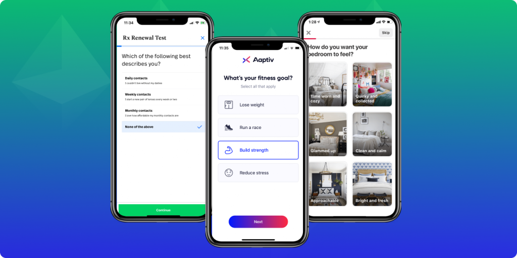
Is there a place for colorful, creative, and inspiring mobile UIs? Absolutely! But, no matter how close or how far you take it — users will always prefer content-first over visual expression.
Can you imagine many of the modern apps today without the use of the Hamburger menu? What would the UIs look like when the top of the page is nothing but a sea of links?
The primary challenge of unembellished designs is that they pose the threat of being similar or “repetitive” to what already exists on the market. You don’t want every app looking the same.
So, if over-the-top illustrations and color blends are out of the question, what can designers use to make content-first designs feel unique and engaging?
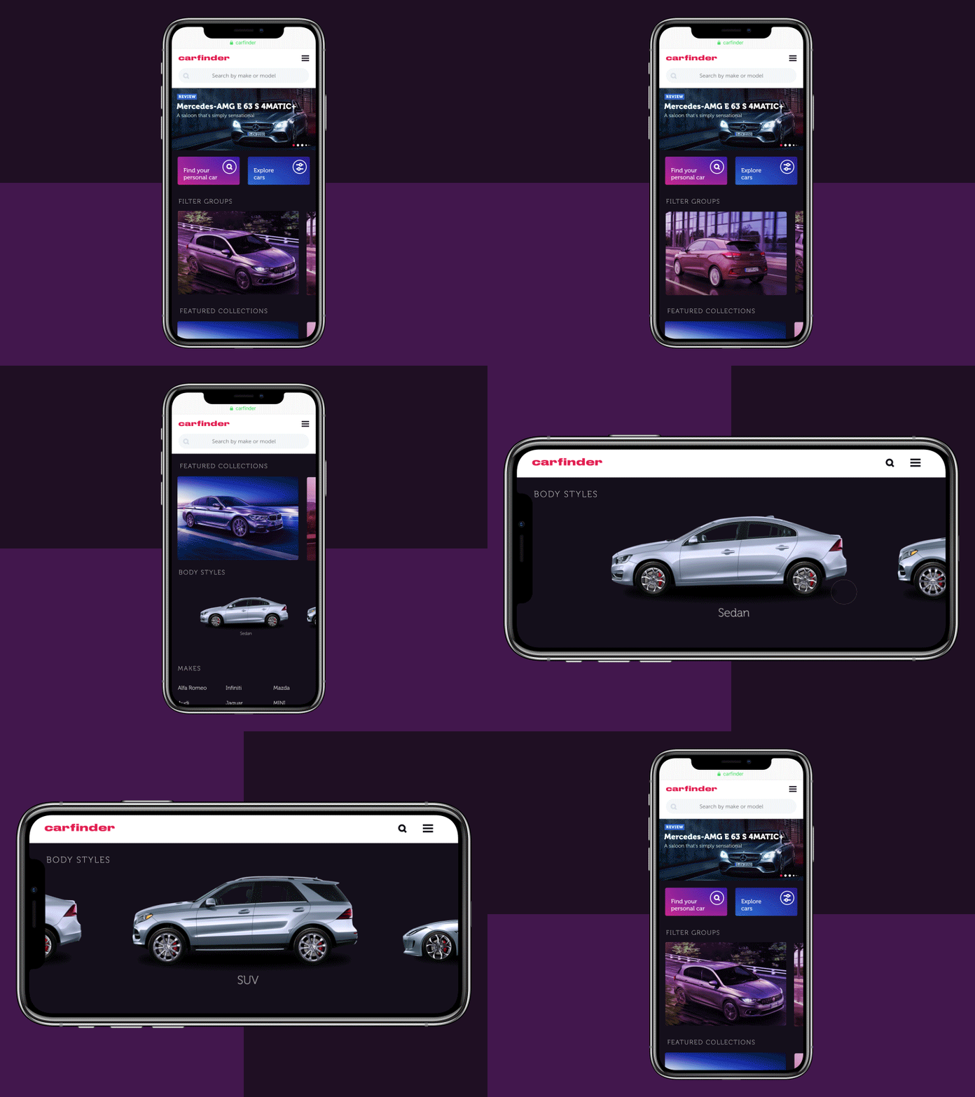
In the current era, many popular apps are turning their designer efforts to typography, font icons, and photography. Pinterest, SimpleContacts, and Aaptiv (image above) are great examples of a mobile app UI based on content-first principle.
Microinteractions
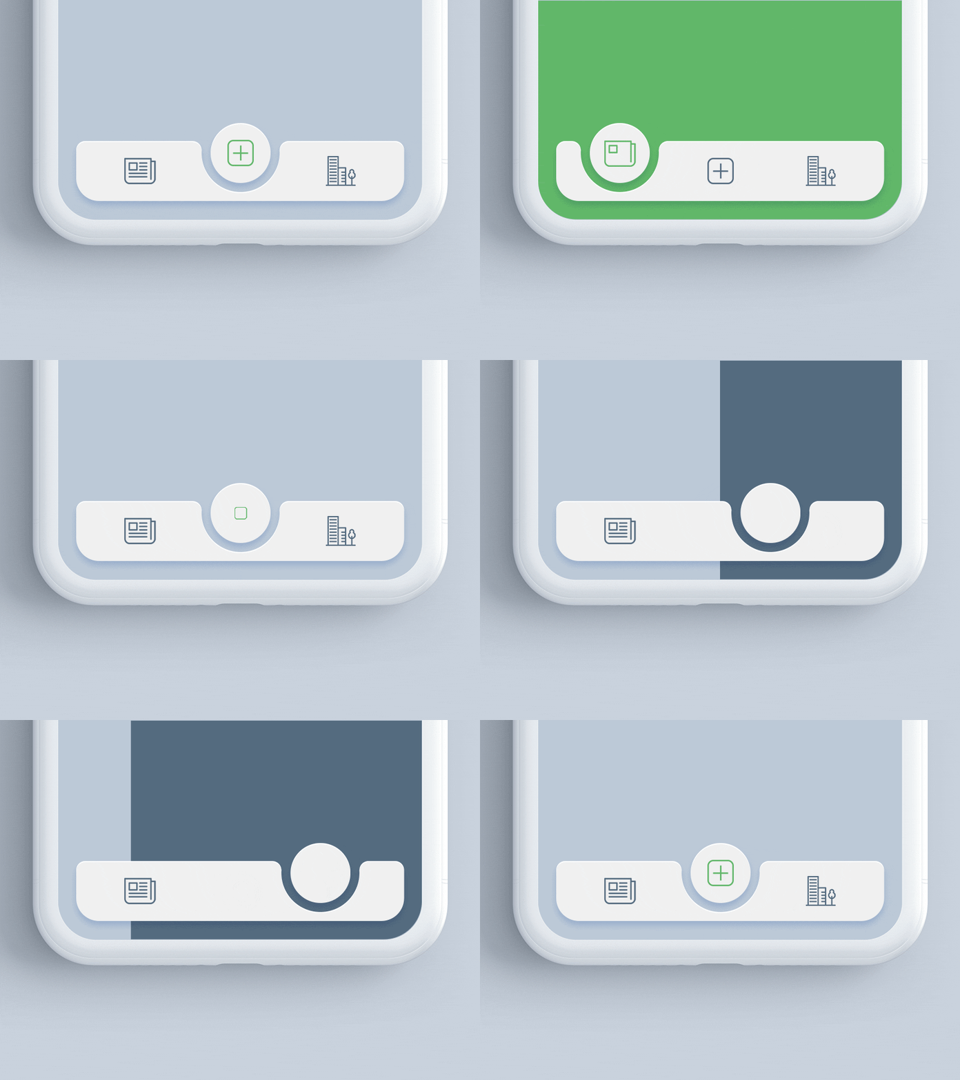 Credits: Midinventory
Microinteractions are a great way to bring your apps to life. Without the use of motion design, apps feel like static websites, which are not fun when you are trying to deliver a great user experience.
A microinteraction that everyone is familiar with is the “swipe down to reload a page” feature that mobile users have adapted to. This is a well-known feature, but what about other types of animations you can add to your apps?
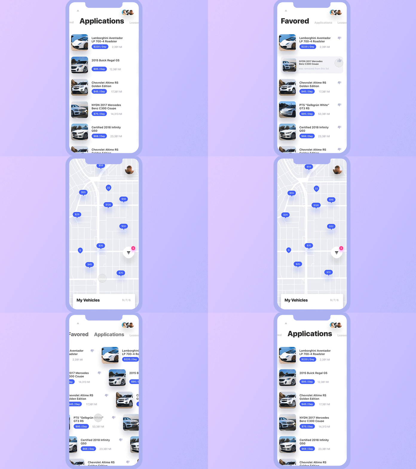 Credits: Yaroslav Zubko
Rather than loading elements all at once, experiment with cascading effects. The goal is to keep the users focused and attentive to the app experience.
And adding such micro-interactions is surprisingly easy if you use the right software. Right now, most designers are relying on Framer, After Effects, and ProtoPie. If you use others, let us know in the comments!
Conversational Interfaces
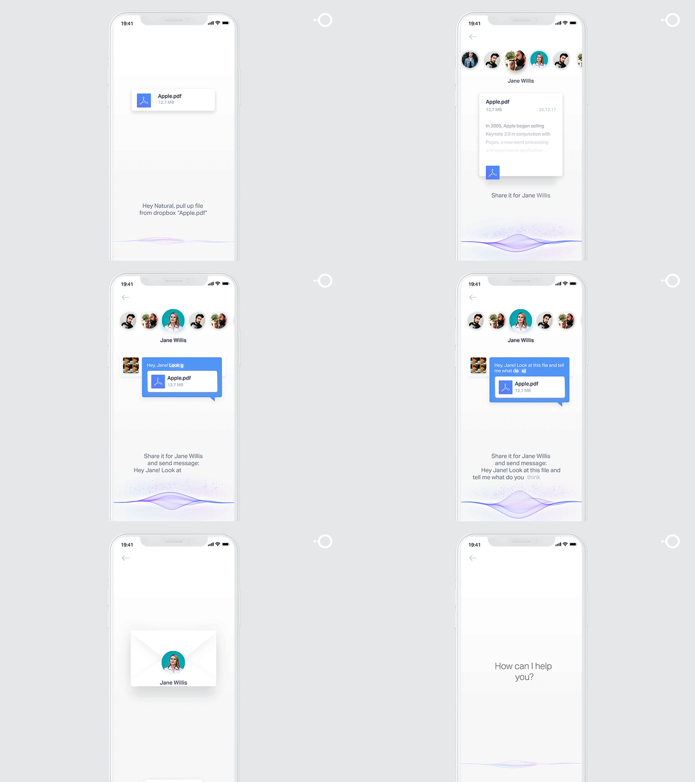 Credit: Gleb Kuznetsov
You are right to think that chatbots won’t replace live customer support any time soon, but this hasn’t stopped the innovation in this highly popular mobile UI trend.
Chatbots can make a sale when nobody is there to answer a critical question. In a world of goldfish attention span, users hate to sit around and wait when they can just fire up Google and find an alternative in seconds.
And both big and small names are investing heavily in their mobile apps to give users a true chatbot experience.
AirAsia redid their entire digital strategy and came up with two brand new designs (desktop & mobile), and their app now supports “guest inquiries” through a chatbot. AirAsia says their chatbot can understand up to 8 languages at the time of release.
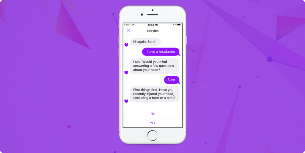
Babylon Health serves hundreds of thousands of users, and their goal with chatbots is to give everyone access to a ‘digital doctor’ that sits in their pockets.
As a user, you can use the conversational interface to look up symptoms, get medical information, and potential suggestions. Further, users can use the chatbot interface to build upon their query to get as accurate of an answer as possible.
And the company has fired back at critics who say that ‘Chatbots’ are not fit to provide medical advice. Babylon Health spends enormous amounts of money on its Artificial Intelligence program.
If you don’t have the development budget to implement a native chatbot experience, you can always try any of the following products:
Closing Words
It’s going to be an interesting year for anyone working with mobile UI’s on a daily basis. Who knows how far will AR/AI have come by the end of the year?
It’s highly likely that many brands are already actively working on new innovations, so keep an eye out on the latest tech news feeds.
And as the technologies advance, so will the need for new design methods.
About the author: Alex Ivanovs is a digital marketing specialist with a knack for writing, UX design, and all-things success. Visit his website Stack Diary.
Title image by Tran Mau Tri Tam
Read about design for voice interfaces, check top logo design trends of the year and learn what’s accessibility of user interfaces.


