Apps are now a mainstream, trusted way to deliver content and services. But in a crowded market, how does a mobile app become useful, relevant, and valued so it delights and retains users?
Here are 7 UX design tips that I think are key for creating really great mobile user experiences.
1. One Screen, One Task
Reduce the effort users have to put in to get what the want
Every screen you design for the app should support a single action of real value to the person using it. Design each screen for one thing and one thing only, with no more than 1 call-to-action. This makes it easier to learn, easier to use, and easier to add to or build on when necessary.
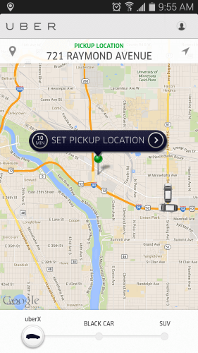
Take Uber, for instance. Uber knows that the goal of the user who uses the app is to take a cab. The app does not overwhelm the user with too much of information: it automatically detects users location based on GEO data and the only thing users have to do is to select a pickup location.
2. Invisible User Interface
Content becomes an interface
Focus on the content and remove unnecessary elements that does not support user tasks. Thanks to the reduced attention span, users should be guided to the content they’re looking for, quickly. Content becomes an interface. Google Maps is a great example — during a redesign phase Google removed all the unnecessary panels and buttons and Google said that the map is the interface.

3. Breathing Space
Use negative space to draw attention to important content
White space or “negative space”, referring to the empty space between and around elements of a design or page layout, is often overlooked and neglected. Although many designers may consider it a waste of valuable screen estate, white space is an essential element in mobile design.
“White space is to be regarded as an active element, not a passive background,” — Jan Tschichold
Not only is white space responsible for readability and content prioritization, but it also plays an important role in the visual layout. Thus, it can simplify UI and improve UX.
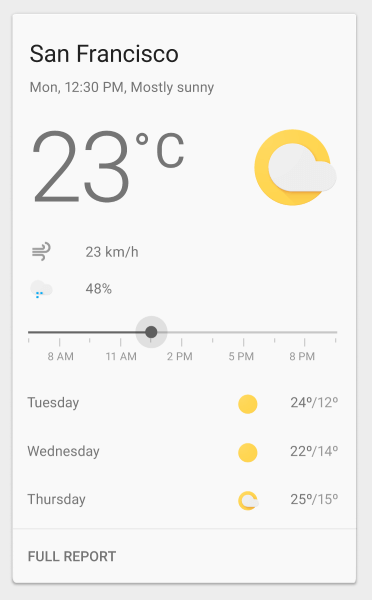
Follow “less is more” principle in your designs. Image credit: Material Design
4. Navigation Made Simple
Make navigation self-evident
Helping users navigate should be a high priority for every app. Mobile navigation must be discoverable, accessible, and take little screen space. However, making navigation accessible is a challenge on mobile due to the limitations of the small screen and to the need of prioritizing the content over chrome.
Tab bars and navigation bars are well suited for apps with relatively few navigation options. They are great because they display all major navigation options and with one simple tap user can instantly go from one page to another.
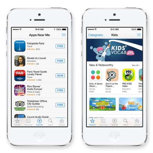
Tab bar navigation in Apple AppStore
5. One Hand Operation
Adapt your design to the bigger screens
With the release of the iPhone 6 and 6 Plus it’s become clear that screen sizes are going to keep expanding.

Here are three basic ways of how people are holding their phones:
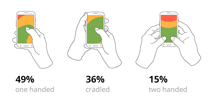
Basic ways of how people are holding their phones. Research by Steven Hoober
85% of observed users working with their phones using one hand. The following heat map shows sorts of the thumb zones applied to every iPhone display size since 2007. You can see that the bigger the display is, the less easily-accessible zone is.
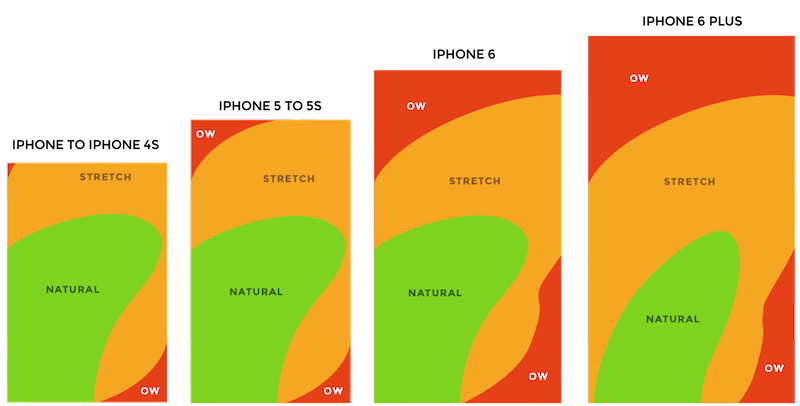
Thumb zones. According to the observation by Scott Hurff
It’s necessary to adapt a design to improve the user experience. Try to make sure that your app can be easily (and fully) be used on a large screen (such as iPhone 6 or 7) with one hand. Place navigation options within the thumb’s reach.
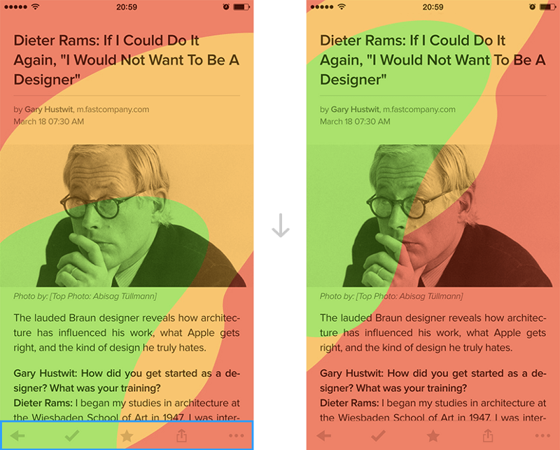
Pocket app for iOS. All the navigation controls are in the footer. They can be easily reached in case you hold your phone normally. Image credit: Dmitry Kovalenko
6. Make App Appear Fast
Don’t make users wait for content
Try as much as possible to make the app fast and responsive. Do things in the background to make it look like actions are fast. Actions that are packed into background operations have two benefits — they are invisible to the user and happen before the user actually asks for them. A good example of this is uploading pictures on Instagram. As soon as the user chooses a picture to share, it starts uploading.
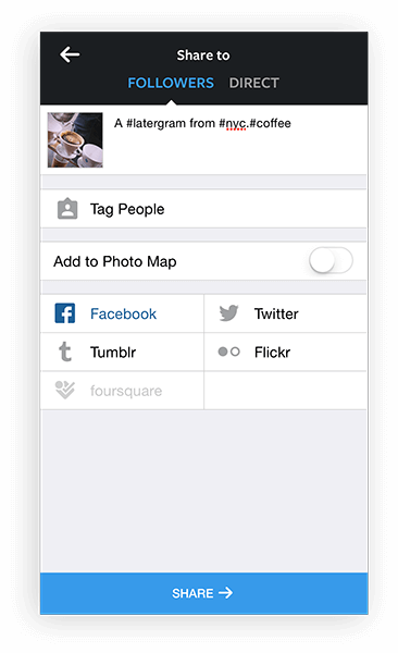
Instagram invites the user to add tags as the picture uploads in the background. By the time when users are ready to press a share button, the upload will be completed and it’ll be possible to share their picture instantly.
7. Use Push Notifications Wisely
Think twice before sending a message
Every day, users are bombarded with useless notifications that distract them from their day-to-day activities and it gets downright annoying. Annoying notifications is the #1 reason people uninstall mobile apps (71% of respondents).

Mobile is all about making every message count. Don’t send notifications “for the sake of engaging them”. Send them if and only if you think they are valuable to the user.
Tips: The best way to establish an effective mobile app messaging strategy is to use different message types — push notifications, email, in-app notifications, and news feed messaging. Diversify your messaging — your messages should work together in perfect harmony to create a great user experience.
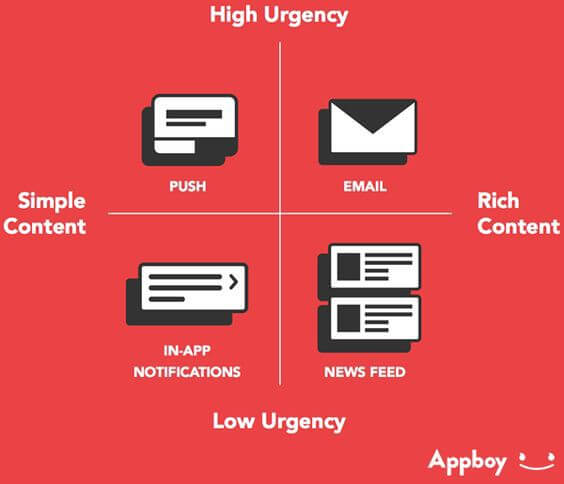
Select proper notification type based on urgency and content. Source: Appboy
Conclusion
The most important thing to keep in mind when designing a mobile app is to make sure it is both useful and intuitive. If the app is not useful, it has no practical value for the user and no one has any reason to use it. If the app is useful but requires a lot of time and effort, people won’t bother learning how to use it. Good UI and UX design address both design problems.
About the Author
About the Author: Nick Babich is a software developer and author of a blog dedicated to usability
Main image credit: Segue technologies


