Picture this scenario: a big product launch is coming up tomorrow and you just remembered that you need to promote your new offering on social media. So you call up your go-to designer and ask if they can come up with a marketing graphic for you in the next 24 hours. But you’re out of luck. Your designer is completely swamped, so you’ll have to find another way to get the job done …
Luckily, you don’t need to be an expert in graphic design to produce marketing graphics in a pinch. All you need is a little basic know-how and some free tools. The result might not be the same quality your designer can give you, but it will be good enough.
The following DIY marketing design tips cover some basic principles, resources, and free tools you can use to produce brilliant marketing designs (without Photoshop or Illustrator).
DIY Tip #1: Use lots of white space
White (also called negative) space is the unmarked space around or between the elements of a design.
When designing graphics for marketing campaigns, less is often more. In other words, the more empty white space, the better. Cramming too much stuff into a single design makes it hard for the user to focus on what’s important.
 Apple is notorious for their great use of white (in this case, black) or negative space. Notice how this clean design focuses your attention on what matters – the big screen.
It can be tempting to fill your designs with all the relevant information you can think of. Avoid the temptation: use white space to focus attention on the key design elements.
Using lots of negative space will help with mobile design optimization too since designs that look cramped on desktop devices will look even more cramped on mobile devices.
DIY Tip #2: Use readable and stylish fonts
Graphic designers use the term typography to refer to the technique of positioning and styling type. It’s a complicated mix of science and art, but you only need to understand the basic idea of how to balance readability with style.
Stylish fonts tend to be harder to read, so you want to use them in moderation. A good compromise is to use stylish fonts for large headers and readable fonts for small body text.
In total, you shouldn’t use more than 2-3 fonts in a single design: one for your headings, one for body text, and (if applicable) one more for special elements.
Most design applications or tools come loaded with fonts. But if you can’t seem to find one you like, websites like Google Fonts and Urban Fonts let you download tons of new fonts for free.
DIY Tip #3: When choosing colors, contrast is king
Colors have a big impact on emotions, so it’s important to choose combinations that work well together and don’t clash. But don’t worry: the principles of color selection are surprisingly simple. It’s all about choosing a high-contrast color scheme.
Using contrast helps focus attention on what matters most, like a particular phrase or word, product image, price, etc. It’s good practice to simply choose colors on opposite sides of the color wheel (see the image below).
 A simple color wheel. Source: Wikimedia Commons
A complementary color scheme will have two colors with the highest possible contrast (e.g. red and green or orange and blue).
 The blue hand contrasts sharply with the yellow/orange background. (Source: Jason Travis Design for MailChimp)
Simpler designs will feature two shades of the same color to focus your attention on certain key elements, mixed with black or white for less important design aspects.
 The designers at MailChimp are masters of color-matching.
It’s a good idea to limit yourself to three or four colors. Any more and your design will begin to look too busy, which can be distracting.
If you’re not sure which color to start with and need some inspiration, visit Color Hunt, where you’ll find lots of color palettes made by professional designers.
DIY Tip #4: Use free art and stock photos
You don’t need to start every design from scratch. Start your marketing graphic by grabbing at least one graphical element or image from a website where artists and graphic designers share their work for free.
Here’s a list of resources to get you started:
Free stock photos
- Flickr is a great place to find work from skilled photographers. Many photos can be reused with the artist’s permission.
- Unsplash is another growing community of photographers who offer their photos for free.
- Moose Photos is also worth a look. Here you can find unique stock photos for various themes that work together perfectly.
- Stock.xchg is a well-organized website with high-quality images that can rival most paid databases.
If you’ve checked all the above sites and still haven’t found anything, try everystockphoto, where you can search through multiple free stock photo sites at once.
Free graphic design elements
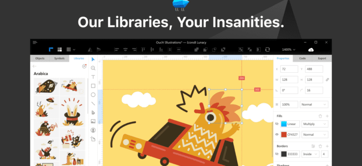
- Check Ouch, a big library of free vectors features tons of well-drawn illustrations in various styles.
- You can browse the Icons8 library, featuring more than 90,000 free flat icons.
DIY Tip #5: Use free design software to put it all together
You no longer need Photoshop or Illustrator skills to produce stunning marketing graphics. There are lots of free graphic design tools you can use. Below are two of the best options available.
Canva
One of the best tools on the market is Canva. It’s more than just an image editor: it also has a built-in color palette tool, font picker, collage maker, infographic maker, and it features many free design elements, images, and fonts.
 Just a small sample of the types of designs you can create with Canva.
Canva works in your web browser (they also offer iOS and Android versions with limited functionality) and their visual, drag-and-drop editor is super-easy to use. You can do most things in Canva for free, but you can also choose to upgrade to a paid plan for more functionality.
Inkscape
Another great option is Inkscape. It’s a completely free graphic design software that’s easy to learn and offers all the basic functionality you’ll need, as well as some advanced features that may come in handy as your skills improve.
 Inkscape is more advanced than Canva, but still highly user-friendly.
Inkscape is a viable alternative to Illustrator for people who don’t have much advanced graphic design experience. You can use it for simple print and web designs, but also for more advanced artwork.
You can save your work in SVG format (which is compatible with most other graphic design programs) and even import Adobe Illustrator files.
Inkscape is available for Windows, Mac OS, and Linux.
Conclusion
Designing graphics for marketing campaigns is possible without much pain. You can try doing it with the help of the tips discussed in this article. Mind that it may not look that original as if done by professional designers still the strategies may cover some basic needs that do not strive for expensive and time-consuming design solutions.
Here’s a quick summary to get you started with your next DIY design project:
- Keep it simple. More white space is usually better.
- Balance readability and style. Reserve stylish fonts for headers and use readable fonts for body text.
- Don’t reinvent the color wheel! Use contrasting and complementary colors.
- Don’t start from scratch. Use the free stock photo and art websites listed above.
- Use simple design software like Canva or Inkscape.
About the author: This is a guest post by Alexa Lemzy, customer support expert and blog editor at TextMagic, a business text-messaging service for sending notifications, alerts, reminders, confirmations, and SMS marketing campaigns.
Title photo by Moose
Check the handy lists of free graphic design software and free vector tools and learn how to use icons on landing pages.
Have an interesting article to share with our readers? Let’s get it published.


