Unlock the secrets of compelling login & sign-up page design. Discover practical tips for balance, engagement, and user-friendly interfaces.
Log in and sign-up pages are more than functional necessities; they set the stage for user experience. This article dives into practical design and illustration tips for creating impactful login and sign-up pages.
We’ll cover essential elements, from layout and typography to selecting and using illustrations effectively. Whether you’re refining a login page UI or brainstorming a sign-up page design, these insights will help elevate your work. Let’s get started.
Effective ‘Log in’ and ‘Sign-Up’ page examples
Drawing from my experience in UI design, here are critical elements and insights for crafting an effective login page:
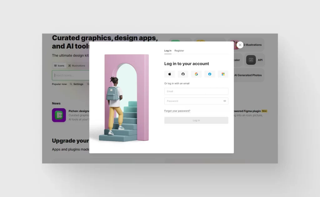
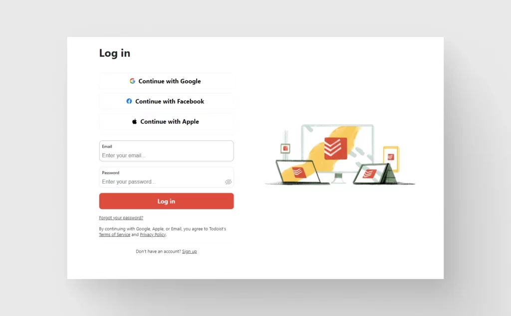
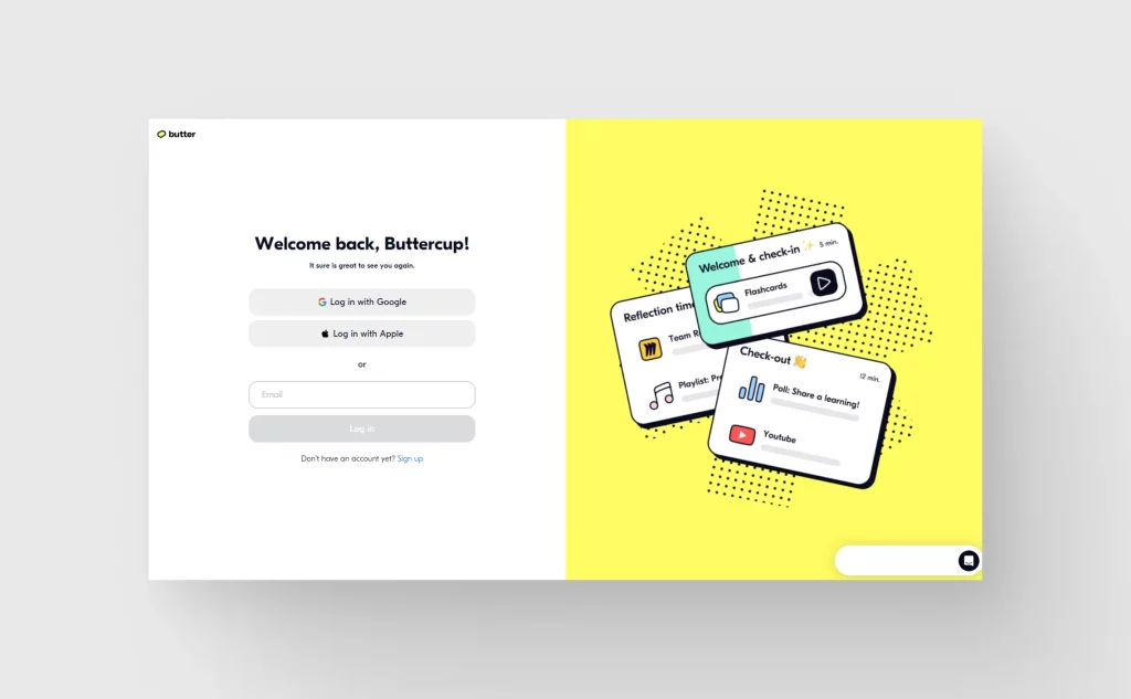
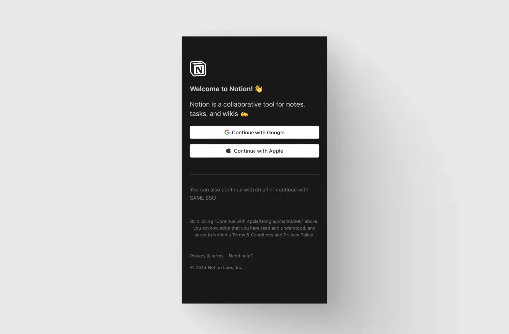
Minimalist layout: A minimalist approach works best. Prioritize functionality by focusing on the essentials – username and password fields, login button, and options for password recovery or account creation. Use whitespace strategically to guide the user’s eye.
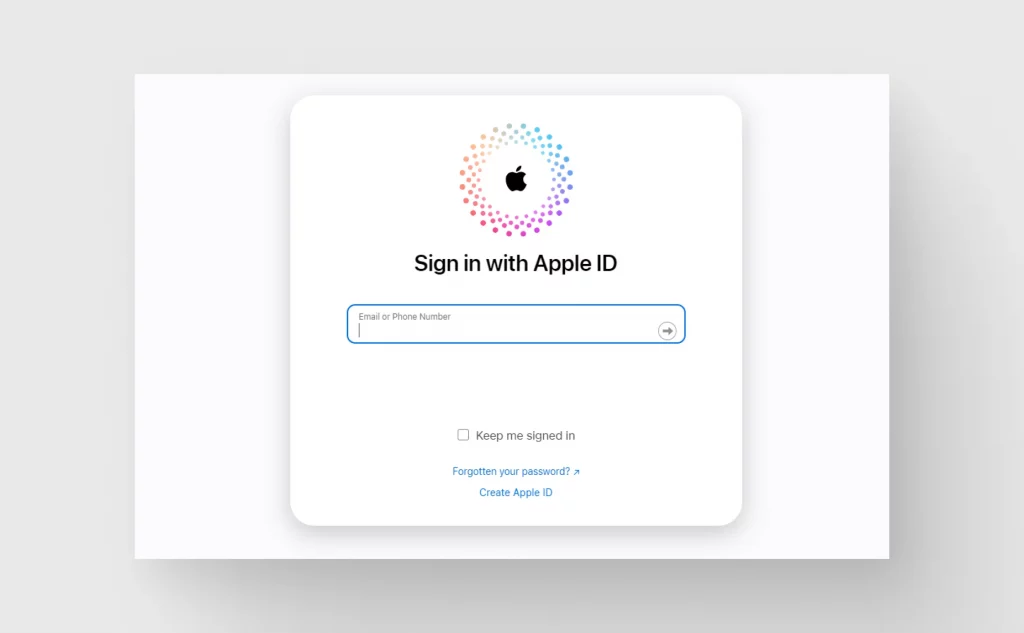
Intuitive input fields: Make sure input fields are intuitively understood. Labels should be clear, and placeholders can provide example inputs. Consider floating labels that animate when the user engages with the field, offering both guidance and a clean aesthetic.
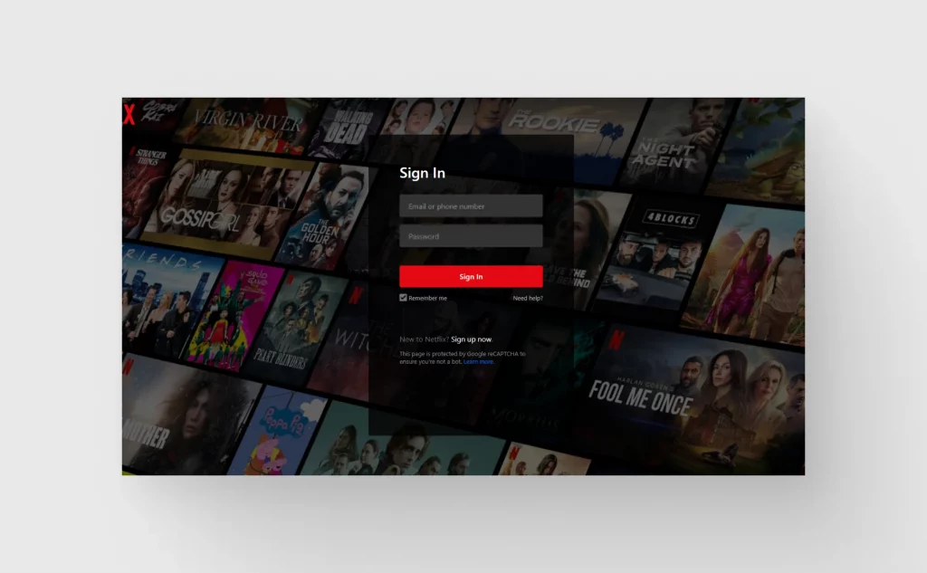
Button design: The login button should be immediately noticeable. Use a color that stands out from the layout but still aligns with the brand palette. For interactivity, add subtle animations or changes in color on hover or click, which can be achieved with CSS transitions.
Responsive typography: Typography must be readable across devices. Try using relative units like ‘rem’ for font sizes to ensure scalability and readability. Remember, your typography conveys the tone of your brand, so choose a font that aligns with your brand identity.
Color psychology: Colors evoke emotions. For instance, blues are often associated with trust and security, making them a good choice for financial applications or social media. Use color psychology to your advantage but also ensure sufficient contrast for readability and accessibility.
Mobile-First Design: Start designing for the smallest screen first. This approach forces you to focus on the essentials. Make sure tap targets are large enough for easy interaction on touch devices.
Load Time Optimization: Every second counts. Optimize images and use modern image formats like WebP. Minify CSS and JavaScript files to reduce load time. Lazy loading of non-critical assets can also enhance performance.
Error Handling and Feedback: Clearly communicate errors in input fields. Use inline validation to give immediate feedback. For instance, changing the border color of an input field to red can indicate an error.
Consistency with Branding: The login page should be a natural extension of your brand. Use brand colors, logos, and style in a way that’s consistent with the rest of your digital presence.
These elements are the foundation of a strong login page design. Balancing aesthetics with functionality is key, always keeping user experience at the forefront.
Leveraging illustrations for user engagement
Incorporating illustrations in login and sign-up pages can significantly enhance user engagement. Based on my experience in UI design, here are strategies to effectively use illustrations:
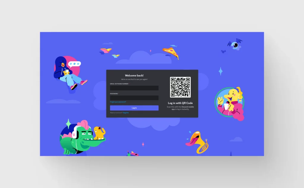
Choose relevant imagery: Pick illustrations that resonate with your brand and the purpose of the page. For example, use playful illustrations for creative platforms or more formal and abstract designs for corporate sites.
Balance with layout: Illustrations should complement, not overwhelm, the login interface. Place them strategically to draw attention but not distract from the main action points like input fields and the login button.
Consistent style: Ensure that the illustration’s style aligns with your overall brand identity. Consistency in style and color palette strengthens brand recognition and enhances the user experience.
Interactive illustrations: Interactive elements can make the login process more engaging. Consider subtle animations that respond to user actions, like a character waving when a user clicks the login field.
Cultural sensitivity and inclusivity: Choose or design illustrations that are culturally sensitive and inclusive. Representing a diverse range of users can make your platform more welcoming to a broader audience.
Optimize for performance: While illustrations enhance aesthetics, they shouldn’t compromise the page’s performance. Use optimized, web-friendly formats like SVGs for scalable and lightweight graphics.
Use as Visual Cues: Illustrations can also serve as visual cues guiding users through the login or sign-up process. For instance, an illustration of a lock could intuitively signify the password field.
Mood Setting: Illustrations are excellent for setting the mood or tone of the user experience. A calming illustration can ease the sign-up process, while a vibrant and energetic one can excite the user about what’s to come.
Testing and Feedback: Regularly test different illustrations and gather user feedback. A/B testing can be particularly effective in determining which illustrations resonate best with your audience.
Update Regularly: Keep your illustrations fresh. Updating them periodically can re-engage returning users and show that your site or app is actively maintained.
Common challenges in ‘Login’ page UI design and how to overcome them
Navigating the complexities of login page UI design involves tackling several common challenges:
- Balancing aesthetics and functionality:
- Challenge: Creating a visually appealing design that doesn’t sacrifice ease of use.
- Solution: Adopt a minimalist approach. Use clean lines, and ample whitespace, and limit the use of colors and fonts. This ensures the page is not only attractive but also user-friendly.
- Responsive design across devices:
- Challenge: Ensuring the login page functions seamlessly on various devices, from desktops to smartphones.
- Solution: Employ a mobile-first design strategy. Use responsive frameworks like Bootstrap or Foundation to guarantee consistency across different screen sizes.
- Security concerns:
- Challenge: Incorporating robust security measures without compromising the user experience.
- Solution: Implement features like two-factor authentication or CAPTCHA in a user-friendly way. Use clear, concise messaging to educate users about security features.
- Brand integration:
- Challenge: Effectively incorporating brand elements without cluttering the page.
- Solution: Use brand colors and logos strategically. Ensure these elements are present but not overpowering. The focus should always remain on the user experience.
- User error handling:
- Challenge: Dealing with user input errors without causing frustration.
- Solution: Provide clear, immediate feedback for errors in a non-intrusive manner. Use inline validation to guide users through correcting their mistakes.
- Page load time:
- Challenge: Maintaining a fast load time despite the inclusion of high-quality visuals or security protocols.
- Solution: Optimize images and use SVGs where possible. Minimize HTTP requests and use efficient, compressed code to keep the page lightweight.
- Accessibility:
- Challenge: Ensuring the login page is accessible to all users, including those with disabilities.
- Solution: Follow Web Content Accessibility Guidelines (WCAG). Use ARIA roles and attributes, ensure keyboard navigability, and provide alternative text for images.
By systematically addressing these challenges, designers can create login pages that are not only aesthetically pleasing and on-brand but also functional, secure, and accessible to a diverse user base.
Wrapping up
Crafting effective login and sign-up pages hinges on simplicity, functionality, and user-centric design. Utilize resources like Icons8’s Ouch! wisely, ensuring they align with your brand and enhance user experience.
Address challenges like responsive design, security, and load times with practical solutions. The key is to create an interface that’s not just visually appealing but also intuitive and welcoming. Keep iterating based on user feedback, and always prioritize the ease and satisfaction of your users. That’s the secret to designing login and sign-up pages that work well and stand out.
Check out our articles about ‘About us‘, ‘404 Not Found‘ page designs.

