Animation is a hot point in the app or website development: some say that it overloads the screens and pages while others show how helpful it is for users. Anyway, today most users expect the motion in the interfaces as a must. Let’s see what types of UI animation are popular and widely used and how they may influence user experience. Traditionally, with a big pack of examples.
Loading and Progress
This is perhaps one of the most diverse and numerous group of UI animations. It aims at informing a user about the progress they have with the app or website. It’s hard to imagine something worse than waiting without understanding what’s going on – loading and progress animations solve this problem. For example, a pull-to-refresh animation shows that the page is reloading the content. Progress bars inform how far the user is into the process and if the completion is close.
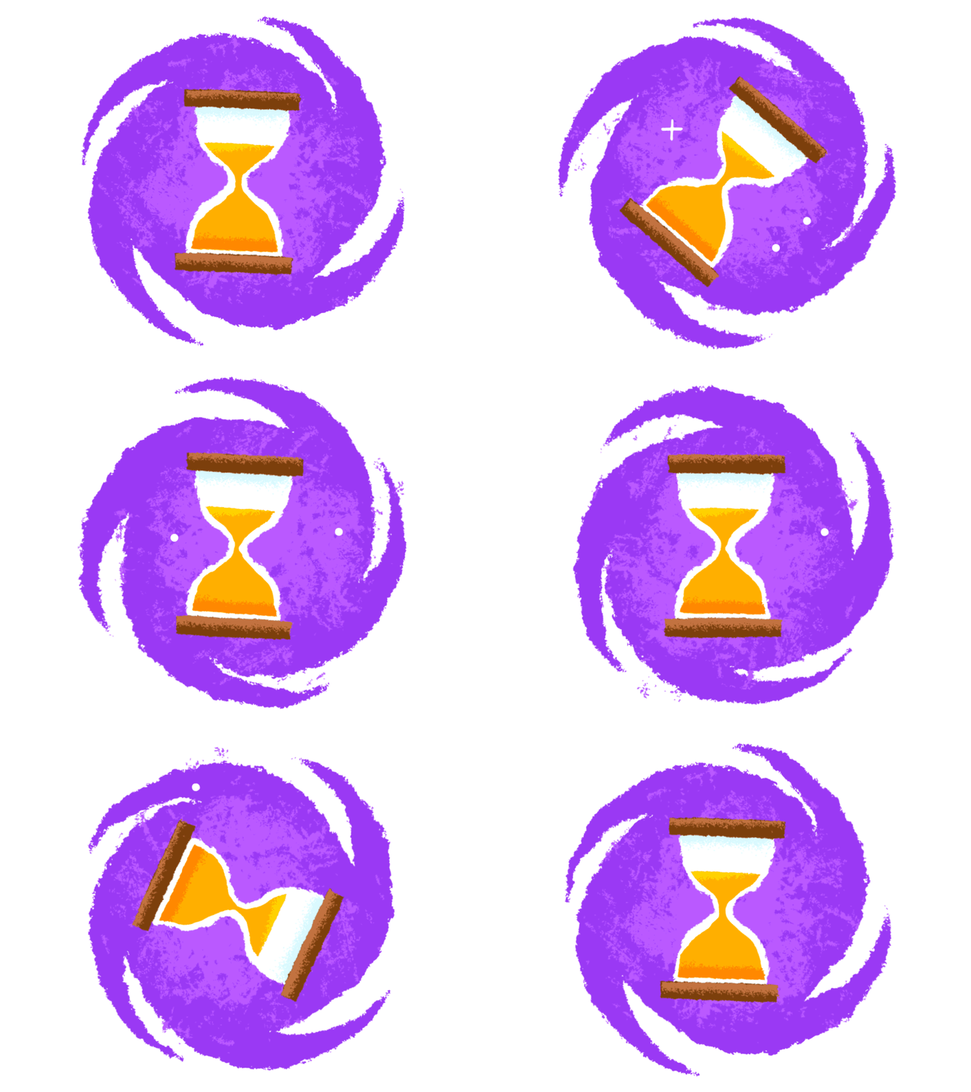
Bright loading animation by the Icons8 team imitates the well-recognized image of the sandglass often associated with waiting.
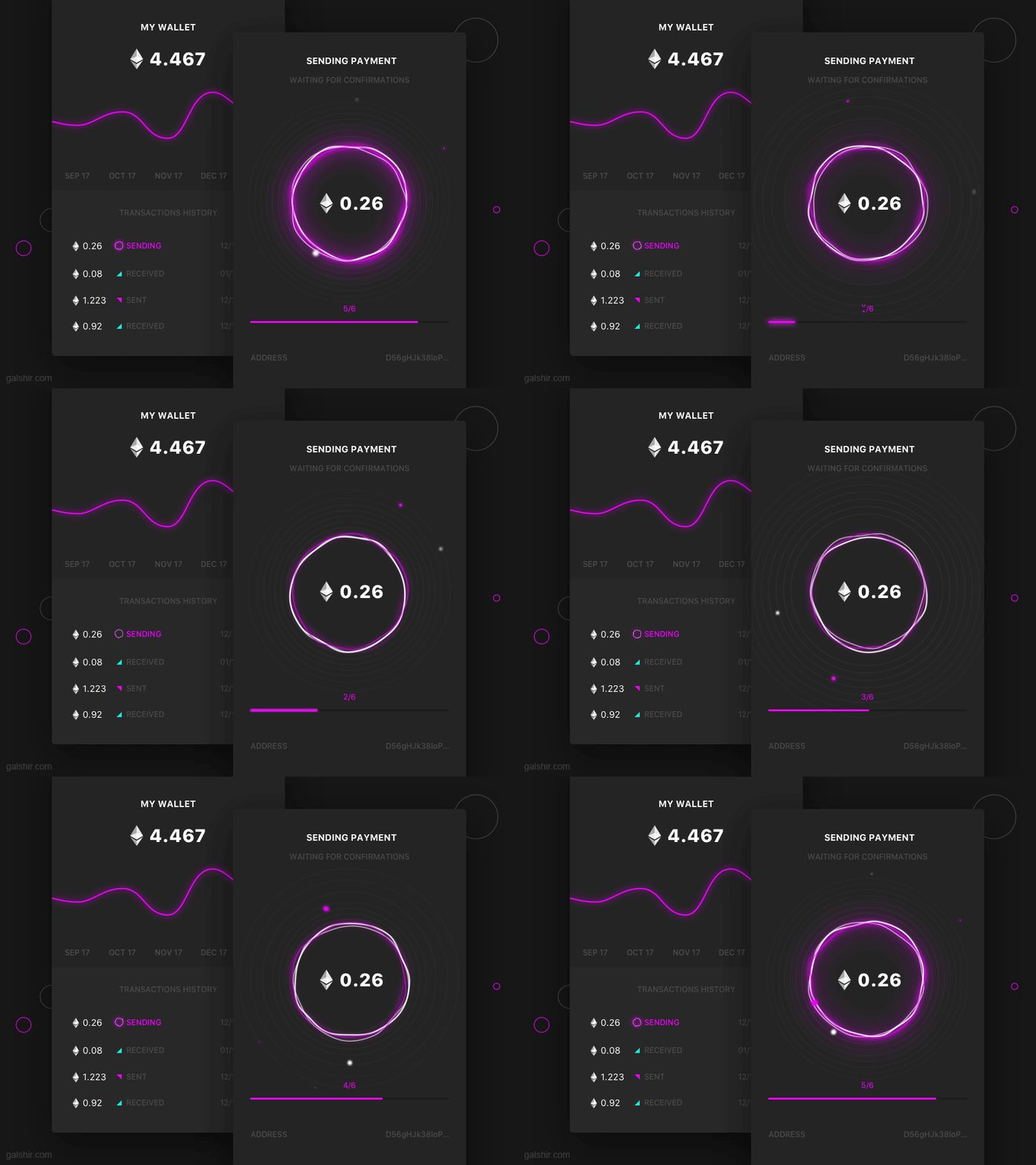
This concept by Gal Shir shows the process of payment confirmation: while the user is waiting, the progress bar is being filled to make it clear. The animated circles on the screen also create the feeling of the active process.
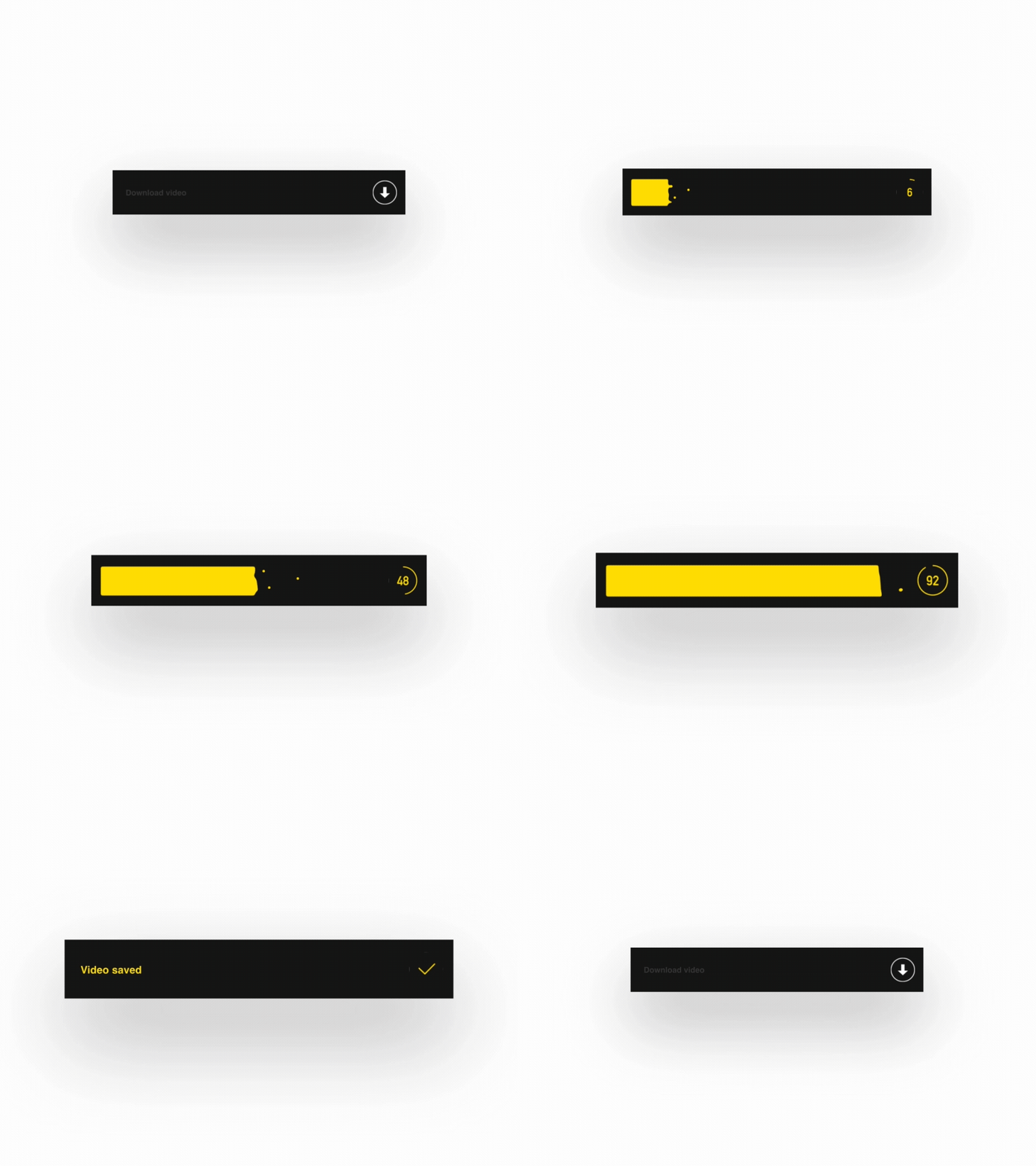
Progress bar animation by Dimest is based on catchy color contrast and special effects of small particles added to the main part. The counter on the right part of the bar also features the progress percentage.
This type of animations navigates the user through the interface. It gives the prompts that some layout elements are clickable, swipeable, pullable or tappable. For example, when something in the web interface layout is animated on hover. It draws users’ attention to the core elements of interaction this way strengthening visual hierarchy and intuitive navigation.
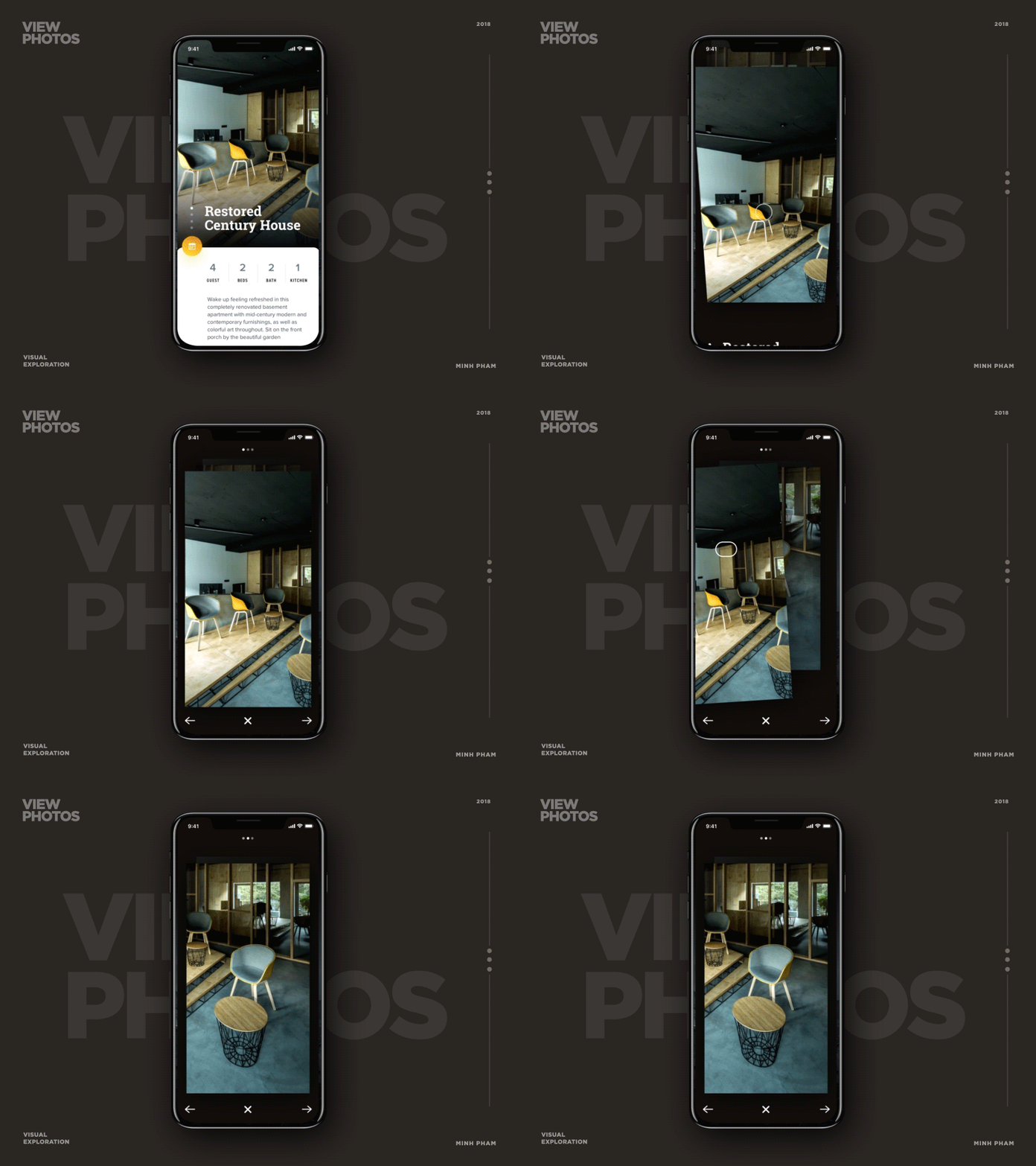
This mobile concept by Minh Pham features the slight animation of the photo that prompts the user it is movable.
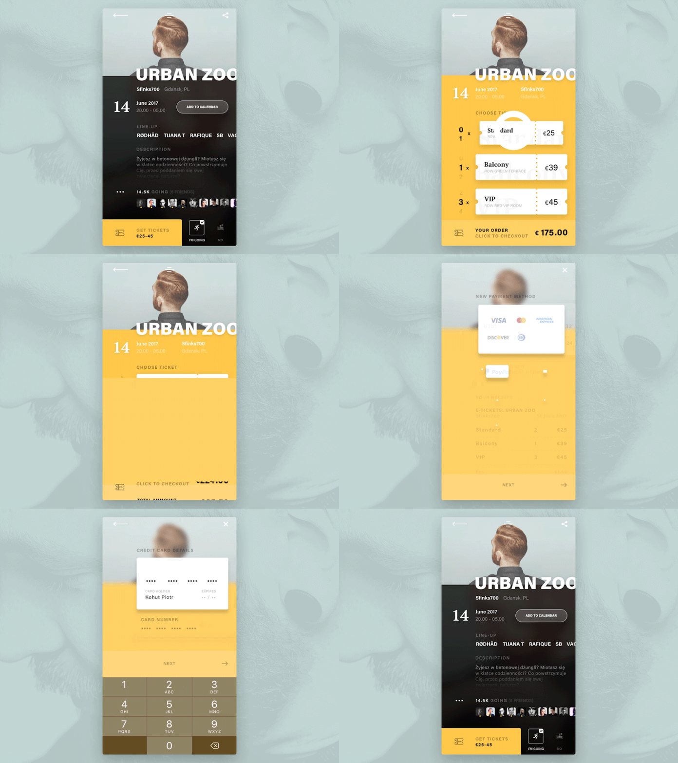
Animated microinteractions in the UI design concept by Piotr Kohut: when you hit the ticket, it responds with animation to show you that the button is pushed and the number of tickets changes with the action.
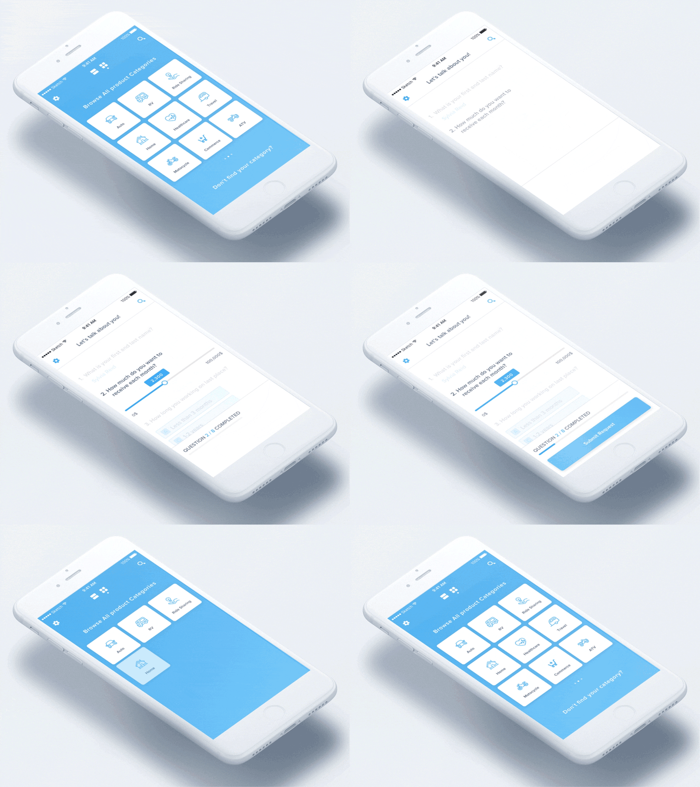
Animated concept by Dmitro Petrenko features the sequence of showing interactive buttons of categories, this way giving the feeling of showing the items one by one instead of overwhelming the user with all the buttons together at once.
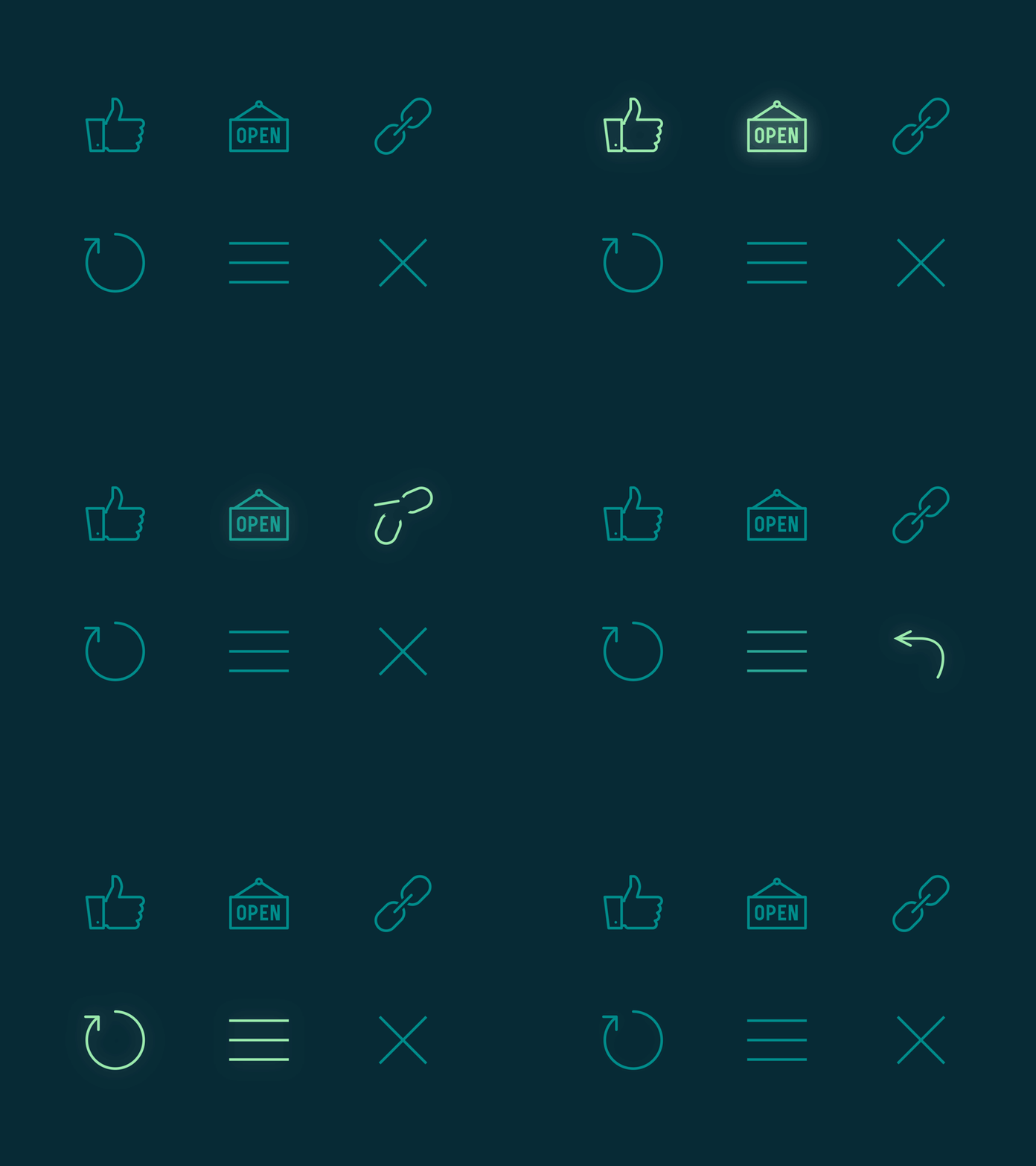
Animated icons by the Icons8 team are a good way to quickly catch users attention to the feedback about operations. Also, they can be used as a hover animation at websites to give a prompt to the user what interactions can be done. You can get the icon animations here for free.
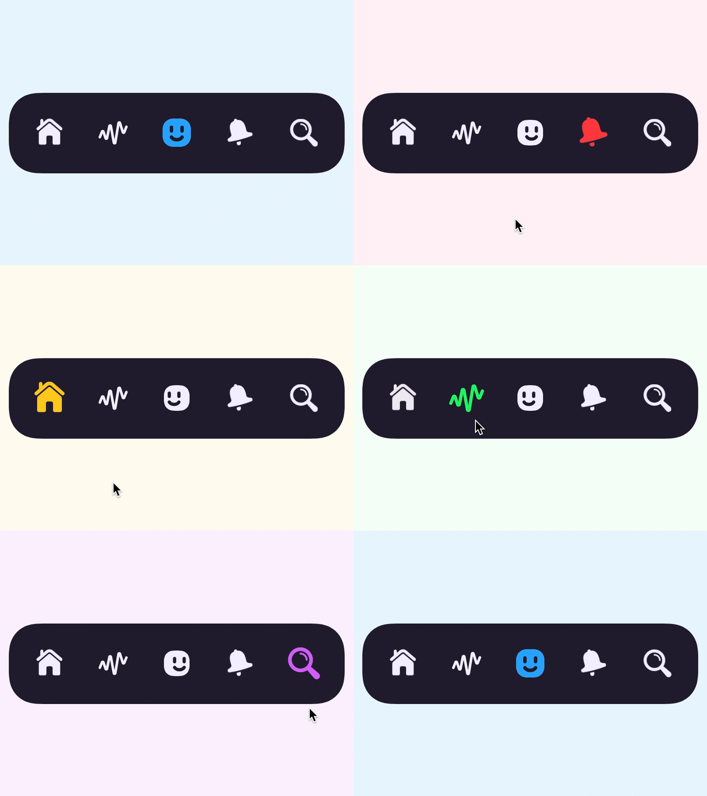
Funny and engaging concept of interactive tab bar design by Prekesh: the profile icon moves right or left as if it were looking at the icon the user is pressing.
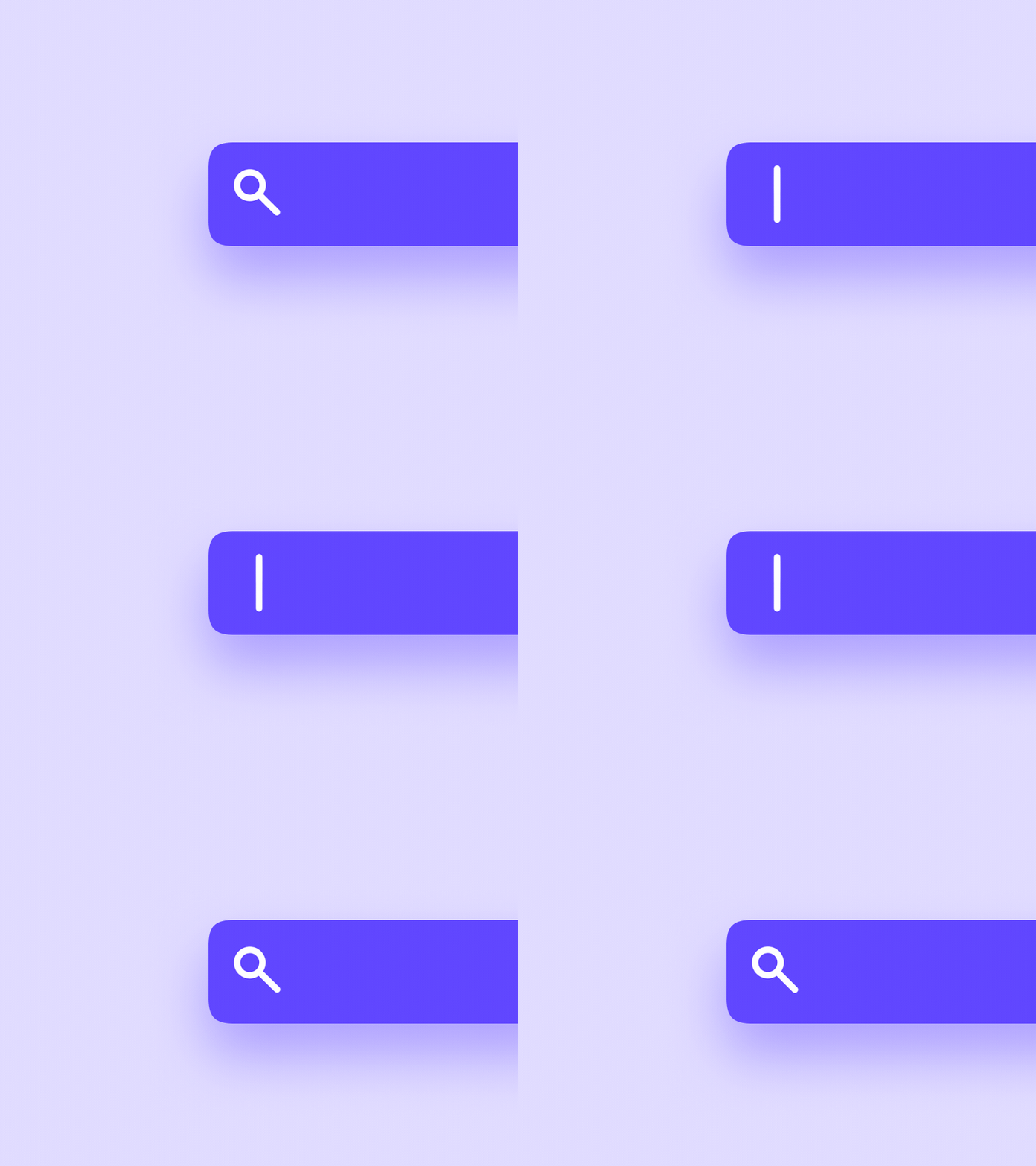
Animated interaction concept by Oleg Frolov shows a search icon that transforms into a cursor.
Action Complete
One more type of UI animation that has a strategic meaning for the app or website usability. Basically, this animation informs a user that the action is done: the button is pushed, the menu is open or closed, the file is uploaded, the payment is accepted and so on, and so forth.
Why is it important? Because just tapping the screen or clicking the mouse for the variety of actions we need to understand what’s going on. It’s different from the interaction with the physical objects.
Simple example: typing the text with a keyboard, feeling the keys texture, resistance and hearing the sounds, is totally different than typing the text on the smartphone screen which gives no physical feedback. So, vibrations and visual signs play the big role to make users confident in interactions.
The same happens when you hit the button “Pay” on the e-commerce website but nothing happens. Was the payment done? Should you push the button again or will it register one more payment and will take your money twice? Give a quick visual hint like changing the color of the button, transforming it into the tick sign or opening a popup with further details to help not only users but also business owners who will not have a mess with payments or hundreds of wrong clicks.
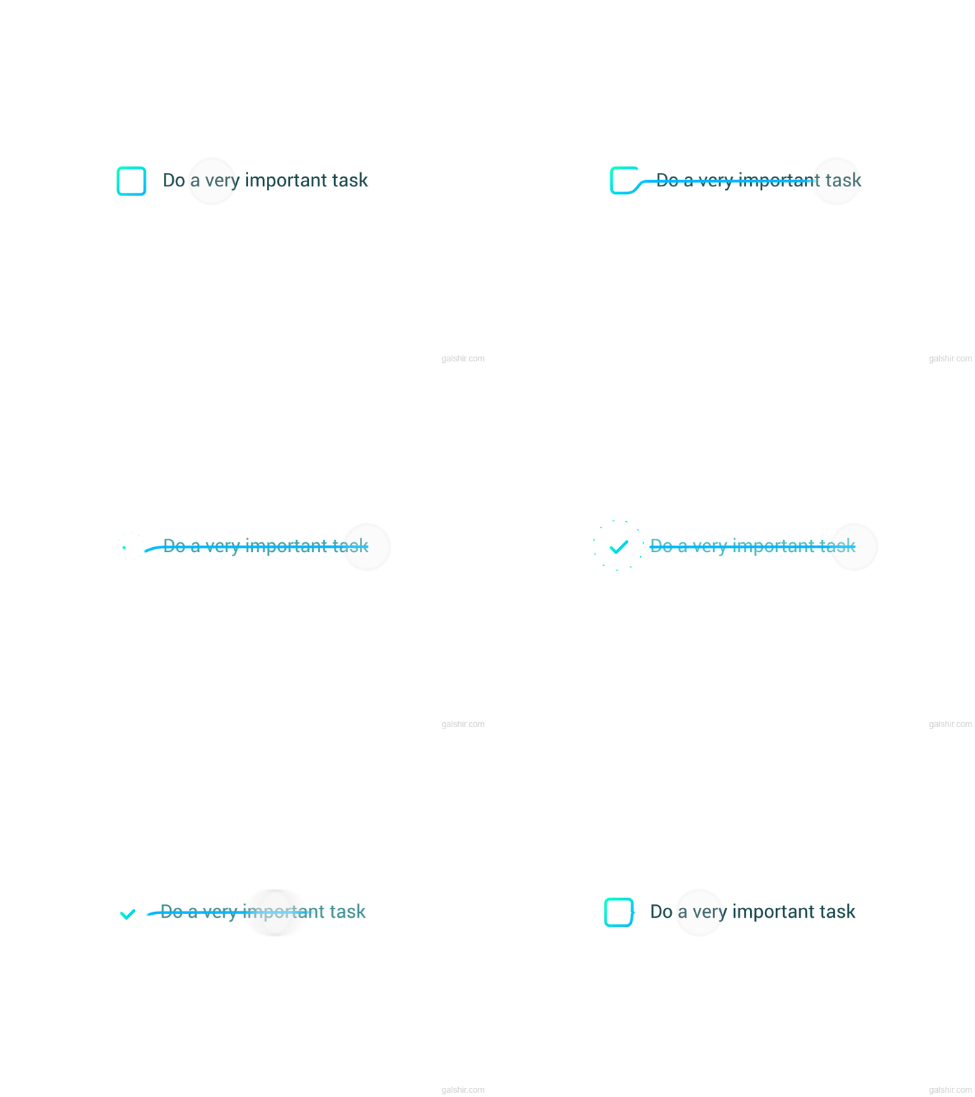
This simple animation by Gal Shir shows the process of crossing out a task from the to-do list. It imitates the same process as we do it on paper: the user just swipes on the text, it gets crossed out while the checkbox transforms into a tick.
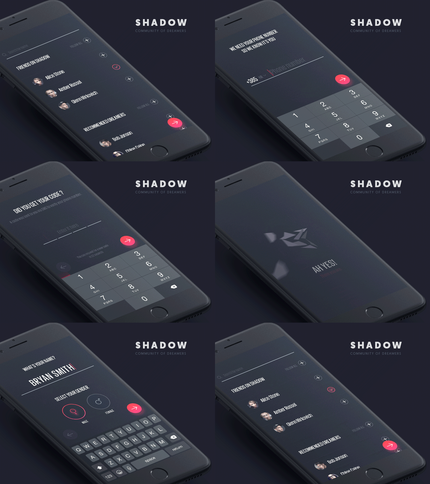
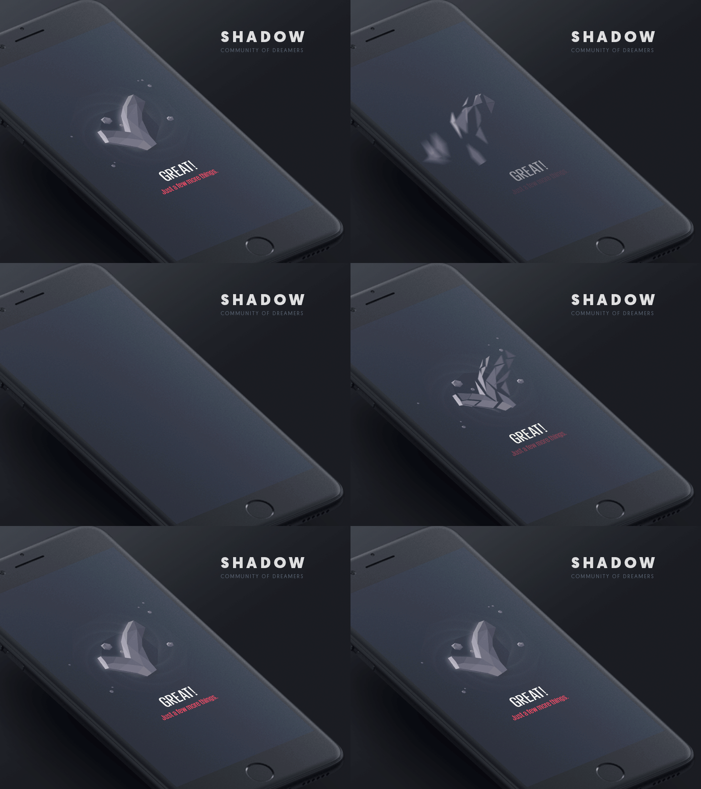

Stylish animation concepts by Kreativa Studio support a kind of wow-effect for the screens and at the same time provide quick feedback from the system to the user.
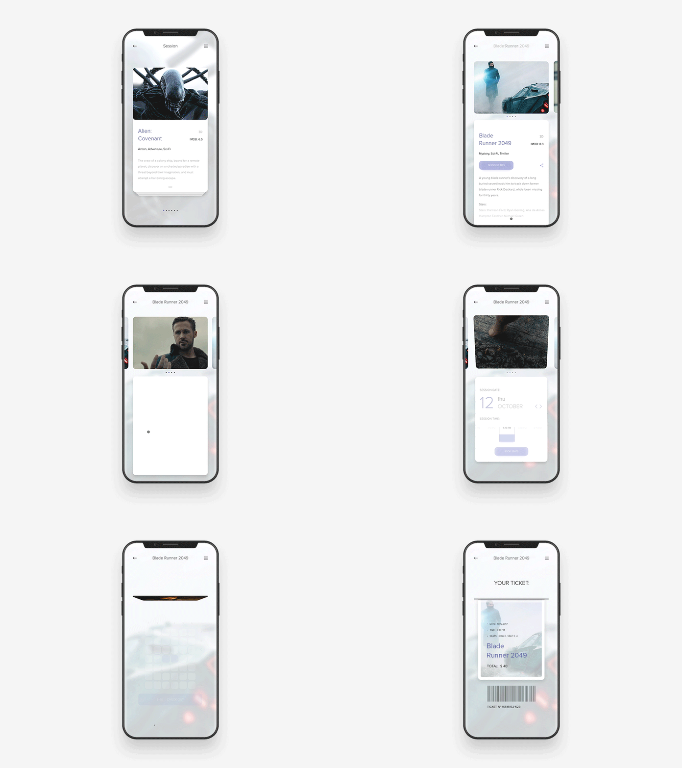
The flow of interactions with a cinema app by Anton Skvortsov animates the confirmation as a sticker removed from the barcode of the ticket.
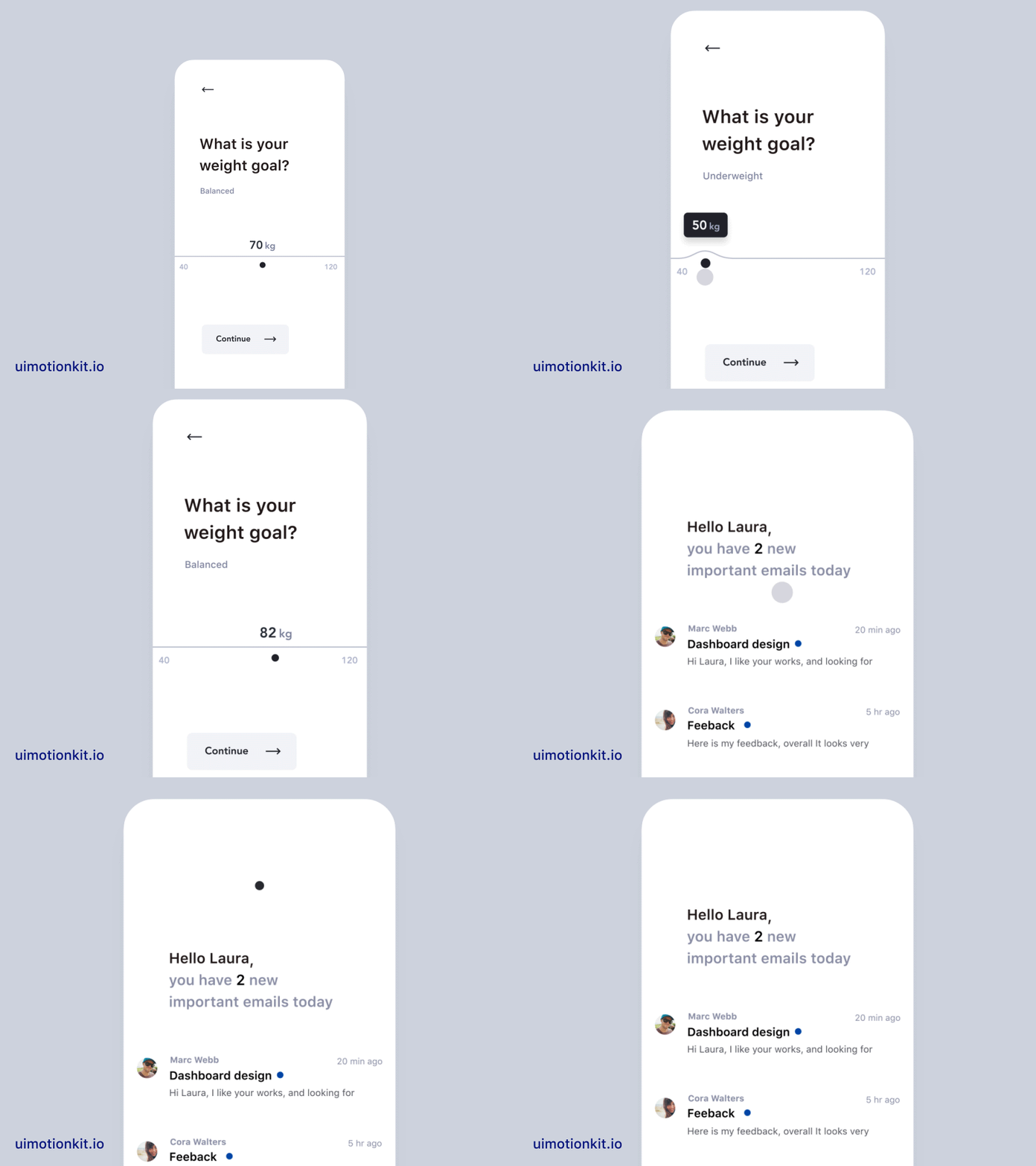
This mobile interface concept by Jakub Antalik shows tick animation to mark that the action is complete on the separate screen.
Scroll
No secret, we spend hours of our life scrolling. Sure, it may work without special effects and animation. Still, motion makes the process more elegant and harmonic. It often imitates natural interactions from the physical world and gives the interface an integral look. Keep in mind that scrolling may be applied in different directions, not only vertical but also horizontal.
Yet, it’s not only about beauty. Animation of this kind can also help to support visual illusions of more space on the screen or clarify the limits of the elements quickly. It’s particularly appreciated in mobile interfaces with their limited screen space.
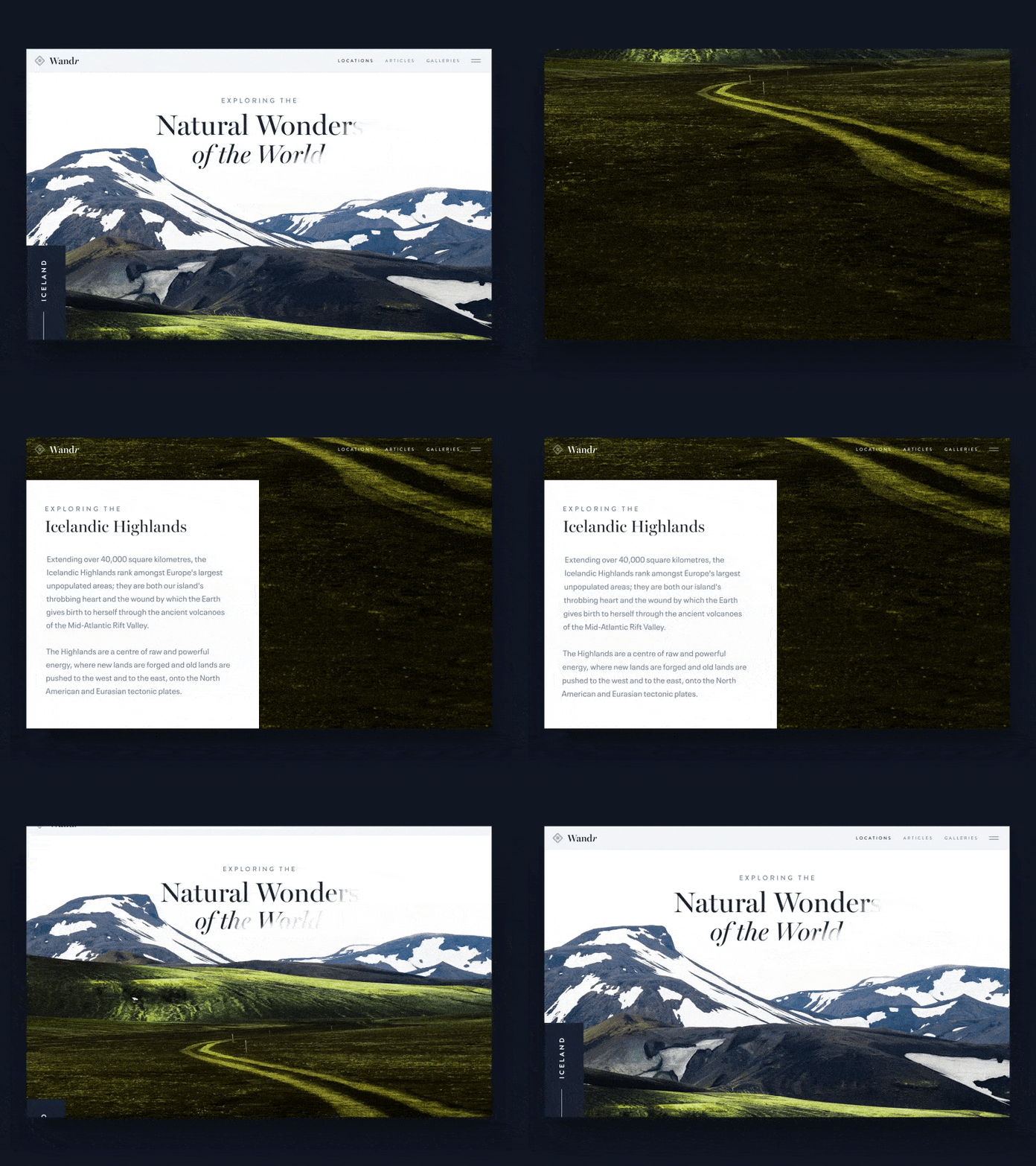
Website scroll animation by Nathan Riley creates the effect of layers interaction making the page look integral and aesthetic.
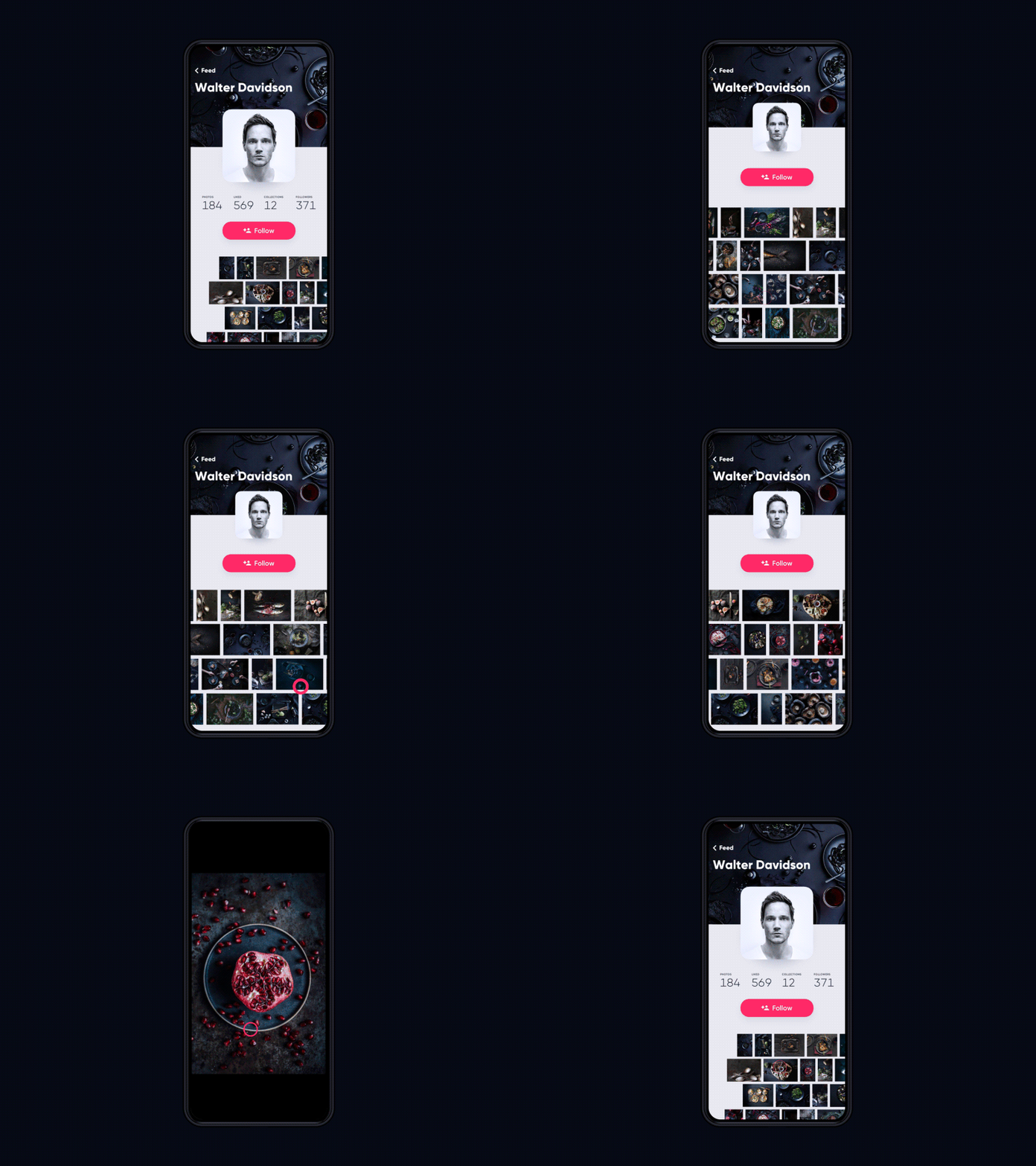
In this concept by Tubik, mobile horizontal scroll in the app gallery makes the feeling of asynchronous movement of the rows.
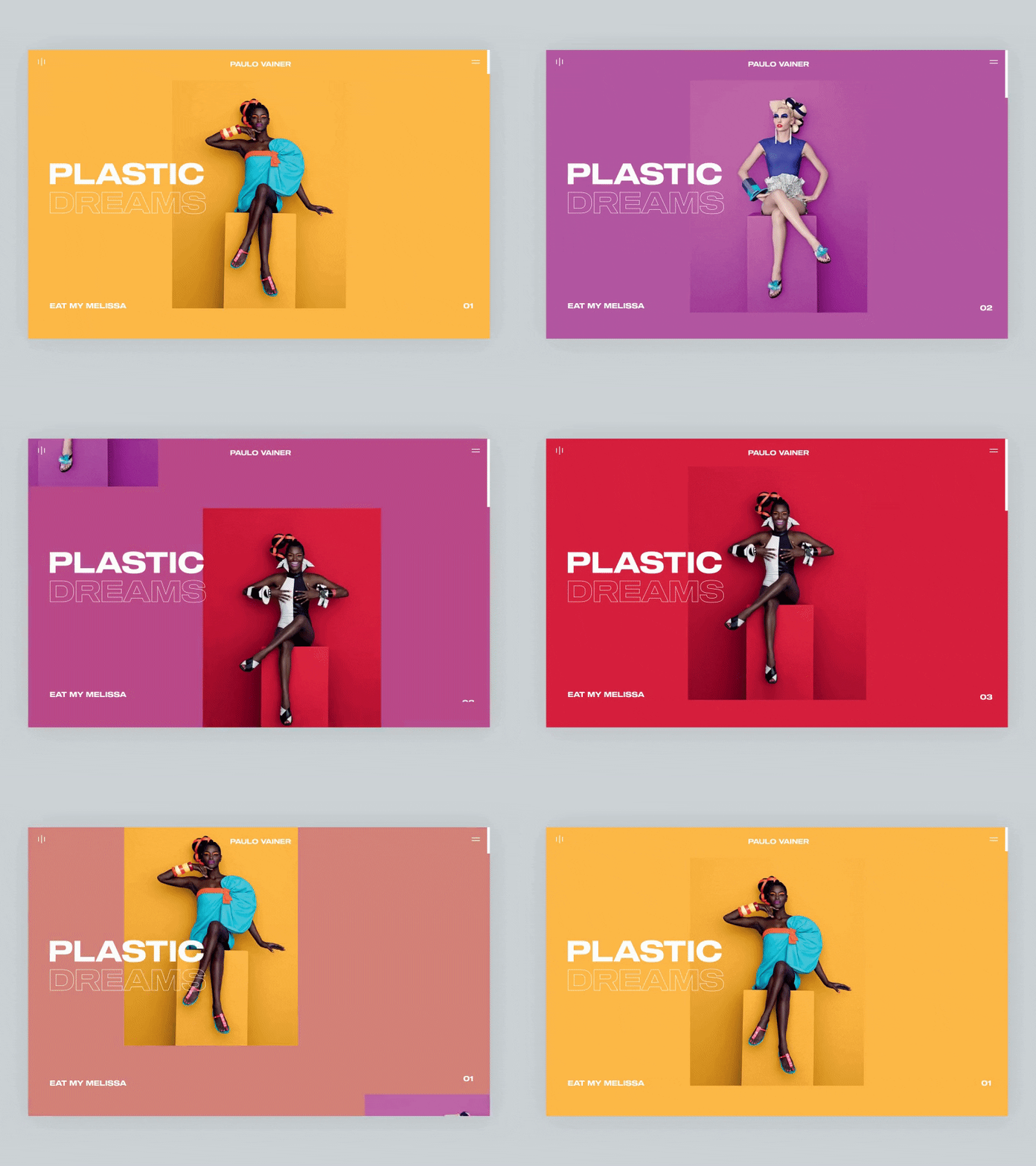
Experimental animation of the diagonal scroll by Nathan Riley: in combination with bold colors and catchy hero images, it looks original and trendy.
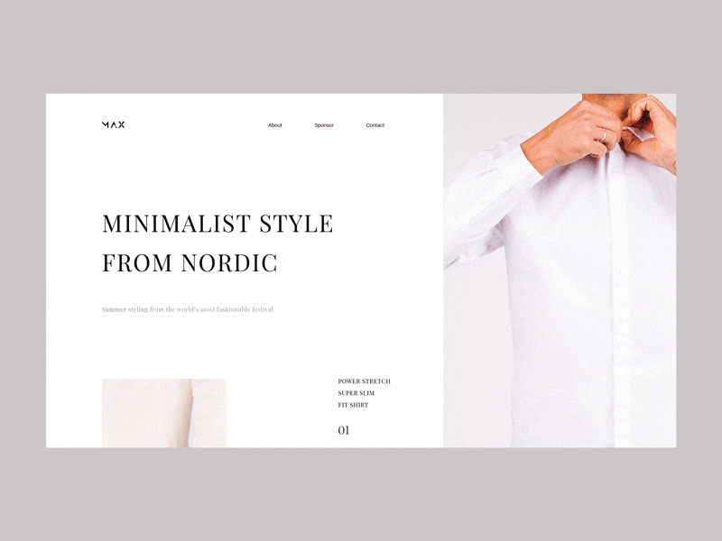
Web UI animation by Radesign where the photos aren’t shown at full immediately but gradually open with the scroll.
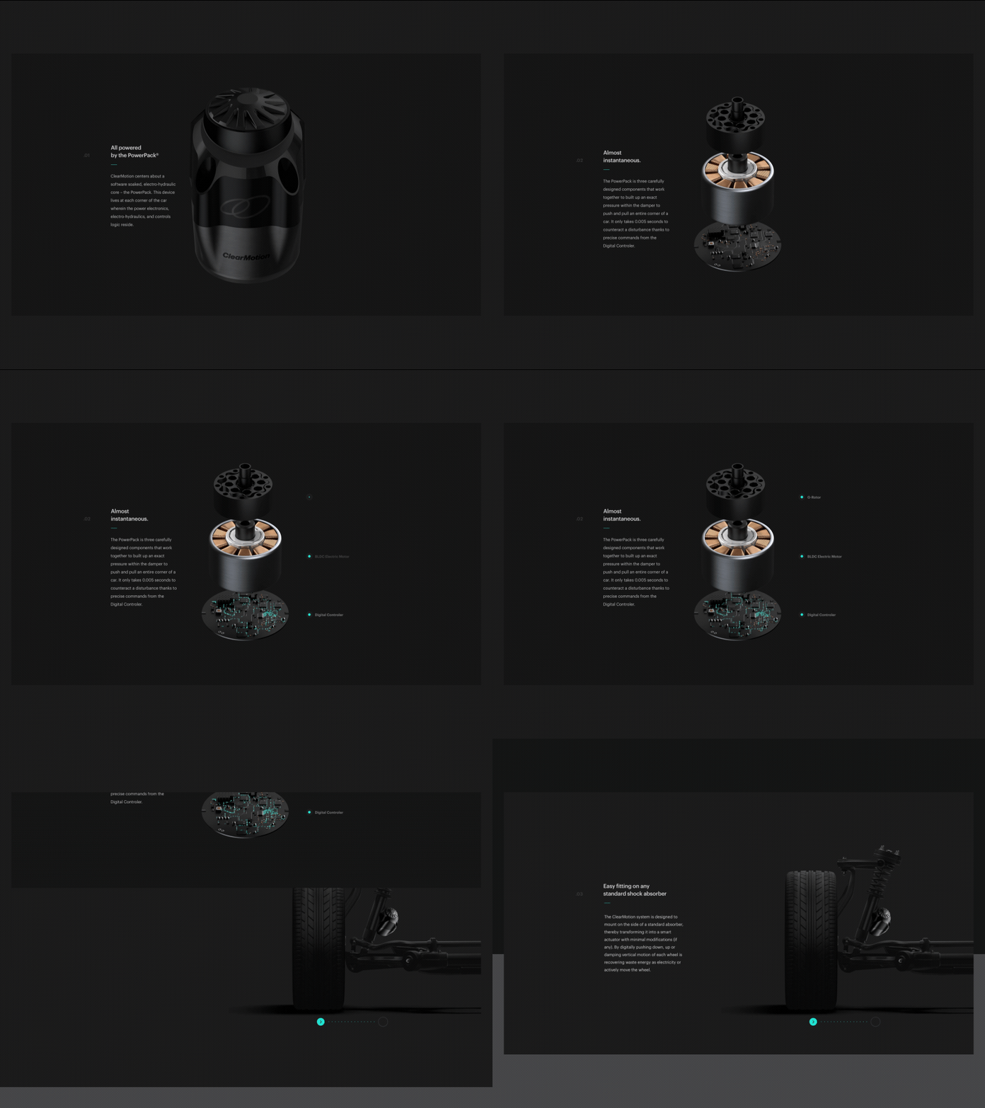
Catchy scroll animation by Robbin Senijn harmonically combine scroll with visual disassembling the mechanism of the hero image.
Transitions
As I mentioned in the article about popular UI design trends, experiments with animation of transitions are found in many designers’ portfolios. Animated transitions add originality and fun to the interactions with a user interface. They allow an app, landing page or website to stand out from the crowd. What’s more, they often set the strong associations with the real world. When the webpages turn over like the pages of a paper magazine or cards are pulled like the real ones, it’s engaging and memorable. And it may even be a reason for users to stay longer on the website (which is good for SEO) or app.
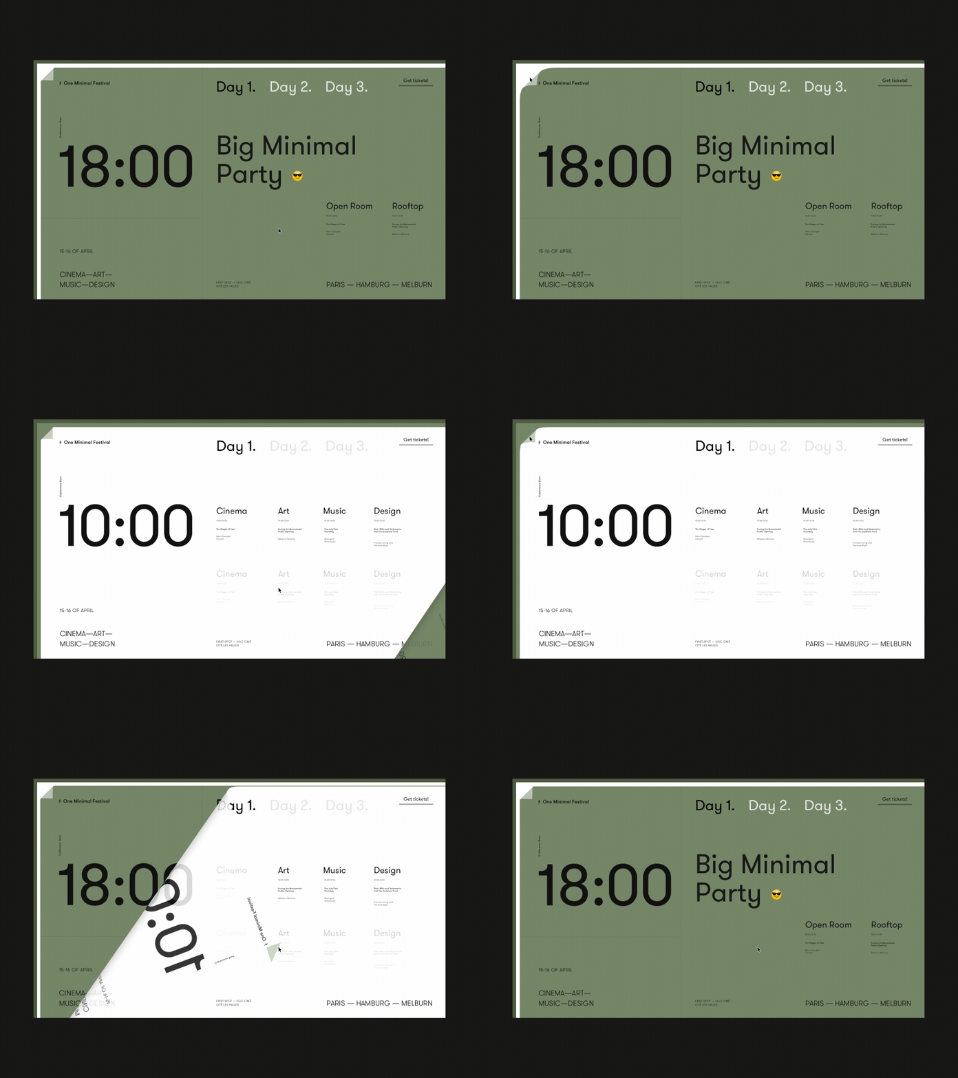
Elegant design by Zhenya Rynzhuk features transitions between the pages which imitate turning over the pages.
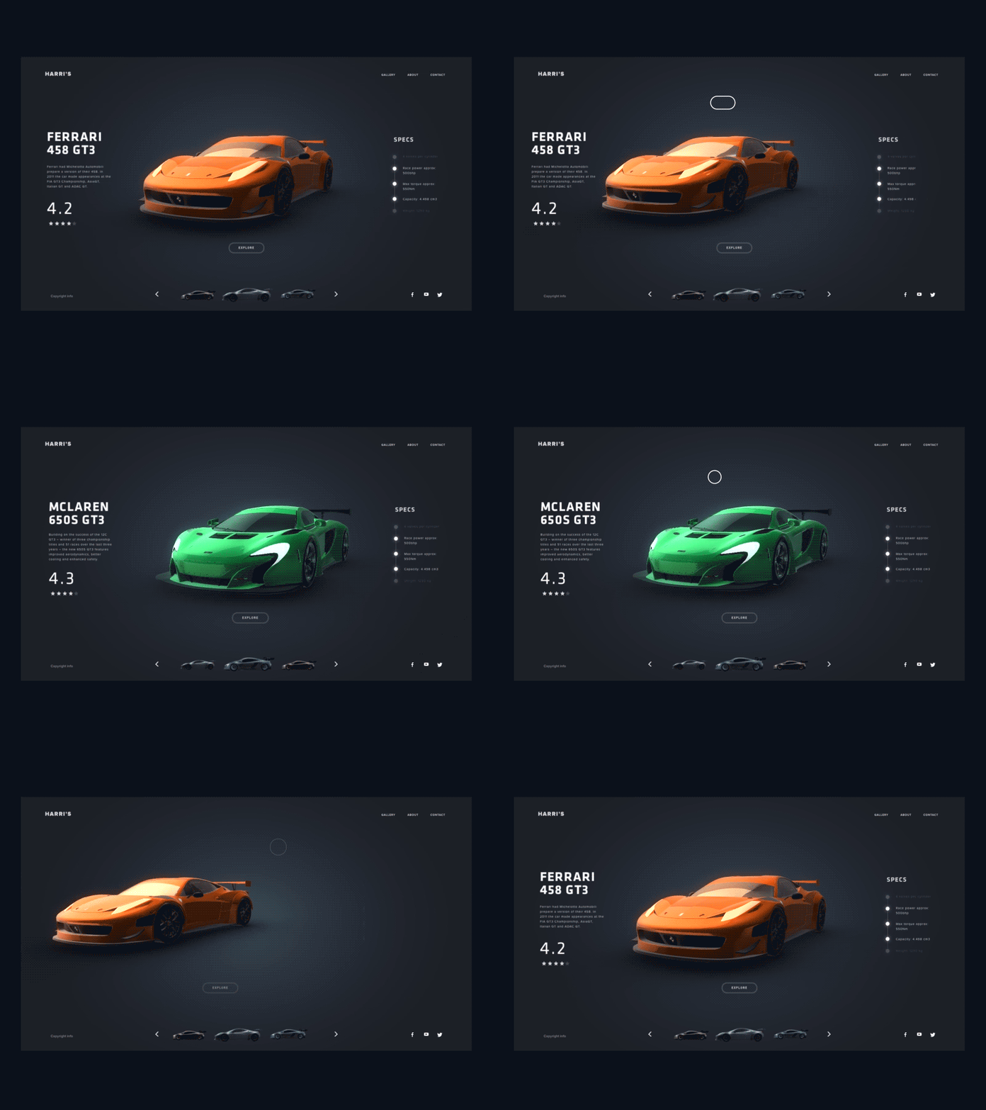
The UI concept by Minh Pham: animation of the transition between the screens of product images is based on the slick motion of hero images and synchronized movement of the page indicator below.
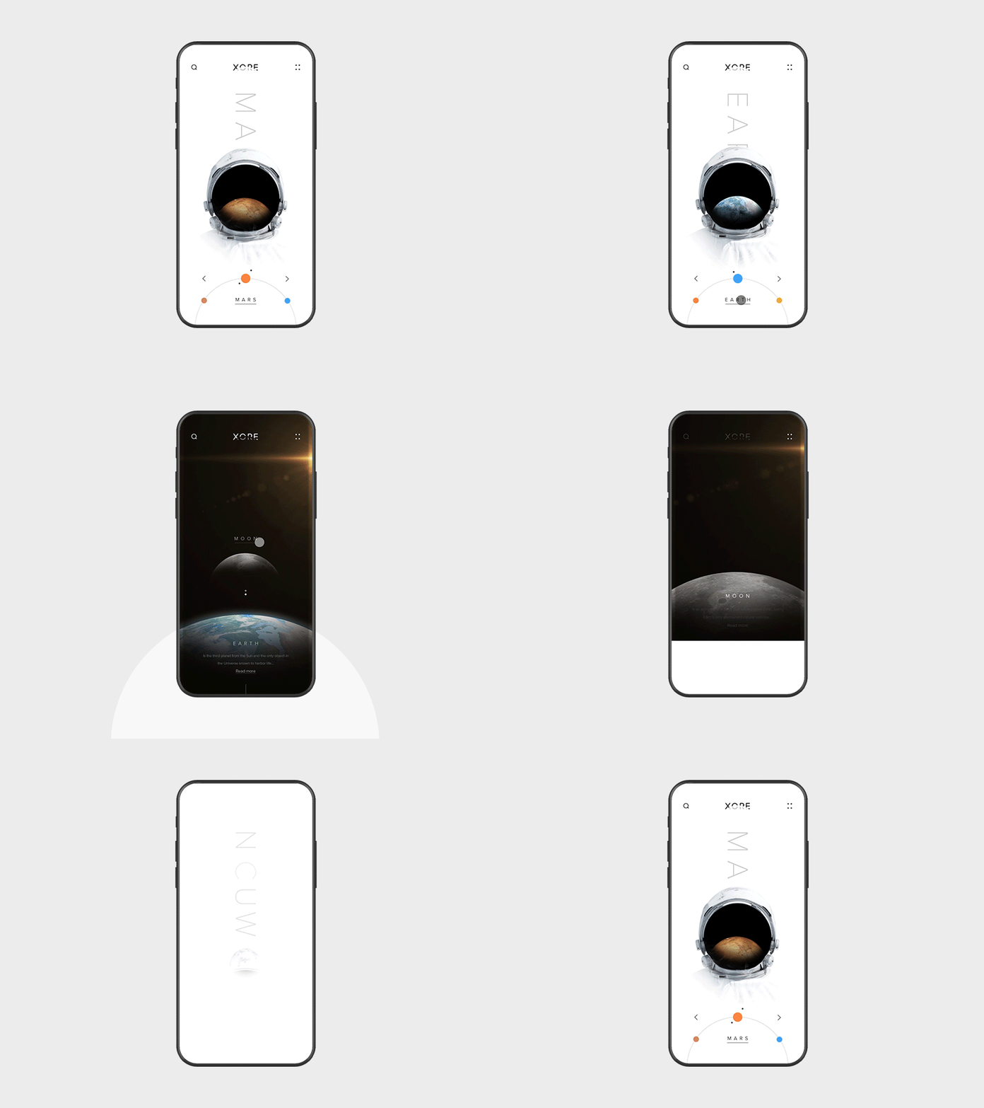
In this concept by Anton Skvortsov, the animation makes you feel like you are diving deeper into one screen instead of just moving from one screen to the other.
Explainer
This type of animation is often found in tutorials, tooltips, and screens with informative visual content. Motion allows designers to attract users’ attention to the graphics and provide quick prompts. Here you can also find animated characters and illustrations.
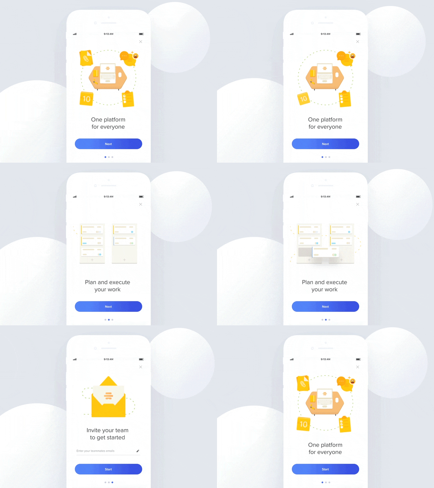
The concept of mobile onboarding tutorial by Adam Zielonko: animation is used for better storytelling and makes the visuals more informative.
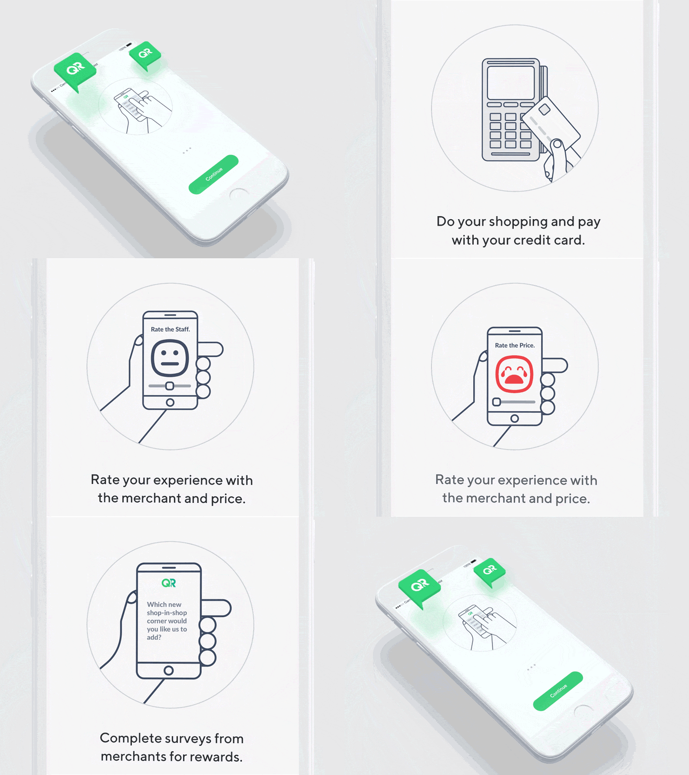
One more piece of motion design for the onboarding tutorial by Virgil Pana: the graphics look quite simple, but the animation transforms them into a united story to give users simple and clear instructions.
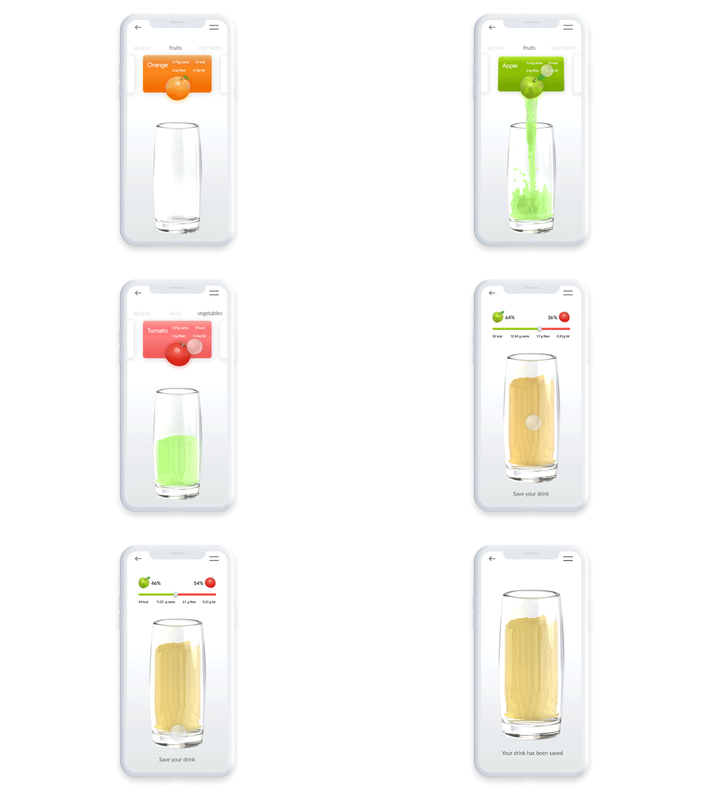
Animated tutorial with prominent 3D graphics by Mikołaj Szymanowski gives clear visual instruction on how the app works with the minimum of text.
Branding
Integration of visual brand identity in UI design is nothing new for now. Corporate colors and typography, logo and mascots, offer visualizations, custom illustrations and photos – all that stuff enables product and marketing go hand-by-hand. Animation is taking more and more presence in this perspective. For instance, logo animations add the mood and catch the user’s eye.
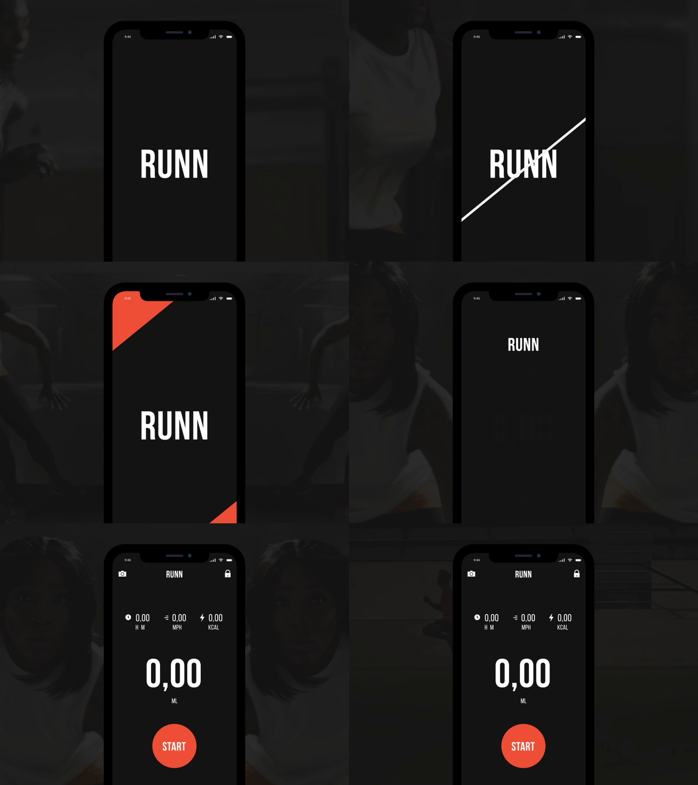
Splash screen animation by Zhenya Rynzhuk makes the process of an app loading beautiful and creates the dynamics echoing the nature of the app for runners.
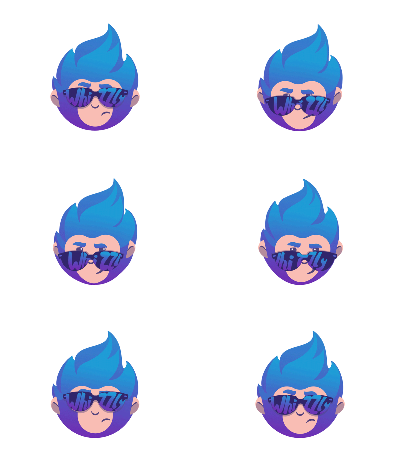
Funny logo animation by Tubik adds playfulness to the character and makes it quickly noticeable.
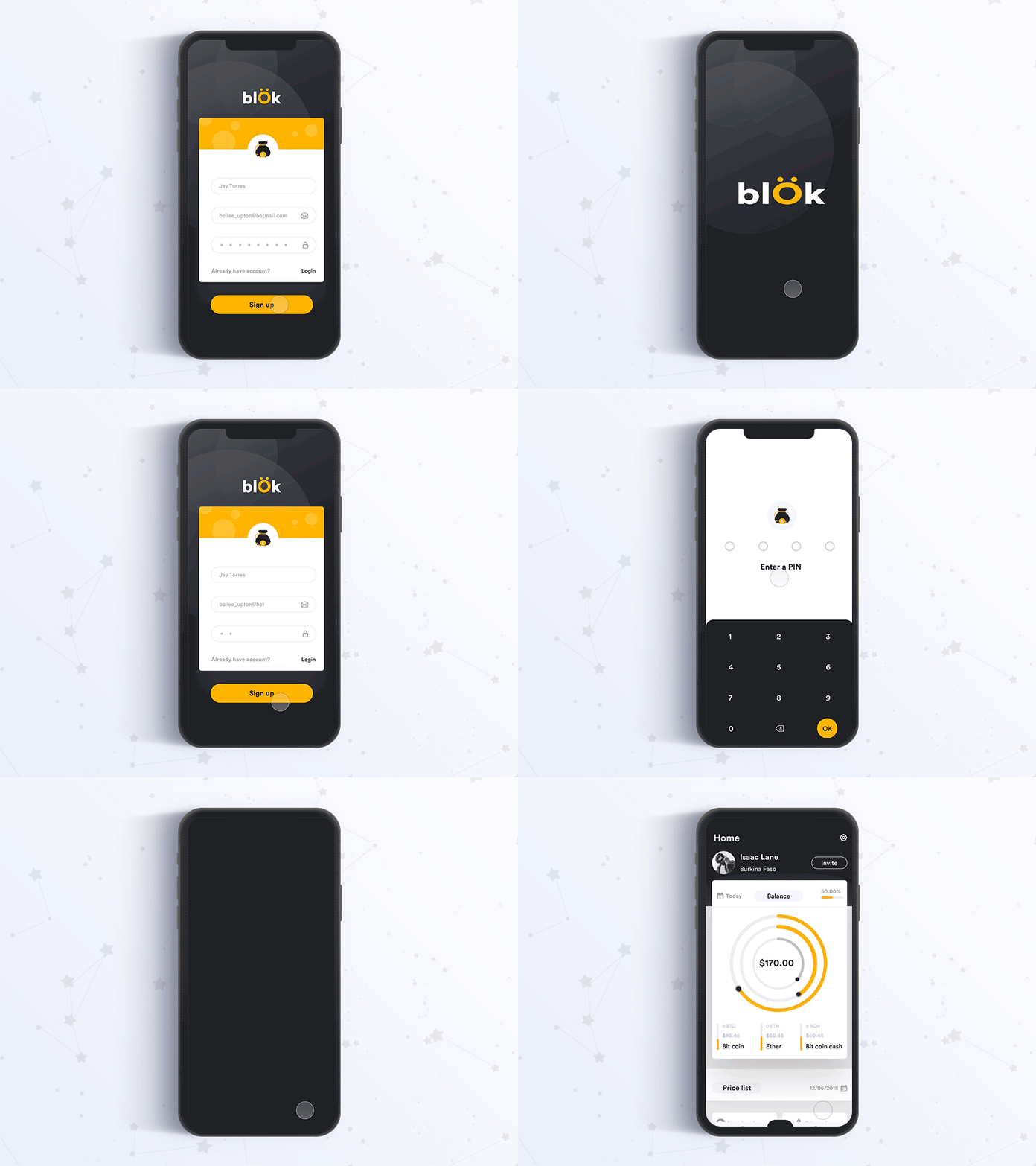
Logo animation on the splash screen for the mobile UI design concept by Johny Vino.
Points to Consider
Whatever catchy and stylish the animation looks, your decision to apply it in the application or website should be well-weighed and well-tested. Let’s briefly check what are the strong sides and drawbacks of UI animation in interaction design.
Advantages:
- enhanced usability
- original looks
- saving space on the screen or page
- adding convenience and speed to interactions
- clear feedback from the system to the user
- support of visual hierarchy and integrity
Disadvantages designers have to consider:
- higher loading time (comparing to static images)
- distraction factor (too much animation is tiring for users)
- time and effort-consuming technical realization (it will take more work hours to develop such interactions).
So, analyze all these factors together with user research before you make a decision.
About the author: Marina Yalanska, tech/design writer and researcher, editor of Icons8 Blog
Title image by Ted Kulakevich
Check the list of 10 popular UI design trends on Dribbble, download 400 free animated icons, and read the article about the most hated UI and UX patterns.
Have an interesting article to share with our readers? Let’s get it published.