“Don’t. Move. My. Stuff. Around”, — that’s what I imagine our users shout during our usability testing sessions.
Users hate it when you move the controls they’re used to. We had to have a really good reason to do so. This article is a story behind the Icons8 redesign, our usability studies, iterations, and trade-offs.
You are also welcome to join the discussion on Product Hunt: we’ve just released the beta version for you to try.
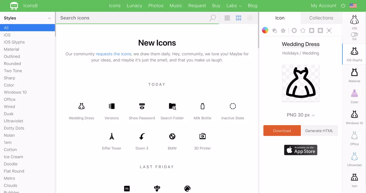
Old user interface
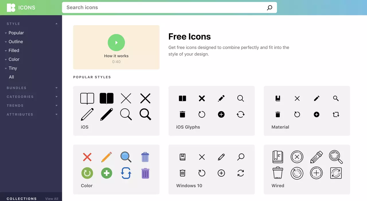
The Problem: Few Clicks
I was looking at our stats. The question that popped into my head was: why do people browse three times fewer pages on Icons8 than on a competitor’s website?
Hypothesis
I was puzzled. I mean, I had several explanations:
- People can find the required icons faster on our website.
- We’ve got a dynamic app, so people don’t leave the page.
It was too good to believe.
First, we still send events to Google Analytics when people click.
Second, my intuition forced me to look for a less pleasing explanation.
The idea came from our friends at Usethics. They explained it with something I shouldn’t have missed. This is something that every UX designer should know for the sake of job interviews.
Fitts’ Law
Stripped from formulas, it says that the closer the objects are, the better. Our app forces users to switch attention from one place to another across the screen. It’s a heavy cognitive task that makes users leave.
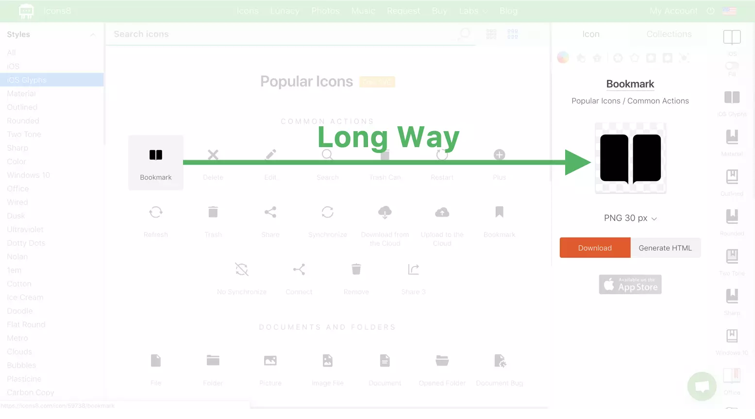
Our old app makes users switch between left and right sides of the screen. That’s a heavy cognitive task that gets users tired and makes them leave.
Solution
The solution is straightforward. Open them close to the screen. Google Images does it for years.
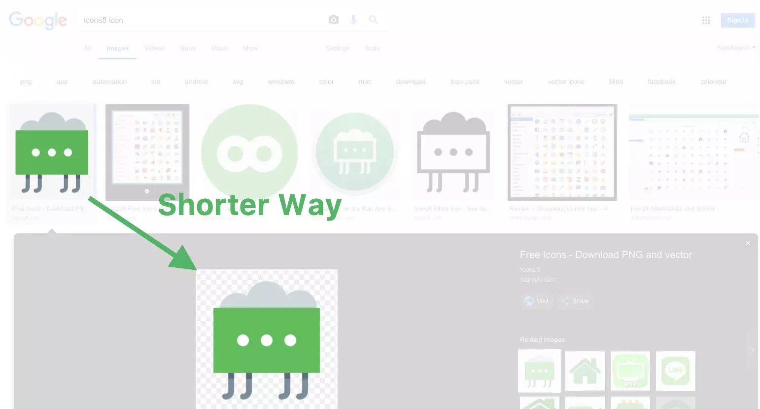
Google Images shows the larger version of the image much closer. I’d also suggest keeping the meta information closer to the large image.
The problem is that Google Images has a limited functionality, while Icons8 offers a bunch of stuff:
- Recoloring
- Applying boxes and circles
- Adding padding
- Adding text and overlays (like a small plus)
- Downloading in multiple formats (some behind the paywall)
- Resizing
- Similar icons (for example, variations of the home icon)
- The same icon in other styles (for example, a home icon in iOS style, Material style, etc.)
- Generating HTML
- Working with the collections
- Generating fonts.
Moving Stuff Away
It’s always an option to move the functionality away:
- Dialog boxes
- Expanding sections
- Accordion menus
- Burger menus, etc.
The problem is that people don’t expect this functionality. So, they don’t look for it. Therefore, according to the information foraging theory, they ignore all “show more” controls.
We tried to hide this functionality before. I felt physical pain watching people struggle with it during the usability study. Users were striving to generate a font while it was just two clicks away.
Long story short, we have to show enough, but also hide enough.
Redesign
Here’s the initial version of the redesign after a few iterations.
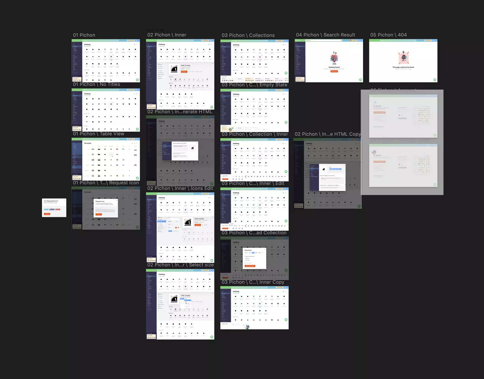
Icons8 app redesign, version 1. Screenshot from Sketch.
Apart from the new icon details, it features the new visual style.
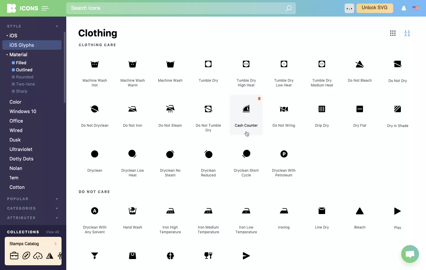
New visual style features the new logo, new colors, new typography, and new almost everything.
Collections
After several usability sessions, we’ve discovered another problem. When we asked people to pick a few icons and create a collection, they picked the icons of different styles without giving a thought about it.
They liked the result. In contrast, we were horrified. It’s like writing a single word with various fonts.
That encouraged us to reinvent our collections.
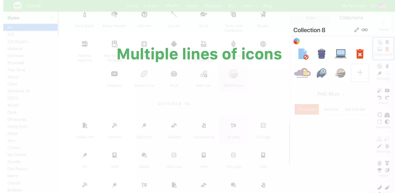
The old design draws the icons of different styles in the same size making them look alike. Also, it splits a single collection into several lines, making them harder to compare.
Thus, we’ve made the collections horizontal.

A single line makes icons easier to compare
Also, we’ve shown the icons in the original size.

Small icons are small. Large icons are large.
A light-headed decision to make collections horizontal led to a massive redesign and re-coding of everything.
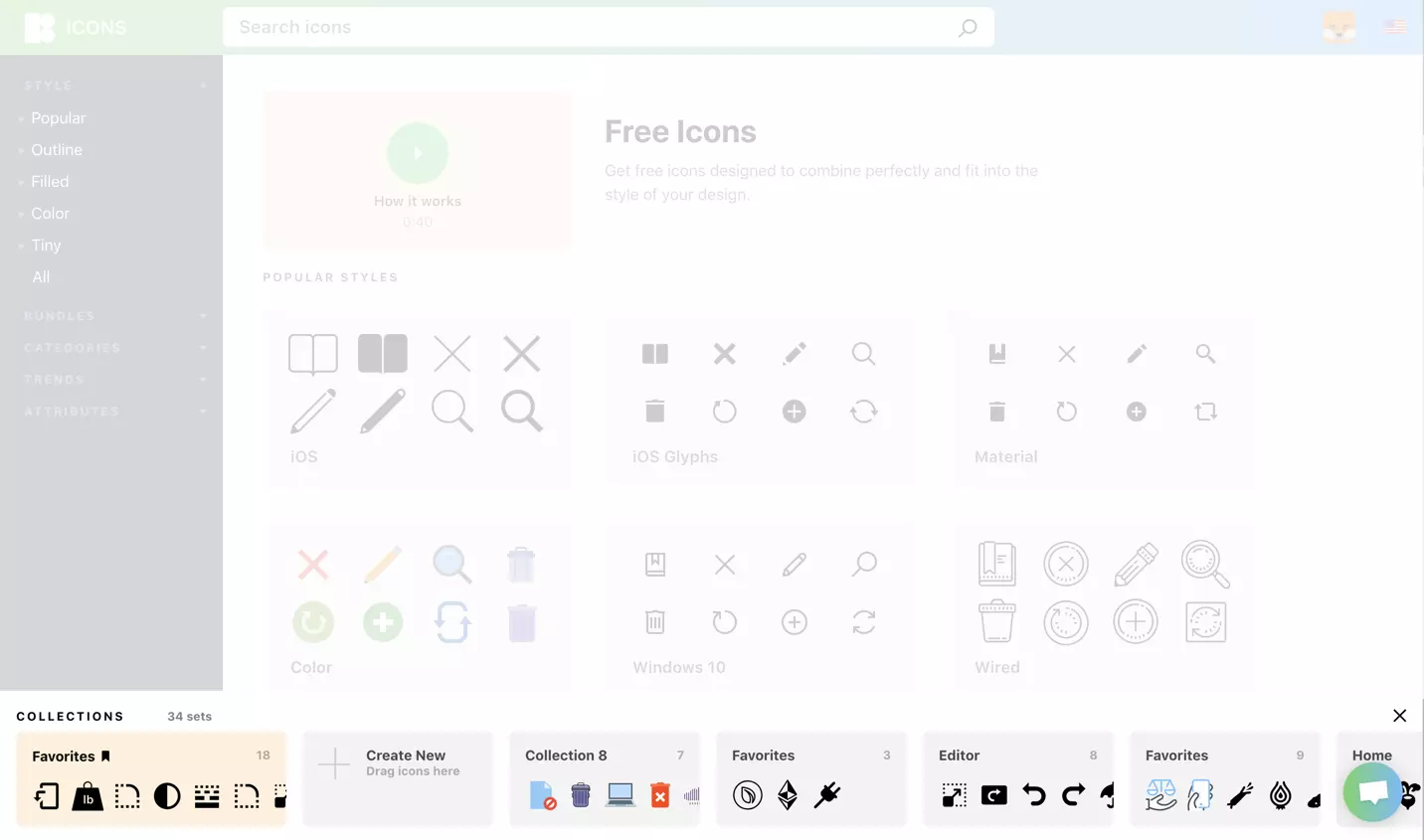
One of the consequences of making the collections horizontal: redesigning the list. Users can drag the icons in any collection in the list.
Icon Details
Here’s the icon details dialog.
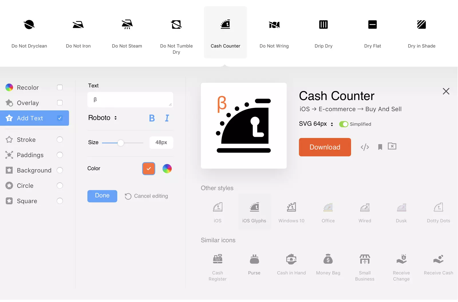
Icon dialog
It’s pretty! Moreover:
- It showcases all the effects we have
- It has all styles (well, with a horizontal scroll)
- It shows similar icons
- It groups the controls and leaves some white space.
The only problem is it’s monstrous a bit. Once you open it, it occupies your whole screen.
Compacting
We put it on a diet, removing all the pretty white space. And decreasing the font size. And compacting the effects. But it was still big.
The breakthrough came from one of our usability study participants. She suggested that we need either other styles or similar icons, not both simultaneously.
Indeed, if we have all styles on screen and search for a home icon, we have it in all styles.

We have all styles in the list.
If we have a single style selected, we have all similar icons on the screen:

A single style is selected. We have similar icons in the list.
Thank you, dear user. Your observation allowed us to squeeze the icon details more than twice:
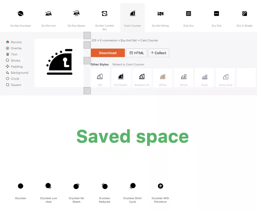
New, compact version of the icon details popup.
Grouped Icon Styles
When we created our current design, we had four icon styles. We’ve got more than a dozen now. The worst part is the style name doesn’t suggest the visual style. Who knows what the style called “Dusk” looks like?
So far, we’ve grouped them.
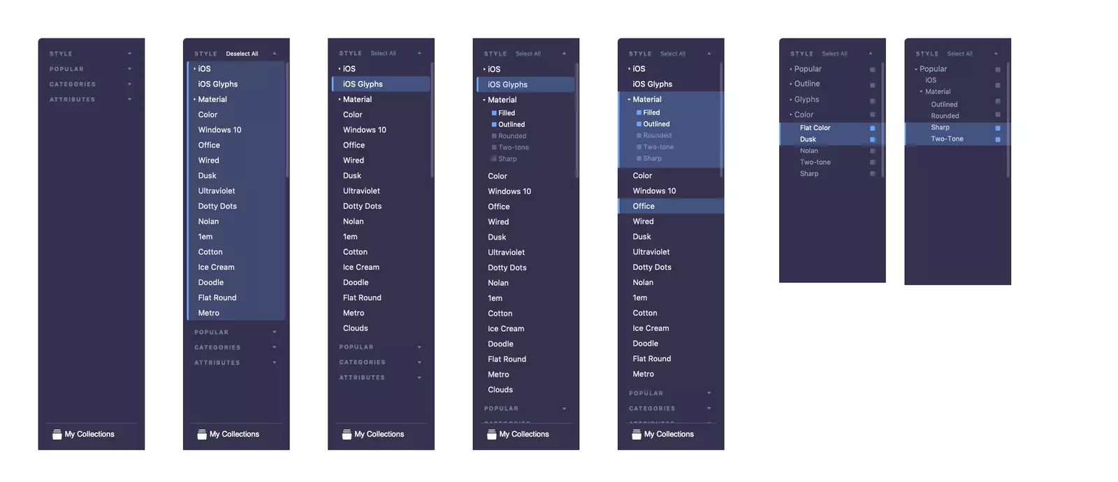
Redesigning the list of styles. The newer ones are on the right.
Download
We have a long story of searching for the perfect download control.
- Not a wizard that forces you to move forward each time you download another icon.
- Not a bulky form that eats away your screen.
We had something that passed our usability tests before, more or less. We’ve started beautifying it.

Our old download options control, beautified.
The problem is you can only fit so many download options in there. Generating fonts is out of the question, for example.
So we gave up and created a dialog.
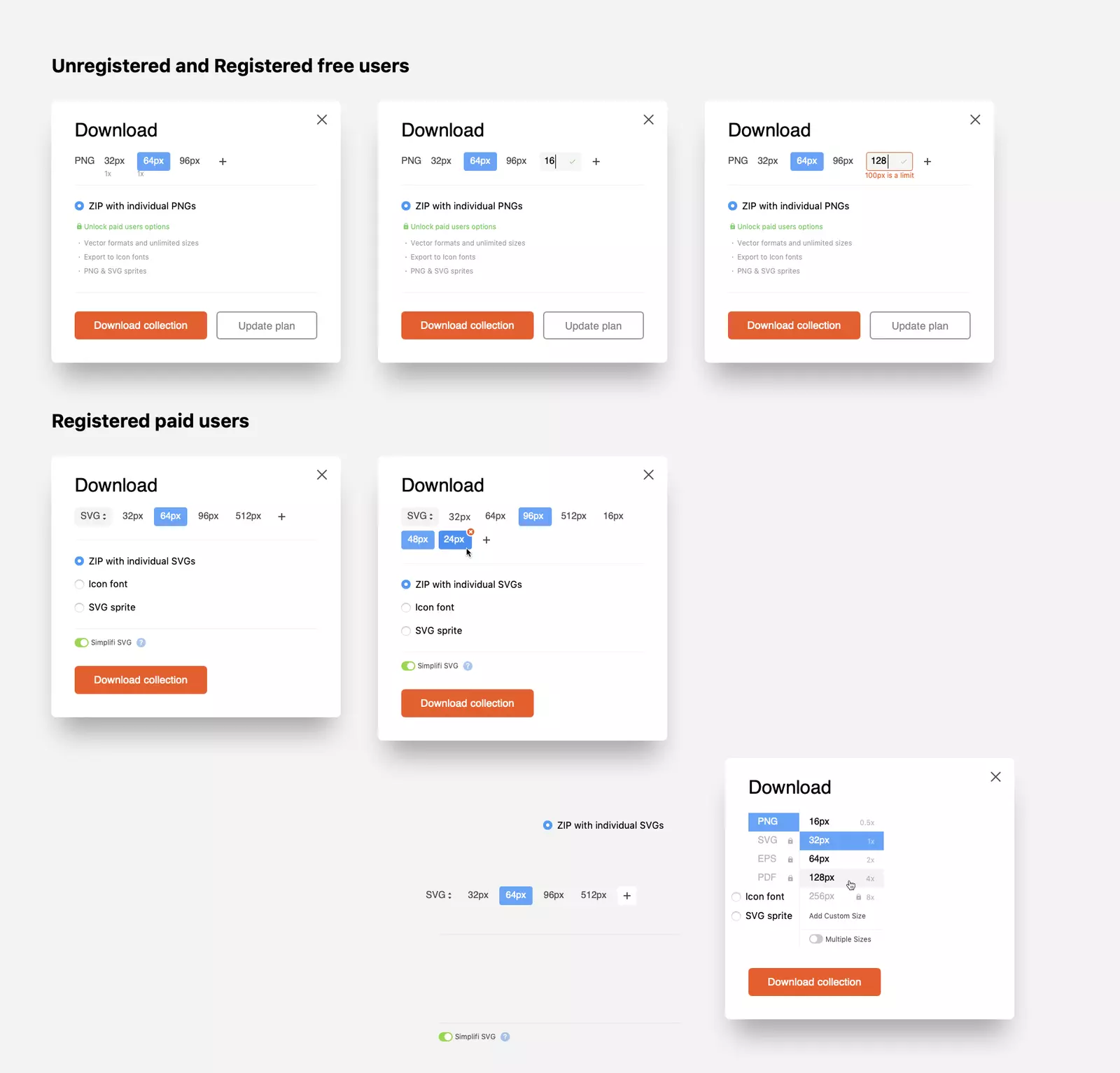
Searching for a dialog
The last iteration looks this way:
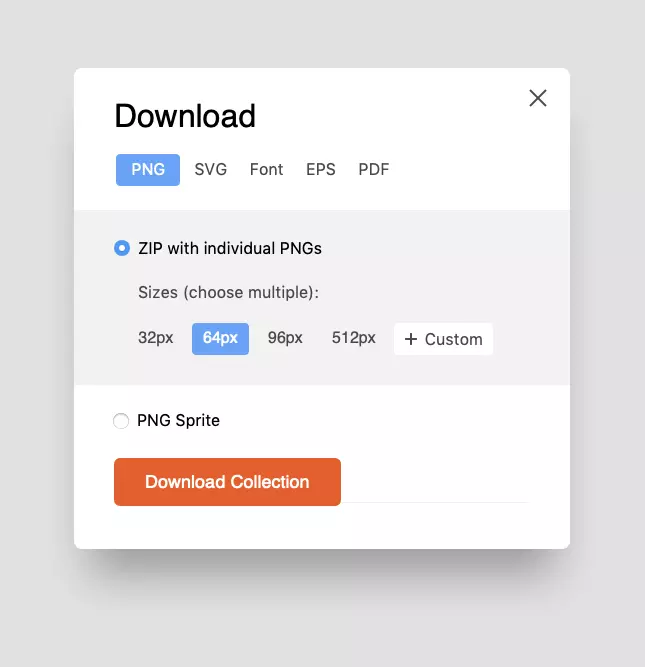
Downloading PNGs
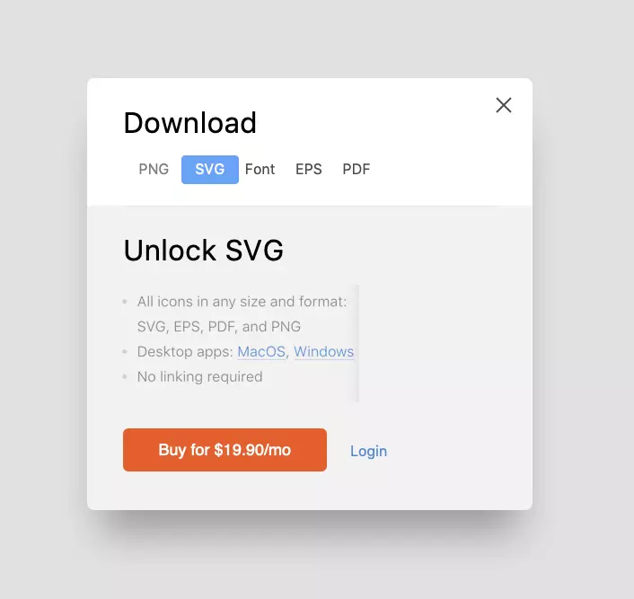
Paywall
Other Stuff
As this article balances between “long read” and “boring”, please let me just list all other improvements we brainstormed and (at least partially) implemented.
- Removed the top menu
- Redesigned My Account menu
- Created the profile pictures
- Added the style previews on the home page instead of the new icons.
Also, we’ve optimized the performance. This is maybe the first time I have seen the AAAA rating on WebPagetest.

Speed improvement. It’s not over: the whole new API is coming this fall.
Future Improvements
We are holding the next round of usability tests at the moment, in particular about the following issues:
- Some users have trouble finding the search bar.
- Some people don’t get our categories, taking them for the list of all the icons we have.
- Registration, login, and paywall have been redesigned but are untested.
Your Turn
Working at Icons8 is special. The people who use Icons8 are designers themselves. Our community has made many improvements. Therefore, you are welcome to leave comments and join our forum.
Wanna try breaking stuff? Here’s our sketch file.
The redesigned Icons8 has just been released on Product Hunt, welcome to join the discussion – your feedback is precious for future updates!
About the author
Ivan Braun, UX designer, founder of Icons8