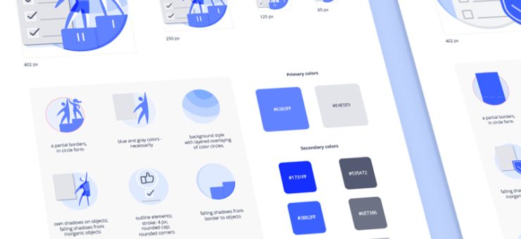
Each design has its own scale. It applies to elements size and like thickness. Now, we have icons that can fit any project and look consistent at any scale.
Meet Forma, fully adjustable icons that can be filled and outlined. Their line thickness varies from 1 to 2.5 px. In general, there are 8 icon packs:
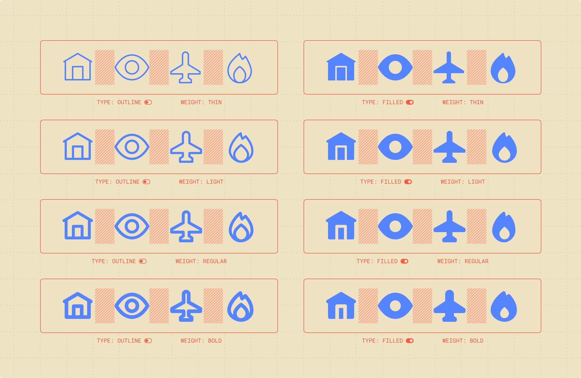
Icons in font
The winning point of using these icons together with the text is that they have four types of line thicknesses. The typeface weight doesn’t matter, Forma will match them all.
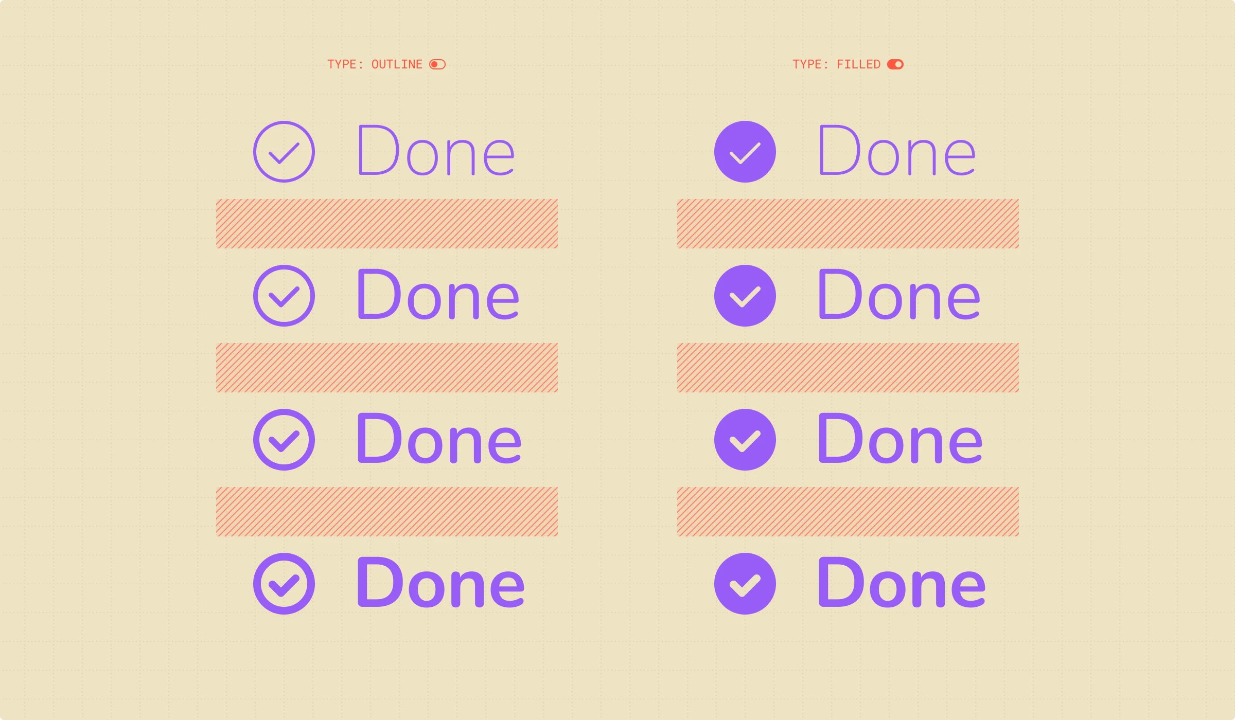
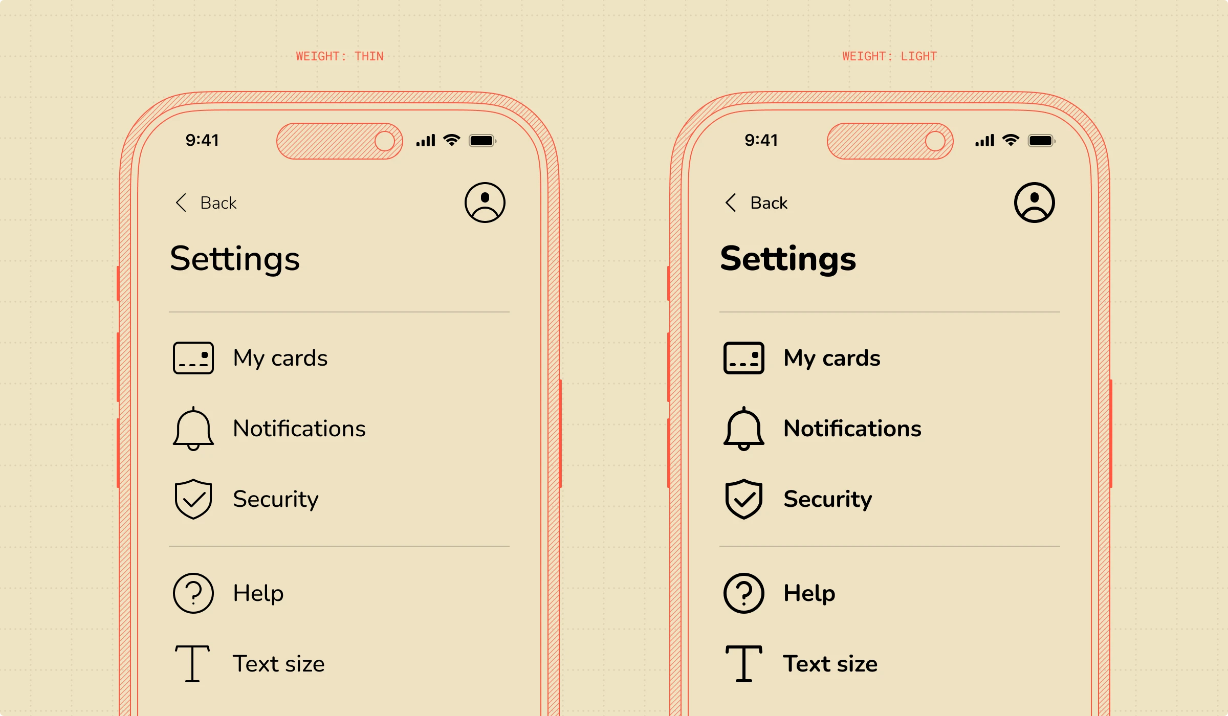
Icons in interface
By playing with different visual weights, you can change the average look of the interface, making it light or bold.
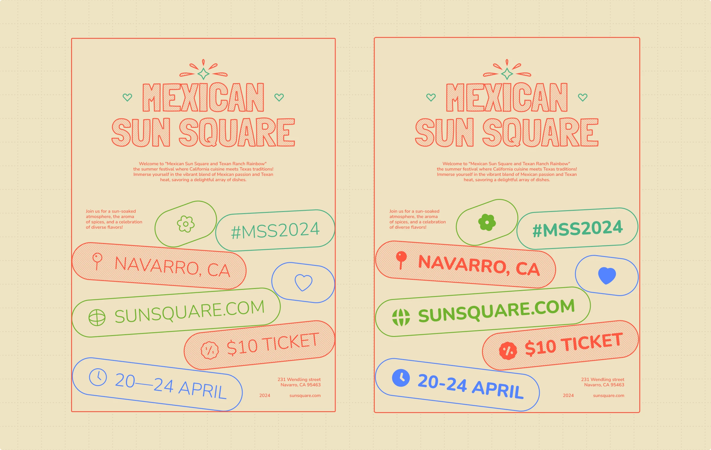
Icons in prints
The same goes for prints: if you want your poster to deliver a light and minimalistic feeling, go with the light weight. If you want the design to look more brutal and noticeable, choose thicker lines.
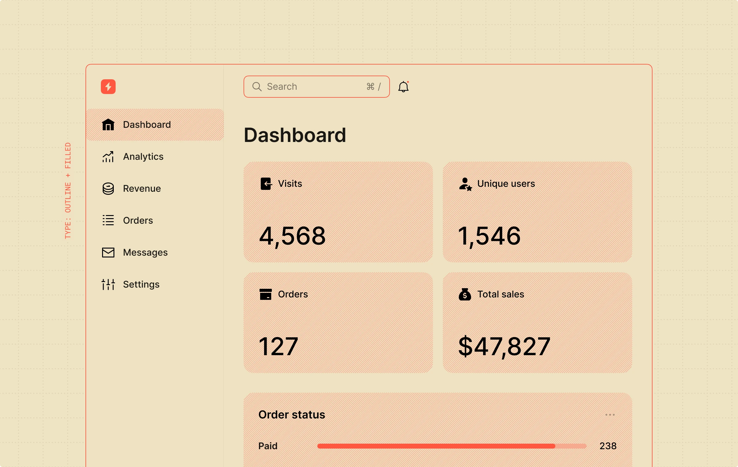
Combination of different types of icons
All packs are made to look good together. Mix and match outlined and filled ones to highlight the selected state in your US design.
Different weight for any purpose
Designs don’t exist in a vacuum. they serve their purpose. For example, Forma Bold can also help in tricky printing cases. Some printing methods, like letterpress or lithography, require thicker lines in design. If your design includes icons in tiny sizes, go for the bold weight to ensure perfect print.
Another example is navigation signs. It should be clear and readable even from afar. So this is where the bold weight comes into a game:
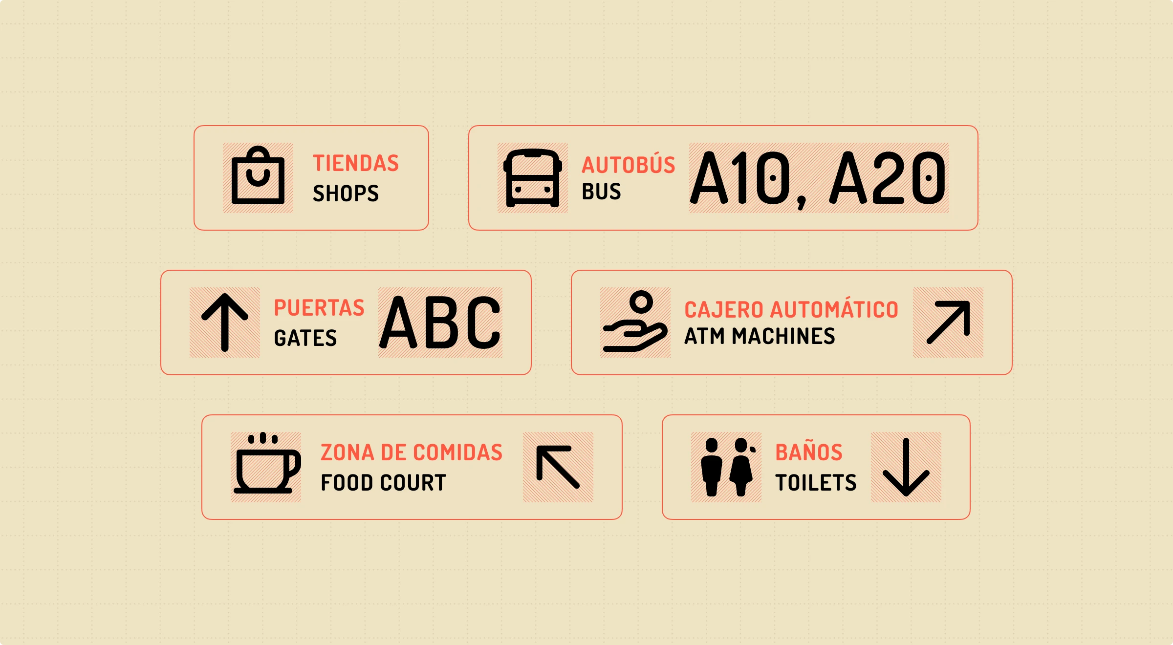
These are just a couple of cases where having more formats is essential. Try using this, the most flexible icon style, to experiment, mix, and match. Don’t waste time adjusting your design elements to fit the scale, just use icons right in the scale you need.
