Most websites have dedicated pages focused on converting visitors into paying customers. The rest of the site usually “sets up” the sales pitch by nurturing leads with great content. And these highly goal-oriented pages drive visitors towards a decision. They ask, “Are you going to pull the trigger?”
In eCommerce sites, these are usually the product pages, which describe on-sale items in detail and display a call to action (CTA).
On SaaS websites, the pricing page usually plays this role. It shows visitors what their subscription options are and moves them to sign up.
When we designed these pages specifically to trigger a sale, we say that they are conversion-optimized. There are dozens, if not hundreds, of ways that a web page can be conversion-optimized. Some are merely UX trends that come and go, while others have evolved into best practices.
This article will look at the latter group, discussing how some web pages have used these to absolutely nail conversion optimization.
1. Highlight free shipping
“Unexpected shipping costs” are frequently quoted as one of the most common reasons for abandoned carts.
If you offer free shipping, you should make it very clear. That will ease any concerns shoppers might have about hidden shipping fees. If this notification isn’t visible, experienced shoppers could regard the product’s price with a bit of suspicion. They are unsure whether this is the actual price they’ll be paying.
At this late stage in your customer’s journey, suspicion, hesitation, and uncertainty are three emotions you do not want to create. You want your visitors to feel the exact opposite. You want them to feel excited and confident about their impending purchase.
That’s why many online retailers resort to working shipping costs into the price of their goods and offering “free shipping.” The smart ones even make a point of highlighting this benefit very clearly. It’s a great way to avoid the concerns that’ll affect your conversion rates.
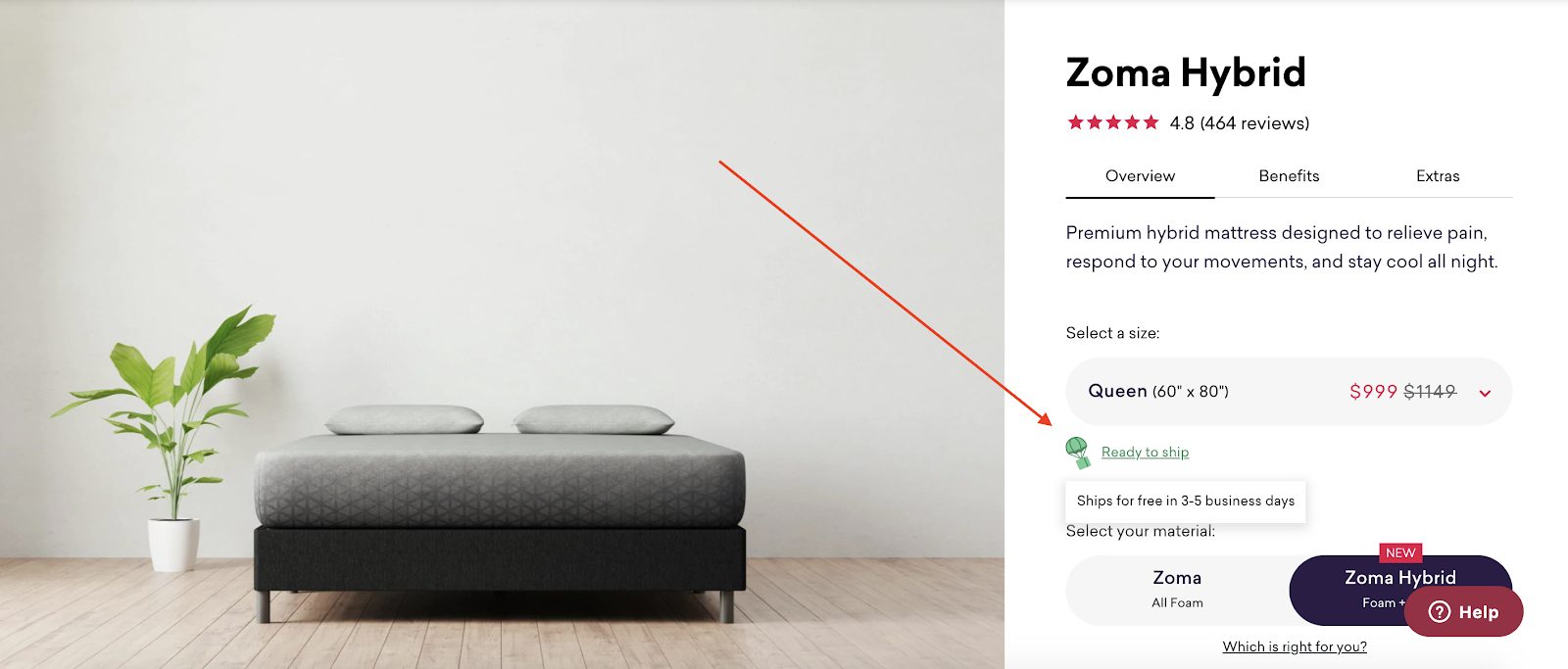
Take a look at how Zoma handles this on their hybrid mattress product page. A nicely designed element with a cute shipping icon says: “Ready to ship.” Hovering over the text shows a tooltip labeled: “Ships for free in 3-5 business days.”
2. Make the quote process easy
Some online businesses provide a service with a highly variable price – one that depends on the visitor’s needs. These businesses often send custom quotes to visitors who fill out an inquiry.
This, in itself, isn’t ideal – especially if you consider how online shoppers have become used to instant pricing. It’s cumbersome and could be seen as a major conversion obstacle.
However, some companies simply can’t get away from this process and have to create a quote based on information supplied by the visitor. It is essential that extracting this info from the visitor is as simple as possible in cases like these.
The number of visible fields shouldn’t overwhelm them. Three at a time is an excellent general rule to follow.
Secondly, the info-gathering form needs to be as easy to interact with as possible with clear visual cues indicating what is required. And including some small copies to alleviate concerns can go a long way.
The Ecopreneurist does a terrific job at solving these issues. It takes only three steps and a total of 65 words to explain the quote process!
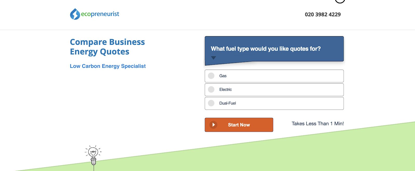
The form itself is also extremely simple to use. Its questions are shown sequentially, with the new form displayed only as the previous one is completed.
A progress bar shows users how close they are to finishing to make things even more user-friendly. Along with that, there’s also a promise that the entire process will take less than one minute.
3. Go the extra mile with your product gallery
Most online retailers know the basics of how to use a product gallery wisely:
- Always use HD images
- Show the product being used
- Show the product from as many angles as possible
- Include a human model or another object for scale
- Include a video or animated gif, if possible
These have long become best practices in showcasing your wares visually.
But there are ways to use the gallery to engage your visitors even more effectively. Remember that your product gallery is yours to do as you please. Amazon may have some strict regulations about what you can and can’t show, but you’re the lord and master of everything that happens on your website. Make use of this privilege!
- Feature images and/or icons that visually show how the product can be used
- Develop trust by displaying pictures of the team/brand story
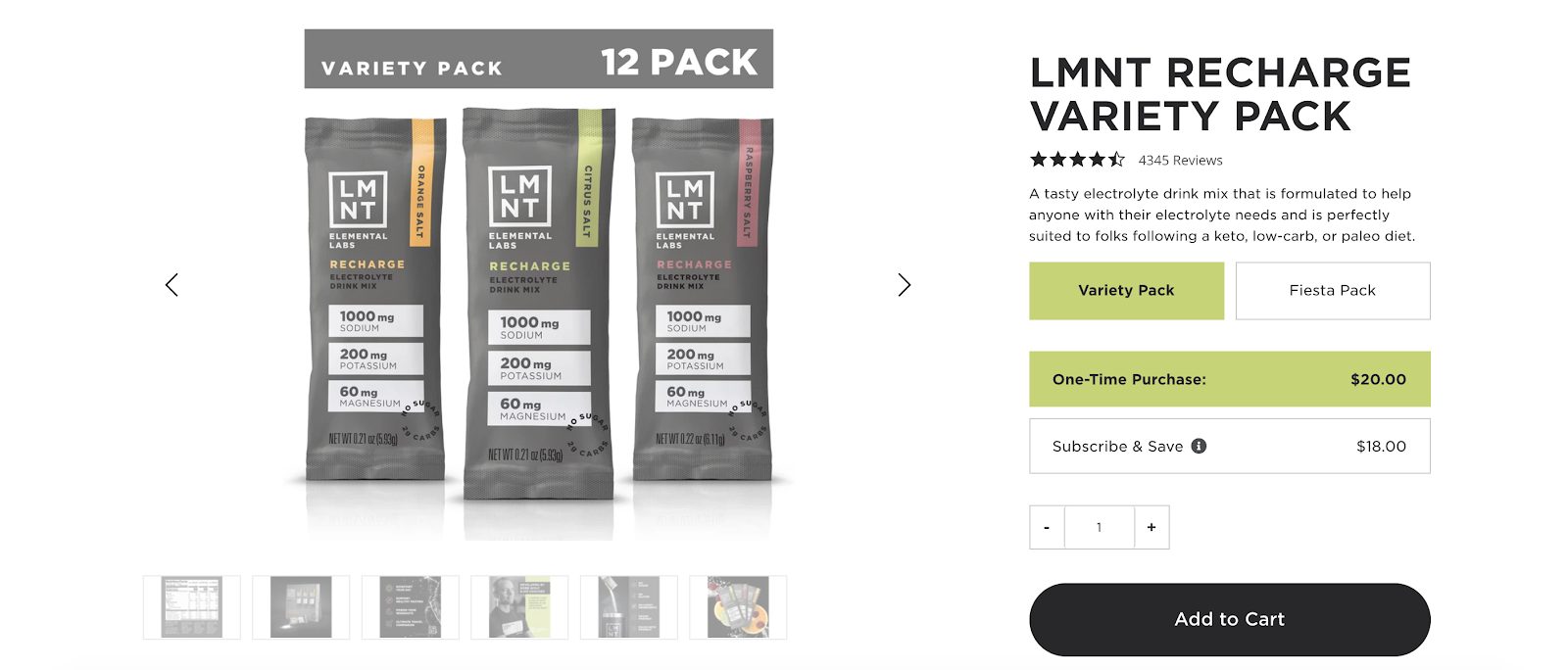
Some retailers are using their product gallery section also to communicate their product’s unique selling points. They know that many visitors will only skim the product page’s text and may miss a vital bit of info that’s critical to conversion.
Elemental Labs does a fantastic job of embedding factual information into their product gallery, mixing this with highly impactful graphics and shots of the product.
4. Show exceptional social proof
Showing evidence that hundreds of your visitors’ peers enjoy your products is a surefire to increase conversion.
But the days of going through the motions with social proof are well and truly behind us. Visitors expect more than simple, one-line reviews by anonymous internet people who may or may not have bought this product.
Customer review best practice has evolved into including the following:
- The customer’s name
- A “verified purchase” flag
- The date of the purchase
- The customer’s location
- A star rating
- The variation (size, model, color) of the product purchased
Some websites further show the customer’s age and skin type, like cosmetics retailer Caudalie.
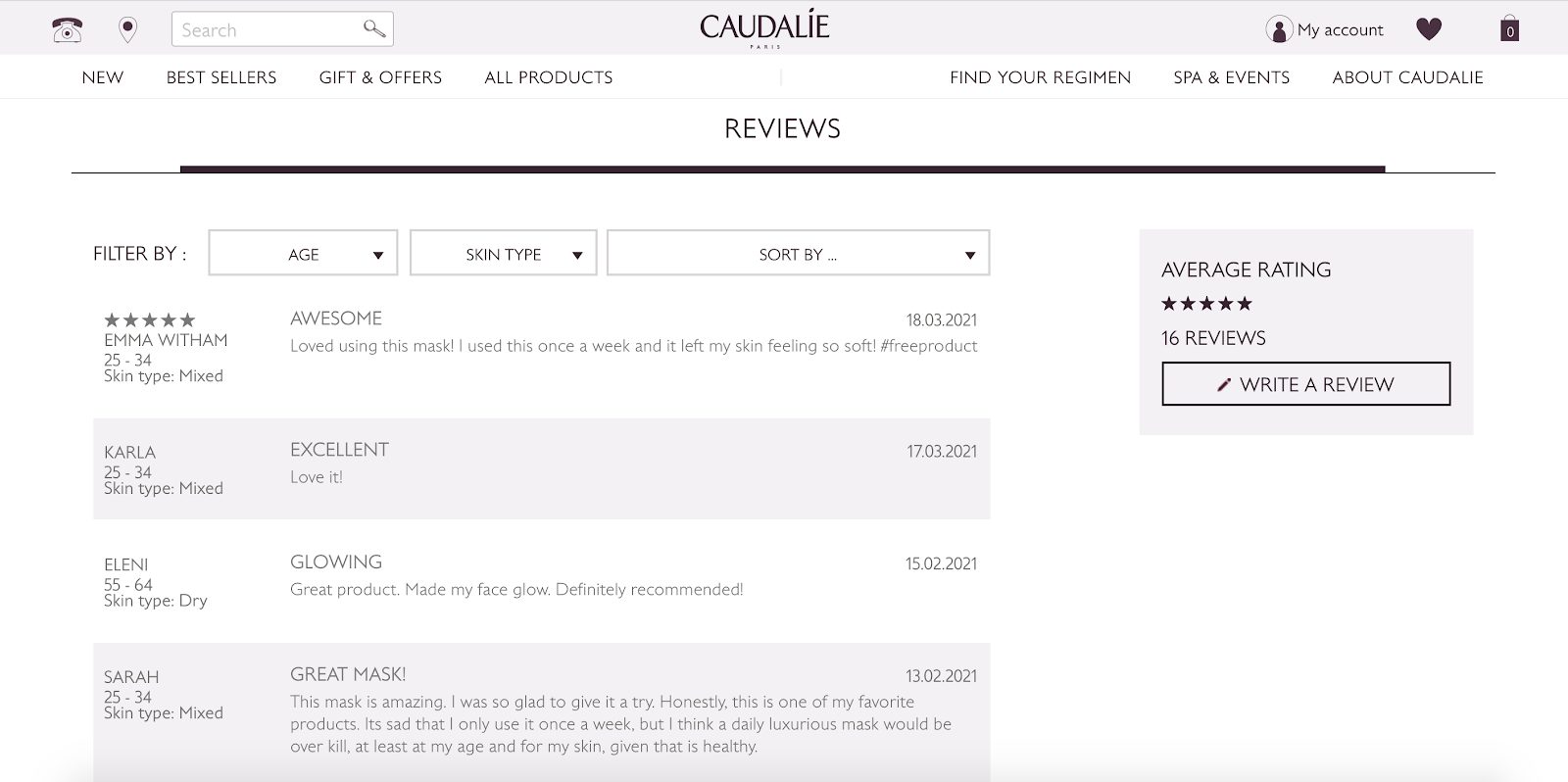
This extra information generates massive credibility for the site and helps drive conversion so that brand-generated sales copy can’t.
5. Highlight discount purchase options
Many online retailers offer discounts based on the number of items bought. What some of these sites fail to do, however, is to make the discount always visible. They only show the new price once a larger batch is selected.
If you offer bulk discounts, make this extremely clear. Don’t wait for them to select different products before they’re (surprise!) shown a new, lower price. They make it super evident that bulk purchasing results in a lower per-item price are a great way to sell more items and buy goodwill with your visitors.
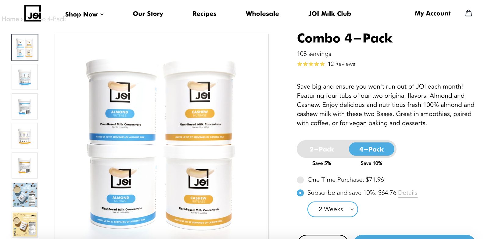
Take a look at the elegant way plant milk retailers Joi highlights this discount on their product page. Right beneath the product description is a toggle for the size of the order with a highly visible percentage-discount text label beneath each option.
6. Clarify who the product is for
SaaS pricing pages have to combat visitors’ analysis fatigue. Successful SaaS companies have an average of 3.5 options available on their pricing pages. Each one is tailor-made for a specific customer persona. And they give a list of criteria that differentiate each pricing option. Often these include usage limitations, storage space, or premium features.
But many times, these pricing tables confuse prospects. They use complicated terms and jargon that prospects don’t understand. That’s why including additional info on who the plan has been designed for is a great conversion booster.
Take a look at how Content Snare and Segment handle this on their pricing pages.
Content Snare gives their options very descriptive names and even writes a short sentence explaining who each plan has been designed for. The segment shows logos of companies that currently subscribe to each subscription plan underneath headings that describe the type of business they’re targeting.
7. Communicate value propositions
A SaaS pricing page isn’t just about displaying your various subscription options. Sure, that’s the page’s main objective, but many businesses forget that it’s also the ideal space to reaffirm your product’s main selling points and value propositions.
Think about it this way, the primary CTA that drives conversion is typically housed on the pricing page. Why wouldn’t you want to use this page to shine a bright spotlight on WHY your product is so amazing?
Be sure not to make this message the primary focus of the pricing page. Its purpose is to draw attention to the CTAs. But there are plenty of ways to highlight USPs without intruding on the page’s main goal.
The most effective way to do this is to use a catchy, concise headline that tells visitors exactly what your product does and why it stands apart from your competitors.
Take a look at these two pricing pages for examples of value being communicated subtly but very clearly.
- Hellosign: “Unlimited signature requests with no hidden fees.”
- Aircall: “A flexible voice solution for your business.”
- LandingCube: “Grow your Amazon business with LandingCube.”

Communicating unique selling points or value propositions can also be done on e-commerce product pages. The main goal of a product page is to promote the product itself by discussing its features and specs and showing it off in a gallery.
However, a secondary objective could also be to discuss the product’s more abstract value – the benefits it will bring into the customer’s life.
Too often, product pages can prioritize features over value, which a smart online retailer will avoid. So don’t just talk about your motorcycle helmet’s color range, its groundbreaking design, how incredibly comfortable it is, or what other customers think of it.
Use your product page to talk to prospective customers about how many fatalities could have been avoided with quality helmets. Tell your visitors how much more they’ll enjoy riding their motorbikes knowing that they’re wearing state-of-the-art protective headgear.
In an e-commerce context, value isn’t just about features and design. It’s about the lifestyle benefits your customers will enjoy.
8. Testimonials — show off positive customer feedback
Testimonials are a great way to nudge a visitor towards clicking on your pricing page’s CTA.
These differ from customer reviews because they need to have more credibility and highlight definite benefits than just a random customer’s opinion.
Testimonials are tidbits of a review or other source of feedback. They are strategically placed on a webpage to build trust/social proof and ease potential concerns stopping a prospect from converting.
The benefit of using testimonials on a pricing page is that you have full custodianship over what this content says and how it is displayed. Unlike a standard customer review section, there’s no expectation for the messaging to be objective.
It’s important to understand how much creative freedom you have here. As long as the testimonials are legit, you can cherry-pick the best things your customers have ever said about your business and display them with pride!
Take a look at these two excellent examples.
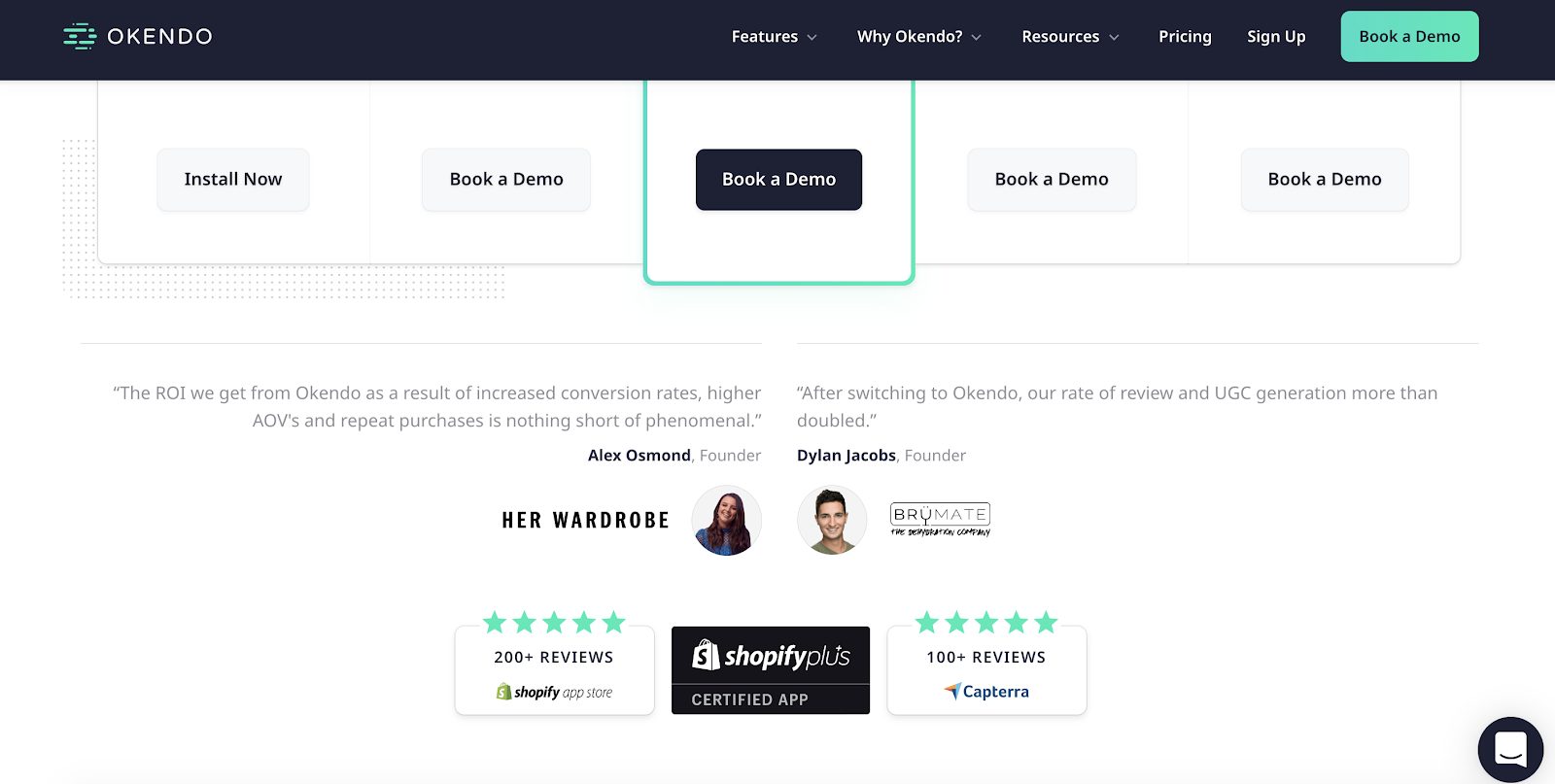
Okendo shows two extracts from customer testimonials. Both include mini portraits and details of the customers who are being quoted.
Maze displays a rotating “carousel” of testimonials. A very striking aspect of each frame is the high-quality photograph of the customer – something that makes a telling contribution to the testimonial’s credibility.
Some final thoughts
Optimizing the design of your product or pricing pages is one of the most valuable things any website can do.
These are ultimately the pages where people give you money or turn away. Even just minor improvements here can result in major increases in revenue and profits.
Suppose you’ve got decent skills with interpreting Google Analytics and performing A/B tests. In that case, there’s no reason why you shouldn’t frequently be making changes to pages where conversion happens, measuring the outcome of these changes, and sticking with the ones that work.
Then you can work on optimizing the other major pages on your website. The pages that get the most traffic and the pages that drive the most traffic to your money pages are usually the next most important.
This way, you are constantly tweaking your website and improving your marketing funnel.

