A brand’s cohesive visual design increases its recognition across all channels. Yet, despite its importance, many businesses overlook this crucial step. In this article, we will guide you through a checklist that will help you create or update your visual style.
To maintain visual cohesion, you need a visual style guide, often called the “brand bible.” It’s the home base for all of your company’s visual imagery guidelines.
A style guide allows you to easily delegate design needs and keep a consistent design across websites, social media, ads, and other media. Instead of explaining your fonts, colors, and other elements every time, you can refer designers to your visual style guide.
Creating a style guide is a time investment; however, in the long run, you’ll save more time. You won’t have to explain to every designer why that font doesn’t work or that your logo needs more spacing.
Why does your brand need a visual style guide?
We’ve established that a visual style guide will save you valuable time, but how else can it help your business?
- Your brand will be instantly recognizable. Branding is key to creating an identifiable business. When you think of Nike, what comes to mind? Either the Nike Swoosh or “Just do it” slogan, right? These are integral spokes in the visual wheel that keep the Nike entity famous.
- Your brand will stand out. With a consistent visual brand, you effectively distinguish your business from your competitors. Use out-of-the-box solutions or combine familiar elements that work, such as pastels for an ice cream parlor. Anyway, you can build a unique, stand-out brand—two birds, one stone.
- You’ll reinforce your brand story. Colors, visuals, fonts, and elements evoke emotions and steward your brand’s impact. Creating a brand style guide ensures that your mission, vision, and values transcend compellingly. They, in turn, will articulate your brand story.
Ok, so a brand style guide is essential, but how do you go about making one? Look no further than the checklist below!
Visual style guide checklist
- Define your logo guidelines
- Develop your color palette
- Fonts speak louder than words
- Pick iconography that distinguishes your brand
- Clarify photography preferences
- Set up templates for social media posts and ads
Define your logo guidelines
Often, the first thing people see from your brand is the logo. Create a logo that accurately portrays your brand and what it stands for. Consider placement, color, fonts, and spacing.
Use your style guide to define your logo guidelines, how to use them, and how not to. Make variations of your logo, as Spotify did in its guidelines.

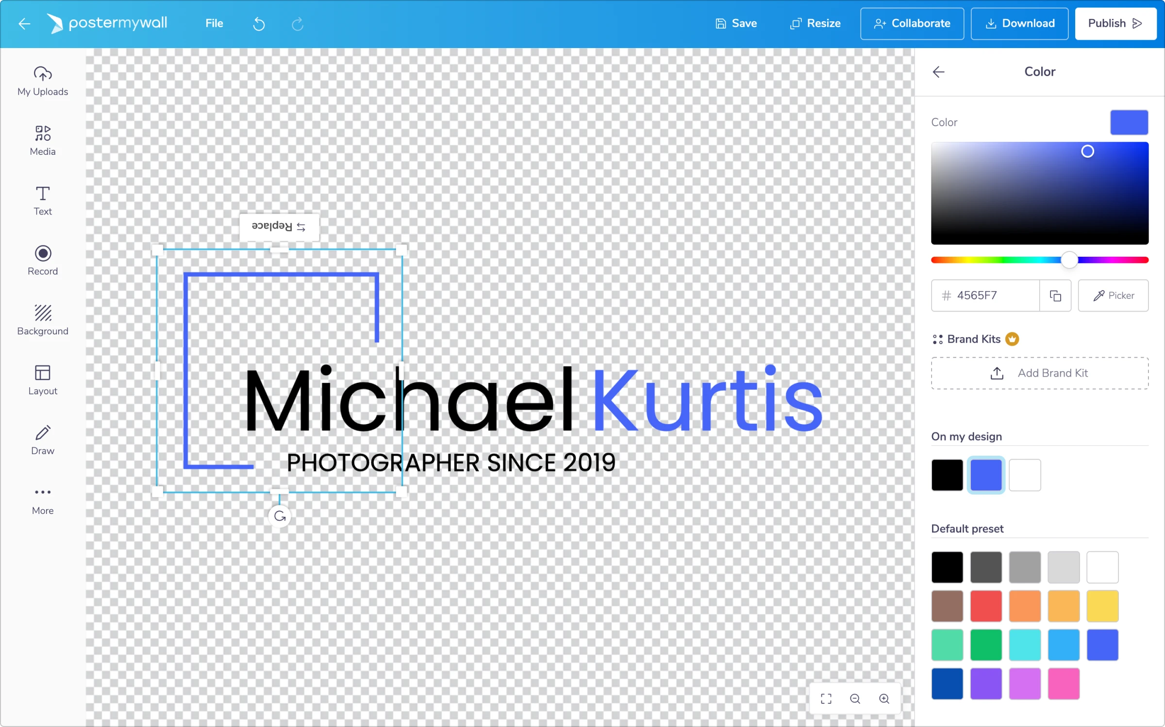
You can apply these principles to create a logo with tools like Freelogocreator, Makr, Designhill, DesignMantic, or PosterMyWall. These apps allow you to customize fonts, colors, placement, and elements easily.
Using a logo creator, you can create high-quality logos yourself and save time and money on design services. It is also easy to create variations of your logo for seasonal promotions. You can save these variants in your visual style guide for future reference.
Develop your color palette
Using the right colors, you tell your audience what to feel and how to respond. When you select a color palette, consider color psychology.
When does blue represent peace, and when coldness? How does red impact people; does it inflict passion or anger? Color psychology will help you select colors precisely and convey their meanings.
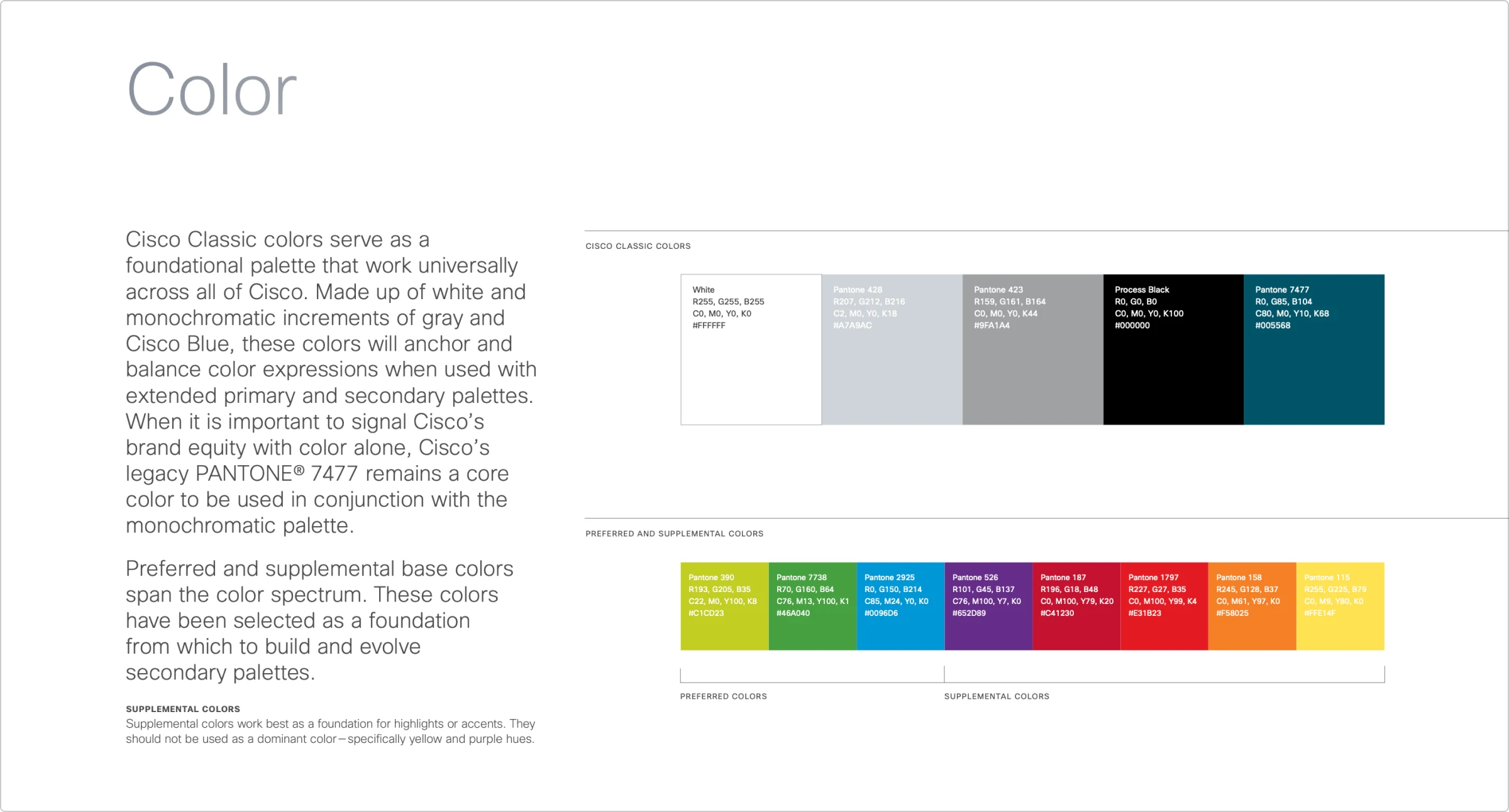
Explore connotations of colors and pick a palette that expresses your values and brand story best. For each color in your palette, you can add its specific hex code, as Cisco did its color breakdown.
Fonts speak louder than words
Some fonts tug at our heartstrings, while others repulse us. Why is that? Because fonts are essentially a form of language. Word and its form deliver brand messages with equal effectiveness. That’s why it’s vital to develop brand typography.
It doesn’t mean you can’t have font variation. Instead, pick 2-3 fonts and arrange them in a font hierarchy. Define sizes and styles of titles, subheadings, body, and anchor texts on your website or blog.
Typography offers a gigantic ocean of options, and it can be intimidating to settle on the right choices. Experiment with variants of Google Fonts and select the best ones for your business.
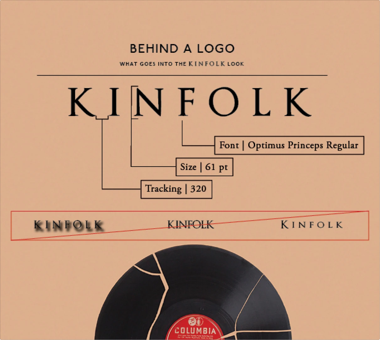
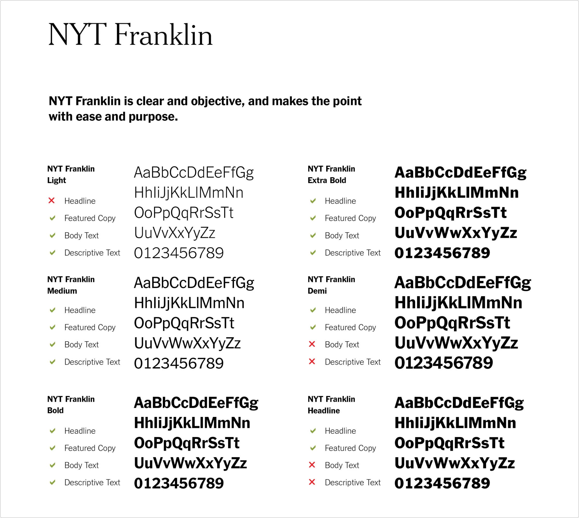
Outlining sizes and spacing is important for creating variation between fonts. Define all font styles and spacing in your style guide, as Kinfolk did in its branding guide or David Jalbert-Gagnier for the New York Times brand strategy.
Pick iconography that distinguishes your brand
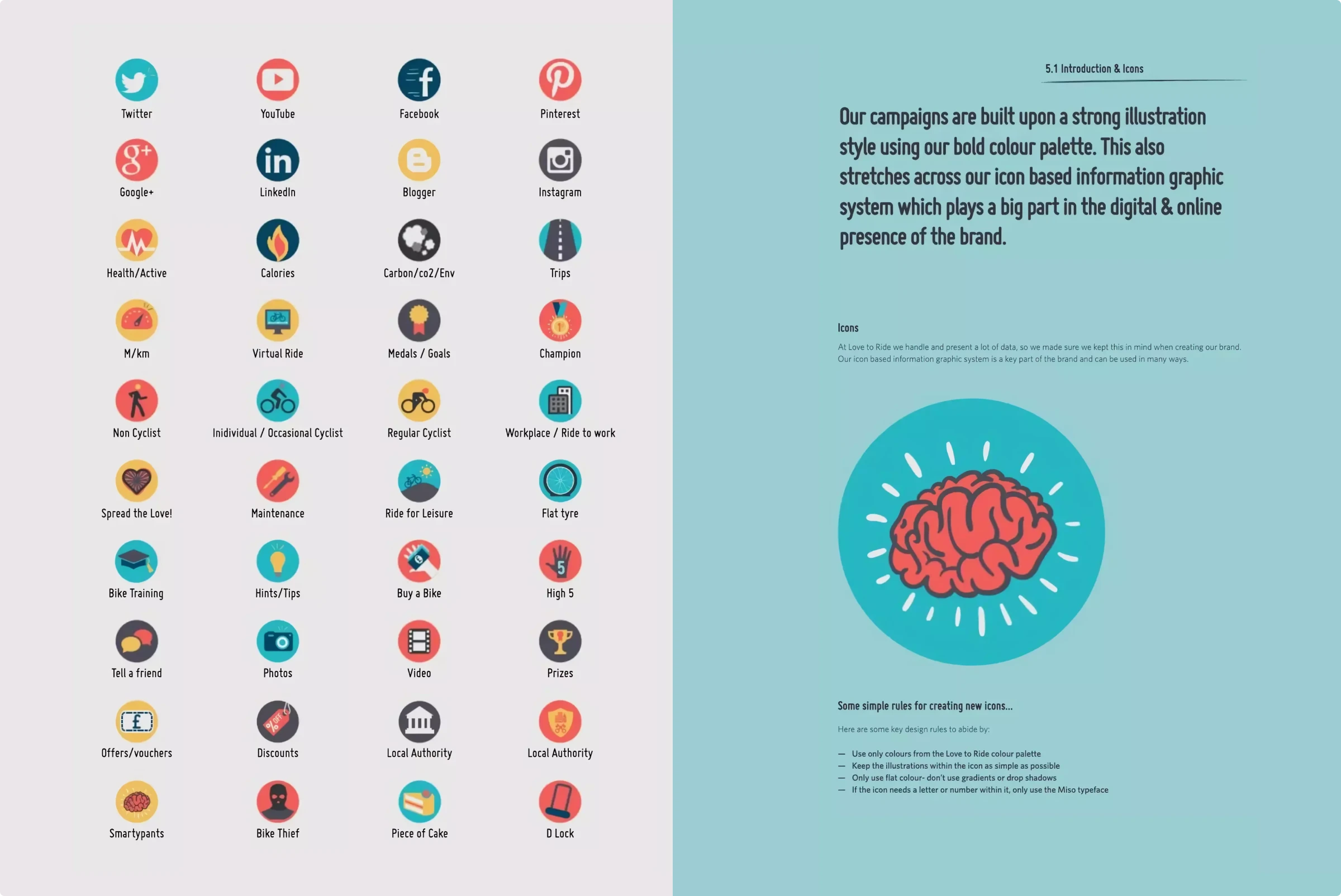
Creating iconography — which includes patterns, icons, design elements, and other graphics — is an excellent way to make your brand stand out.
One study observed that visuals comprise 90% of information communicated to the brain and that the brain processes visuals 60,000 times quicker than text.
Bottom line: images stick.
Think squiggly lines, colorful polka dots, geometric shapes, and objects.
Take a look at Love to Ride’s “icon-based information graphic system.” Pictures, bold colors, and iconography are key ingredients in its visual style. The style guide also includes rules and guidelines for icons and illustrations.
Clarify photography preferences
When using photography instruments correctly, images illuminate specific feelings and emotions. Black and white photography is emotional, moody, and artistic. A sepia tone incites nostalgia. Vibrant colors are active and pop off the page.
For photography to work for your brand, use it carefully and precisely. Think about how you will convey your brand’s mood, atmosphere, and culture with photos. Formulate guidelines for it in your style guide.
Also, include examples of appropriate and off-brand pictures, such as those in the University of Colorado Boulder’s photography guides.
Whether you work with stock photos or hire a photographer, clearly define the photography style to ensure consistency in your imagery.

Set up templates for social media posts and ads
Staying active on social media builds community while keeping your brand relevant. However, posting high-quality content consistently is a full-time job. To mitigate this time demand, set up design templates. You can quickly customize them for specific tasks.
There are many online graphic design tools for creating social media content, such as Canva, Desygner, and PosterMyWall. Each application has its own unique set of templates.
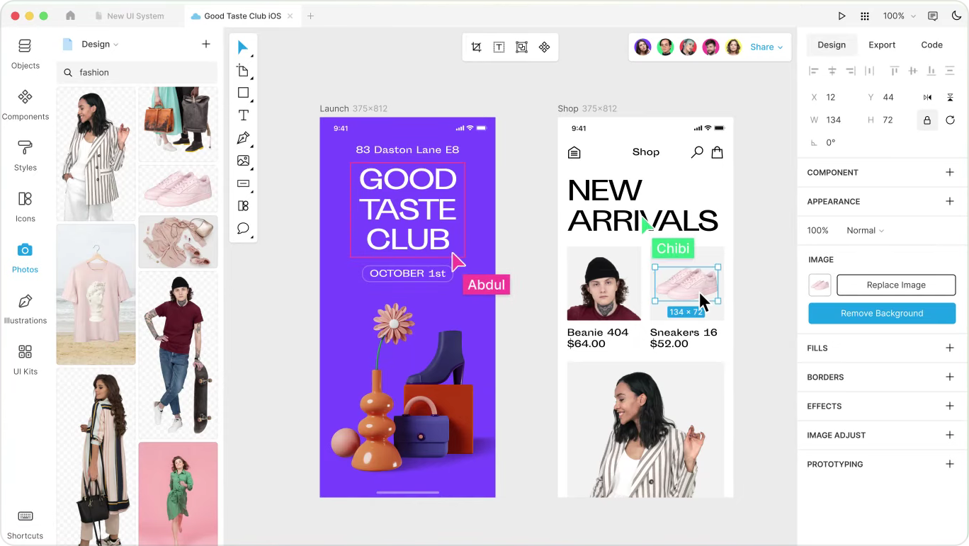
To create and customize templates offline, you can use Lunacy, free graphic software with built-in Icons8 assets.
Tying it all together
Now that you know the fundamentals of creating a visual style guide, it’s time to bring it all together. Chances are, you might not need to emphasize every step listed here. Instead, use this list to craft your style guide – whether that requires 1 or 100 pages.
As your business grows and evolves, your visual style guide should change with it. The visuals must always match the essence of your brand. And we hope this article will help you with that.
About the author
Christina Lyon is a SoCal-based writer, blogger, and musician. She obsessively reads fiction, writes poetry and songs, and is currently editing her debut fiction novel. She loves wandering the coastal beaches and contemplating the meaning of life through words.
Also, check these articles:


