You’re likely a few WIPs and a couple of case studies away from landing a dream illustration gig. Dive in to see our tips on creating a portfolio.
It might seem like creating a portfolio is not that hard. After all, it’s there to showcase your work and let people know what you do as an artist. However, writing “freelance illustrator, DM for commissions” on Instagram and posting your latest pieces occasionally is not enough if you’re looking for work. If you are serious about illustration and want to find exciting projects to work on, you need to adopt a more professional approach.
Whether you showcase your portfolio on a dedicated platform like Dribbble or create your own website, here are some tips to make your work stand out.
Show the WIPs
Nothing can better illustrate your creative process than work-in-progress shots. By showing them, you take your potential clients behind the scenes and let them peek at your workflow. WIPs add value to the final work because the clients see how many iterations the illustration went through. Also, it’s a great way to make your portfolio feel less formal and more alive. You can include hand-drawn and digital sketches and versions that didn’t make it to the final round.
Make it clear what you specialize in
Stating what you specialize in doesn’t mean you have to reject any project that is not exactly what you prefer to do. It simply helps potential clients see what you’re best at and filter out commissions that might be outside your field of interest. If you mostly do illustration for children’s books and your portfolio highlights it, you will be less likely to receive, say, a request to make flat minimalist illustrations for a local law firm.
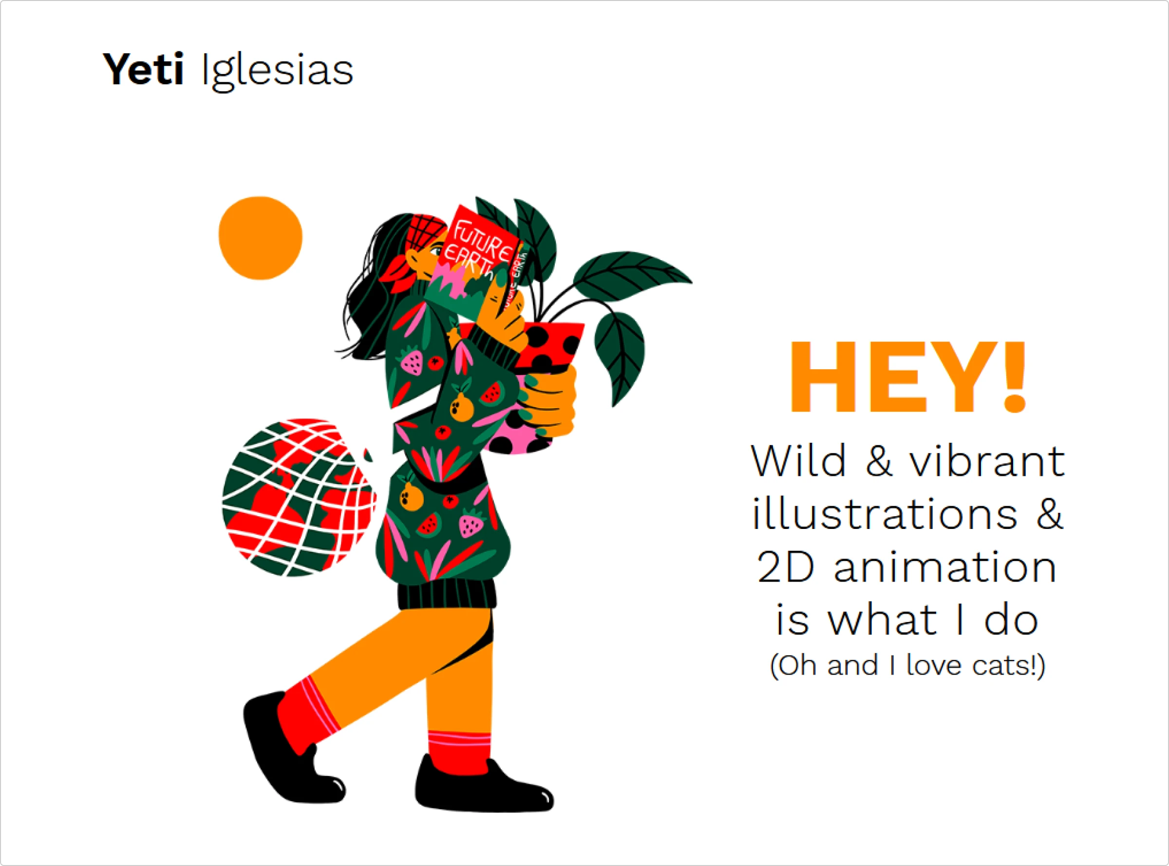
Be consistent with naming
Do you have a pseudonym? A nickname? Do you usually use your real name when showcasing your illustrations? Or are you a one-man creative studio? Whatever the case, make sure you use the name you normally use as an illustrator. If users on Instagram know you as DuoTony, this should be your username and domain name on every other platform. In case you normally post your works using your real name, e.g., Tony Velasquez, make sure you keep it when creating a portfolio. Using something entirely different out of the blue will make your work harder to discover.
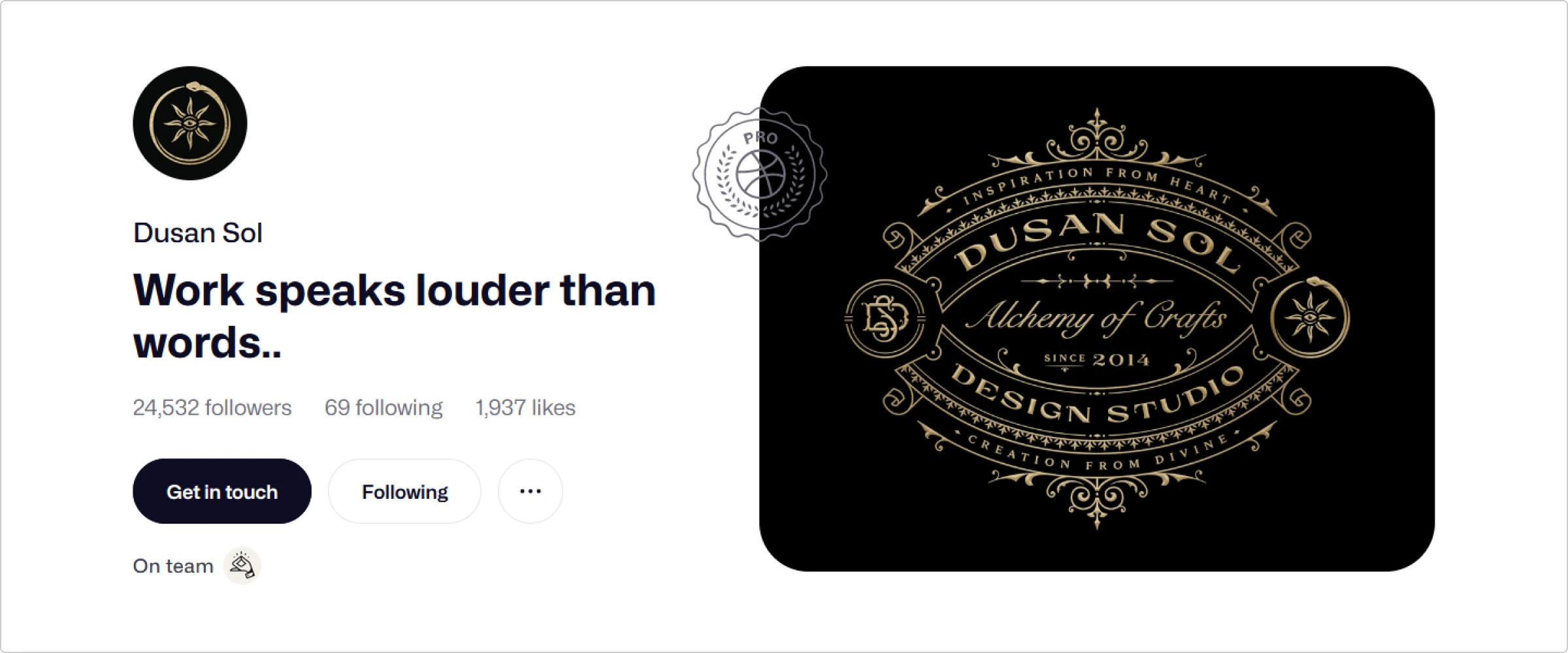
Be careful with the word “studio”
If you are a solo freelance artist, present yourself as one and avoid using the word “studio.” Many companies aim to find an independent solo artist rather than a creative studio when looking for an artist. For clients, studios can be more expensive to work with than freelance artists. For studios looking for talent to add to their team, another studio sounds like a competition. This means that using “Jane Doe illustration studio” on your portfolio could lower the chance of getting hired. Something like “Jane Doe illustration” or “Fashion illustrator Jane Doe” tends to work much better.
Write case studies
If you had a particularly challenging/atypical/massive project that went far beyond making a few sketches and delivering the final version, write about it. Like WIPs, case studies are an amazing way to show the work behind your designs. Share stories behind your most prominent projects to let potential clients take a glimpse of your creative journey. Again, it adds value to what you do and makes your portfolio more lively and relatable.
Less is more
Always choose quality over quantity, and don’t try to squeeze every project you’ve worked on into your portfolio — even if you want to do this to show how many commissions you’ve already completed and how diverse you can be as an illustrator. A portfolio is a selection of your best, most relevant pieces that show your skill. It’s not supposed to be an all-in-one with a dash of mediocre works, along with solid ones.
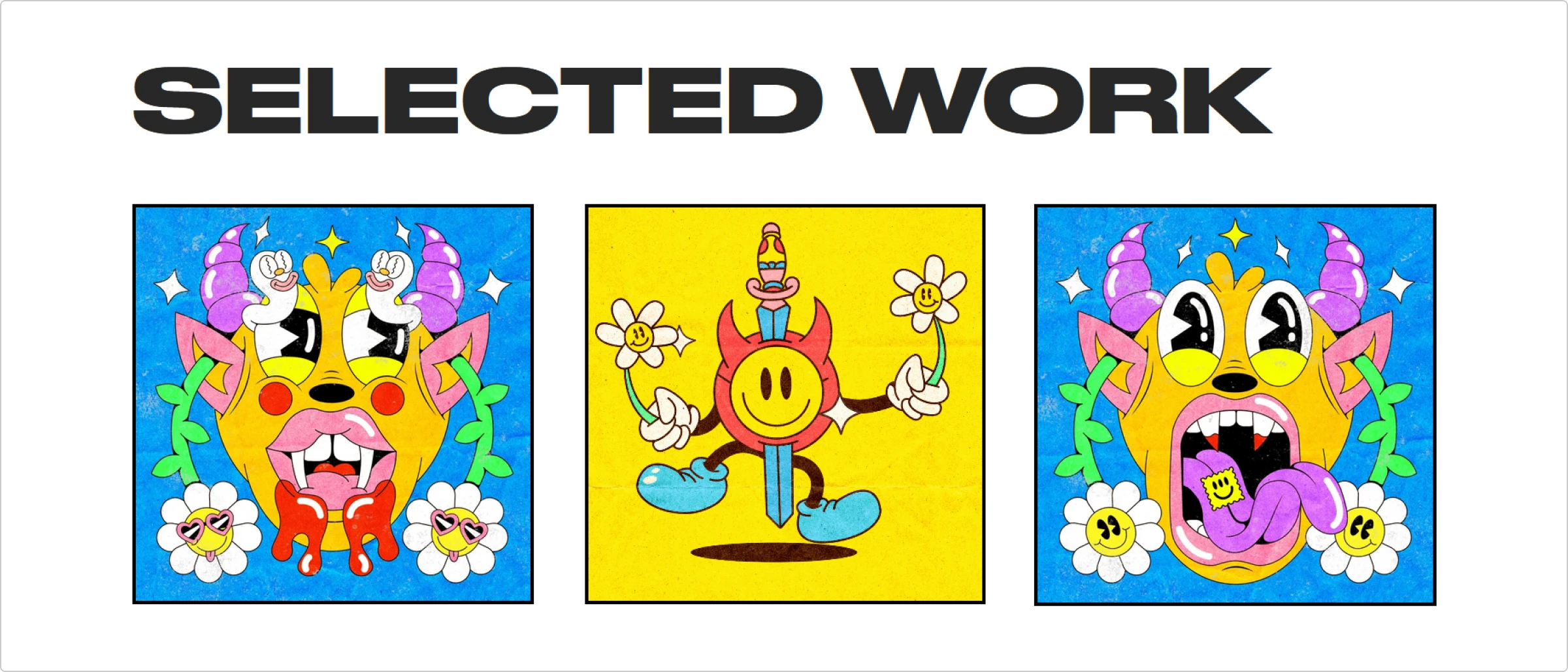
Make sure the portfolio reflects your vision
Overall, the best color scheme for any portfolio is a white background and a non-overwhelming black font. It looks clean and professional and doesn’t overshadow the actual work. However, it’s not a universal formula that fits every portfolio. Ideally, the color palette, font, and button style you pick for your website should be in tune with your style or complement it. Choosing a plain, black-and-white layout might not work if you are famous for over-the-top, colorful, trippy illustrations.
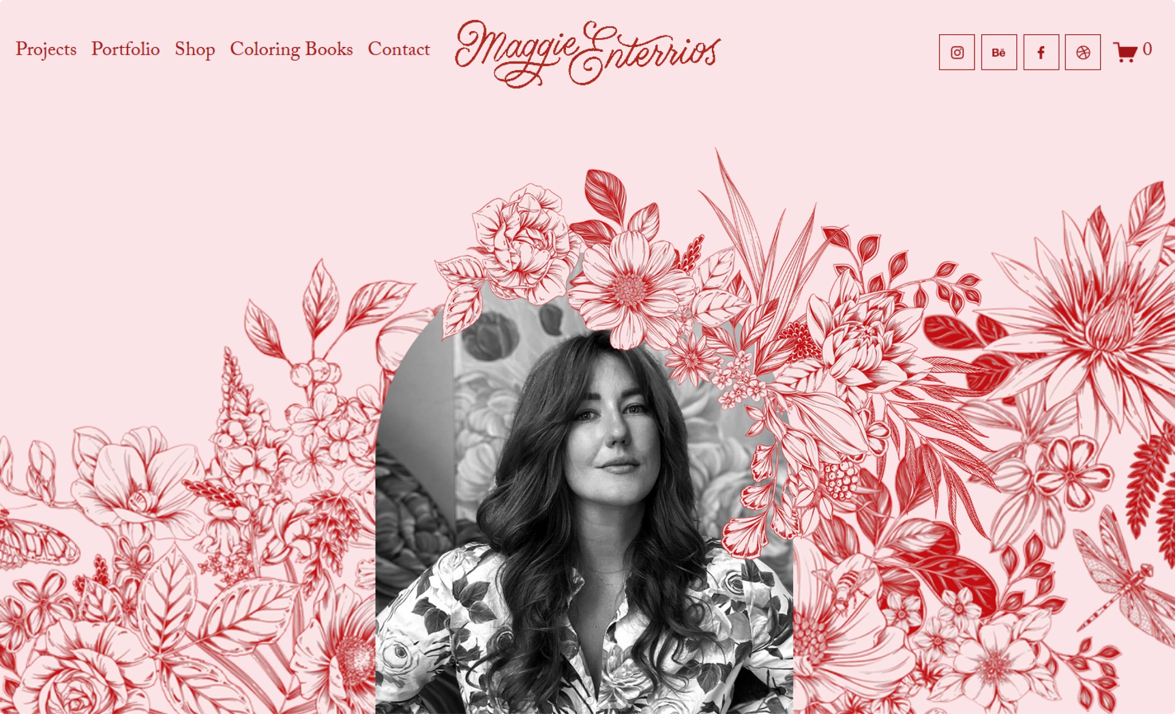
Also, beware of a layout that looks almost too sleek and luxurious unless your price is way above average and you only work with luxury brands. If you want to attract a broader audience, a portfolio with an expensive feel might do you dirty. It can make people think your pricing is above and beyond their budget, leaving you with no offers. Instead, make the layout lighter, simpler, and friendlier to show that you are available and affordable.
Only use high-quality mockups
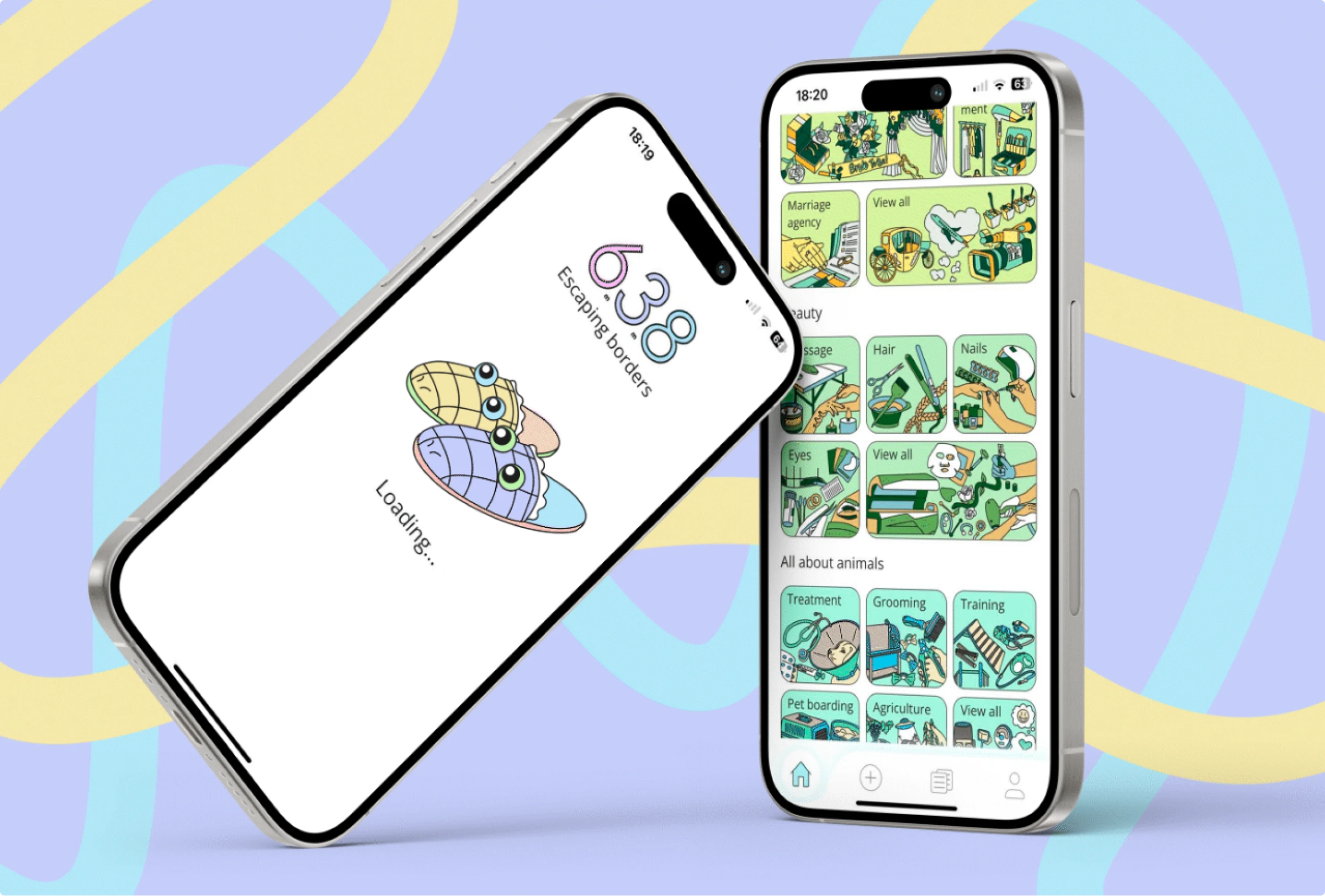
When creating mockups of the final look of your project, make sure it doesn’t look sloppy. Avoid using sample texts like lorem ipsum, awkwardly unnatural frames imitating phones and PCs, generic layouts, etc. Also, avoid using front-facing mockups and choose a more lively angle instead. A front-facing one often looks flat, lifeless, and boring, which doesn’t do your illustrations any justice. A good mockup makes your illustration come to life and look like a well-rounded, complete piece.
Where can I host my portfolio?
Lucky for you, there are tons of options to select from when creating an online portfolio. There are portfolio website builders like Carbonmade and dedicated professional platforms for creatives like Behance. Here is a quick overview of some of the most popular of these.
Adobe Portfolio
Adobe Portfolio is free if you already have a Creative Cloud subscription. You can also try it with Behance Pro for free with a 7-day trial. After that, the Adobe Portfolio + Behance Pro subscription starts at US$9.99 a month.
Behance
If you have a free Behance account, you’ll need to pay fees for every transaction. With Behance Pro, you don’t have to pay fees and get access to advanced profile analytics. The Pro plan starts at $9.99/month.
Dribbble
The basic Dribbble Designer Account is free for everyone, but if you want to improve your account’s visibility and view your profile stats, you can subscribe to the Pro version. Dribbble Pro starts at $8/month.
Format
The Format has a 14-day free trial, then the subscription starts at $8/month. If you want more freedom to customize the site via HTML and CSS, opt for the Pro plan, which starts at $11/month.
Portfoliobox
With Portfoliobox, you can use it for free for one month when selecting a Pro or Pro Plus plan. After that, the Basic plan starts at $3.5/month if billed annually. You can set up an online store along with your portfolio with no additional commission fee.
Carbonmade
In Carbonmade, you get to experiment with the website editor for as long as you’d like, but once you decide to go live, Carbonmade’s basic subscription starts at $8.25/month.
JournoPortfolio
Creating a basic portfolio website with JournoPortfolio is free. You get one page with up to 10 portfolio items. If you need more pages or additional room for more media files, the Plus subscription starts at $2.50/month.
Check more digital art in the collections of illustrations on teamwork, landscape illustrations, hero illustrations for web design, review the collection of mobile UI designs with illustrations, and learn how illustrations improve user experience


