How many designers are out there?
According to BLS, there were almost 270,000 graphic designers – employed – in the US alone. How about freelancers and other types of designers?
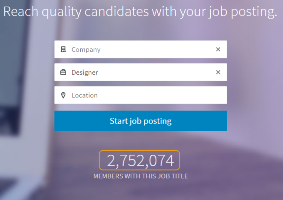
On LinkedIn job stats, there are almost 3 million people who have “designer” in their profile description. However, anyone can put a “designer” tag in their profile. I’m sure my unemployed friend who constantly criticizes the Mickey Mouse t-shirt I love is somewhere among them.
Yet, global design platform Behance rejoiced on reaching 10,000,000 members in 2017, and in the same year Dribbble welcomed more designers than it did during 6 previous years.
So, how many designers are out there? A lot, and a lot more to come.
Now how many of them are standing out?
To make this question not rhetorical – how many of them have more followers than they follow themselves? How many of them have more than 1,000 followers?
In my last article, I asked successful designers how to be unique while standing out. In this article, I’ll try to cover how to stand out while staying unique.
Use Platform-Specific Tricks
There are many platforms that you can feature your work on: Behance, Dribbble, Instagram…
You can say that they are all pretty much the same – you upload your work and count your likes. However, the devil is in the detail. Every platform has a unique set of features that make certain efforts more efficient. I’ll mention a few.
Behance
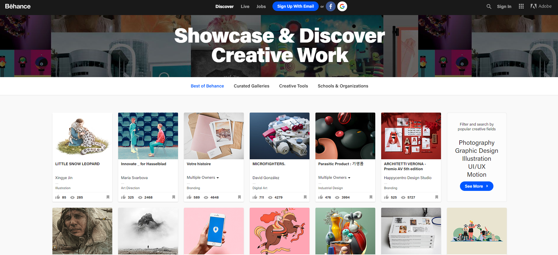
All the Behance projects you see on the front pages are approved by curators
In my opinion, two distinct features of Behance are curated sections and collaborations.
Curated Sections
On Behance, there are curators who go through thousands of projects every day and decide which ones to feature in every one of 60 different categories. What does that mean for you?
You have a chance, even if not a particularly popular designer, of getting featured in one of these and instantly attract a lot of attention to your work. Sounds too good to be true? Probably, because getting featured is darned hard.
There are hundreds of established professionals on Behance with a great following base, so their work will always attract the attention of many people, and, consequently, curators.
So what do you do? You pivot. You niche. Or you buzz.
- Pivot: if everyone is drawing elephants, try going for a mouse. The hardest part about pivoting is not drawing mice, it’s finding elephants. More on that in the later sections.
- Niche: some Behance categories, such as illustration and graphic design, are overpopulated. Others, such as [made via] After Effects, have lower competition. Thus, they are easier to get into.
- Buzz: work with big brands. Big names always attract attention. Work for free, if you need to, just to get your name out there. More on that later in the article.
Collaborations
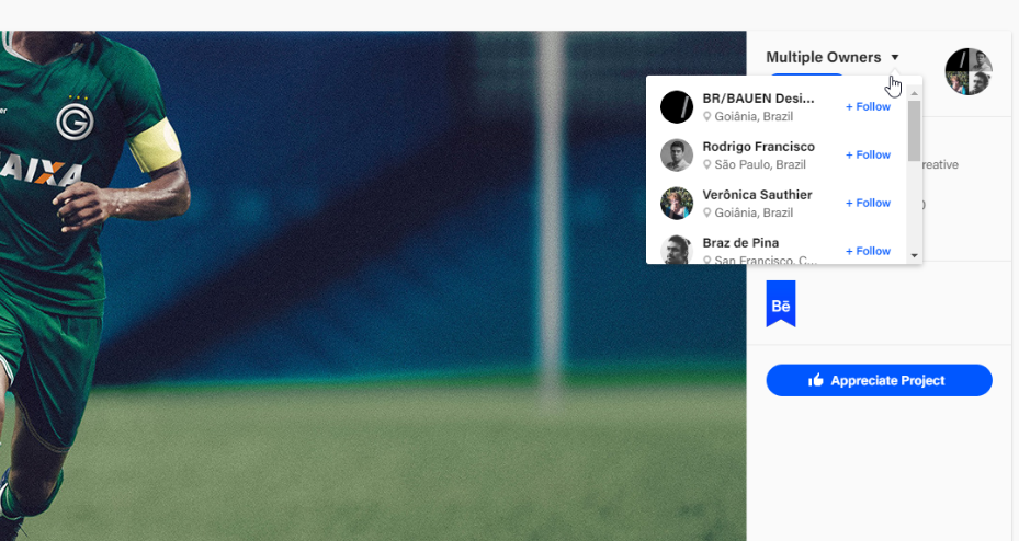
One thing I like about Behance is that you can have multiple owners for a project.
Project link
When a project has multiple owners, it is shown in the feed of every one of them. Such projects get the attention of all the followers of the people involved, and, consequently, more often end up in the curated section.
If you plan to do a collaboration, make it a worthwhile experience for all the designers involved – have approximately the same number of followers to have equal benefits in the pack and make sure that your collaboration will actually produce something interesting to the people. If you can’t offer followers, offer something else – money, time or organizational skills.
Just remember, Behance is a project-oriented platform. You never upload a single shot from your work – there has to be a whole visual story to every post you make. If you post anything, make sure it includes sketches, added materials, alternates, etc. Make sure you work tells a story. Ideally, make sure that your whole profile tells a story. All the projects you upload should be somehow connected, otherwise curators might think you’re fishing for their attention and testing their algorithms.
Also, I’ve noticed that on Behance most projects that get featured are real-world projects, there’s not much fooling around with test concepts and fun ideas.
If you want to fool around & experiment, I know just the place.
Dribbble

Dribbble is all about single shots. You post just one piece of your work, and that’s it. It changes the whole approach on how you behave on the platform.
First of all, your shot should be catchy. A few tips here:
- Animation: Dribbble supports .gif and, recently, video formats. Animation always intrigues, and people like to know where it goes. In order to watch full animation, they click on your shots.
- Vibrant colors: unfortunately, as all great marketers do, Dribbble designers exploit basic human nature to spot unusual things around us. Thus, bold colors will inevitably attract more attention than neutral tones. However, if everyone is using them, the opposite happens. Remember about spotting elephants.
All in all, designers on Dribbble tend to experiment more than on Behance. Half-baked concepts, unrealistic color combinations, and overloaded animations could be inappropriate in real-world projects, but here? It’s a wild west of ideas, and you can easily be the one to find gold.
There are no curators on Dribbble, so you attract the attention of your fellow designers and bystanders. Every shot you upload starts in the “Recent” section. If your shot is popular and gets upvoted, you will end up in the “Popular” section on the main page. There are not many rules here, so you are free to experiment with whatever works. Your profile can be a collection of completely opposite projects, yet stay relevant at the same time.
Tip: consider regular posting if you want to end up in the “Trending” section of the platform.
I’ve seen many designers having profiles on Instagram, uploading their shots there parallel to uploading on Dribbble or Behance.
As for me, Instagram is the worst choice for a designer, because other platforms give you access to a design community and to people who are deliberately looking for someone to hire. However, that is where Instagram differs from design-oriented platforms: the audience.
Your work will be judged not by designers, but by ordinary people. Their design standards and overall awareness in the field is lower, so the only binary you’ll be judged with is “I like it”, or “I don’t like it”. I wouldn’t expect bystanders to appreciate 30 hours spent on kerning two letters in a 3-letter logo.
On a bright side, it’s easier to stand out among legions of booty queens and travel bloggers with your work, especially if you’re in illustration. I wouldn’t expect UX mockups to generate a lot of aws, but who knows. You just need to find your audience.
A few tips, specific for Instagram:
Tags
A big part of the network. If you find popular and niche tags, you may attract attention to your work.
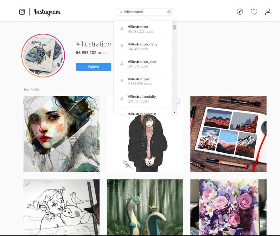
Tip: browse semi-popular designers (not those who have millions of followers) and try using in your posts the tags they use. Better yet, come up with tags that are hot and connected to your work, yet not too overpopulated.
Paid Promotion
Perhaps the most flexible promotional engine you can find anywhere, and it’s connected directly to Facebook ads. Unlimited potential, but requires a lot of expertise in Facebook and social marketing to make it work. I wouldn’t expect miracles here.
Strong marketing community
Many marketers employ Instagram as a selling platform for their products, so there are tons of materials on how to promote yourself there. Back following, giveaways, stories, influencers… Whatever works these days and is not banned, yet can be used if you’re willing to spend some time learning the craft.
That’s it for the tips. Take your time and learn the platform you’re going to use most often and utilize its hidden gems. Dribbble meetups, groups on Behance, Instagram analytics… I’d recommend focusing on one platform at a time – read success stories, try and fail, then try again, then give up, then watch Rocky movies, then don’t give up… You know the drill.
Identify Design Trends
Whatever you do, trends are there. Building trend awareness is equally important whether you’re going to follow trends, disrupt them, or even ignore them.
To spot design trends:
- Analyze Dribbble top pages and Behance best section daily
- Follow prominent designers in your field
- Read popular design publications and authors
Analyze Dribbble top pages and Behance best section daily
I wouldn’t expect to catch all the trends in one day, so you should do the reconnaissance for some time. If you’re serious about design, you’re already doing it. Just start thinking more analytically about it.
Let’s look at the Dribbble “This Past Month” top shots:
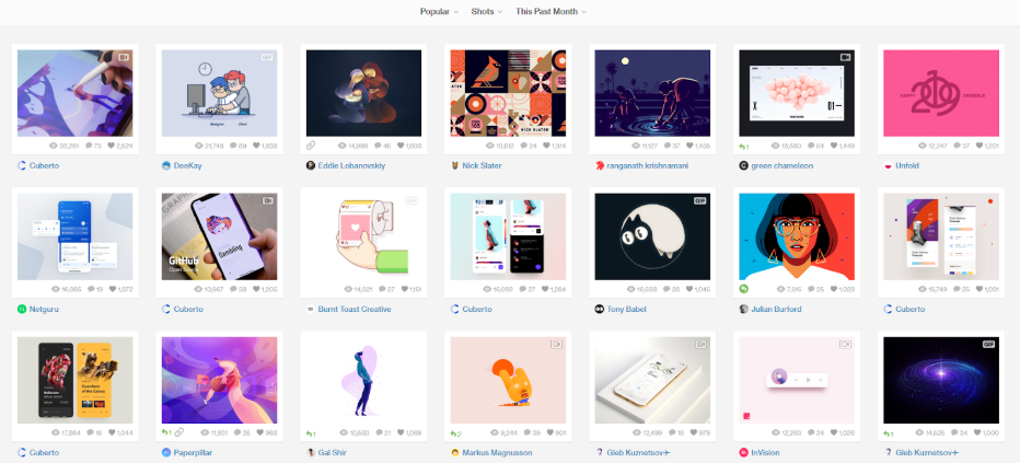
Most of the shots here (actually, all of them) are made by popular designers on this platform. These people follow trends or create them. Their work will generate a lot of likes no matter what, but there’s still much to learn from here:
– What are the similarities between different designers?
– Is the shot as popular as other work of this designer?
– Are there any designers with a smaller following that made it to this section?
– Is there anything new any of these designers tried or did they keep their shots similar to the past ones?
Add “why” to every one of these questions. Add 10 more questions. Also look at the “top of the week” section. Repeat on Behance. Repeat weekly. That should give you some trend awareness.
Follow prominent designers in your field
Not all designers are on the platforms you utilize. Some of them tweet a lot, others blog. Find them, follow them, research their work and their insights.
Read popular design publications and authors
What to read is up to you. A few suggestions:
CommArts
Dexinger
Creative Bloq
And yours truly, Icons8 Blog. Give us a try.
Don’t just focus on the design field exclusively. Explore fashion, tech, culture, photography. The more versatile you are, the more resourceful you are. More on it in the “Merge trends” section below.
Utilize Trends
After you’ve built trend awareness, there are all sorts of things you can do, such as:
- Follow trends
- Disrupt trends
- Merge trends
Follow trends
If you’re going to do what everyone else does, at least be the best at it. Or one step ahead.
We’ve been drawing icons for a long time and every major design update or trend, such as Apple’s switch from skeuomorph to flat design, or Android’s surge in popularity, affected our work.
We weren’t reinventing the wheel, we were drawing icons in popular styles. But people appreciated the quality of our work, and that got us pretty far.
We took it one step further, though. We took in requests for new icons, we developed many features on our website and built a whole community around our products. So can you.
If you spot that illustration in UIs is becoming trendy, don’t just make a nice illustration. Explore different UIs, create variations, take what someone prominent did and push it a bit forward. Do it every time, and someone will notice.
Disrupt trends
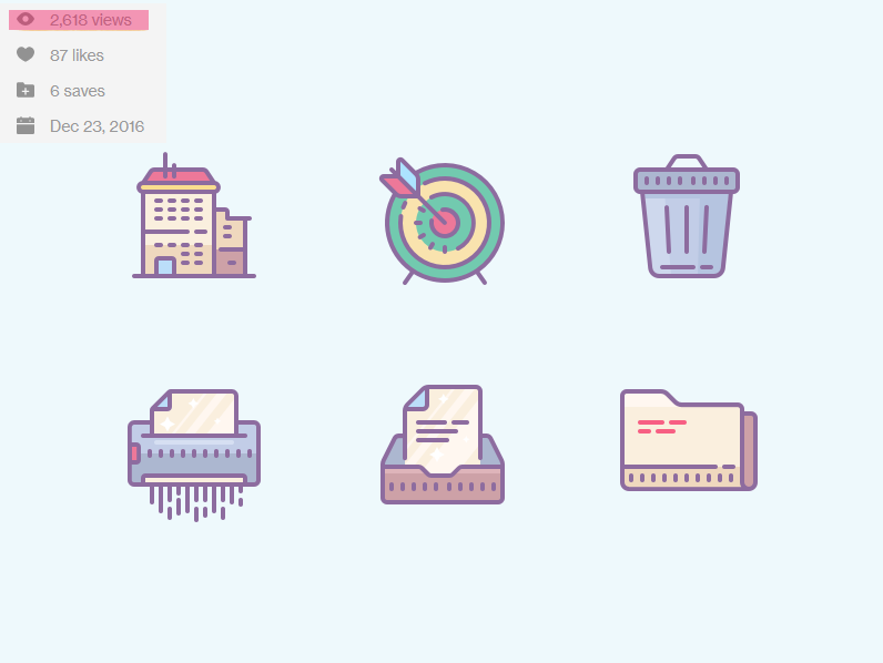
When you follow trends, you draw icons like this: [gentle color styles were quite popular at the time and even more popular nowadays]
On Dribbble
Naturally, you get many likes. These icons are balm for the soul.
When you disrupt trends, you do everything in reverse. Many colors? How about one. Bright violet. Let’s add forbidden gradient for good measure.
On Dribbble
If you’re lucky, double the likes.
Merge trends
You can merge trends from different disciplines. In the photography, hipster and realism are still holding the reins.
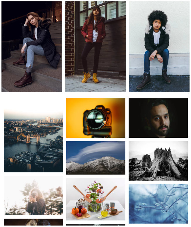
However, graphic design in 2018 was heavily influenced by colorful minimalism – remember top dribble shots.
What would happen if you merge minimalism and photography?
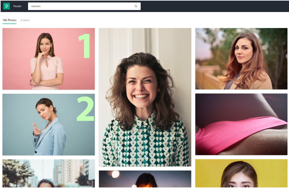
Both photos are part of Icons8 “Moose” Photo Stock
You get #1 spot for a target search. And #2 as well.
Offer Expertise
Tutorials
Some designers may think that they need to be “popular” to make tutorials, but all you really need is to be good at something.
One of Icons8’s designers, Rita, made two niche tutorials on Skillshare: How to make Pixel Perfect Icons, and Animated Icons Transitions. She didn’t have thousands of followers, she was just really good at these things, because she did them every day.
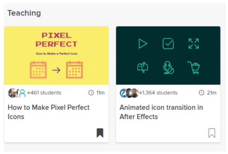
Now she has almost 2,000 students that enrolled in these courses. She built the following from her expertise, and a Dribbble link in her mentor profile allows people to find more about her projects and follow her there.
Find what you’re good at and share your expertise with other people. Even if doesn’t bring you millions of followers, teaching is a very rewarding experience in itself. Give it a try. Making these tutorials free or not is up to you, both options have their pros and cons.
Note: it’s not just about teaching platforms. There are a lot of ways to give people value: YouTube and blog comments, Quora answers, Reddit discussions, live classes… It’s a mindset of sharing rather than the method that is most rewarding in the long run.
Tip: find top-ranking Google articles in your field of expertise that constantly generate traffic from Google, e.g. search “how to draw a logo”, and leave your expert opinion in the comments. Don’t be pushy, though, your contact information should be in your profile, not your comment.
Free work / Non-profit
I’ve seen many times this advice for designers: do not work for free. Most of the times, it is true.
Some crafty clients can offer you work for exposure, and think that this may be enough to light a twinkle in your eyes.
Even if you do banners for the next Olympics and billions of people will see them, it means nothing if you can’t share it with the world.
However, if you can…
Take the project. Work your ass off and then post the story on Behance. Big names, big clients, and big collaborations will almost always attract hefty attention.
Same goes for non-profits. There are so many famous non-profits, research funds and social organizations there that could use a good designer. Reach out to them, offer specific help (better yet, come ofrward with sketches and mockups) and make sure you bring real value. All you ask in return is the ability to feature your work on social media and design platforms. Such work will have a greater chance to be noticed than the paid projects for unknown e-commerce companies.
Interviews
Another way to share your expertise (and demonstrate it at the same time) is to give interviews. It goes without saying: if someone is reaching out to you with a question I see no valid reason to deny it.
Recently I reached out to 10 different designers with one question – What was the most unexpected thing you discovered in your profession/field?
Five designers replied. I wrote an article, and it got featured by CommArts, one of the oldest design publications out there:
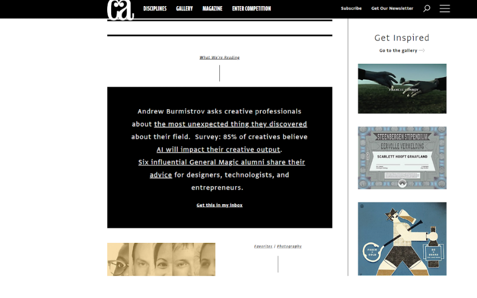
So I did it again. 10 other designers, one question. This time six of them replied. It got featured again:
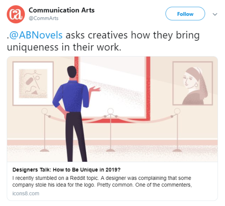
Of course, one twitter mention will not change your fate and spawn unicorns in your bathroom. But what if next time the article is picked up by Huffpost (I wish)? Or goes viral? And that was just one guy asking you one question.
But don’t wait for someone like me to write you, especially when you’re hard to find (I searched for my designers on the Dribbble “Trending” section”). Write an article yourself. Many online publications accept guest posts (including ours), especially coming from field masters.
A few more publications to try:
Smashing Magazine – very strict guidelines and extensive material demand, beware – you can easily spend 3 months editing your article
UX Planet – interfaces and usability-focused publication, the biggest on Medium.
Icons8 Blog – once again, reach out to us with an interesting design-related story or useful guide. Bonus: we promote all our posts for free.
Another way is to find writers in the design field and offer your insights, so they could include you in their upcoming articles.
Tip: if you’re contacting a writer, you will have better chances if you pitch them a full story with examples and offer help with choosing illustrations. Smaller insights or fragmented information will probably be bogged down in their to-do list.
You can also add something to their existing articles, but make sure that these articles are relevant (e.g. you can find them via Google popular searches). That advice works great if you’re familiar with SEO tools. If not, better focus on other mentioned options.
Afterword
It happens that in our time, being “a good designer” or even “a great one” is not enough to stand out. One must also learn to attract attention to one’s work.
I hope you find the tips mentioned in this article useful and a good starting point for your promotional efforts. If you have some tips or questions, make sure to leave a comment. Good luck!
About the author: Andrew started at Icons8 as a usability specialist, conducting interviews, and usability surveys. He desperately wanted to share his findings with our professional community and started writing insightful and funny (sometimes both) stories for our blog.
Title image: Ouch! Icons8 illustration project
Check the tips on successful global freelancing, read about basic principles of visual storytelling, and learn how interface illustrations enhance user experience.


