We see tens and hundreds of icons on our computer and phone screens every day. But do you know the stories behind these icons?
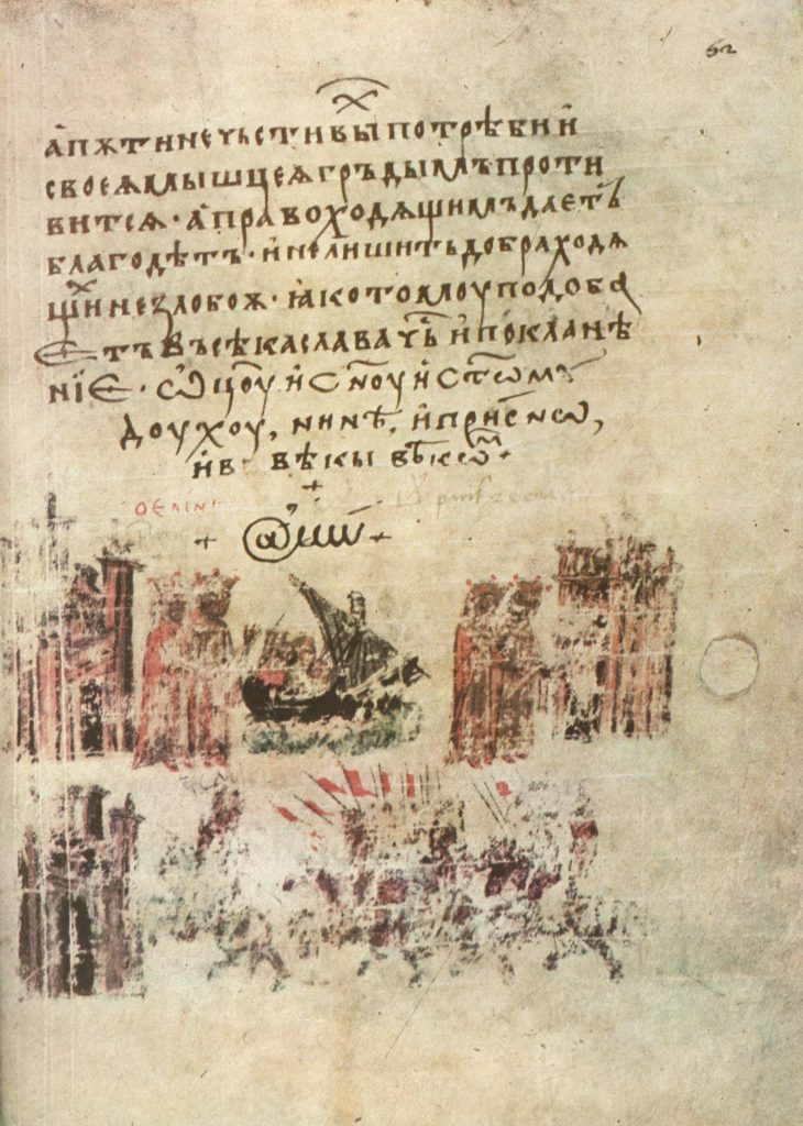
At (@)
The first appearance of the @ dates back to 1345, long before the first email was sent. In a Bulgarian translation of a Greek chronicle, the symbol was used instead of the capital letter “A” in the word ‘Amen’.
The next documented usage of the sign dates back to the 16th century. Florentine merchants used the @ as an abbreviation of arroba, a measure of weight equivalent to 25 pounds.
Some sources claim that monks also used the @ as a shorter way of writing the word “at” in the meaning of “toward.” That was the best way to avoid confusion between “at” and A.D (Anno Domini).
Later, the sign began to appear in commercial documents, meaning at the price of. Little by little, the @ made its way onto the typewriter keyboards and then onto the coding schemes of the first computers.
Its triumphant journey began in 1971 thanks to Raymond Tomlinson, a legendary programmer who sent the first email over the Arpanet, the grandfather of the modern Internet.
Tomlinson was looking for a symbol to separate the username from the terminal name when the @ on the keyboard of his Model 33 teletype machine caught his eye. So, he sent the first-ever email and started a new era of human communication
USB
The USB symbol is associated with Roman mythology. This is nothing but Neptune’s trident. The god’s weapon is supposed to represent the power a user can have by connecting devices via USB.
The technology’s creators decided to add different shapes at the tip of each dent to denote how many devices we can connect. This is where the triangle, square, and circle came from.
Bluetooth
Unlike USB, the Bluetooth logo appeared thanks to a not mythological but completely historical person. The origin of the symbol is described with great care. There was even a separate web page explaining why it looks like this.
In 1989, Ericsson, a Swedish company, initiated the development of a short-link radio technology. Later on, they teamed up with Intel, Nokia, Toshiba, and IBM in the Bluetooth Special Interest Group (Bluetooth SIG).
Jim Kardach of Intel proposed to name the technology after Harald Blåtand (Bluetooth), the King of Denmark and Norway. He got the nickname for his love of blueberries. The king was famous for uniting Scandinavia just like the developers intended to unite computers and mobile devices.
The icon is a combination of two Scandinavian runes: hagalaz (“ᚼ”) and berkana (“ᛒ”). Together they form the king’s initials (HB).
Media buttons
Now, we can often see these intuitive symbols even on control panels of washing machines. However, it was the recording industry that made the biggest contribution to the look of media icons.
These recognizable squares and triangles went a long way to become a generally accepted standard. Initially, there were no icons at all, only short text labels.
Here’s what the control panel of the German AEG FT4 tape recorder (produced from 1939 to 1941) looked like.
This is the control panel of the Ampex AG-440 tape recorder.
Again, the buttons differ only in color, while the text explains their purpose.
We see graphic symbols on the 1962 Revox F36 tape recorder instead of text, but still, those are not triangles and squares we’re used to.
In the 1970s, the global market forced electrical manufacturers to develop a single common standard. So, in 1973, the International Electrotechnical Commission issued IEC 417, a standard that specified conventional signs for electrical equipment use.
It’s a shame, but no one can tell the name of the designer who invented the signs for the “play,” “stop,” “pause,” “rewind,” and “fast-forward” buttons.
The “play” symbol indicates the direction in which the tape rotates in the tape recorder. “Fast forward” and “rewind” buttons share the same metaphor. Double triangles also point to the direction of the tape rotation.
The pause button is similar to the caesura symbol “||” used to indicate pauses in texts.
The red circle of the “record” symbol comes from live broadcasts indicated by the red light.
The exact origin of the square of the stop button remains unknown. On the Straight Dope forum, one user claims to have worked for Ampex in the 1960s and says he created the “stop” symbol in its present form. But there is no trustworthy confirmation of this version.
Power On/Off
Like Bluetooth, the power button symbol consists of two other symbols: 1 and 0, where 1 stands for “on” and 0 for “off.”
A partially broken circle with the line going through means that this particular equipment doesn’t completely disconnect with the power supply when in the 0 or off position.
Share
To this day, there is no generally accepted symbol for the share feature. Over the years, different developers have tried to rethink the icon’s appearance.
But only two have survived: the box with the arrow (iOS) and the three connected dots (Google/Android).
And though this battle is far from over, I would dare to suggest that the general audience of internet users is more likely to embrace the three dots symbol. And it’s understandable because some users still take the Apple’s “share” icon as “upload”.
Alex King created the first concept of the three-dot icon. In 2007, he launched the Share Icon Project and released the icon under four free licenses simultaneously: GPL, LGPL, BSD, and Creative Commons Attribution 2.5.
Less than a year later, Google started using the new symbol in its interface. The name of Alex King went down in history regardless of how the confrontation with Apple’s box-and-arrow icon ended.
Hamburger menu
The three-stripe symbol, also known as the hamburger, has become extremely popular in the era of smartphones. But its story began long before Steve Jobs introduced the first iPhone.
Norm Cox invented the hamburger icon in 1981. He made it for the first graphical user interface for Xerox Star.
The developers needed a symbol that was visually simple, understandable, and functionally memorable. The 16x16px area did not leave much room for creativity.
As Cox himself recalls, they considered only a few symbols: a downward arrow, “+” or “*,” and three horizontal lines. And they chose the last option as the most intuitive.
But this was not the beginning of the hamburger’s triumphant march through UI. Following Xerox Star itself, the hamburger icon disappeared from screens for decades.
Its second life began with the development of mobile interfaces.
It is unclear what app used it first. There is a common version that Apple brought the hamburger back by using it in Voice Memos in 2009. Before then, Apple had already borrowed the mouse and the desktop concept from Xerox, so a small icon would not matter much.
In the late 2000s, hamburgers appeared on Gmail, Facebook, Reeder, Twitter, and other popular platforms. Now, the three-line menu icon is a standard not only for mobile but also for the web.
Conclusion
It is difficult to say why some icons become popular while others become oblivion. The reasons can be thorny, spanning years and even centuries, a strong-willed decision of one particular person, or pure chance.
Dutzus of new icons appear every day in the computer era. It’s interesting how many of them will endure and become iconic.
Next time, we’ll talk about the origins of icons you see daily on your laptops.
Get the icons presented in this post and other awesome icon packs on the Icons8 website.
See also: