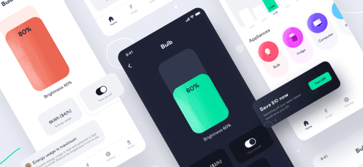
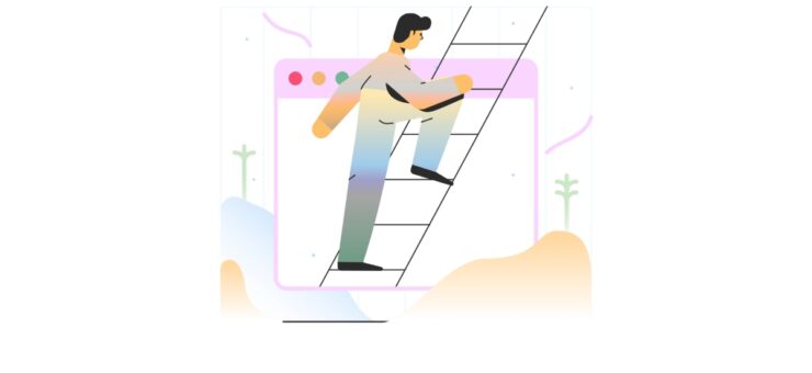
Graphic design shows up in nearly every aspect of a business — from the sign on the front of a brick-and-mortar store to the Facebook post touting a new product. Staying on top of graphic design trends helps your brand stand out and look current. You’ll grab users’ attention if you get in on a trend early enough because they’ll recognize you’re using something new and exciting. Younger companies, in particular, should pay close attention to the latest styles — although anyone can benefit from trying new things.
Approximately 290,100 graphic designers work in the United States, making a median salary of $50,370 per year. However, many new ideas and trends in the industry stem from sources beyond the U.S. as part of today’s global economy. When figuring out the latest trends, look beyond competing businesses to creations from designers around the world.
We’ve scoured the graphic design world for ideas and come up with eight exciting trends your business shouldn’t miss out on. Give these techniques a try and see how your customers react. While you can always go back to the old way of designing things, your customers will know you are open to new things and stay on top of changes in the industry.
1. Create Custom Illustrations
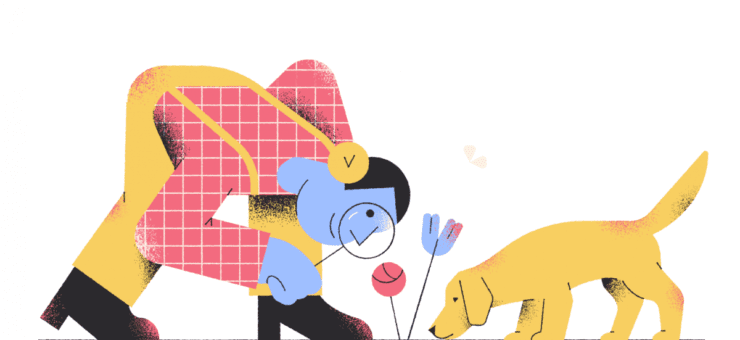
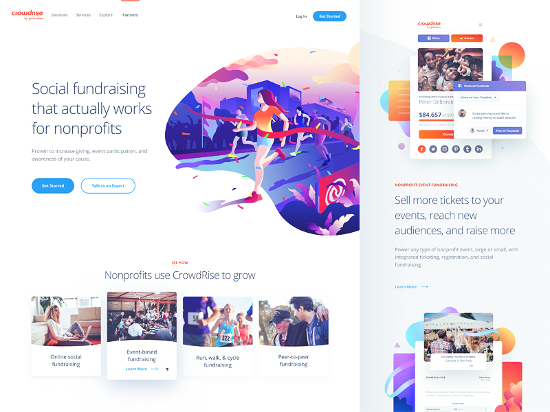
Custom-drawn illustrations are the design trend of the year, according to one graphic design portfolio company. They’ve popped up nearly everywhere you visit online, and studies show they convert seven times higher than stock photos.
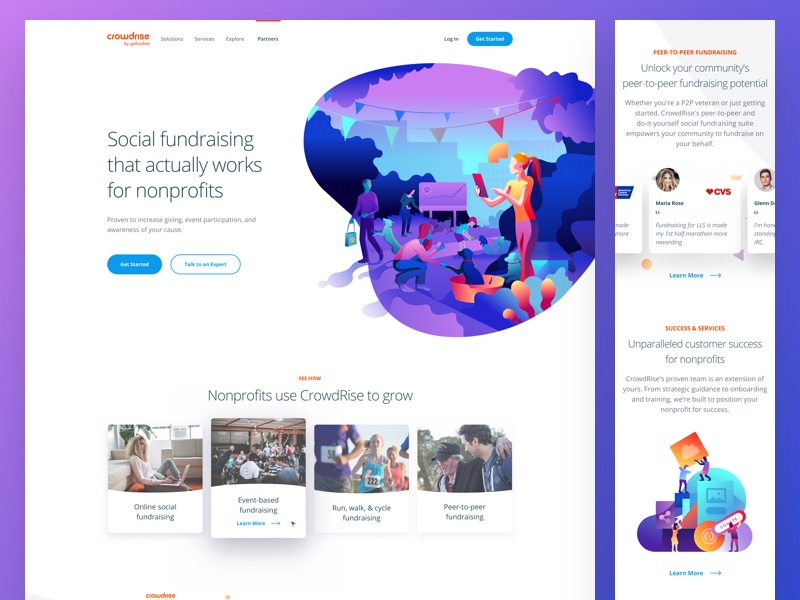
 Source: Unfold
Consumers are looking for a more personalized experience, and “custom” seems to be the word of the year.
 Source: Buffly
Use custom images in an infographic, on your website or even in advertising in a glossy magazine. The key is for each drawing to match the platform where you’re using it. A professional graphic artist is best equipped to create the illustration for a specific need. They’ll ensure it fits the space perfectly and reflects your brand’s values.
2. Implement 3D Effects
Source: Tubik
Three-dimensional signs have finally come into their own. No longer are images flat and lacking depth. Instead, designers have added edges, shadows, and even motion to grab user attention.
 Source: Autoneum Acoustic
Various images flood the average person daily, so businesses must find ways of standing out if they hope to engage the consumer. With the combination of 3D and animation, designers can mesh the real world and virtual reality (VR). Since VR has enjoyed an upward trajectory for the past few years, adding some VR capabilities to static ads is a smart move, even for smaller retailers.
Add 3D effects to showcase a new product with a rotating image. You could also use 3D lettering to grab attention when a user lands on your website. Further, consider whether your business can afford to add an app that incorporates VR as its costs come down.
3. Push the Limits of Digital Trends
 Source: Mahmoud Sayed
If your business doesn’t already have a presence at trade shows, now is the time to look at this marketing method as a way to reach new buyers. While event-related tech use has increased recently, it’s still new enough to help you stand out.
 Source: Mahmoud Sayed
You might not immediately think of digital signage as part of your graphic design process. But even the images on a digital screen must be carefully crafted and designed. Add items such as:
- Some big screens highlighting your booth
- A digital sign that invites them in from aisles away
- An interactive station where they can share their email for future contact or sign up to win free promotional items
4. Try Open Composition
Source: Aztec Animation
The new open composition look is one recent trend that will likely continue far into the future. Instead of designs laid out on a grid-like pattern, composites are more fluid, with elements drifting in and out of one another’s space. This concept is sometimes combined with animation, such as fire turning to smoke and then fading away to reveal a new product. Open composition design appears both online and offline. Try an open composition design for your next ad and see how users respond. While you might not want to revamp your entire website based on a trend, keep an eye on this one — it will likely stick around for a while.
5. Incorporate Bold Typography
 Source: violenceisnotmyculture.com
You’re no longer stuck with the same old typefaces already created. More and more people turn to custom type to make a statement. Typography has become bigger, the letters bolder and the designs more interesting.
Designers use bold, custom type more frequently than ever as part of a site’s overall design. Logos are no longer relegated to a small area to the left side of the header. Now, they appear front and center — sometimes taking up most of the area above the fold. Expect this trend to continue and type to become more customized for each business.

Think about where you might utilize a custom font — perhaps as the header for your business’ Facebook page? Once you have an idea of where you might use your custom type, work with a designer on a concept that shows consumers who your business is and what you have to offer.
6. Use Color Transitions
 Source: Designmodo
Gradients and duotones appear all over the internet, and they’ve become one of the more interesting recent graphic design trends. Although people once thought of these transitions as more of a psychedelic 70s style, today’s gradients are softer, and the color bands blend well. Computer and smartphone screens’ higher resolution make this design trend doable today. Color transitions have even shown up in logo designs, such as those on Spotify’s playlist covers.
Source: Green Chameleon
Use color transitions in a header’s background or an ad’s lettering. However, only use gradients if they make sense for your business. This trendy look may not work well for an organization such as a financial institution or a doctor’s office. If your business is the least bit hip and cutting edge, though, you can use gradients to your advantage to show you are current.
7. Consider Using Isometric Icons
Source: Vy Tat
Detailed but simple isometric 2D drawings have popped up from various brands. These designs show significant detail in a small space, such as the outline of a town or a college campus.
Isometric images are a bit bolder than flat designs. They have plenty of color and pop without being quite as detailed as a 3D design. For example, a money icon might include a stack of bills with some coins next to it, and a home icon might include a small house from a top view with some flowers around the front border.
![]() Source: 10 Clouds
Source: 10 Clouds
One of the easiest places for you to implement isometric design is the icons on your site or in your email newsletters. Adding isometric designs to these places is inexpensive and easy, and it gives you a testing ground for how your users respond to the changes.
8. Add Metallic Elements
 Source: Push 10
Have you noticed metallic colors in designs recently? Rose gold icons and silver logos have suddenly become more popular. In the past, metallic colors came off looking fake online, but the advances in graphics in the last few years now allow designers to create a rich effect that looks almost realistic. The image shimmers and fades as needed to draw the user’s eye. Shadow and light create interest.
 Source: DanyResto
You can add metallic elements to your logo or in an illustration of one of your products. Use this effect sparingly — too much gold can make your designs seem like those of a Las Vegas show stage rather than a serious business.
Choose Your Trends
Trends come and go, so pick the ones you use wisely. It’s smart to try different things and conduct split testing to see what your target audience responds to. However, don’t try to implement every trend all at once or make too many changes. Instead, make small changes and test results before adding more. With a little tweak here and there, your business will remain current without looking flighty.
About the author: this is the guest post by Lexie, a web designer and UX strategist. Visit her blog, Design Roast, and follow her on Twitter @lexieludesigner.
Title image from Abstract pack of free vectors on Ouch
Review the pack of popular UI design trends on Dribbble this year, the big collection of web design examples with hero illustrations, and the handy checklist for the website launch.

