Since the early days of cinema, posters have played an immense role in presenting the public with new film releases, inspiring interest, and increasing box office sales. Much like a book cover, it’s your very first impression of the film that can make or break your desire to watch the movie in question. In this article, we’ll look at some of the most successful movie posters and explore exactly what it takes to make a film poster iconic and intriguing for the public – let’s dive in!
Film Poster Design: 4 Essential Components
Although it may seem simple, designing a poster entails balancing a multitude of different aspects. The following 4 points can be seen as the essential building blocks of an effective poster – get them right, and everything else will fall into place. The key to film poster design (and any other kind of design with a similar purpose) is consistency: keep all these elements in coherence with each other, make them all work around one chosen idea or theme, and you’ll be a winner.
Capture the Essence
The film poster is basically a glimpse into what the movie is about, so it’s important to make it reflect the movie as much as possible, without giving the entire plot away. The best way to do this is to recreate the main storyline or the conflict the movie revolves around on the poster, as the posters for the final part of the Harry Potter series did:


The conflict between the two sides – good and evil, Harry and Voldemort – is very much the dominating theme of the movie, and this is clearly depicted with their opposing each other. The posters capture the seriousness and dark essence of the movie: the characters are in a battle, bruised and bleeding, and full of determination and animosity. In the first poster, a scene from the film has been used to give us an insight into what to expect. This movie was heavily anticipated, so the main purpose of the posters was to announce the release date and spark even more excitement – hence the very simple title: “IT ALL ENDS 7.15”. The use of all caps heightens the sense of drama and importance. Furthermore, thanks to the huge reach and public awareness of the movie, there was no longer any need to place the film title on the posters, which allowed the design to stay simple and focused on getting the atmosphere of the movie across, without any unnecessary elements.
Compare this with the poster for the first film:

The first poster has a much dreamier and softer essence, reflecting the (much less intense) film. Although poster design has advanced a lot since the early 2000s when this poster was created, the blue clouds (or smoke) that blend the images evoke a sense of mystery and magic.
Capturing the essence of the movie in the poster is essential – and this is the key component that dictates all of the design choices you’ll be making. A pretty obvious but crucial way to do this is to allow the genre to dictate the design decisions. So if it’s a comedy, get across the lighthearted atmosphere with a picture of the cast smiling or by creating a bizarre or somewhat ridiculous scene or collage.

The monkey in the Hangover II poster seems out of place, as do the characters themselves, which sparks interest, making us want to find out how they ended up in such a crazy situation (which is what the plots of the entire Hangover series revolve around). The poster also suggests we can expect a lot of unexpected, entertaining twists and turns and comedic situations throughout the film.
Similarly, if you’re designing a poster for a drama or horror film – make it intense so that the viewer feels uneasy and anxious. This way, you’ll appeal to the target viewers, as this is exactly what they are looking to experience when watching the movie.

The iconic Jaws poster featured a chilling image of a shark just about to reach the unsuspecting swimmer on the surface. Once again, the poster recreated a key idea of the plot and even though this is not the scariest horror movie poster by far, it still gets across the feeling of suspense and terror that viewers are after.
Effective Images
What images will be on your poster? How will you convey the plot? There are a number of ways to go about this. One option is to choose a scene from the movie and make it the focal point of the poster, as demonstrated by all of the film posters above or get the main characters to recreate a scene facing the viewers of the poster (as in the case of the Hangover II poster).
Another option is to choose one key memorable feature – this can be an object or a character – and make it a primary image.

In the poster for It, the key focus is on the red balloon and the innocent small child. Although the main character is Pennywise, we only see a glimpse of his arm coming out of the shadows, and only a very slight trace of his reflection on the balloon. The designers of the poster chose to use this iconic red balloon as it is a key symbol of the plot. Another thing to note about this design is the choice of colors (more on this below) – the vibrant red and yellow are a stark contrast to the deep darkness surrounding them, which allows the focus to stay on the essential images.
Whatever you do, the key is not to over-saturate the poster with various pictures: minimalism can work amazingly well, as demonstrated by the highly effective It poster.
Color Choice
Go for contrasting colors that will attract attention – as the designers did for It, or choose a primary, dominating color that will cover most of the poster’s surface and select some accompanying complementary colors to create visual interest.

The team behind Ex Machina’s poster design made a steel grey color the dominating choice, a color that completely lacks warmth and life, reflecting Ava’s (pictured) robotic nature. The remaining colors are either complementary or have the same greyish hue.
Text, Typography and Key Details
The text used in the poster includes a few different aspects:
- The film title
- The tagline
- Language style
- Fonts
Firstly, title the poster and include a short tagline. Make sure the language used reflects the overall genre and themes of the movie. This tagline will ‘speak’ to the potential audience, and though posters are a primarily visual form of communication, the textual aspect brings it alive and allows it to connect with the viewers. A short summary of the plot (without giving any details away) works really well:

Catch Me If You Can has been perfectly summarized in the tagline: “The true story of a real fake”. Without any knowledge of the plot, the language, though basic, creates some confusion through the use of contrasting ideas, thereby intriguing those that come into contact with the poster and making them want to find out more.
When it comes to fonts, go with what your film’s genre calls for! Whatever fonts you choose, make sure they are easily readable and work well together.

The Beauty and The Beast poster features an intricate font resembling hand-written text, which plays with the movie’s dreamy fairytale theme. Note that this is not a simple font, but it is still easily legible.
As with images, don’t clutter your poster with text. The less text you have on your poster, the less ‘chaotic’ it seems and the easier it is for passersby to understand.
Finally, always include a summary of the cast and credits – these are best placed somewhere on the poster’s border, at the top, or the bottom.

Afterword
Film posters all follow the same basic guidelines, so getting creative with your poster and making it a unique masterpiece can be challenging. After all, in order to fulfill its purpose and easily be recognized as a movie poster, even from afar, it has to have an element of genericity. However, the upside to this is that film poster design doesn’t have to be difficult – by focusing on the movie’s plot and genre, the key elements of the design will fall into place without much effort. Of course, there is no one-size-fits-all formula, but by choosing suitable imagery and fonts, including an interesting tagline, and adapting these to the movie, you’ll have the perfect recipe for a successful film poster!
Dive into history and typology of poster design, check the tips on event poster design, learn more about branding and brand books, and read about laws of visual storytelling
About the author
Diana Raz, content writer on technology and design issues
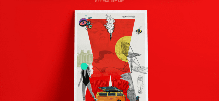
Title image: posters designed by Bruno Valasse


