There are no hard and fast rules for how to compose a photograph.
But there are some concepts for you to incorporate that will help improve your shots. These five rules of composition are not a list that every photographer should tick off during every photo shoot. Instead, they’re intended to help you think about what you see when you’re framing a shot. Also, they allow you to understand what worked and what fell short when you come to edit your work.
1. Learn about the rule of thirds and then ditch it: aim for balance
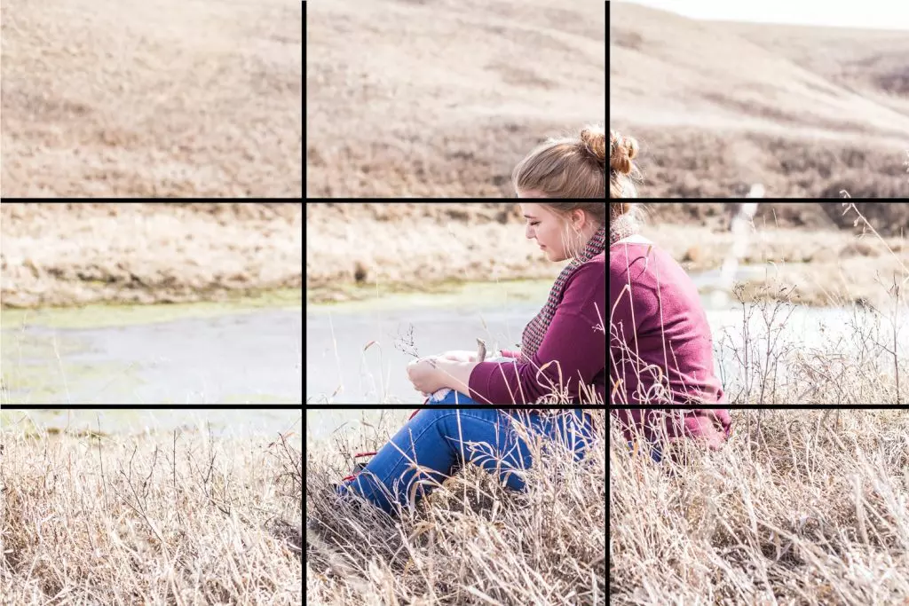
Pretty much every guide to composition seems to start with the rule of thirds. Perhaps because it’s the easiest to explain. Split the frame into thirds and try and position the most critical parts where those imaginary lines carve up the image. Even better, where they intersect.
It’s so ubiquitous that many cameras give you the option to add a grid to your viewfinder to help you with your composition. However, a quick scroll through any image libraries shows how photographers use the rule of thirds: nowhere near as often as you might expect.
This is because the rule of thirds can be restrictive and works best with images shot in a landscape in a 3:2 ratio. However, today, influenced by platforms such as Instagram, people shoot and publish most photos in portrait with a 4:5 ratio. And very often with a centered subject.
The rule of thirds teaches us how to create balance without apparent symmetry. It pushes us away from the classic beginner technique of putting the most crucial part of the subject slap-bang in the middle of the frame. Instead, it encourages us to consider what is around it.

In this example, the subject sits alone, surrounded by the landscape. With her body leading away to the left, the area behind her feels like a dead space because she has been positioned in the center of the frame. By repositioning her so that she is off-center, facing into the frame with her legs leading towards the middle, the dead space is eliminated, and the photograph has a much stronger sense of balance.

If you’re unsure, shoot your subject both centered and edit according to the rule of thirds. You’ll tend to find that a subject that naturally creates symmetry can work best when placed in the center. If you can’t achieve symmetry, place the subject to one side and try to use the remaining space to give a sense of balance.
Even space can create balance, so don’t feel like you have to find another element in the frame to work with your primary subject.
2. Use lines
Our eyes love geometric shapes, and these shapes begin with lines. Draw a single line on a blank page, and suddenly, that page is divided into distinct elements. This gives the viewer a sense of the difference in weight between the two parts. The line itself becomes a path that the eye naturally follows.
The most impactful lines are horizontal, vertical, and diagonal. Horizontal lines give a feeling of stability related to our innate understanding of the horizon. For this reason, it’s usually best to try to keep the horizon flat and fix it during your editing if it’s slightly crooked.
There’s something that tickles our sense of OCD when horizontal lines are perfectly flat. Especially when they’re close to the edge of the frame; this is true of vertical lines as well.
For example, when staring up at a skyscraper, there will be occasions where your verticals will converge. In such an event, embrace this convergence and make it a feature. However, if your vertical lines are slightly off vertical, see if you can make them completely vertical. These solid geometric patterns that link the image to its frame can create a sense of satisfaction for the viewer. Vertical lines tend to develop a feeling of strength and solidity; the more upright, the better.

Diagonal lines bring energy, especially if they sweep from the image’s corners and towards the middle of the frame. In fine art, diagonals leading from corners are such robust features that they have their names. Baroque leads from bottom left to top right, and the sinister goes from top left to bottom right.
None of these lines have to be distinct: instead, they can be implied by how certain elements are arranged within the frame. Nor do they have to be straight; a curved, sweeping line can give an organic sense of energy to an image.
Leading lines can push the viewer’s eye towards a specific part of the image for even more impact. It acts as a psychological nudge to help convey the main subject’s importance.
3. Isolate your subject and frame it with space
Every element in your frame is competing for attention. Anything that stands on its own speaks more loudly to your viewer, grabbing their eye. For this reason, photographs, where the subject is isolated and surrounded by space, make for much more substantial compositions.

Having the subject placed against a clean background makes it easier for the viewer to process. Having your primary subject stand independently, distinct from everything around it, will give it greater emphasis. As mentioned, the eye loves solid geometric shapes. Having elements positioned so that their outlines are distinct and free of interruptions will create a cleaner, more impactful image.
When shooting portraits, try to position your subject so that branches or telegraph poles don’t stick out of their heads. Using a large aperture or switching to your camera’s portrait mode will blur the background. This reduces any distractions and further makes your subject stand out within the frame.

To take this isolating technique even further, photographers frequently use a trick. They position the subject within another frame, again helping the viewer understand the most critical part of the photograph. This method of sub-framing naturally isolates the subject, often using more geometric shapes. It creates a strong composition.
4. Embrace minimalism
Everything in your frame speaks to the viewer. Anything that doesn’t contribute to what you’re trying to convey is a potential distraction. If there’s an opportunity to reduce the number of elements in your frame, do it.
Our brains love simplicity, and the quicker that visual information can be absorbed, the more impact it can create. If you can trim your image to its essential parts, not only are they going to be easier to position with one another, you’re also creating an image that will create a more direct connection with the viewer.

Minimalism also allows you to use another classic technique in visual art: negative space. Negative space is the clean, empty parts of an image that create a weight that offers balance with your subject.
5. Check your edges
Pushing your subject towards the edge of the frame can dramatically shift the balance of a photograph. Done well, it can be a great way to offset a subject with a large area of negative space. However, when an element moves towards the edge of your frame, it gains more visual weight. If it’s not the primary subject, this extra weight can end up being a distraction.

When you’re putting together your shot, look for anything intruding into the edges. If you can’t avoid it, consider eliminating it when you come to edit, perhaps by cropping or, even better, using the clone tool.
Closing words
Photography doesn’t have any strict rules regarding composition. For each of the rules listed above, there are plenty of famous photographs that completely ignore them.
However, these five practices create a good foundation for understanding how to compose images. They help you build strong, impactful photographs that connect with your audience.