Revamp your FAQ page with graphics! Discover how to blend visuals with info for a memorable, user-friendly experience. Make FAQs engaging and effective.
Let’s face it, FAQ pages are often the unsung heroes of website navigation. They’re where visitors turn when they’re just a step away from making a decision or taking action. But let’s be honest, most FAQ sections are as exciting as watching paint dry. That’s where design steps in.
Incorporating graphics into your FAQ page isn’t just about making it pretty – it’s about transforming this utility space into an engaging experience. It’s like giving your FAQ page a personality that resonates with your brand and speaks directly to your users.
This article will guide you through turning a typically mundane FAQ section into a visually captivating and user-friendly part of your website. Let’s dive in.
Table of contents
- Impact of visuals in FAQ design
- Key elements of effective FAQ section design
- Graphics in FAQ sections: from icons to illustrations
- Practical tips for revamping your FAQ page UI
- Common pitfalls to avoid in FAQ design
Impact of visuals in FAQ design
Why should you care about visuals in your FAQ section? Simple: visuals speak louder than words. It’s not just a cliché; it’s a fact backed by psychology. When a user lands on your FAQ page, their brain is on a mission for quick answers. Dense text blocks? A big no-no. Graphics, however, can make this quest less of a chore and more of an experience.
Simplifying complexity: Complex questions can be daunting. A well-placed chart, icon, or illustration can break down these questions into digestible bits. Think of it like using a map in a large mall. You’re not just reading directions; you’re visually guided to your destination.
Increasing retention and engagement: Ever wonder why social media is addictive? Visuals. Our brains are wired to process and remember images far better than text. By integrating relevant and attractive visuals, you’re not just answering questions; you’re making the information stick.
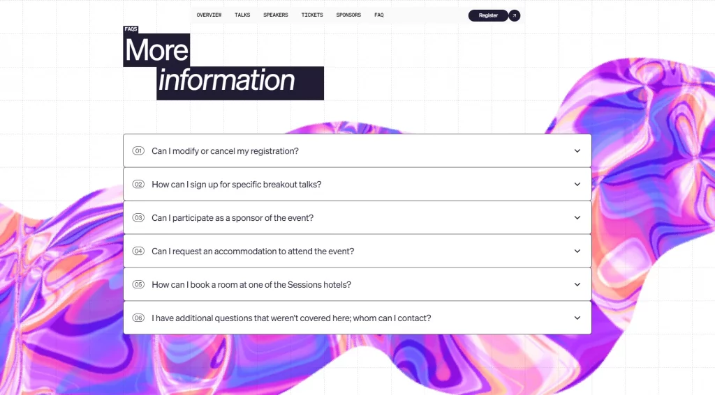
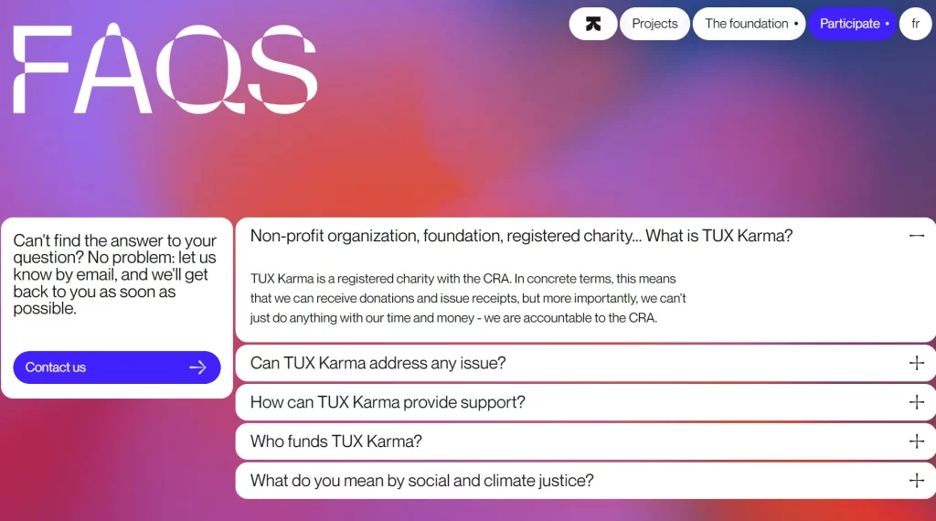
Boosting aesthetic appeal: First impressions count, and your FAQ is no exception. Graphics infuse life into what could otherwise be a dull page. They contribute to the overall aesthetic of your site, keeping it consistent and on-brand.
In short, integrating graphics in FAQ design is about more than just aesthetics; it’s a strategic move to enhance user understanding, engagement, and retention. Next, we’ll dive into the key elements that make for an effective and visually appealing FAQ section.
Key elements of effective FAQ section design
When it comes to jazzing up your FAQ section with graphics, it’s not just about slapping on some pretty images. There’s an art to it. Here’s how to strike the right balance and choose the right graphics.
1. Balancing text and graphics: It’s a dance, not a race. The goal is to complement the text with graphics, not overshadow it. Use visuals to break the monotony of text, but ensure they are directly related to the content. It’s about creating a rhythm that guides the user through the information smoothly.
2. Choosing the right graphics: Icons, illustrations, infographics – the choices are many, but the selection should be strategic. Icons are great for simplifying and highlighting key points. Illustrations can add a storytelling element, making the FAQ more relatable. Infographics work wonders for explaining more complex processes or data.
3. Consistency is key: Your graphics should be in harmony with your brand’s visual language. Consistent use of color, style, and tone ensures that your FAQ section doesn’t look like a patchwork but a part of a well-thought-out design strategy.
4. Visual hierarchy: Prioritize your graphics based on the importance of the information they accompany. More significant questions might warrant larger or more prominent visuals, guiding the user’s eye and emphasizing the hierarchy of information.
5. Accessibility matters: Good design is inclusive. Ensure that your graphics don’t hinder the accessibility of your page. Alt-text for images and mindful color choices for readability are not just niceties; they are necessities.
By keeping these elements in mind, you’re not just designing a FAQ section; you’re crafting a user experience. Up next, we’ll look at real-world examples to see how these principles come to life in FAQ design for websites.
Graphics in FAQ sections: from icons to illustrations
A picture is worth a thousand words, and in your FAQ section, the right picture can be worth a thousand clicks. Here’s a rundown of the types of graphics you can integrate into your FAQ design, with each serving a unique purpose.
Icons
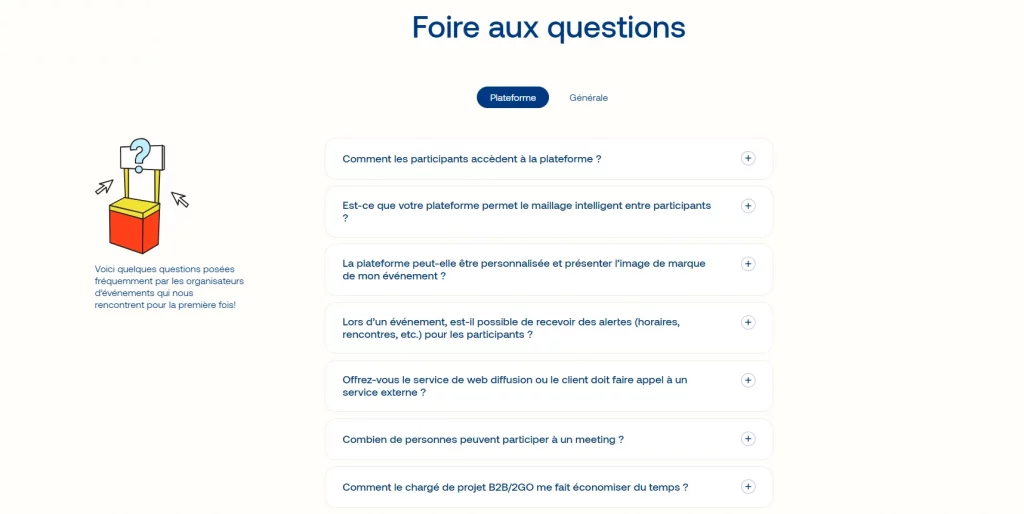
These small but mighty graphics are perfect for breaking up text and visually representing different questions or categories. Think of icons as signposts, guiding users to their answers.
Illustrations
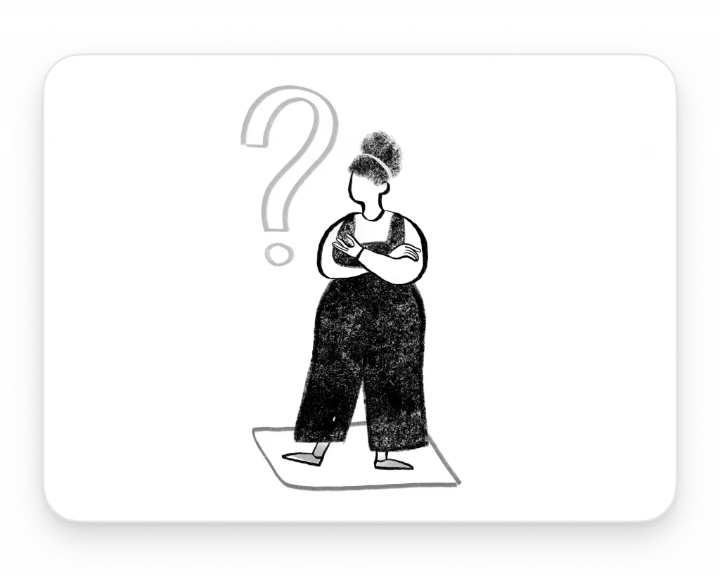
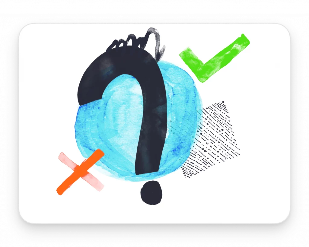
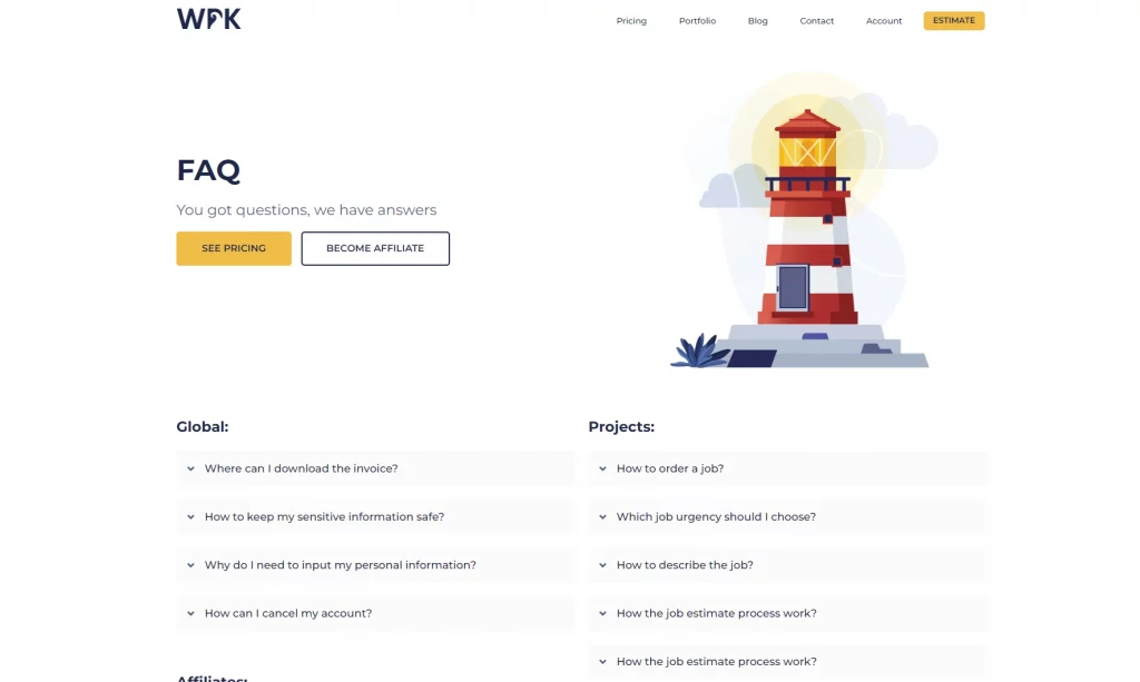
Want to add a touch of personality? Illustrations can do just that. They make your FAQ page more engaging and can convey complex ideas in a fun, digestible way.
Infographics
When you’re dealing with data-heavy answers or a process explanation, infographics are your best bet. They make understanding intricate information a breeze.
Screenshots and annotated images
If your FAQ is about software or a specific product, screenshots with annotations can be incredibly helpful. They provide a visual step-by-step guide that words alone might not convey effectively.
Animated GIFs and short videos
Sometimes, movement catches attention. Animated GIFs or short videos can be used to explain things that are difficult to capture in static images, like a quick tutorial or a process flow.
Charts and graphs
For FAQs that involve statistics or comparisons, charts and graphs can present the information in a visually appealing and easy-to-understand format.
Custom typography
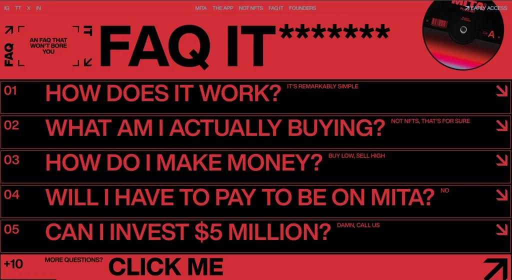
Sometimes, the way you present your text can be a graphic element in itself. Custom fonts or typographic treatments can emphasize certain points or questions.
Integrating these graphic elements isn’t just about decoration; it’s about enhancing the user’s journey to finding answers. In the next section, we’ll explore some practical examples of how these graphics have been effectively used in FAQ design.
Practical tips for revamping your FAQ page UI
Ready to give your FAQ page a graphic overhaul? Here are some practical steps to guide you through the process:
1. Audit your current FAQ page: Start by assessing what you already have. Which questions are most visited? Is the information up-to-date? This will give you a clear starting point.
2. Plan your graphics: Based on your audit, decide which type of graphics (icons, illustrations, infographics, etc.) would best suit each section or question. Remember, the goal is to aid comprehension and engagement.
3. Keep brand consistency: Ensure that the graphics you choose align with your brand’s visual identity. Consistency in style, color, and tone is key to creating a cohesive look.
4. Optimize for user experience: Arrange the questions logically. Use graphics to guide the user’s eye and make navigation intuitive. Test different layouts to see which works best.
5. Make it accessible: Ensure that all graphics have alt text and that the design is accessible to users with disabilities. This is not just good practice; it’s a necessity.
6. Test on multiple devices: Check how your FAQ page looks and functions on various devices. It needs to be as effective on a smartphone as it is on a desktop.
7. Collect feedback and iterate: Once live, gather user feedback. What do they think about the new design? Use this feedback for continuous improvements.
By following these steps, you’ll make your FAQ page not only more visually appealing but also more functional and user-friendly. Remember, the best designs are those that evolve based on user needs and feedback.
Common pitfalls to avoid in FAQ design
While integrating graphics into your FAQ page can work wonders, there are some traps you should steer clear of. Here’s what to watch out for:
1. Overdoing it with visuals: Remember, the main aim of your FAQ page is to provide information. Don’t let the graphics overshadow the content. Overloading the page with too many visuals can confuse rather than clarify.
2. Ignoring mobile responsiveness: In a mobile-first world, your FAQ page must look good and function well on smaller screens. Graphics that work on desktop might not translate well on mobile, leading to a frustrating user experience.
3. Inconsistency in design: Your FAQ section should feel like a part of your website, not a separate entity. Inconsistent use of graphics (varying styles, colors, or sizes) can disrupt the visual flow and brand identity.
4. Sacrificing load time: High-quality graphics are great, but not at the cost of page load time. Slow-loading pages can drive visitors away. Optimize your images and graphics for quick loading without compromising on quality.
5. Neglecting accessibility: Graphics should enhance accessibility, not hinder it. Ensure that your visuals are complemented with alt text and that the color contrasts are accessible to all users, including those with visual impairments.
By avoiding these common mistakes, you can ensure that your FAQ page not only looks great but also serves its purpose efficiently and inclusively. Next up, we’ll explore how to measure the success of your revamped FAQ page.
Wrapping up
Transforming your FAQ page with graphics isn’t just a style choice; it’s about improving user experience. A visually engaging FAQ section not only answers questions but also showcases your brand’s care and attention to detail.
Keep it accessible, engaging, and in line with your brand identity. Experiment and iterate based on user feedback. Remember, your FAQ page is more than information; it’s a reflection of how you value your visitors.
Ready to revamp your FAQ page? Start with creativity and a focus on the user’s journey. Let’s make FAQs informative and memorable.
Check out our ‘About us’ page graphics guide to redesign your website.
