Welcome to our traditional summer review of some hot trends in UI design for web and mobile, we found on Dribbble this year. Packed with examples, as always.
Within the never-ending debates of the viability and practicality of designs shared on Dribbble, it still presents a sort of popular playground for creative people to not only show real-life projects but also creative experiments and new approaches. Let’s see what got super popular in Dribbble shots on user interfaces this year.
Neumorphism
Neumorphism, or soft UI, presents a design approach in between skeuomorphism and flat UI. The neumorphic interfaces are not as realistic as skeuomorphic were back in 2012-13, but they aren’t also as simplified as absolutely flat designs. The screens of UI concepts designed in this style usually look neat and eye-pleasing, elegantly returning volume to the layout. However, the practical aspect of neumorphism is now a subject of hot debates in design blogs and forums, with some designers discussing its low viability and usability. Nevertheless, like it or not, see it as a concept or a practice; on Dribbble, it’s one of the prominent trends this year.


Neumorphic app design concept for an audiobook application by Khonok Lee.
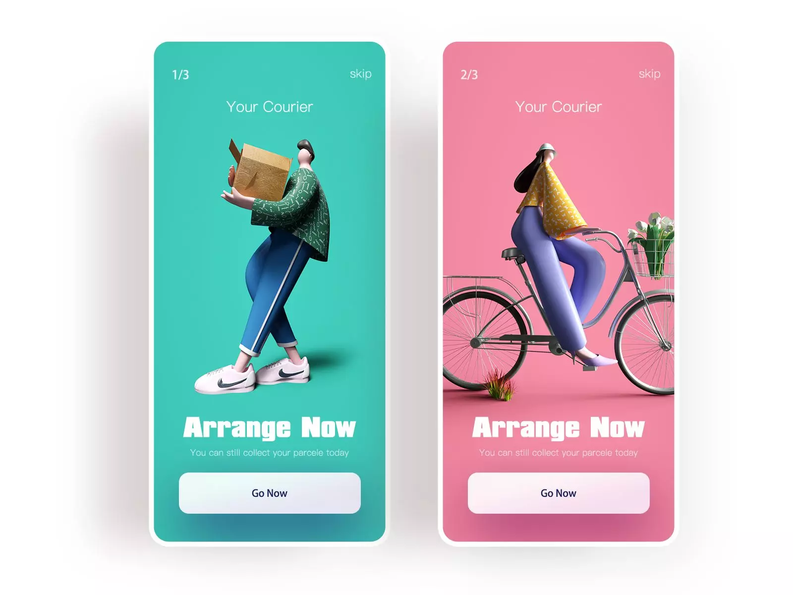
3D Hero Illustrations
Well, hero illustrations are nothing new or revolutionary. In recent years, the trend of using catchy custom or stock graphics in the hero section has established itself solidly. But this year, this trend showed a noticeable shift to becoming even more diverse and also turning to adding volume due to 3D graphics and animations. Therefore, webpages gain more depth and volume while 3D illustrations create more interesting compositions and plots.


Beautiful 3D illustration created by Leo Natsume in collaboration with Adobe.
The impressive design concept of a webpage with animated 3D graphics for hero illustration by Minh Pham
Animated 3D illustration on a web page designed by Tubik.
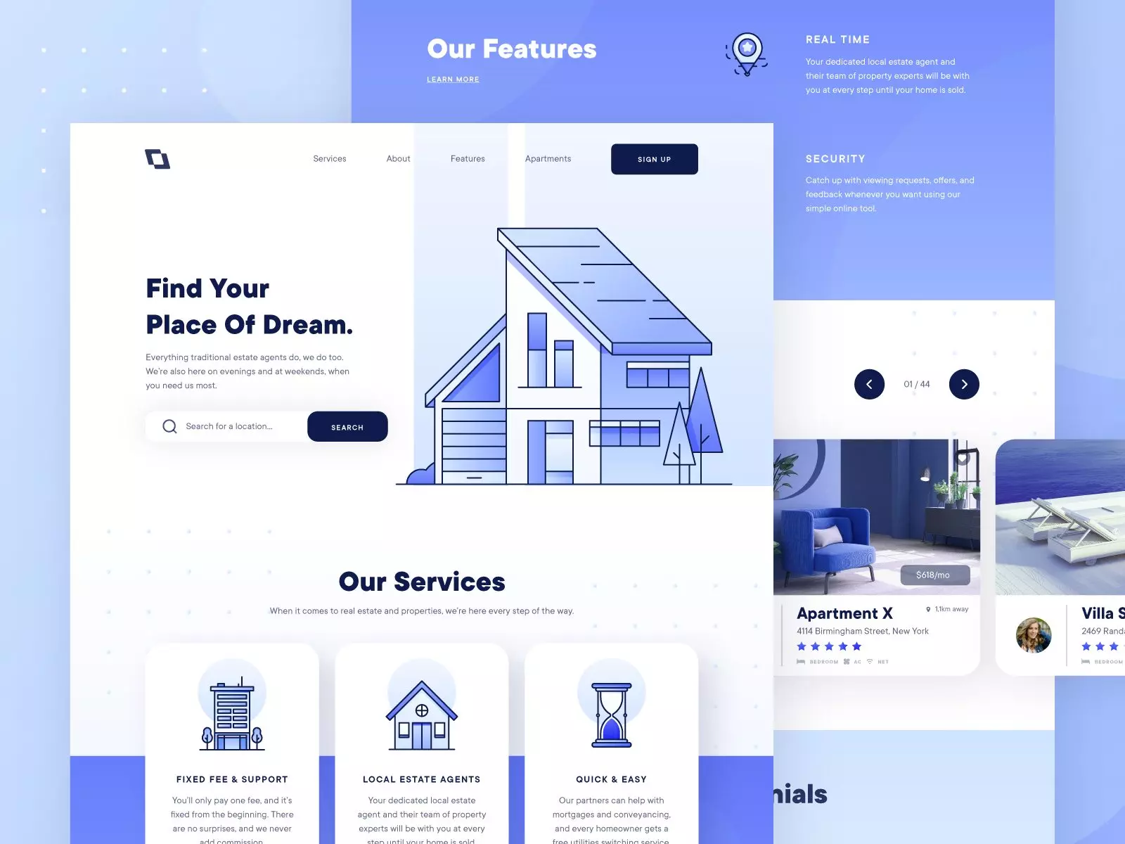
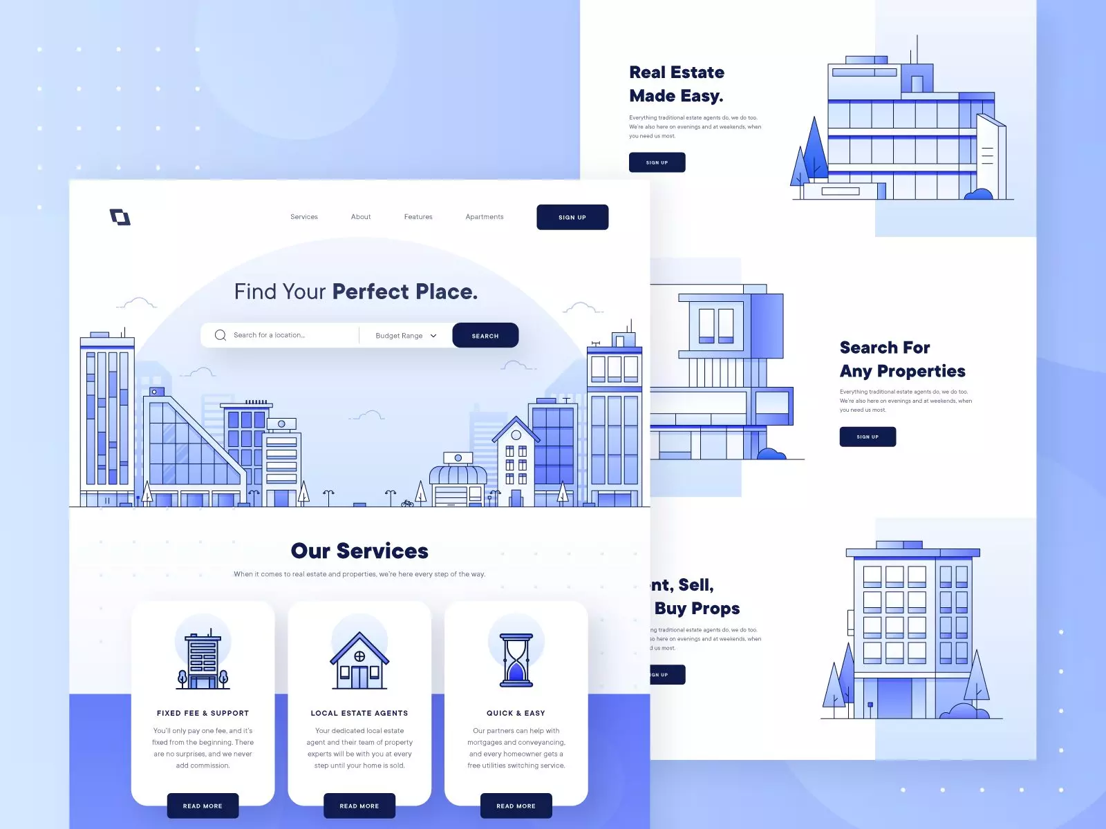
Monochrome Palettes
As a counterbalance to super bright and vibrant palettes that seemed to be the distinguishing feature of Dribbble designs, this year monochromatic designs also demonstrate the considerable presence in both web and mobile interfaces, often being a part of the ultra minimalistic approach.


Monocromatic app design with custom graphics by Taras Migulko.
Typographic Diversity
This point is not only about using diverse fonts but also different variations of the same typeface in one interface. Bold and italic, filled and outlined, big text blocks in all caps, playing with font sizes and text colors – all that makes the design concepts presented on Dribbble catchy and diverse in the presentation of text parts on web or mobile layouts. And sure, designers never stop trying new font combinations and testing fresh typefaces properly, amplifying the mood and message.

Web design by Zhenya Rynzhuk features both regular and italic font in one text block, also different in color.
Bold typography getting filled on hover and engaging users to interact by Green Chameleon.
Overlaying Scroll Animation
A creative approach to scrolling interactions is one of the well-checked ways to impress website or landing page visitors. One of the Dribbble design trends from this perspective is using an overlaying effect that supports the integrity of the whole page and strengthens aesthetic satisfaction.
Impressive animation for a touristic website with overlaying custom illustrations by Tubik.
Horizontal overlaying animation on the elegant webpage designed by Green Chameleon.
Mobile UI Illustrations
Interface illustrations don’t stop or slow down their progress, especially as a part of the mobile user experience. Although the trend of integrating illustrations into screen layouts has been popular for a couple of years already, this year, it was boosted. It demonstrated the great diversity of themes and bright design solutions. One of the reasons is the rise of design resources like the Ouch vector library that offers a variety of graphics in different styles for different UX points and needs. So, UI designers who don’t draw custom graphics get more flexibility in this aspect and can make their design concepts more engaging and creative with illustrations. Also, many studios and design teams work with illustrators or have one on board to bring out designs that reflect this trend of custom illustrations in mobile applications.


Interactive Pages
This year, dribbblers are demonstrating more and more activity from the perspective of interactivity and playfulness of web pages. Trying to both impress and engage the visitors, designers seem to push their creative experiments to a new level with movable backgrounds, erasable elements, networks responding to users’ cursors, and much more. This way, they perhaps get some developers nervous, though, as some of the solutions look super cool for Dribbble but may take much thought and effort to implement on the websites.
Interactive and engaging webpage with 3D illustrations by Anton Tkachev.
Interactive background for a furniture website designed by Tubik.
Volumetric and impressive website design about space education by Unfold.
Irregular Grids
Another trend continuing to diversify Dribbble this year is experimenting with grids. Various asymmetric, broken and irregular grids help designers to find the original performance of content in web and mobile interfaces, catching users’ eyes, and never letting them get bored.

Monochromatic website design for a photographers’ portfolio with irregular grids and typographic diversity by Green Chameleon.
Sure, this set of trends is only the tip of the iceberg, and obviously, what’s trendy on Dribbble does not mean getting broadly used on real websites and mobile applications. Yet, I never stop believing that all creative experiments are of crucial value, pushing the limits, broadening the horizons, and engaging designers to try, discuss, or even argue about new tricks, approaches, and techniques. To grow, we have to take challenges, dare, probe, and analyze. Who knows what UI design trends will turn from the experiment into the best looks for the favorite products in the future. See you soon in our next reviews of design trends!
Check the inspiring collections of dashboard designs and mobile UI designs with illustrations, review the benefits of Ouch 2.0 vector illustrations, and learn how modern and traditional web design are mixed.
About the author
Marina Yalanska, tech/design writer and researcher, managing editor for Icons8 Blog.