This topic has a very simple yet deceptive name: “Drag-and-drop vs. Click.” On second thought, it’s nonsense. How could two actions that are so different possibly be compared? Well, let me introduce collections.
Collections are by far one of the most underrated features of our web service. 80 percent of our customers don’t use them because they simply don’t know they exist. Collections allow the user to group icons so they can:
- recolor them all at once
- resize them all at once
- generate a font
- keep icons structured, e.g., “FoodAppCollection,” “WhyIWearPinkCollection”
The goal of this article is not to promote this feature (I doubt that would help) but instead to use it as a playground where both procedures (dragging and clicking) serve one purpose – adding an icon to the collection.

Showcasing both ways of adding an icon
Dragging is a very common behavior used in many interfaces (most obviously, like a file manager in your OS) for adding or moving something. Left-clicking, on the other hand, isn’t often used for that purpose. So, what’s the point? Well, in our case, it’s extremely handy to use clicking because it saves a great amount of time. We’ve conducted studies on how people add their icons, which will be presented alongside a bit of analysis. Hopefully, you’ll find it useful for your own projects.
Survey Results
Of 13 participants, only 1 or 2 had ever used collections before, so most of them had seen them for the first time. Here are the results:
- Dragged an icon 8 (~62% attendees)
- Clicked an icon 5 (~38% attendees)
That 38% is actually not so bad, considering it’s not so common to add something by left-clicking (shopping carts use a slightly different pattern). Plus, we never provided any hints or visual clues for how we expected people to add icons, so people had to come up with their own way of doing it.
Our overall environment lets us implement both ways of doing things – kind of a basic decision. If you don’t know what to choose, pick both. But let’s explore a few factors that may affect your decision.
Target Audience
Our audience is quite varied – developers, designers, and pretty much everyone who uses icons in their projects be it in an app or on T-shirts. This, and a few other factors, let us implement both mechanics to serve the needs of our audience. There may be more specifics, however, according to these studies:
“Children were able to perform point-and-click interactions significantly faster and with significantly fewer errors than drag-and-drop interactions, and more children preferred the point-and-click interaction style.”
That means they were more effective and had better overall learning experiences. Let’s not forget that games always teach us something; otherwise, they would not be interesting for our brains. Of course, you may say that dragging is a learning field as well, and many games are based on this mechanic—which is right. It’s all about whether to become more efficient at shooting pigs with birds or playing puzzle games.
The same goes for older folks. I believe there may be issues with coordination and fatigue if you force more mature users to constantly drag something with a mouse. These may be niche examples, but they show how important the needs of your target audience may be in some cases.
In short, the special aspects of your target audience may affect your choice. See more in “Productivity, efficiency, and habits” below.
Complex Interfaces
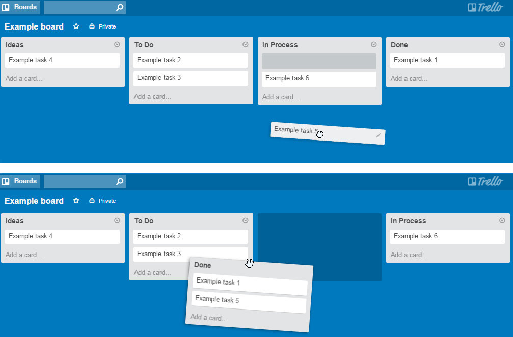
I’m not saying that our interface is very easy; it’s actually the opposite, but in the context of collections, it’s a one-way ticket – you have one icon and one place for it to go. Now, suppose you have a few potential places you could “send” an icon – say, a shopping cart or some editor. To use a more “practical” example, let’s think of a “Trello” web service. Basically, it’s a board with notes that can be dragged all around.

You can drag notes not only within columns but also in the columns themselves.
If you click something and it automatically goes somewhere – that would be awkward at the very least. Instead, you provide only one mechanism – dragging. Dragging, in this case, gives your customers a great variety of options to where they can drag the object, and a good interface would use that very effectively. Meanwhile, left-clicking is free and can be used for any other useful operation – say, opening this object’s contents or settings, which allows you to keep your interface simple. Even more importantly, if clients are used to one procedure, you can successfully implement other ones based on it. For example, you can add new modules to your app to extend it, but people can still use old procedures. If you use that wisely, trying out new features may become a pleasant and rewarding experience for your customers.
In short, complex interfaces that implement both procedures for the same purpose may lead to ambiguity and chaos.
Productivity, Efficiency, and Habits
As I mentioned, clicking saves a good amount of time and energy. Well, not when you drag 5 icons a day. Suppose you need to drag 5,000. Now, let’s talk about efficiency. So why not implement both and let people choose for themselves? Well, that’s the thing called habit. During my studies, when I asked people after they “dragged” an icon to find another way of doing things, such as by clicking, 80% of them were discouraged. They tried dragging to another place and were looking specifically for the “another-way-of-doing-things” button but were never successful in finding a clicking mechanism. However, one time I used a prototype with Drag and Drop function not working (to be honest, it wasn’t intentional).

One does not simply drag and drop the icon.
Guess what? They found the clicking mechanism quite successful on their own. Many psychological mechanisms are involved, but there’s one I should mention specifically – sufficiency. After discovering a successful way of doing things, people may completely lose the motivation to find another one, even if the mechanism they’ve found is not the most efficient and optimal.
In short: it’s much easier to add a new feature or behavior than to get rid of unproductive but “sufficient” old ones. This is especially true for an enterprise environment where such issues may lead to losses in productivity. Customers may also find some interactions not convenient but will be bound to them by force of habit. Even displeasure with your app may come to be a habit, so be careful.
Mobile Platforms and Touchscreens
Gestures are far more natural to people than dragging with the mouse. Most mobile apps I saw tended to use gestures for that reason. However, it’s also about saving space. Considering the small size of mobile screens, it becomes even more important to optimize interfaces, so doubling the procedures may be a luxury. As for the rest, everything already discussed applies to mobile platforms as well.
In short: Gestures are a very pleasant and natural mechanic for people. I’d suggest using them everywhere it’s appropriate and makes sense. Be careful of overkill, though. Some people may not use your application publicly just because it’ll look like they’re trying to conduct a mouse orchestra.
Summary
The combination of these two mechanics may benefit your application or totally ruin your user’s experience. I hope this article helps you make the right choices for your environment. That’s pretty much it. I never expected such a simple topic to grow into such a big article, but believe me, there’s much more to say, so you got off lightly.
Now tell me, are you a clicker or a dragger? And why? Share your examples in the comments, as it would be very beneficial to other readers as well as myself.
About the Author
Andrew Burmistrov is a usability specialist at Icons8. He started his career as a phone support specialist, telling jokes while customers were rebooting their computers, then moved to usability testing and occasional writing.
Try free tools for creators by the Icons8 team
Also, get the lists of free vector software and free photo editing software.


