
Tricky case of creating icons for small interfaces, written by our design team.
Icons are vital for interfaces. They talk to you in the universal language, point in the right direction, and present product features to the user. In the age of IoT and wearable gadgets, some interfaces became tiny: kettles, electric toothbrushes, watches, and even cigarettes — they all need icons. But how can they work in such a small size?
Let’s draw a “time” icon and use it as an example.
The easiest way to convey the “time” meaning is with a watch. It shows the time to people of all genders, geography, and generations. So, let’s keep this as a solution.
So, time — clocks.
But what kind of clocks?
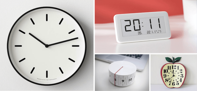
There are many clocks in our life, and they can be very different from each other:
We want a look as simple as possible, and it’s probably the one people use the longest.
This is how we came to the idea of the image: a round dial with two arrows.
The most popular size for small icons is 16×16, with a line width of 1 pixel. Our task is to enter the 16-pixel grid.
Putting a circle in a pixel grid is not difficult, but arrows are tricky. If you display them in their usual form at “3 o’clock” (option A), then both arrows will stand “past the grid” and will be blurry.
There are two ways out:
Both ways could work, depending on the context:
In theory, any icon should be universal, understandable, and fit well into the pixel grid. Meanwhile, the world is imperfect; designs are different, and sometimes, you can sacrifice some parameters if the situation requires it.
The case above shows that in small interfaces, the size leaves you no choice but to approach these three points with dedicated attention and fine-tune each icon so that it can be seen.
About the author
Alex K. lead icon designer of Icons8
This is where we place all the possible blocks that we use for our articles…
Creating illustrations for a children’s book is challenging, especially if you're not an artist. Learn…
Nostalgic typefaces are trendy and more varied than ever. Discover the story behind vintage typography…
Curious about the diverse world of nostalgic fonts? Keep reading to explore typography from the…
Check out arrow icons in different aesthetics and get some inspiration on how to implement…
Step-by-step tutorial on generating AI illustrations for the online school landing page design.
This website uses cookies.