The new interface takes visual clarity to another level. Icon search is now faster than ever before.
We know why you browse our icons library: you need icons that look good. You often need very specific ones (‘physical abuse’ is totally not a weird search query), and you want them right away. This is why we made our icons search more user-oriented. Numerous brainstorms and drafts later, it’s time to welcome the new Icons web app!
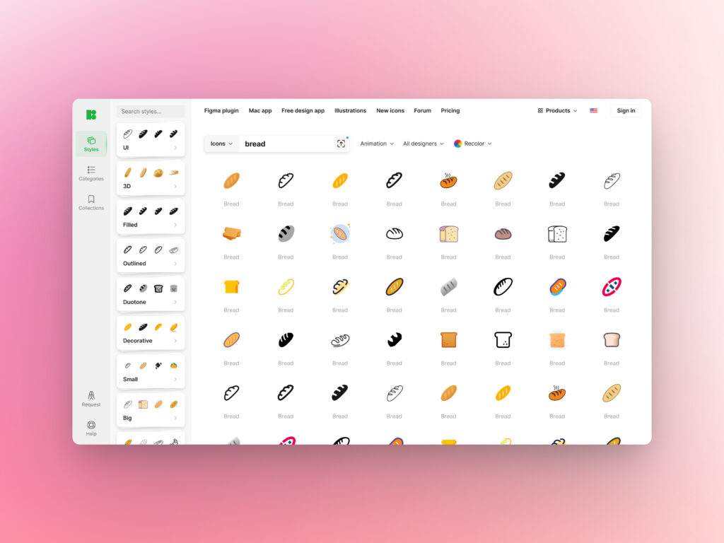
The left panel now has everything you might need in your search for the perfect icon. There you will find Styles, Categories, and Collections.
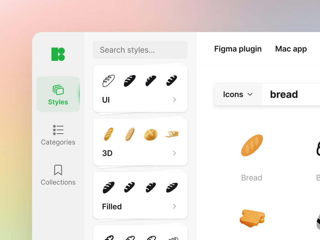
Styles
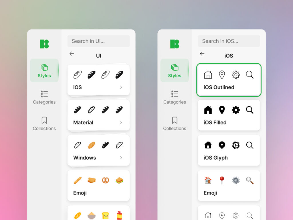
We added micro previews for our icon styles. Now you can get a good idea of what different icon styles look like without clicking through each of them. Icon styles are sorted into groups based on their function. You can literally see them stacked up in piles in the new interface.
Categories
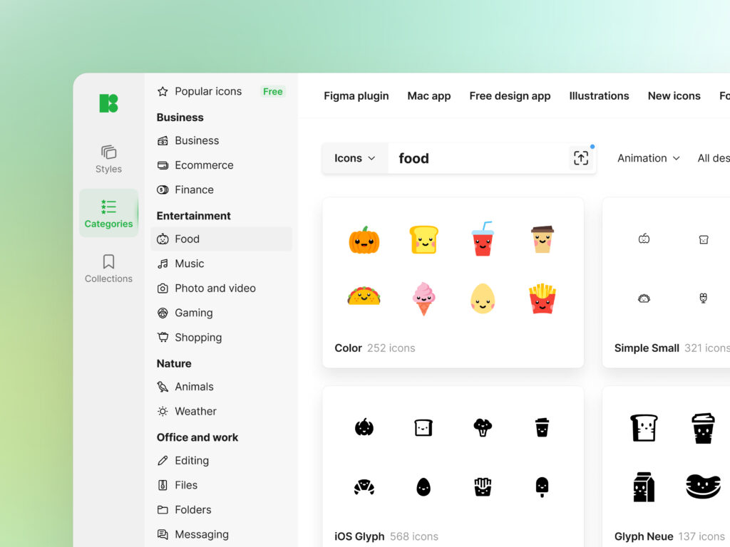
The next tab is Categories, in case you want, say, food icons in all possible styles.
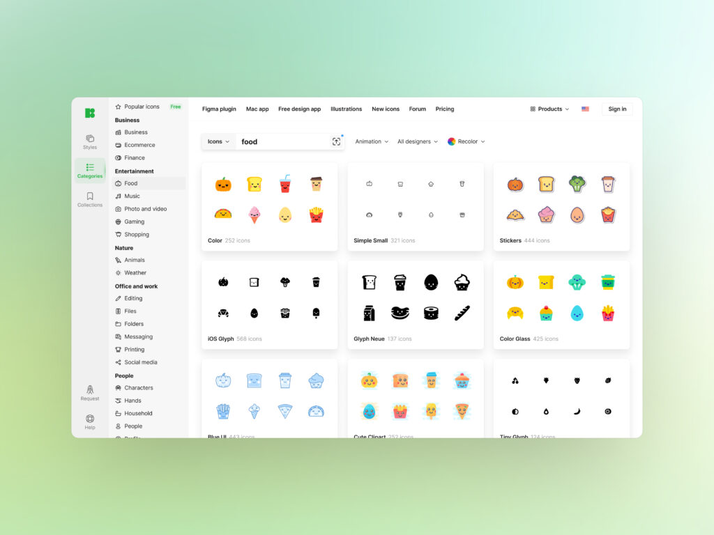
Each category has a tiny pictogram to give you a better idea of what each of them includes.
Collections
You can save or simply drag & drop all the icons you like to your personal collections. Download them in bulk or copy the link to the collection and share it with your teammates. This tab also stores the icons you downloaded earlier.
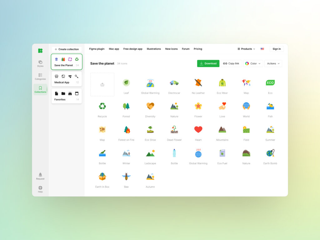
Didn’t find the right icon? Request it using the link in the bottom left corner.
New landing
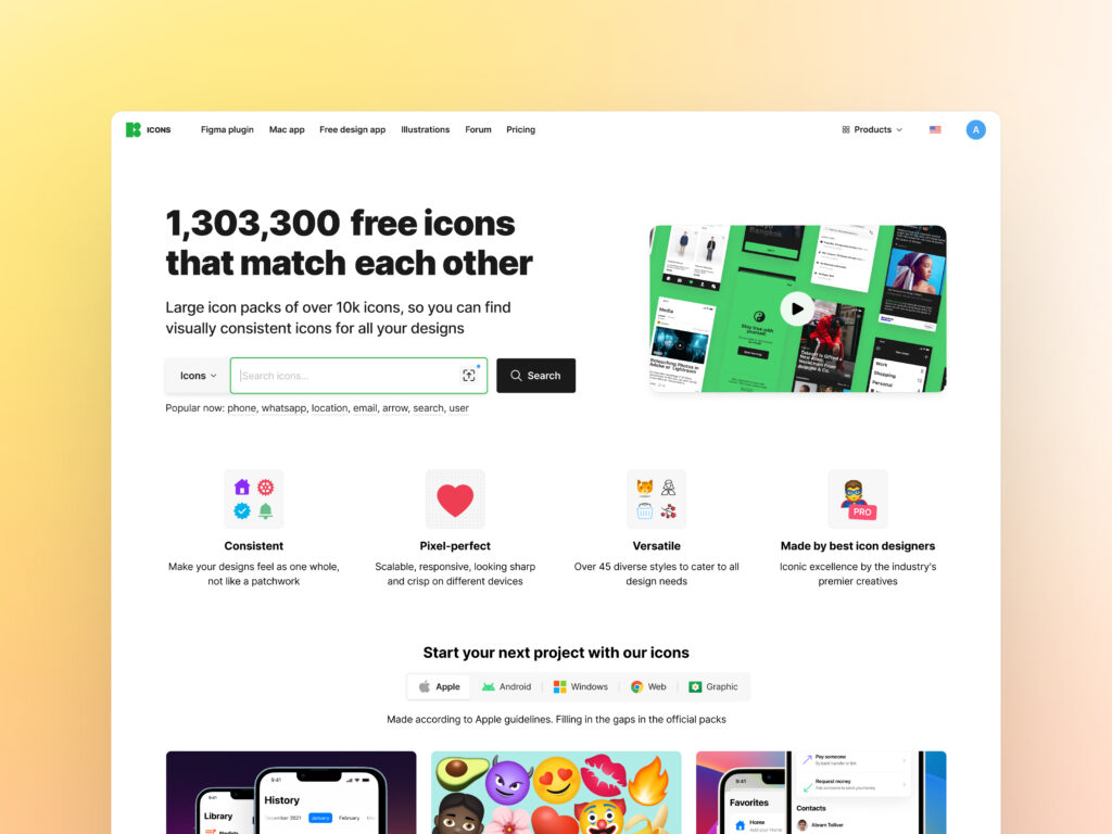
The Icons landing page also got a huge update. With our most popular icon styles featured on the landing page, you can jump straight to the pack you like and continue browsing icons from there.
New pricing page
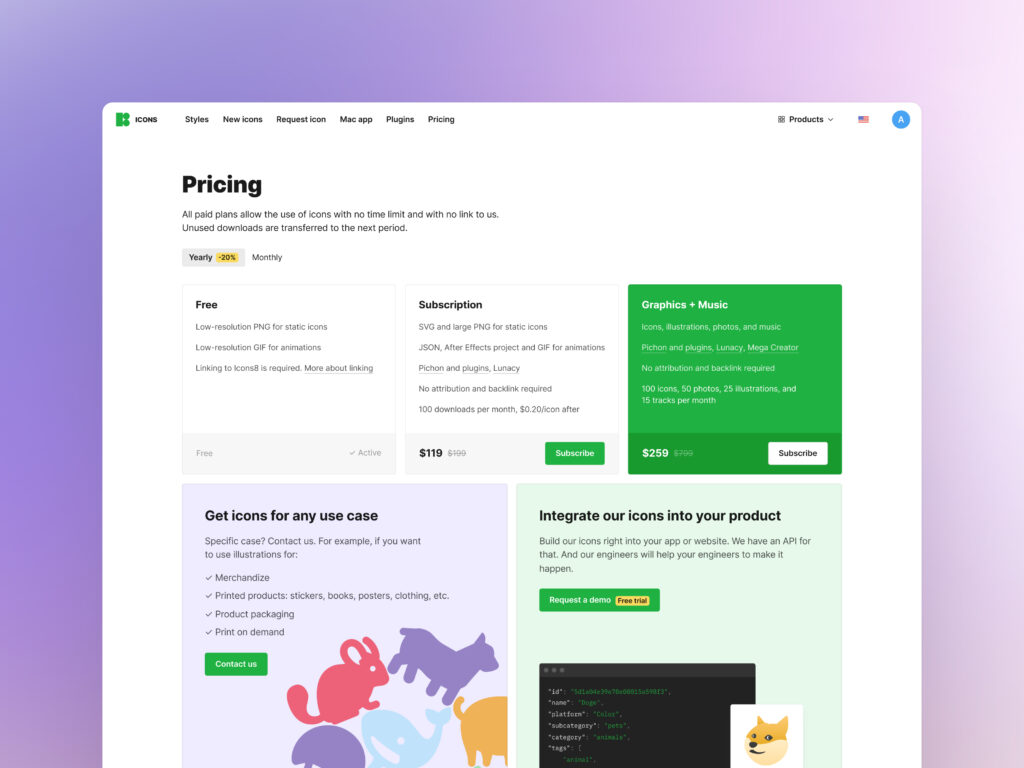
No more confusion: you can now see each plan summarized in one place. The new pricing page shows what you can access with different plans, making it way easier to decide whether you’re good with a free option or not.
