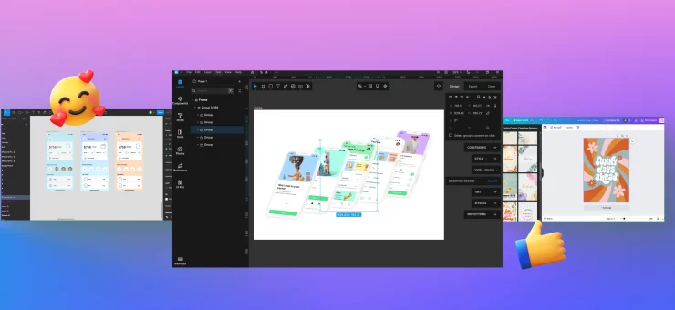
Meet the new UI with floating panels, on-canvas controls for auto layouts, refreshed text editing, and even more.
No matter what you use Lunacy for, the very first update you see as soon as you open it is the new UI. The bulky panel on the right that took up a lot of space is gone — say hi to floating panels that leave more room for your creations. Here is how we made it happen and what else you will find in the latest update of Lunacy.
What’s new:
- Floating right-sided panels in the new UI
- On-canvas font size editor
- Text baseline alignment
- Auto layout wrapping
- On-canvas auto layout settings
Floating right-sided panels in the new UI
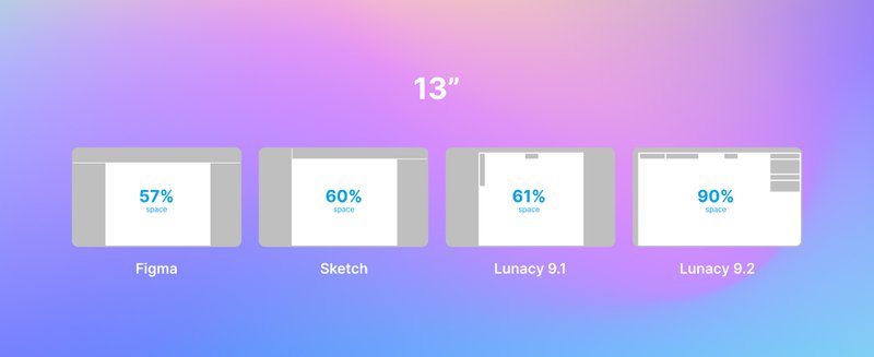
Not all Lunacy users have huge professional screens. Some of them are using 13” laptops. In this case, especially when collaborating with the team in real-time, it is crucial to have as much free canvas space as possible.
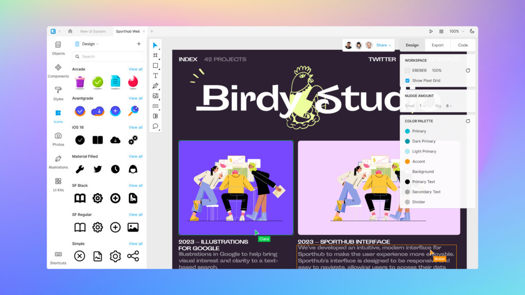
Therefore our team was working on the task to free up some more space.
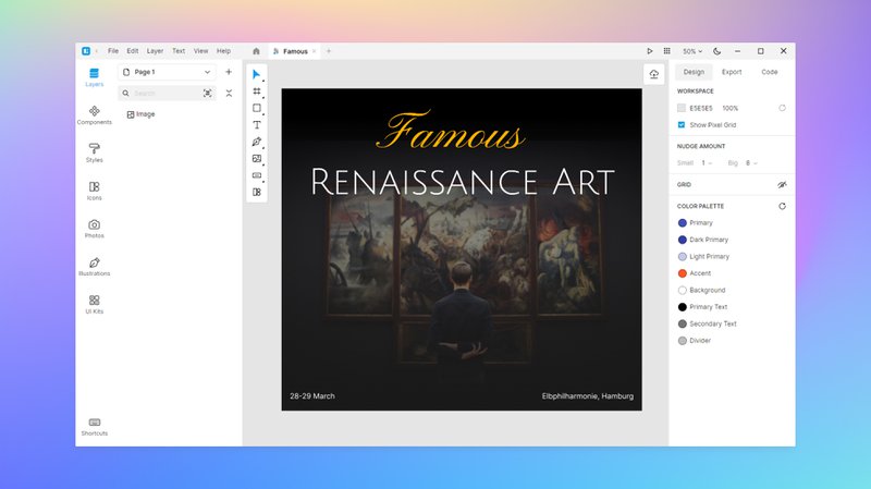
The very first concept for determining the direction to take is to make the panel semi-transparent in order to introduce more visible space.
Previously, we were unable to make the space under the inspectors transparent due to the application’s architecture (which caused significant performance lag). However, we attempted to minimize the lag and provide users with more whitespace.
In one of the initial prototypes, we experimented with reducing the opacity of the inspectors, hoping that this would result in fewer performance issues. Nevertheless, the performance remained unsatisfactory, leading us to shelve this idea.
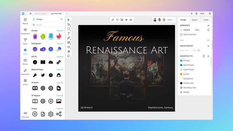
When we got updates to our development components, we began crafting floating panels. The initial iterations looked like this, with the notion of making them collapsible at any given moment:
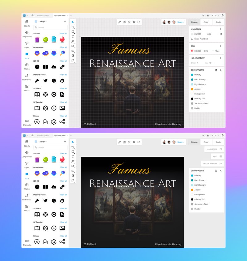
This idea didn’t work for us because it clashed with the existing behavior of inspectors. Many of them have a “+” on the right side that triggers the inspector, and this idea was not aligned with that interaction pattern. So we kept looking further.
Next, we played with the upper tabs, moving them to the sides of the inspectors and making the left side floatable:
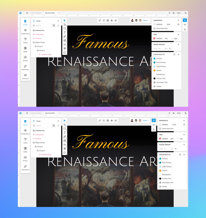
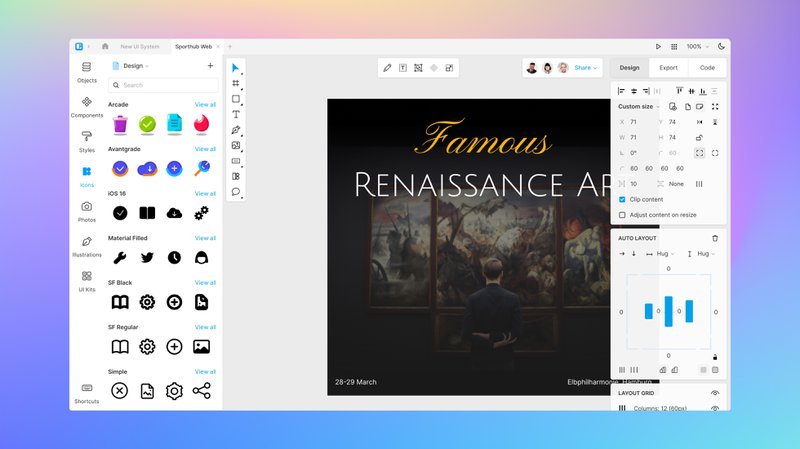
Ultimately, we ended up with the final version of floating panels, which you can see in the latest release of Lunacy. We also added a touch of transparency to the panels to allow for a slight view of what’s positioned beneath them on the canvas.
Bits of stats
On the 13” display with the resolution 1366х768, canvas takes up to:
What is also inside
Floating panels are the major feature of the latest update. But not the only one.
On-canvas font size editor
Adjust the font size just by dragging the handle on the layer box:
Text baseline alignment
Align text layers within auto layout frames based on their baselines rather than their bounding boxes. Mostly recommended when dealing with texts of varying fonts and/or sizes.
Auto layout wrapping
When wrapping is activated, the content within an auto layout frame will transition to the following line as the frame is resized smaller.
On-canvas auto layout settings
Fine-tune padding and spacing directly on the canvas for auto layouts.
Other than that, the new version of Lunacy got many more improvements. Check all of them in the Release notes.

