Web designers and developers are continuously creating and improving features that help create an exceptional customer experience.
Many of these features are helpful, but sometimes designers overlook some of the most important ones. In this article, we covered 12 features that you shouldn’t forget in your work process.
1. Hero header or hero image
A hero image is a banner on your homepage or landing page that users see when browsing your website. The image is your site’s first impression. It can either repel your new visitors or urge them to scroll down and learn more about your business.
Yes, judging a website or business based on the first image seems superficial, but it’s the reality.

A good hero header is both captivating and communicates your business’s key features.
There are free online design tools that you can use to design a hero image to your preference.
Here are some tips for creating a quality header image:
- Highlight your business’s core function: the user should learn what your business offers when the homepage loads.
- Clearly visible font: the user should not struggle to read the message because the font is too small, illegible, or the text doesn’t contrast with the background.
- Use a lightweight animated SVG for your hero image to improve the website’s personality.
2. Design for your audience
Everyone wants their website to attract as many visitors as possible. But in reality, only a small niche of people will relate to your content and buy your products.
You should design your website to appeal to this group of people.
You should identify your target audience when creating your marketing strategy. Try to narrow down the criteria as much as possible:
- Are you targeting children, adolescents, or adults?
- Which gender?
- Which age range?
- Or is it a group of people with certain interests?
- Individuals or businesses?
Using more filters allows you to narrow down your audience to a small group of people.
When you design for a specific audience, you don’t have to include so much general information. You can go into more technical and specific details. As a result, the target audience will find your content meaningful, and you will gain credibility.
This increases your conversion rates and returns customers while reducing your website’s bounce rates.
3. Search engine optimization
Search engine optimization (SEO) is great for making your site rank high in online organic search results. Organic search results are non-promoted or non-advert.
Here are some search engine optimization tricks you can use on your website:
- Use the right keywords
- Include statistics and illustrative graphics
- Use subheadings in your articles
- Create informative and entertaining articles that readers can easily read to the end without getting bored
- Add internal and external links
Search engines use web crawlers to get and store information for indexing. Sites that have operated the above features get a higher rank when indexing.
Your website’s quality and SEO are interdependent. When you have great content, users are more likely to engage with the site and become regular visitors. More traffic on your site raises your ranking on search engine results.
But, the bounce rate may increase even with good SEO optimization if users find uninteresting content on your site. This will reduce both traffic and ranking on search results.
4. Navigation
Your website visitors want to move from one page or section to another conveniently. The modern Internet user will not hesitate to move to your competitor’s site if yours proves too tricky to navigate.
Some features you can use to make your site more navigable include:
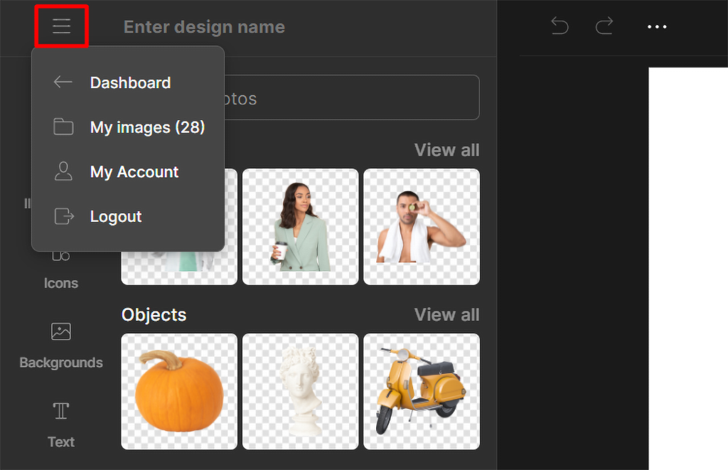
Hamburger menu or vertical navigation menu
This menu type is denoted by three lines at the page’s top right or top left. Users are more familiar with the hamburger menu because most modern websites use it.
The hamburger menu leads users to other pages you could not cram into the homepage. Therefore, it’s suitable for navigation and keeping the site neat.
Internal links
A customer on one page should hop to another effortlessly for more information. Internal links help with this.
But don’t just insert links thoughtlessly. Ensure the page that the link leads to complements the content on the previous page. And what’s more? Internal links boost SEO ranking as well.
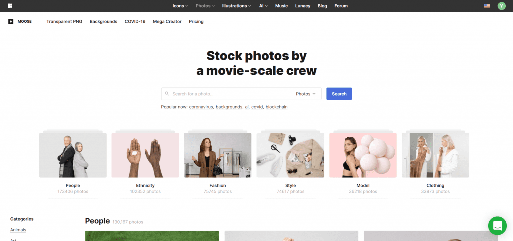
Search box
Many times, a user knows the type of information they want to get from your site. Such users would prefer searching for the content or product they want directly. A search button makes navigation faster for such users and improves their experience using your site.
5. Use of white space to avoid cluttering
It is tempting to include as many features and information on your homepage as possible. This will help you improve your conversion rates. Right?
The clutter works against you in many ways.
First, it communicates that you are disorganized. It also creates confusion, making it difficult for users to navigate the site.
A congested website reduces readability, and it makes users difficult to engage with content.
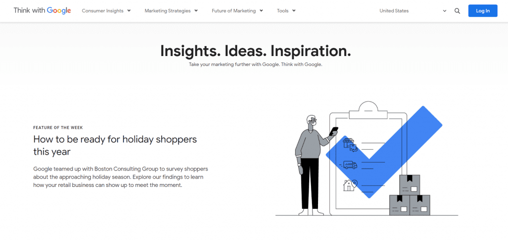
Leave some space, known as white space, between elements – especially images. White space on your site makes the content more readable, especially on mobile browsers.
Finally, when your site is crowded, a keen user can tell you are inexperienced and just use any tools and features you can get your hands on.
This erodes your credibility as a service or product provider.
6. Mobile optimization (Mobile-first indexing)
Over 50% of Internet users access websites and digital platforms through mobile phones. This excludes tablet users. Therefore, optimize your website for mobile use. Not doing so places you at the risk of missing out on the biggest demographic of Internet users.
Google adopted mobile-first indexing because peoples browse websites from phones more and more. Under this approach, your site will rank lower if you do not optimize it for mobile browsing.
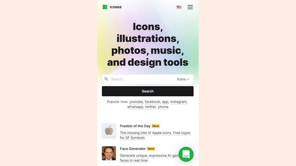
Optimizing the site for mobile use goes beyond just being accessible via a mobile phone. The site should load at the same speed, and images and content quality should remain the same. The user should get all the features on their phone as they would on their PC.
7. Fast webpage loading speed
Slow loading speed is the number one cause of high bounce rates. A site that loads within one second has a 6% bounce rate. The bounce rate increases to 37% and over 60% if the loading time increases to five and ten seconds, respectively. This shows you how impatient the modern Internet user is.
To improve your website speed and reduce your site’s bounce rates:
Choose a fast web host
The speed and responsiveness of your web host directly affect your site’s loading speed. Based on Bitcatcha’s latest Website Speed Study – your hosting server needs to respond within the first 180ms to be considered good.
To choose a fast web host, look out for key speed features such as proprietary caching technologies:
- HTTP/2 or HTTP/3 support
- NVMe or solid-state drives (SSD)
- Control over critical areas such as NGINX
Optimize your images
Images are great for your site but must be moderated carefully. Large images are often the main culprit of slow page loads. Always optimize your images before uploading them. You can use a third-party image optimization tool like Optimizilla. Serve WEBP images (which load 1.5x faster than traditional JPEG images) on your site.
Reduce website redirects
You may, on occasion, find the need to change URLs. To maintain usability and SERPs while doing this, redirects come into play. The problem is that redirecting websites or specific pages takes server resources. So keep them to a minimum where possible.
8. Flexibility and ease of updating and maintaining the site
It’s important to update the content of your website regularly. Content in some areas, such as tech and social trends, becomes outdated quickly.
But you should not upgrade content only.
Developers are constantly releasing newly designed or improved features. During updates, you can include such features in your site to improve functionality and aesthetics.
If your website design is complex, you might need to hire an experienced developer to update it, which can be expensive.
Your site’s design should be simple and flexible enough that another designer can do the updates without the original designer.
9. Short feature videos
Websites have been using short feature videos for a few years now. Those that have used the feature to engage their audience, e.g., by giving more details about products, have reaped the benefits in several ways, including:
- Improving your SEO: Search engines rank sites with feature videos on their result pages. You also get a better ranking if you keep the video content fresh by posting new ones regularly.
- Distinguishing your brand: Unlike written and image content that your competitors can imitate easily, videos are authentically yours. Your competitors cannot fully imitate the character and personality that you espouse in your videos.
- Increasing user engagement: Users are more receptive to video content compared to written content. This increases engagement in your website, increasing its SEO ranking. Also, it allows you to pass a lot of marketing information about your business fast. Such satisfied users are more likely to become repeat customers.
10. Clear call to action
Everything on your site should lead the visitor to take a certain action. It could be anything from purchasing to signing up for a newsletter to donating.
The call to action (CTA) should urge the visitor to take the specific action you need.
Most Internet users are aware of the use of calls to action. In fact, by the time they reach the CTA, they are almost convinced to buy or interact with you further.
All you need is a persuasive call-to-action message to push them over the edge. Some tips you can use to achieve this include:
- Use a non-mistakable verb or phrase such as “buy,” “subscribe,” or “fill this form.”
- Tell the visitor why they should take action, e.g., “subscribe today and get a free newsletter every month.”
- Take advantage of FOMO. Inform the user that a promotion will run for a short time, and they risk missing out if they don’t act immediately.
- Stay focused: Avoid using too many CTAs in one fold of the screen. Take MyPilow.com, for example (see screenshot) – There are four “Click Here” buttons in one fold. There are so many happenings on one page – which button should the users click?
11. Noticeable contact button
An easy-to-spot contact button informs the customer that your business is easily reachable. This then creates the perception that you offer stellar customer service. Of course, you must put in the effort and live up to this perception.
Why do you need to appear reachable to the customer?
Trust is an essential element of e-commerce. When customers feel they can contact you, it boosts your legitimacy.
The contact button can also double up as a call-to-action button. For example, a button stating “Contact us today for a free consultation session.”
12. Reviews and testimonials
The Internet is infested with scammers that pose as legit businesses. And this has led people to be skeptical of websites. This especially happens with new users who have never interacted with your site before.
Fortunately, you can earn the trust of new site visitors using reviews and testimonials of genuine customers. Do not pay for or make fake testimonials. Customers can discern them easily. This will damage the credibility of your brand.
And don’t delete the negative reviews. Resolve the issue raised right there in the reviews section, which every visitor can see and follow.
Conclusion
As a business, you aim always to get the maximum customer lifetime value. You need to keep as many current customers as possible to do this. And the best way to retain customers is by giving them a quality customer experience.
In today’s digital world, your website is a huge part of your brand and marketing. You probably interact with more customers through your site than you will ever meet face-to-face.
Therefore, you need to put a lot of effort, thought, and resources into creating a positive user experience for users visiting your site. Invest in features that will give your customers a good user experience. They will come back for the products and expertise and refer other potential customers.
About the author
Jerry Low has years of experience in digital marketing. He runs a web marketing agency and operates various successful sites, adapting quickly to ever-changing Google updates.


