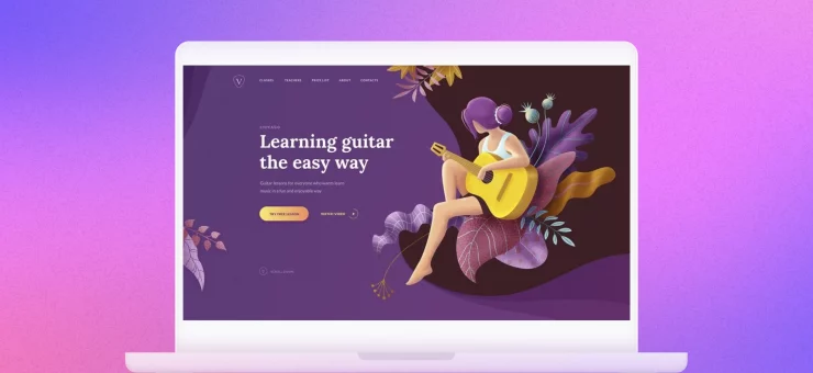
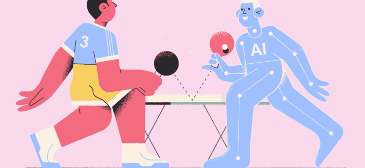
If we took a shot every time we saw an awesome design with our graphics, we’d be totally wasted. Check these beauties out!
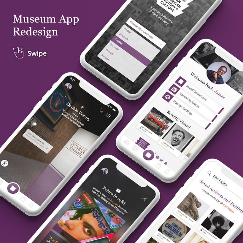
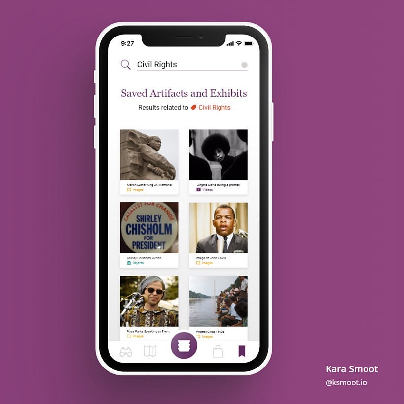
Museum app
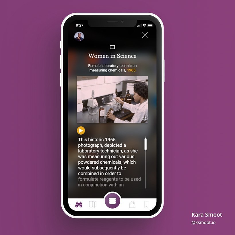
How cool would it be if you could bookmark your favorite museum’s exhibits in a mobile app to revisit them at any time? Or use that same app to learn more about some of its most significant pieces by watching documentaries and video lectures? Kara Smoot created an app design concept for the National Museum of African American History using the Icons8 UI/UX icons. The neat, minimal iOS 16-inspired icons blend into the museum’s signature UI style seamlessly.
Travel app
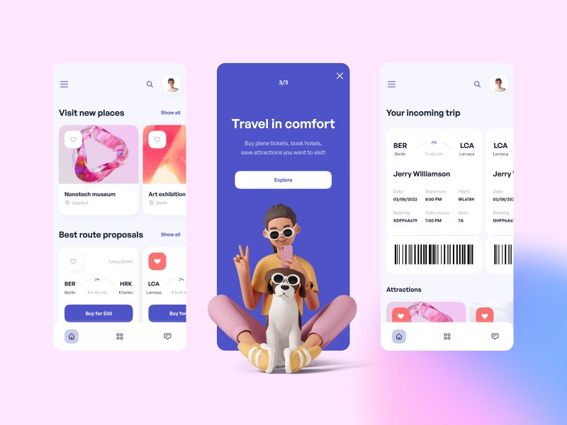
This design created by Anna Kapustina for Gotoinc uses 3D illustrations from the Icons8 3D Casual life pack. The three-dimensional humans make the minimal design of the booking app more lively. By placing 3D illustrations on monochromatic backgrounds, the designer creates a perfect balance between clean and fun.
Job search website
Looking for a job can feel exhausting and hopeless, and the bland black-on-white website design only makes the experience a billion times more discouraging. Something as little as a splash of color and a little animation can make job seeking more exciting. Izzy Bialkowska used a mesmerizing animated illustration from the Abstract set. Picking a less common shade of blue, such as Perano, instantly makes the design more alluring.
Online banking
Who said finances need to be plain and boring? A bit of 3D art in web design for an online banking platform might add just the right amount of friendliness and make the page look less formal to a user. UI design created by Awe Design Studio utilizes a 3D hand illustration from the 3D Hands Fun&Wild pack.
Educational app
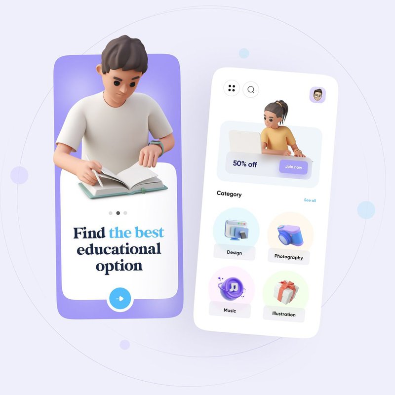
Being able to find various educational courses and acquire new skills inside a mobile app sounds like an awesome concept. To visualize it, Yasir Noori used 3D illustrations of people studying from the 3D Casual life pack. These 3D characters make the design feel more human and user-oriented, rather than focused solely on educational content.
Tech museum app
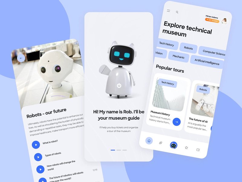
Beep-boop, anyone? In this app design for a tech museum made by Gotoinc’s Anna Kapustina, you can see our 3D robots from the 3D Business pack. The irresistibly adorable three-dimensional robot represents the app’s AI assistant named Rob. Its minimal design fits the color scheme of a tech-themed app impeccably.
Virtual cardholder
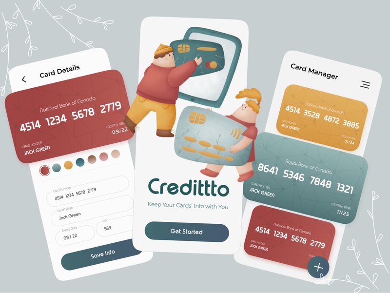
Imagine Apple or Google’s Wallet app, but a bit more refreshing and cute – this would be Credittto designed by Niloufar Jamali. Warm, muted colors and rounded, children’s book-like illustrations make the dry cardholder app appear way friendlier. To create this UI design concept, Niloufar Jamali used the dreamy Woolly illustration collection.
Productivity app
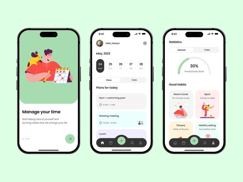
Planners are some of the most boring things humanity has ever created. One way to make them actually enjoyable is by using a vibrant UI design with charming illustrations, just like Anastasiia Shaba did. Sammy style illustrations paired with comforting pastel backgrounds create a design that looks inviting and non-overwhelming.
E-library app
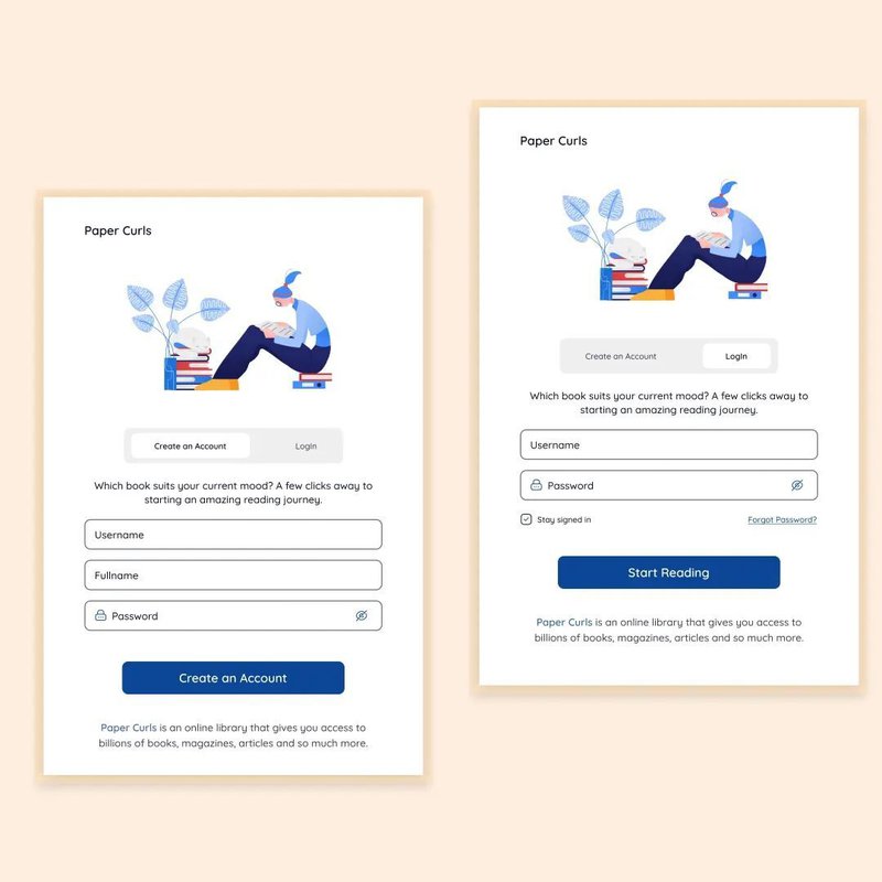
Reading off a mobile screen can quite literally hurt your eyes. This is why e-library apps use uncluttered, non-irritating designs to make the reading experience more pleasant. In this concept design for an e-book app, the unknown designer (we mean it, look at the username) used an illustration from the Clip pack. The soft blue palette with a subtle pop of color is ideal for a mobile library.
Budget planner
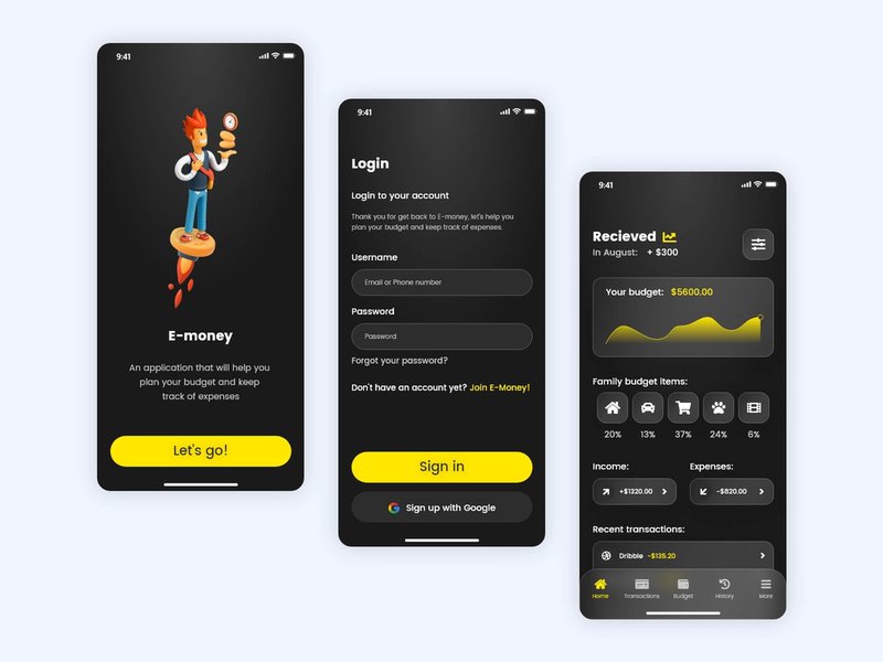
Does it sometimes feel like your money burns right in your hands before you even get to spend it? This is probably why Andrii Pleshkov used our 3D Flame illustration set for his budget planning app design. 3D Flame is a mix of quirky and professional, making it an irreplaceable collection of illustrations for those who love a serious design with a twist.
Fitness app
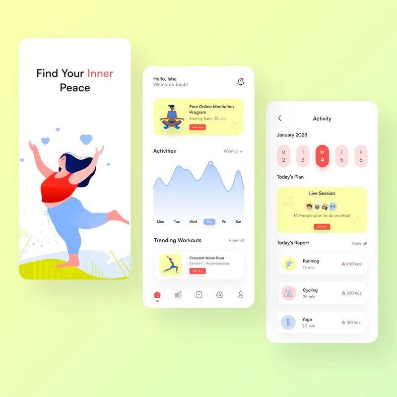
Fitness applications can be immensely off-putting if they use a design that is too aggressively in-your-face. Get those abs working, burn those calories, walk those 10,000 steps, and here is a picture of a professional athlete to make you feel guilty for not completing the daily goal. By using a soft color palette and calming illustrations from the Urban collection, Pragati made the app appear much more soothing and uplifting.
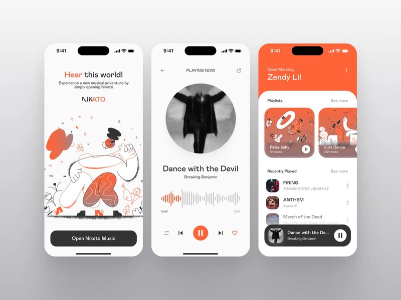
Music player
Our sets of illustrations are a perfect foundation for any design. You get a whole pack of ready-made images that share the same style, making the design process quick and effortless. In this design for Daily UI Challenge, Alla Vilenskaya used our Crayon vector illustrations and built the app’s color scheme around it.
Get creative with the Icons8 assets and our free offline graphic design app – Lunacy. We look through our user’s projects all the time and post our favorites on the blog (just like we did this time). Make sure you use the #icons8 hashtag and tag us in your post so we can see your work!


