

Check out this list of top 10 mistakes people make when designing sign-up forms and follow the UI tips to avoid them.
A sign-up form is a barrier between users and your web application, so it’s crucial to make it as easy to use as possible.
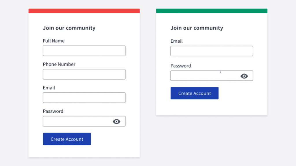
Avoid asking for too much information when the user signs up. Life is too short to spend it filling out forms. Ask only for essential information.
You probably don’t need the user’s phone number or first and last name. You can even omit the password field! Instead, you can auto-generate it and email it to the user.
If you need more information, try to explain why you ask. That will give users some assurance.
If the form is too large, consider breaking it into a few smaller forms.
If there is no autofocus, users have to move the mouse and make an extra click.
A good practice is autofocusing the first input. Not only in a sign-up form but in most other forms too.
Users who make a mistake in the password field might want to check what they’ve typed and correct a character or two rather than retyping the password anew.
A small eye icon is an established pattern and is easily recognizable. You can also use the Show label instead of the icon.
Show password requirements right away. Don’t wait till the user clicks the Sign-up button and sees the validation errors.
A good example is the Mailchimp form. Once the password a user enters conforms to a requirement, this requirement greys out.
Small sign-up forms might not be necessary. But if a form consists of dozens of inputs, it is a good idea to display a green tick next to correctly filled fields.
Imagine you have a checkout form with a credit card number field. It’s easy to make a mistake there. Even if the user has filled in 16 digits, the number still might be incorrect. Add a nice green tick to indicate that everything is fine.
It’s hard to remember usernames for every single service you use. Email is a much more convenient way. What’s more, it spares the user from annoying “already taken” errors.
Don’t make users re-type their credentials over and over again. Even for the password input, you should have a way to reveal its value so that users can fix a small TYPO in it.
Security considerations: it’s the job of the server to prevent password brute force, not of the interface.
When you forward users to the restore password page, it is humane to auto-fill the email address so that they don’t have to type it again.
A small but handy feature that makes the user experience better. Simply alert users when they have caps lock enabled.
If your form includes such fields as email address or phone number, don’t forget to define the proper HTML input type. If you don’t, users will have to switch the keyboard type manually.
About the author
Victor Ponamariov, a web developer fell in love with user interfaces. He published a book with 100 practical UI/UX tips where he shares his experience.
Read also:
This is where we place all the possible blocks that we use for our articles…
Creating illustrations for a children’s book is challenging, especially if you're not an artist. Learn…
Nostalgic typefaces are trendy and more varied than ever. Discover the story behind vintage typography…
Curious about the diverse world of nostalgic fonts? Keep reading to explore typography from the…
Check out arrow icons in different aesthetics and get some inspiration on how to implement…
Step-by-step tutorial on generating AI illustrations for the online school landing page design.
This website uses cookies.