This article explores the role of interface icons, examining various classifications and the types used in web and mobile platforms.
Icons might be small, but they pack a big punch in user interface design. They’re not just decorative elements. Icons are powerful tools that help users navigate smoothly and intuitively.
Famous coach John Wooden said, “It’s the little details that are vital. Little things make big things happen.” In UI design, it works the same way: the tiniest details can have a great impact on conversion, usability, and visual harmony. Icons are definitely at the top of that issue.
Let’s explore some insights into their history, classification, and functions.
What is an ‘icon’ in design?
The term “icon” has a broad meaning. Merriam-Webster dictionary offers two explanations that somehow reflect its movement from the physical world to digital design:
- A: a sign (such as a word or graphic symbol) whose form suggests its meaning.
- B: a graphic symbol on a computer display screen that represents an object (such as a file) or function (such as the command to delete). Based on that, icons can be described as symbolic images that satisfy particular communication needs.
Together with copy, these graphics present information and help people exchange or obtain necessary data. Copy communicates with words; icons do it via images and pictograms resembling recognizable physical objects. For a couple of decades, icons have helped to make human-computer interaction successful.
How icons enhance user experience
There are some core benefits that make icons influential in user interfaces of any kind, and the ability to replace or support text is perhaps the most essential. In many cases, icons crafted with good knowledge of the audience successfully replace the words in the interface, adding to all the benefits below:
- Multilingual understanding. Icons transcend language barriers, making interfaces universally understandable, so icons can make the interface more flexible.
- Faster interaction. Users typically process images quicker than text, speeding up navigation and decision-making.
- Improved memorability. Visual elements are more likely to be remembered than text, aiding in user recall of interface layouts.
- Space efficiency. Icons can convey information compactly, saving valuable screen space, especially on mobile devices.
- Design cohesion. Icons contribute to the overall design theme, reinforcing the visual style of the interface.
Nevertheless, applying the power of the mentioned benefits to the interface, make sure it’s tested properly: even the slightest misperception can become the reason for poor user experience or cause interaction troubles.
The evolution of icons in user interfaces
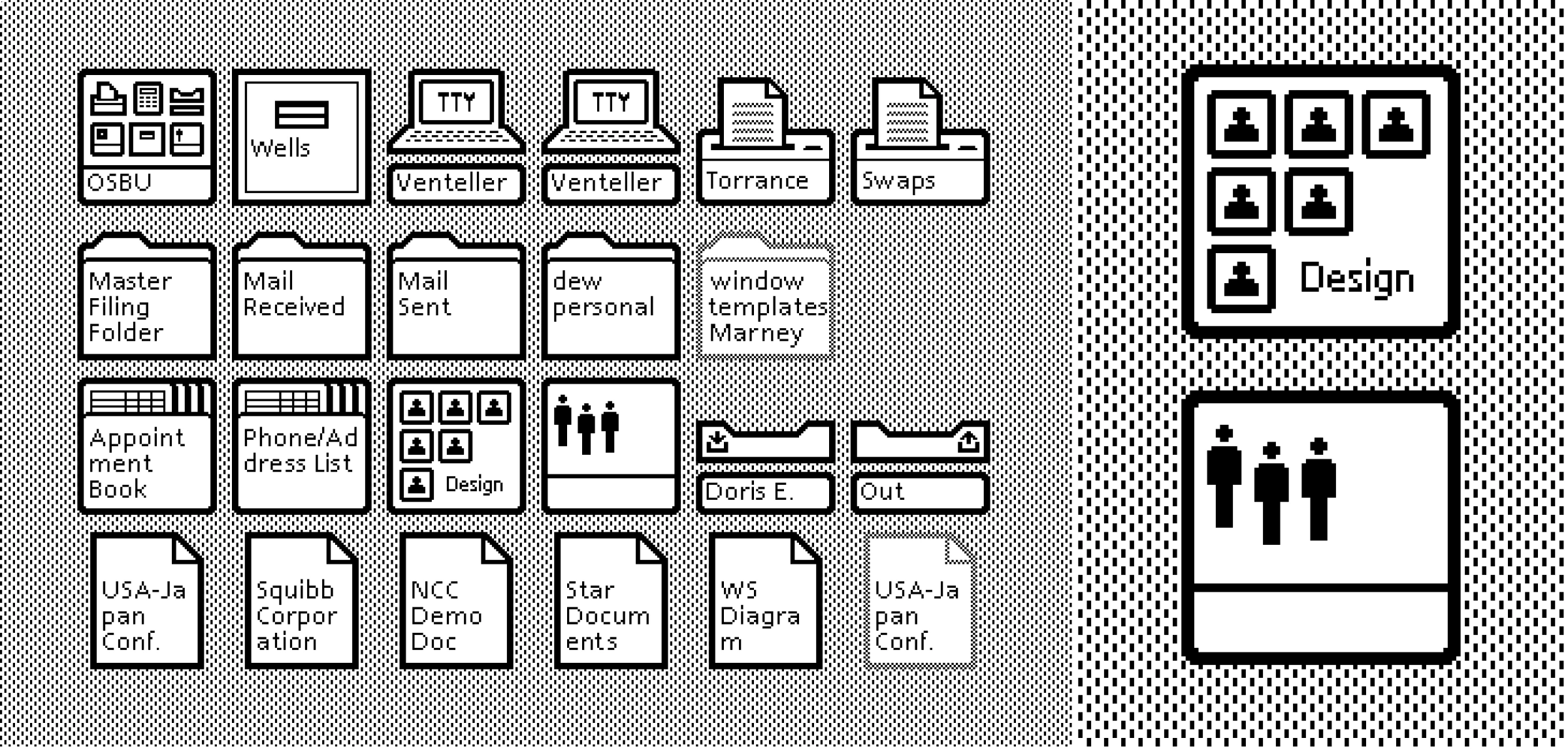
Icons have a rich history that predates modern interface design, appearing in early signs, maps, and manuals as symbolic pictograms. The journey of icons in digital interfaces began with Xerox in the early 1970s, who developed the first graphical user interfaces for the Xerox Alto, an advanced but commercially unavailable machine. This innovation continued with the Xerox Star in 1981, which popularized icons like folders and trash bins that are still integral to desktop environments today.
Apple later advanced the icon evolution by introducing the first color icons in 1991, enhancing both functionality and visual appeal, setting a new standard for icon design.
Today, icons are broadly presented in user interface design with numerous packs and sets of all the themes and styles possible. Although there are already many ready-made packs, this global database is growing nonstop in search of new, appealing, and useful solutions.
Types of icons
When it comes to the classification of icons, several aspects can be applied to group them into types.
Functions
Explanatory (clarifying) icons
The name is self-explanatory. Explanatory icons clarify interface features or help categorize content. While not always interactive, they enhance text with visuals to quicken navigation and add flexibility to the interface.
This method engages users at multiple perceptual levels, boosting the visibility of call-to-action elements. Users who recognize the symbol quickly or struggle with text aren’t hindered by verbosity. For those uncertain of an icon’s meaning, accompanying text confirms its function, reducing misunderstandings and offering a more user-friendly choice of information presentation.
Interactive icons
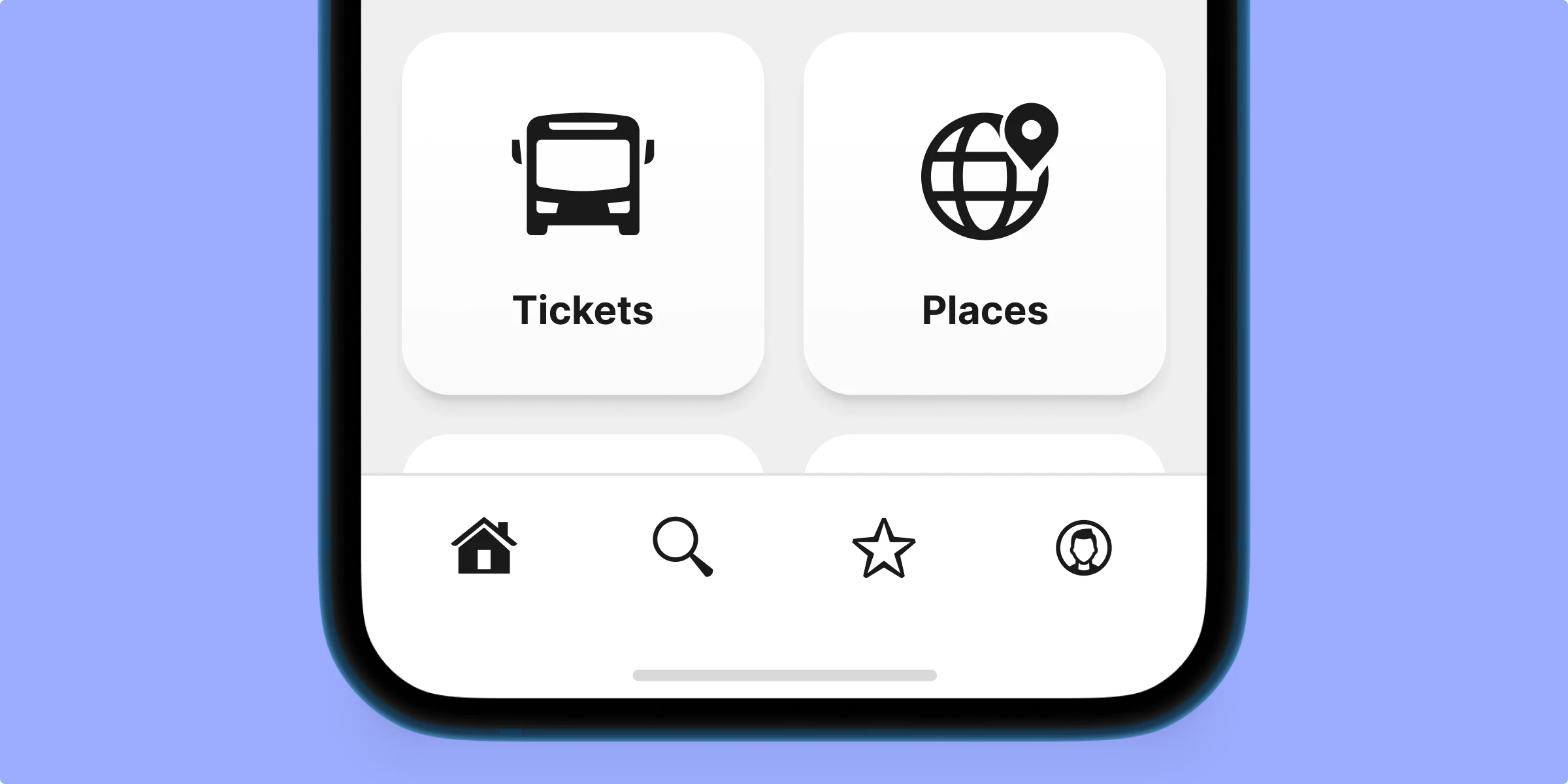
Essential for user interaction, these icons are directly involved in the user’s navigation path. They are clickable or tappable, activating the functions they represent, such as those found in menus and tab bars.
App icons
App icons are interactive brand symbols that enhance brand identity and awareness across platforms. Typically featuring custom logos, these icons can also include game characters, mascots, or abstract color schemes. Effective app icon designs should be based on market and competitor analysis to ensure they stand out.
Favicon
Favicon, aka bookmark icon or URL icon, is a special symbol representing the website or landing page in the URL line of the browser as well as in the bookmark tab. It lets a user set a fast visual connection with the brand in the process of browsing. Favicons are useful for website promotion and make their visual identity memorable.
Decorative icons
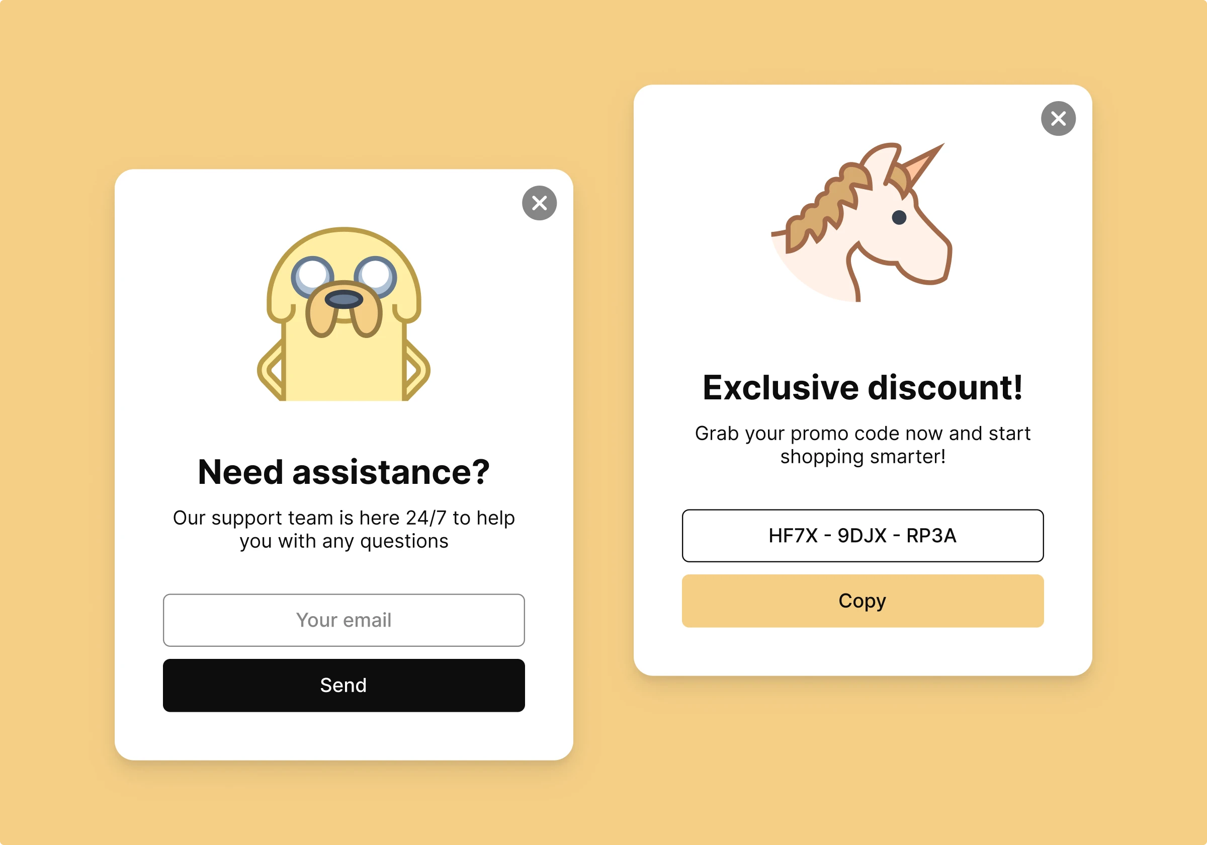
Icons aren’t just practical—they also have aesthetic appeal. They’re designed to resonate with the audience’s tastes and expectations, making every interaction feel more inviting or fun. Used wisely, decorative icons can greatly enhance the user experience and bring attention to seasonal events or special deals, like Christmas or Valentine’s Day, making them stand out in a fun and engaging way.
Visual performance
Skeuomorphic icons
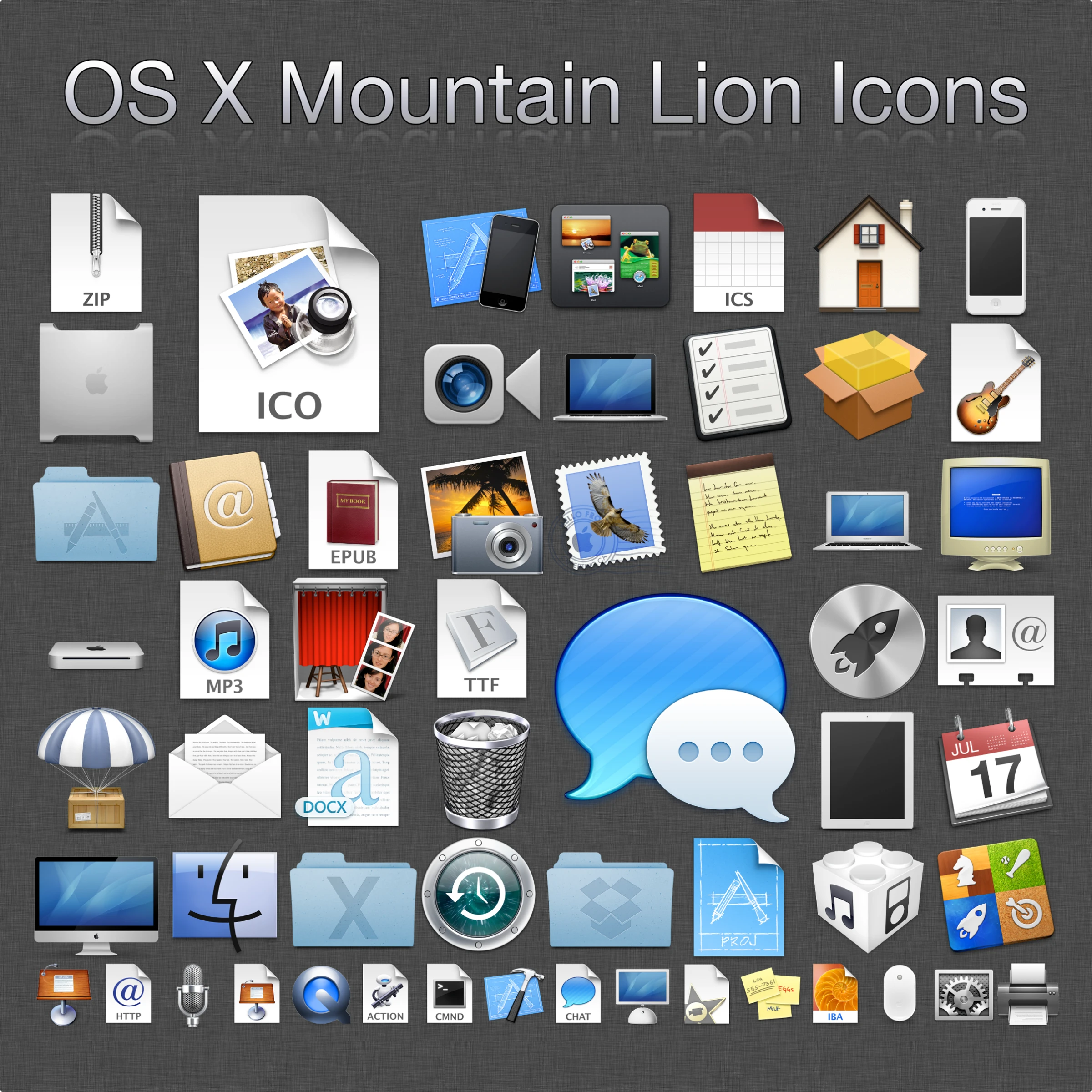
Skeuomorphism, a design style that contrasts with flat design, aims to replicate the three-dimensional appearance of real-world objects in icons. These icons are among the most intricate to create and were once widely favored in various graphical user interfaces. Over time, flat design has largely supplanted skeuomorphism due to its simplicity and flexibility for UI needs.
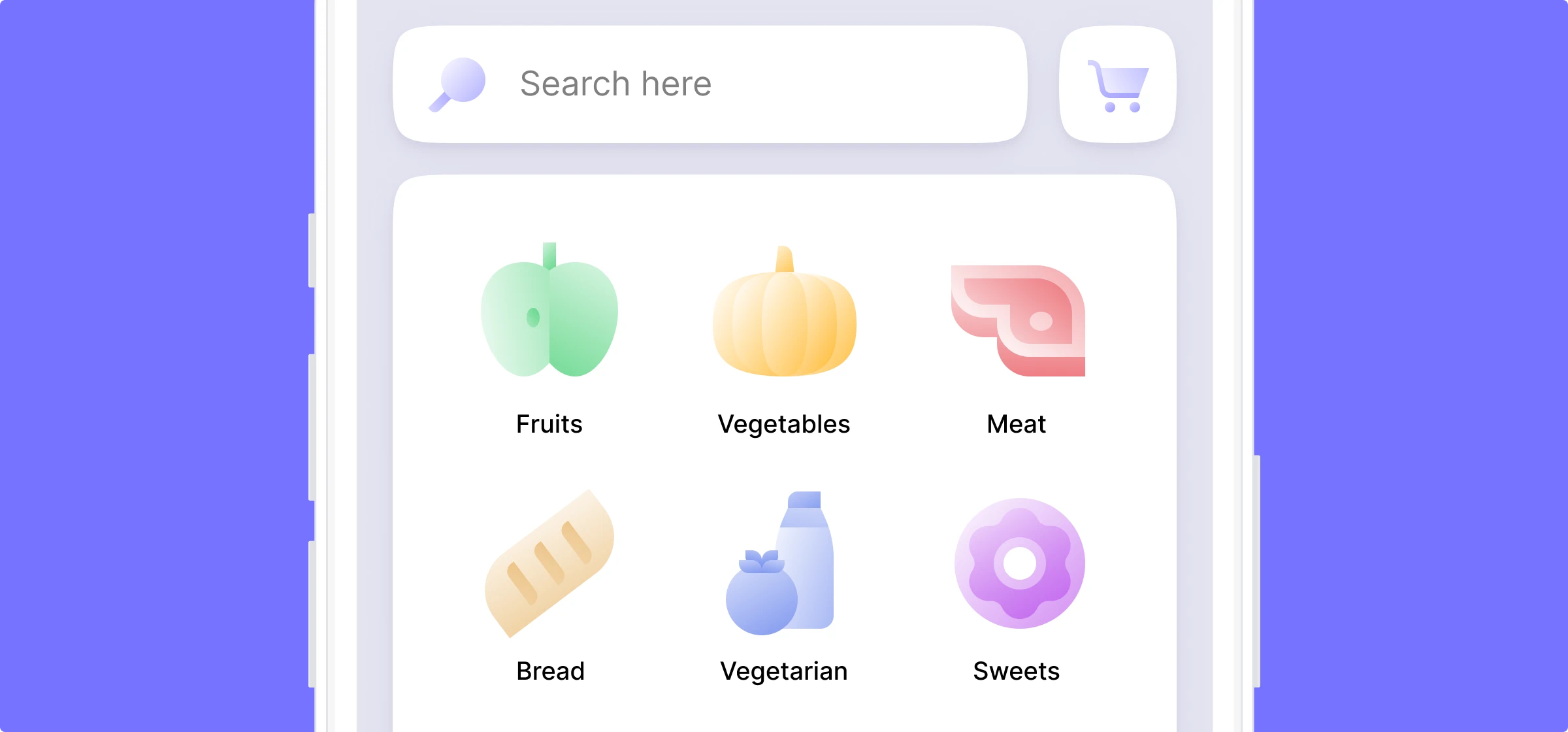
Flat and semi-flat icons
Flat icons use clear visual metaphors that are quickly recognizable, instantly conveying their intended meaning. They often feature vibrant color combinations and solid, filled elements. This design style is named for its streamlined, two-dimensional look, which stands in stark contrast to the highly realistic and detailed skeuomorphic design. The simplicity of flat icons allows for greater flexibility in color and shape usage while maintaining clear and legible visuals.
Glyph icons
Glyphs are versatile symbols found in everything from books to digital screens, representing everything from single characters to intricate combinations. They’re especially handy in digital design, where they take on shapes like the familiar “@” symbol. For more on how glyphs enhance navigation and flexibility in modern interfaces, check out our handy guide!
Image metaphor
This classification approach, outlined by usability expert Jakob Nielsen in his work for the Nielsen Norman Group, categorizes icons into three distinct types based on the metaphors they employ:
- Resemblance icons. These icons clearly depict the item they represent, making immediate visual connections. Examples include an envelope for email, a magnifying glass for search, a heart for like, and a checkmark for done.
- Reference icons. These icons use analogies to represent their function. For instance, a clamp icon might symbolize a file-compression tool because it ‘squeezes’ the files together.
- Arbitrary icons. These icons are recognized based on conventions rather than direct visual resemblance. A classic example is the floppy disk representing the “Save” function. For newer generations who may not recognize the floppy disk’s original purpose, this icon’s meaning is learned through repeated exposure and cultural conventions.
Features of effective icons
To sum up, let’s quickly review the checklist of characteristics for effective icons. They should be:
- Clear. The icon’s purpose should be immediately obvious to its audience.
- Meaningful. The icon conveys its intended information or function clearly.
- Recognizable. Users can easily identify and understand the icon at a glance.
- Simple. The design is free from unnecessary elements, ensuring quick recognition.
- Original and noticeable. It stands out distinctively from other icons in the interface.
- Scalable and flexible. The icon maintains its clarity and coherence at any size and resolution.
- Attractive. The icon is visually pleasing and aligns with aesthetic standards.
- Non-offensive. It avoids symbolism or implications that could be considered inappropriate or offensive.
- Consistent. The icon fits seamlessly with the overall design style of the application or website.
Free UI icons for your designs
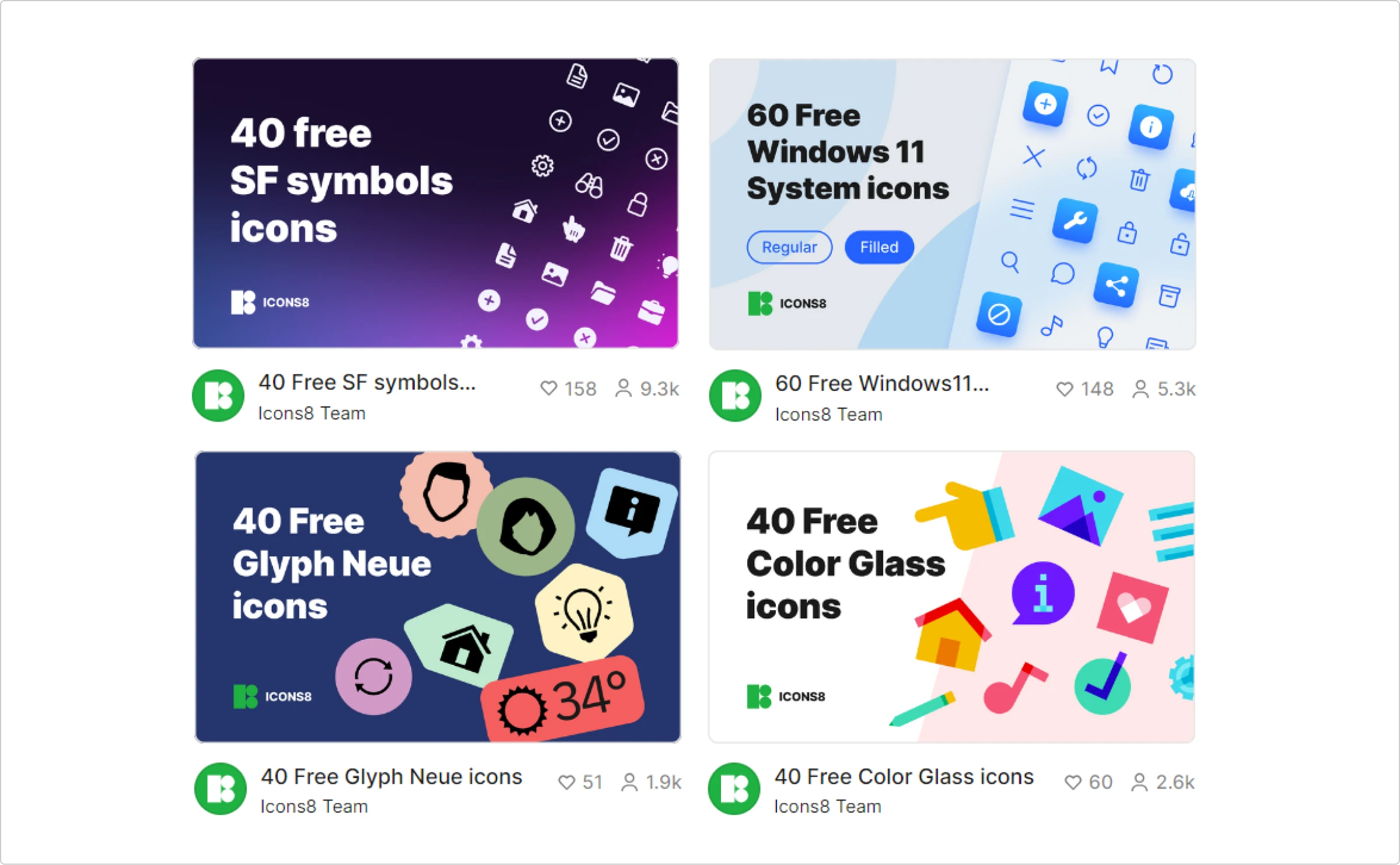
- SF Symbols. A comprehensive set of interface symbols from Apple, designed for integration across their device platforms.
- Windows 11 System icons. Microsoft’s icons are tailored for harmony and clarity in Windows applications.
- Color Glass icons. Bright, glass-effect icons that add a vibrant touch to any project.
- Glyph Neue icons. A collection of sleek, minimalistic icons suitable for various design needs.
Find perfect icons for your project
EXPLORE NOWAbout the author
Marina Yalanska is a content manager, design researcher, and writer for Tubik Studio

