Wanna make user-friendly, pleasantly aesthetic websites? Use modular grids. The modular grid is an instrument for organizing visual space.
Let’s look at why the modular grid is so popular and how to use it.
Why Use the Modular Grid
The modular grids came into web design from typography. They are used in all printed materials to organize the information on the page. At the beginning of the 20th century, modular grids began to be used in web design.
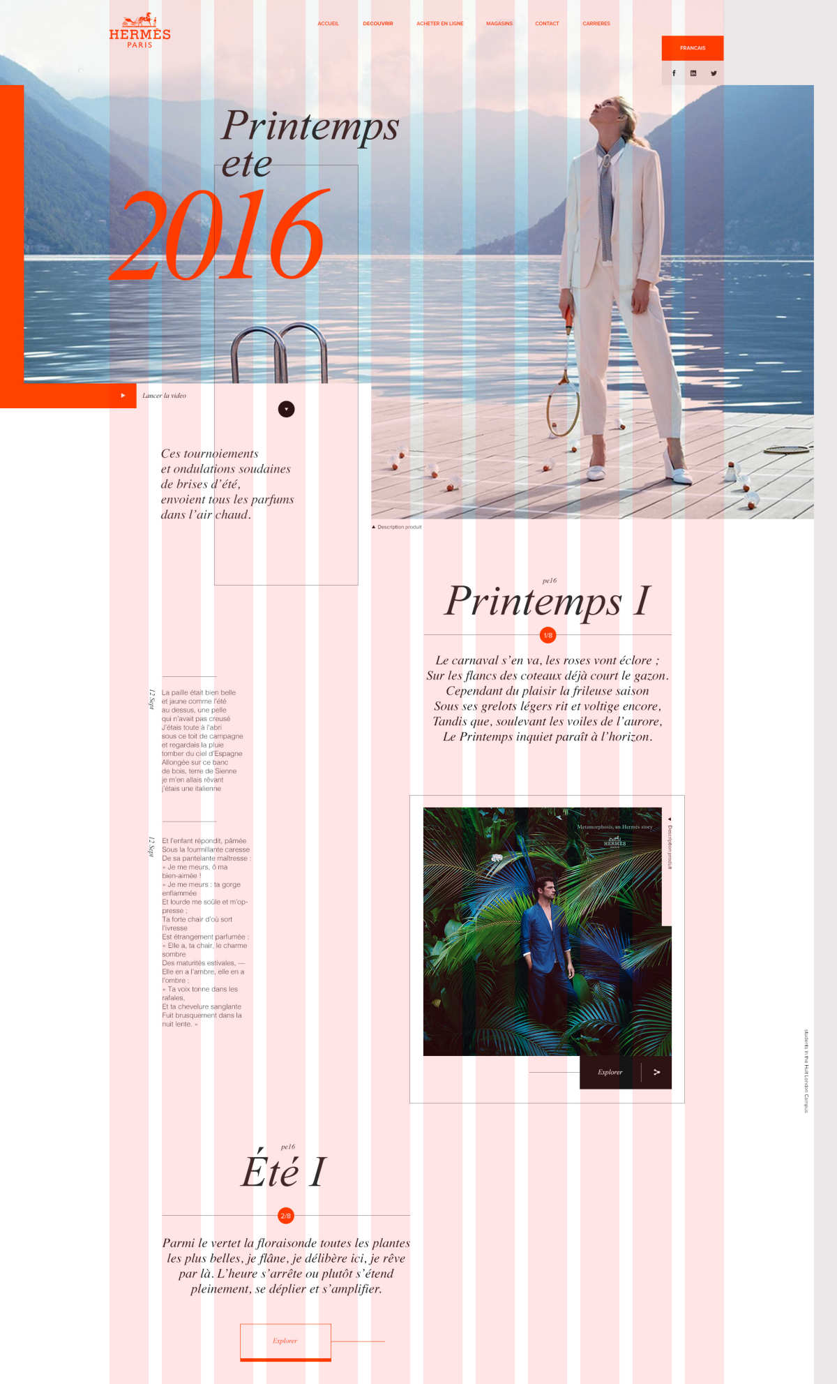
Website built with the modular grid example from Pinterest
The reasons why we use them in web design so thoroughly nowadays are:
- The modular grid reduces the chance of errors when moving elements between pages.
- The modular grid helps to align elements. This makes it easier to add new ones and support the old ones.
- Websites built with the modular grid look more aesthetically pleasing.
- It’s easier to navigate on websites built with the modular grid.
- It’s easier to make adaptive website design with sites built with the modular grid.
How to Use the Modular Grid
The modular grid is an instrument, not a design method. Thus, before using the grid, you need the concept of a future site.
When the concept is ready, describe all blocks of the website pages and block elements.
Open or create the modular grid in the image redactor.
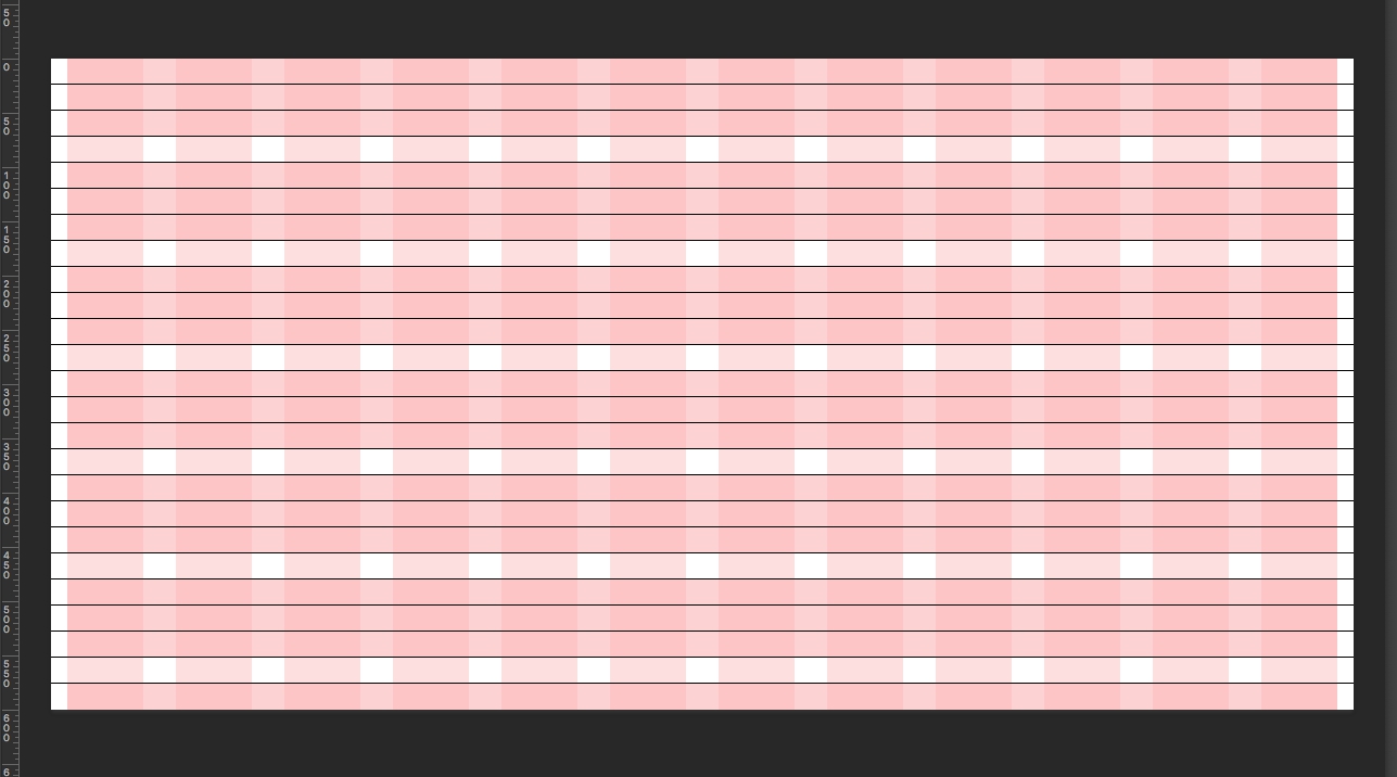
Draw blocks on the modular grid.
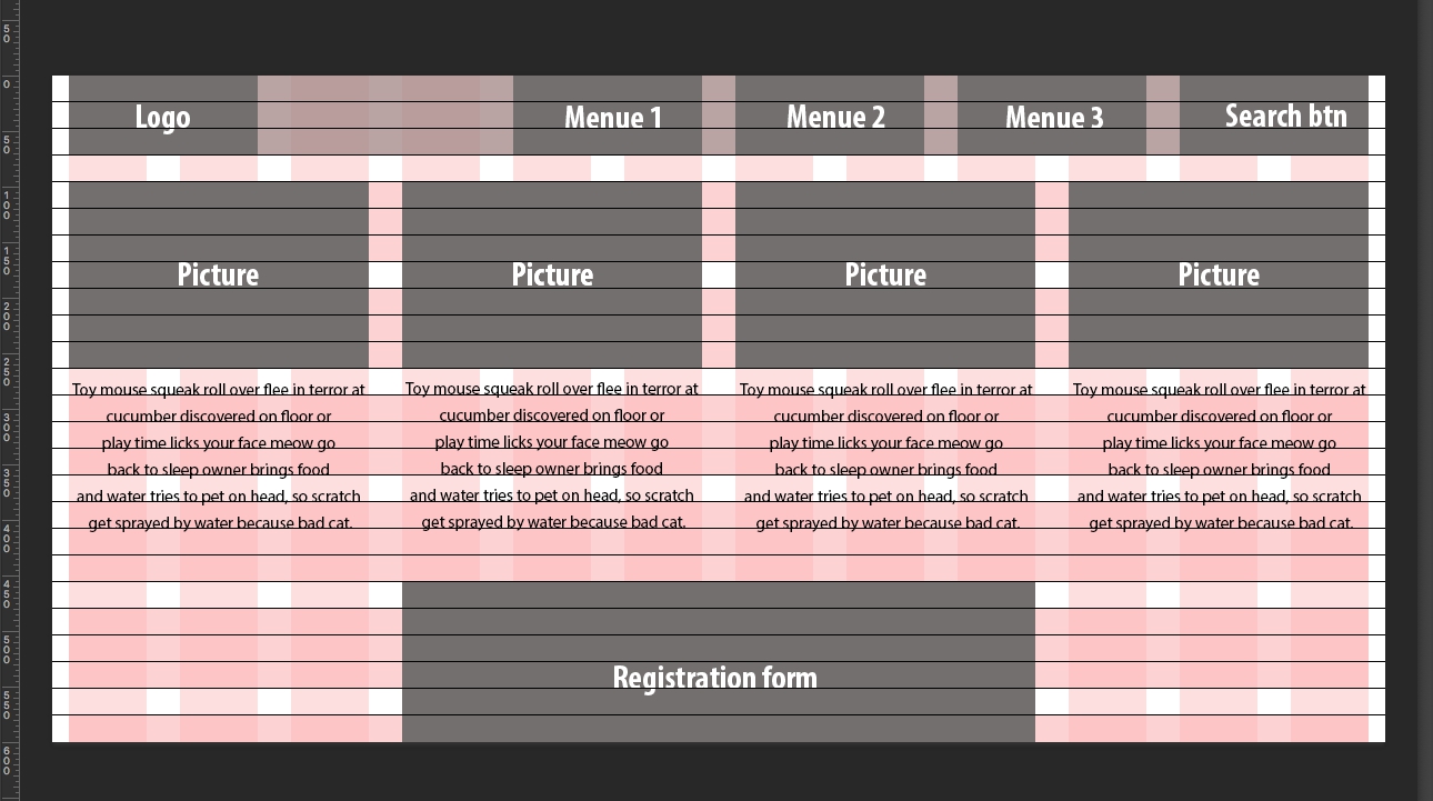
Hint: the left and right borders of the blocks always start and end on the columns, not on the gutter. The borders always coincide with the borders of the columns, as shown above.
The top and bottom edges of the blocks always coincide with the rows of the font grid, so the horizontal rhythm will be uniform and aesthetic.
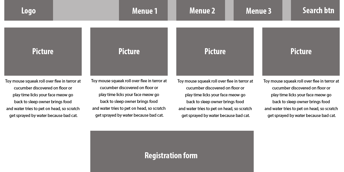
The site layout is ready!
Where to Get the Modular Grid
There are two ways to get it: draw the grid by yourself or use the grid generators.
How to Draw the Modular Grid
Determinate the Working Area Width
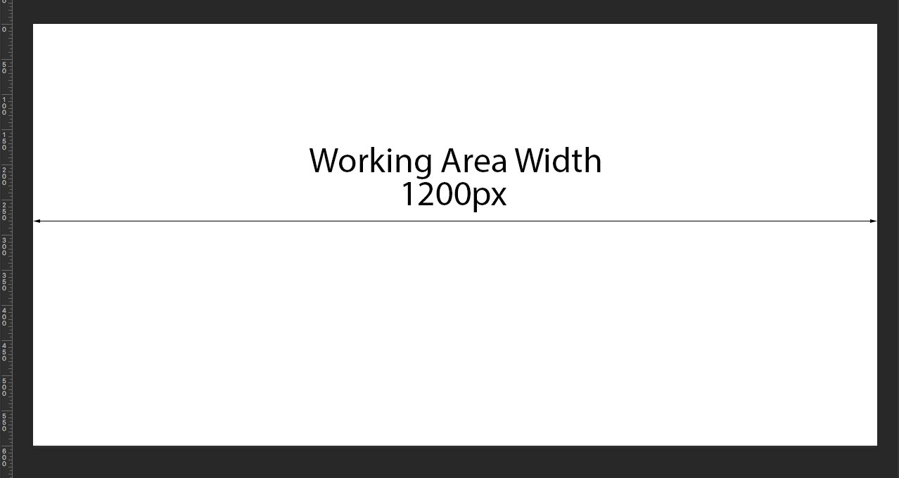
Hint: the common working area width is 960px. But nowadays there are a lot of widescreen monitor users, tablet users, and smartphone users. Thus, the team that created the front-end framework Bootstrap recommend to increase the common working area width:
- 1200px and up for the widescreen monitor
- 970px and up for the default monitor
- 768px and above for the tablet screen in portrait orientation
- 767px and below for phone to tablet screen
- 480px and below for the phone screen
Remember that your website should always have an adaptive design. Thus, you should always draw several modular grids for the devices with different screen sizes.
Choose a Number of Columns
In web design, it is common to use the modular grid with 12 columns. The other possible modular grids use 16 and 24 columns.
Calculate Column and Gutter Width and Draw Them
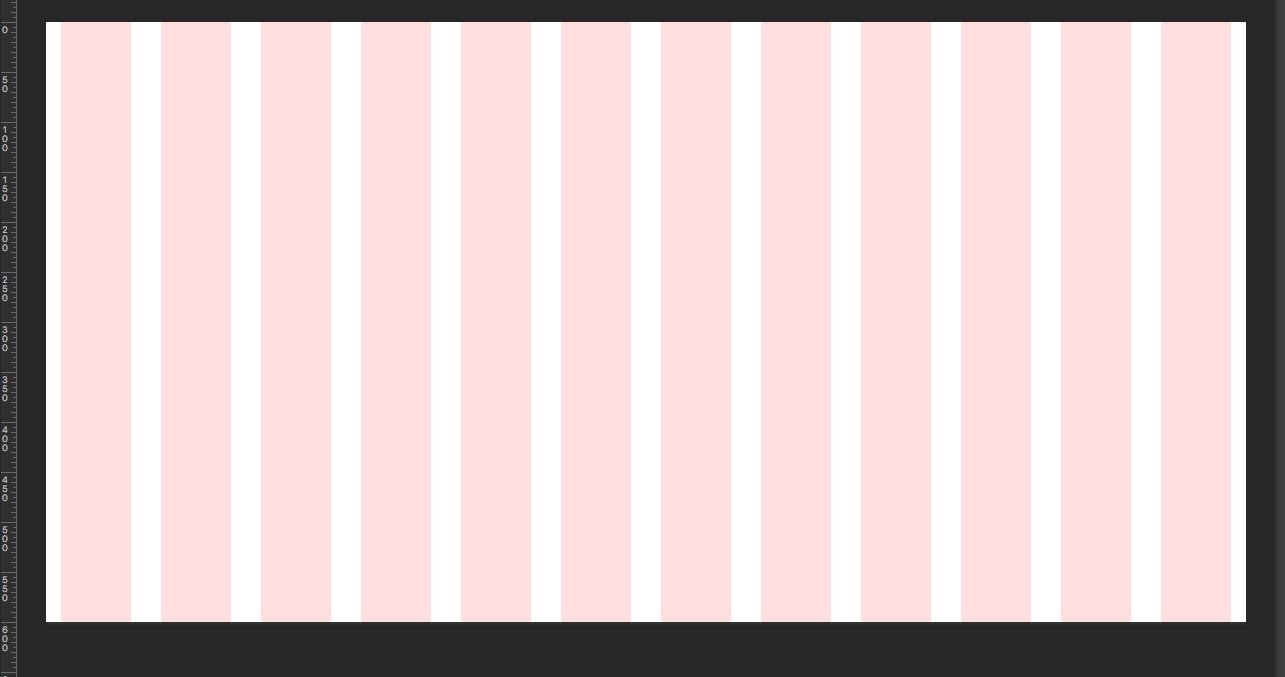
Columns are vertical rectangles that separate the page into parts. The gutter is the distance between columns.
Example: You have a 1200px working area and decide to use 12 columns.
1200px / 12 = 100px for each column
Hint: For different working area widths, use different columns and gutter widths.
Add 30px gutters. Now it’s 12 columns with 70px width and 11 gutters with 30px width.
100px = 70px + 30px
Hint: The gutter cannot be less than the size of the base font size.
Add 15px to the left margin for the leftmost column and repeat for the right margin for the rightmost column. Calculate:
1200px = (70px * 12) + (30px * 11) + (15px *2)
Draw the Font Grid
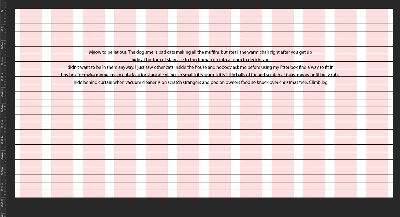
The font grid consists of horizontal rows that define a vertical rhythm and font location. The distance between the grid rows is equal to the line height of the main font.
Example: If you use a 15px font for the main text, the line height and the distance between the lines will be 24px.
Hint: To calculate the line height, use the Golden Ratio Typography Calculator.
Merge Font Grid Rows into Groups

Merge the font grid rows into groups of 3 or more rows. Now you have horizontal columns with the distance between them that’s equal to one row. Those columns add horizontal rhythm to the modular grid.
From this point, you have a complete modular grid and can use it.
Modular Grid Generators
Modular Grid Pattern
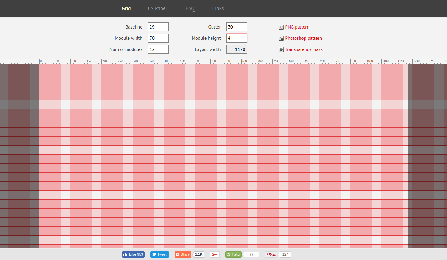
Online modular grid generator: use it to get the detailed grid and download it as a Photoshop pattern.
Hint: There is some confusion about Modular Grid Pattern grid settings:
- Baseline – the distance between the font grid rows
- Module width – column width
- Num of modules – the number of columns
- Module height – number of the font grid rows combined into a group
You can download the Modular Grid Pattern extension for Photoshop from this site. The extension allows you to create grids directly in Photoshop.
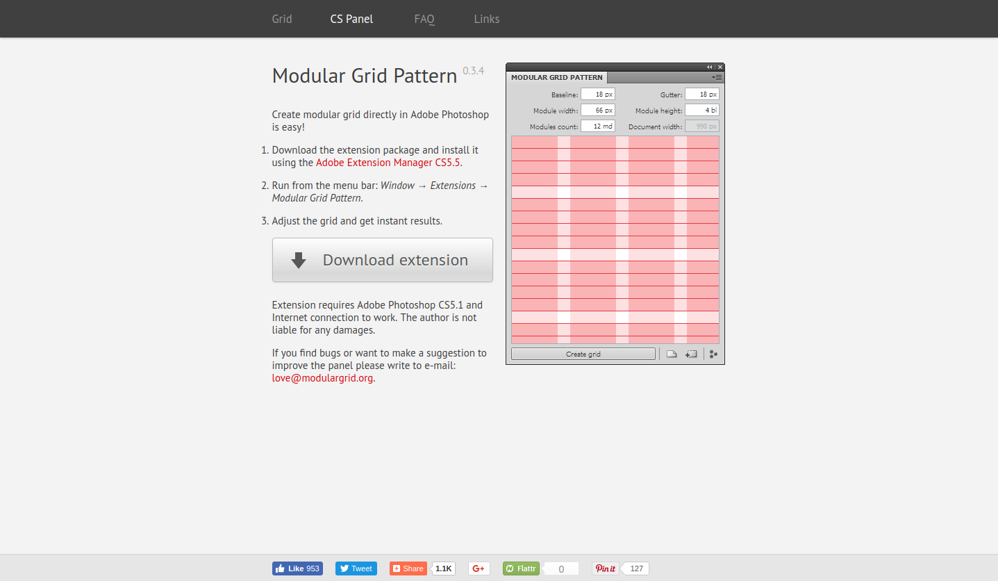
You can’t setup margins in Modular Grid Pattern. Always keep this in mind, and add margins to your grid in Photoshop.
Grid Calculator
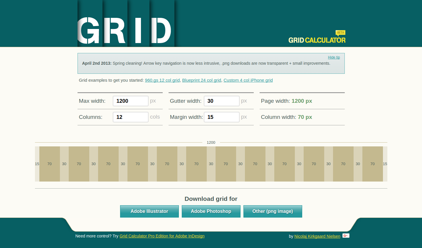
Online modular grid calculator: This allows you to create a modular grid without a font grid. The cool thing about Grid Calculator is it allows you to properly calculate column width.
Hint: Set the max working area width and the number of columns, margins, and gutters. Grid Calculator calculates your column width and shows your current working area width. If you use the right properties, the page width will be the same as the max working area width. If not, Grid Calculator shows it.
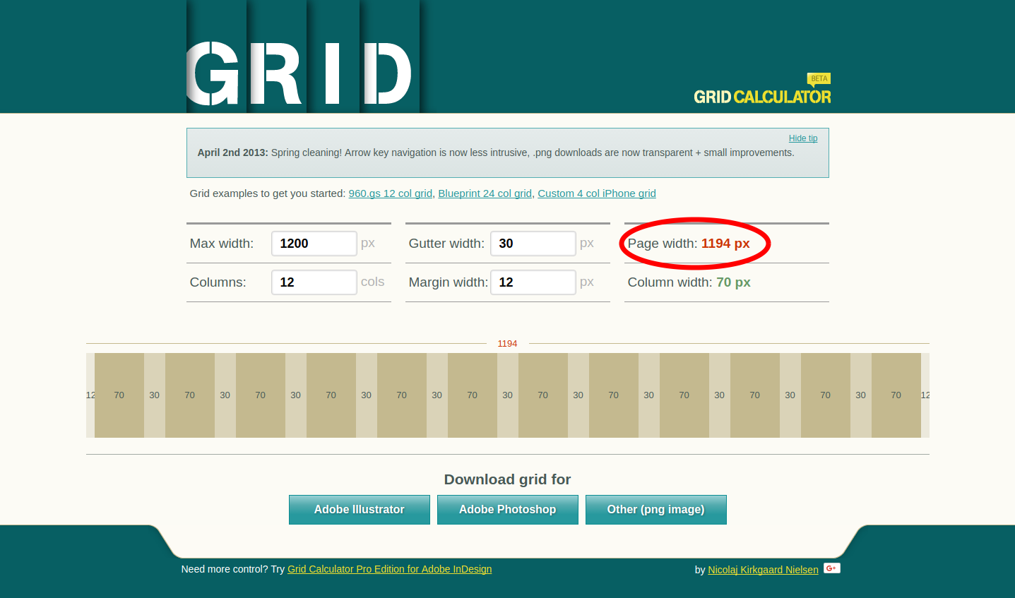
After creating, you can download your grid as a picture in PNG format or as a file for Photoshop or Illustrator.
960 Grid System
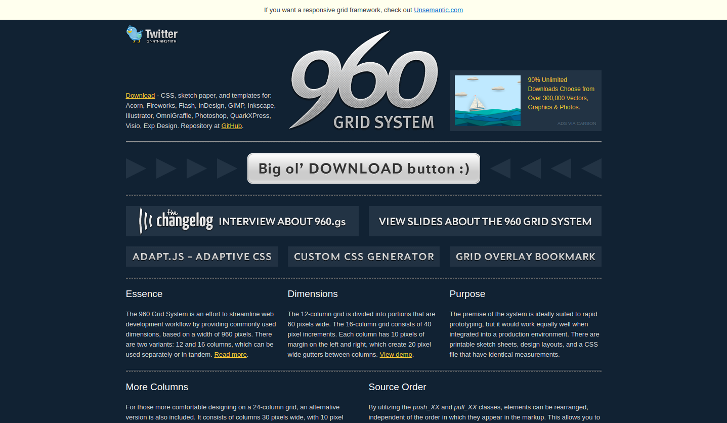
Ready modular grid for 960px working area width. Download it and use it with Photoshop, Fireworks, and other image redactors.
Gridpark
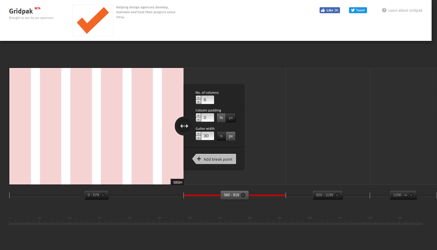
Online modular grid generator which allows creating a responsive grid system.
Using it, you can set the number of columns, column padding, gutter, and working area width after you set a breakpoint from where you will build the grid for different screen widths.
In web design, the breakpoint is the point on which your site content layout changes to provide the user with the best possible layout depending on the device screen size.
When you build a number of grids for different screens, you can download them all as PNG, CSS, LESS, SCSS, and JavaScript files.
