


Neumorphism is a UI design style known and loved for its retro feel. Neumorphic UIs look as if they were made from extruded plastic and remind you of your old iPod nano and those days when gadgets had real buttons instead of screens.
And here is how you can create neumorphic UI elements in Lunacy, a free graphic software.

Since neumorphism relies heavily on using shadows, you’ll mostly work with them a lot throughout this tutorial. You will also learn how to use layer styles, gradients, and icons. The above links will take you to the respective pages of the Lunacy documentation. Just in case you need more details.
To get a better understanding of what we’re going to do and to cut a long story short, I recommend that you first watch this short video and then follow the steps below.
Creating a panel
1. Let’s start with creating a panel that will keep all our neumorphic UI elements.
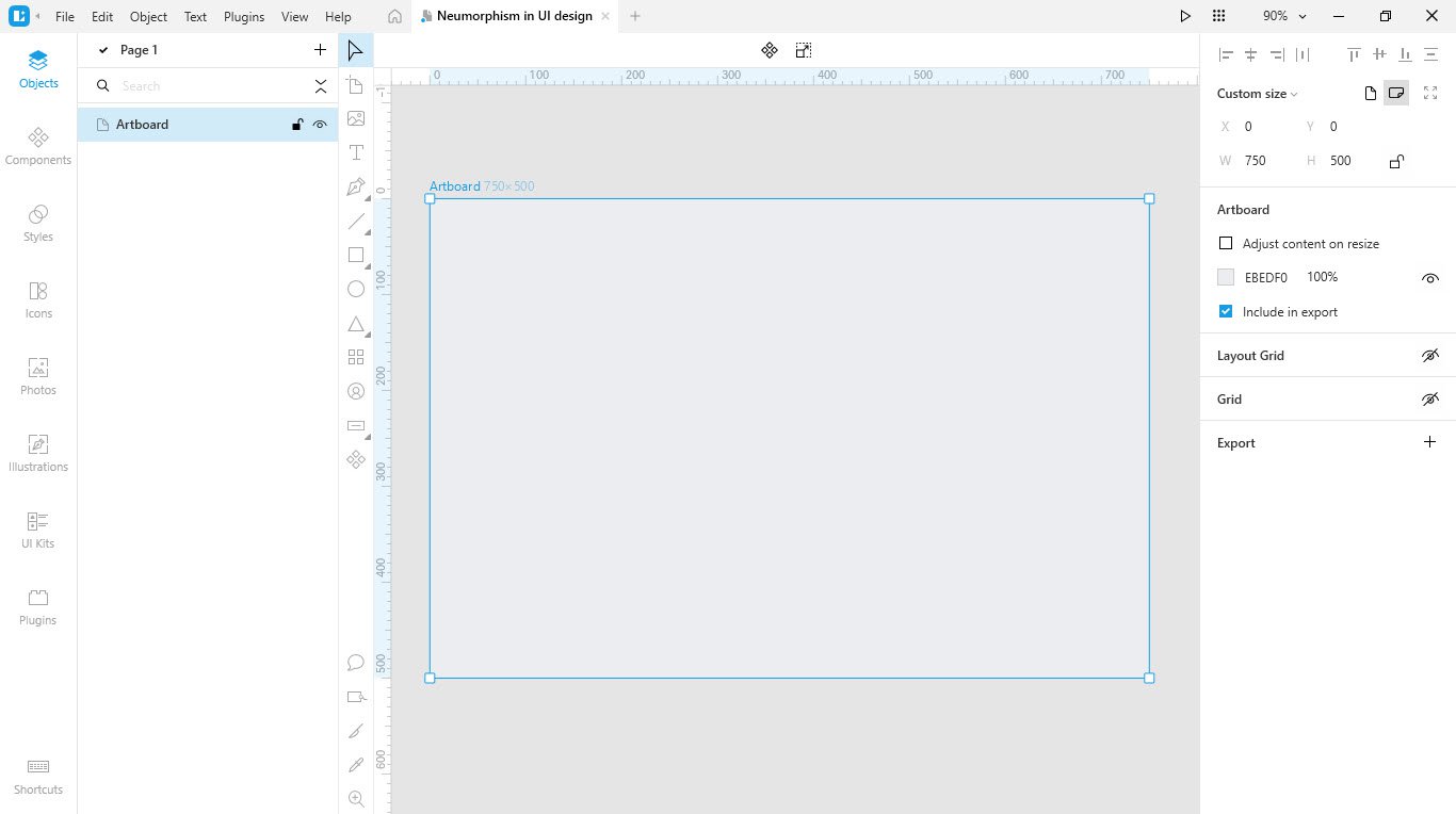
2. Select the artboard tool and draw an artboard. I think that 750x500px would be enough.
Set the artboard color to #EBEDF0. Of course, you can choose a color of your own. But remember that it will also be the color of all the UI elements.
Creating a button
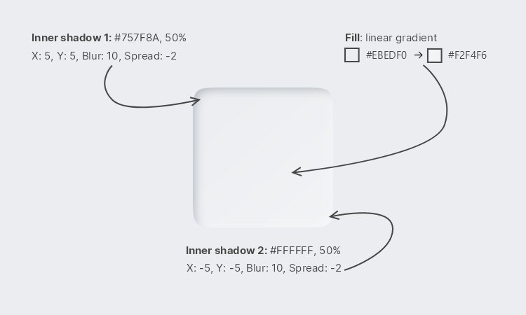
1. Enable the rectangle tool and draw a 50*50px rectangle.
2. Apply a linear gradient fill to the rectangle. The colors are #EBEDF0 at the start and #F2F4F6 towards the end (see the figure below).
3. Set the rectangle’s corner radiuses to 8.
4. Apply two shadows to the rectangle: light and dark.
The settings are as follows:
| Fill | Opacity | X | Y | Blur | Spread | |
|---|---|---|---|---|---|---|
| Light shadow | #FFFFFF | 50% | -5 | -5 | 10 | 0 |
| Dark shadow | #757F8A | 50% | 5 | 5 | 10 | 0 |

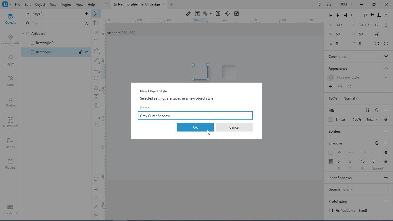
Saving a style for further use
Let’s save the style of the button. You will it later with other similar UI elements. This will greatly speed up your work.
1. Select the button.
2. In the Inspector, on the Appearance panel, click +.
3. In the displayed dialog box, type the name of the style, say, Grey Outer Shadow.
4. Click OK.
Creating a pressed button
1. Select the button that we’ve created at the previous step and press Ctrl+D to duplicate it.
2. Remove the shadow settings.
3. Add light and dark inner shadows instead. The settings are as follows:
| Fill | Opacity | X | Y | Blur | Spread | |
|---|---|---|---|---|---|---|
| Light shadow | #FFFFFF | 50% | -5 | -5 | 10 | -2 |
| Dark shadow | #757F8A | 50% | 5 | 5 | 10 | -2 |
4. Save the new style as Grey Inner Shadow.
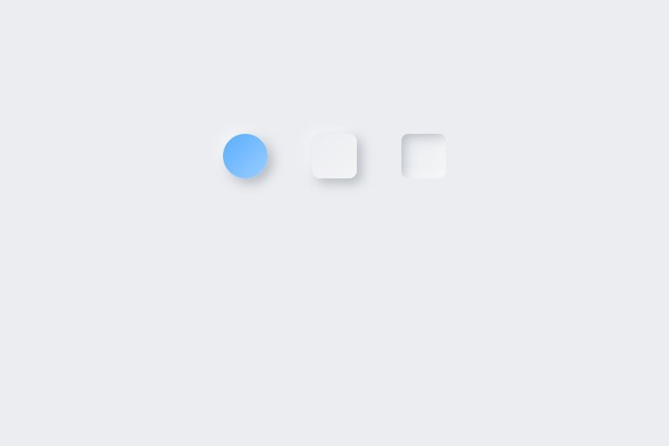
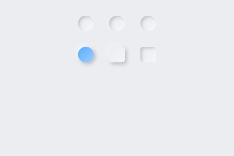
Creating a colored round button
1. Create a 50x50px ellipse.
2. Apply the following styling:
Fill. Linear gradient: #59ADFF –> #83C2FF.
Shadow. Color #757F8A, Opacity: 50%, X: 5. Y: 5. Blur: 10. Spread: -0.
3. Save the style as Blue Outer Shadow.
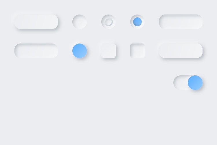
Your artboard should look something like this:
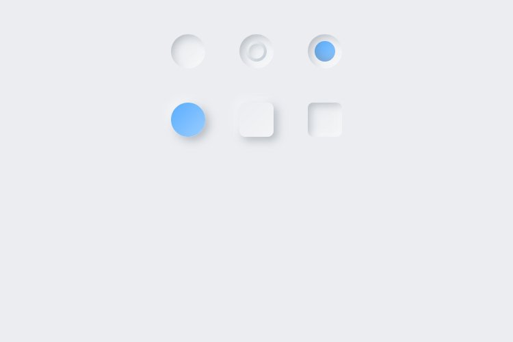
Creating radio buttons
1. Add a 50X50px ellipse above the buttons from the previous step.
2. Select the ellipse, and apply the Grey Inner Shadow style to it.
3. Adjust the inner shadow settings. They should be as follows:
| Fill | Opacity | X | Y | Blur | Spread | |
|---|---|---|---|---|---|---|
| Light shadow | #FFFFFF | 50% | -8 | -8 | 10 | -2 |
| Dark shadow | #757F8A | 50% | 8 | 8 | 10 | -2 |
4. Save the new style and name it, say, Grey Inner Shadow Ellipse.
5. Create two more duplicates of the ellipse and arrange the shapes as shown below.
Let’s create an unselected radio button:
1. Create a smaller (30x30px) ellipse within the middle duplicate from the previous step.
2. Select both ellipses and align them: press Alt+H (align horizontally), then press Alt+V (align vertically).
3. Select the inner ellipse and apply the following styling:
Fill. Linear gradient: #FAFAFA –> #EBEDF0
Border. Inside, 8px, Linear gradient: #F2F2F2 –>#BFCAD4
Inner shadow. Color: #757F8A, Opacity: 50%, X: 4; Y: 4; Blur: 9, Spread: 0
4. Save the style of the inner ellipse as Grey Inner Shadow Ellipse 2.
5. Select both ellipses and press Ctrl+G to group them.
Now, we’re going to create a selected radio button. For this:
1. Create a 30*30px ellipse within the second duplicate.
2. Select both ellipses and align them: press Alt+H (align horizontally), then press Alt+V (align vertically).
3. Select the inner ellipse and apply the following styling:
Fill. Linear gradient: #59ADFF –> #83C2FF.
Inner shadow. Color #757F8A, Opacity: 50%, X: 5. Y: -5. Blur: 10. Spread: -3.
4. Save the new style as Blue Inner Shadow.
5. Select both ellipses and press Ctrl+G to group them.
Here’s what we’ve got:
Some more buttons and fields
1. Enable the rectangle tool and draw a 150x50px rectangle.
2. Set the rectangle’s corner radiuses to 20.
3. Apply the Grey Outer Shadow style.
4. Create a duplicate of the rectangle and apply the Grey Inner Shadow style to it.
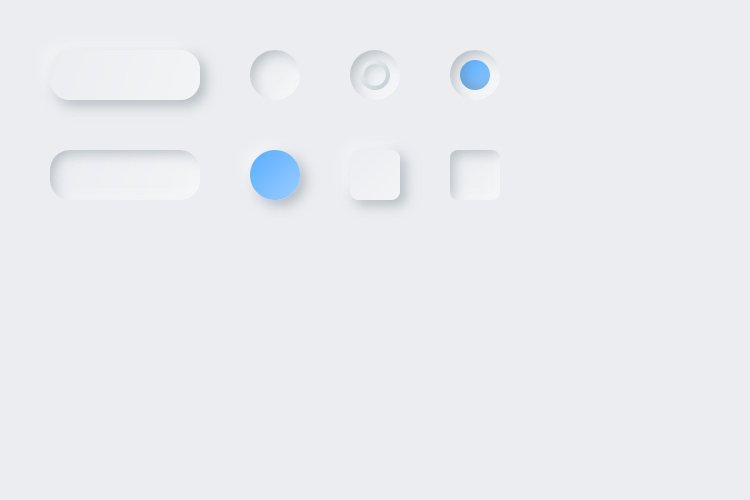
5. Add copies of these two rectangles to the opposite side of the artboard.
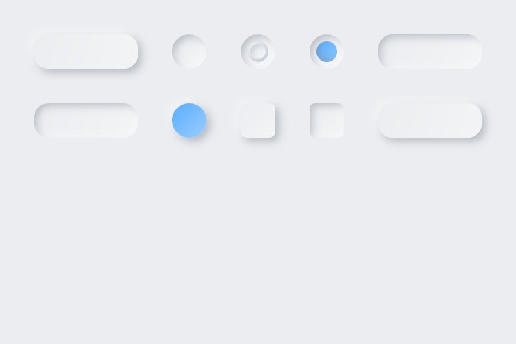
Creating toggles
1. Create a 100X50px rectangle.
2. Select the rectangle and set its corner radiuses to 30.
3. Apply the Grey Inner Shadow style to it.
4. Add a 50×50 ellipse.
5. Apply the Blue Outer Shadow style to the ellipse.
6. Select both shapes and press Ctrl+G to group them.
1. Duplicate the enabled toggle.
2. Move the slider to the opposite side.
3. Apply the Gray Outer Shadow style to it.

Creating a slider
1.Now let’s create a simple slider without a handle.
2. Create a vertical rectangle (50X200 px).
3. Select the rectangle and set its corner radiuses to 60.
4. Apply the Grey Inner Shadow style to the rectangle.
5. Create a 50x100px rectangle inside the one created during the previous steps.
6. Apply the Blue Inner Shadow style to the second rectangle.
7. Select both rectangles and press Ctrl+G to group them. The slider is ready.
8. Create two more duplicates of the slider. To visualize different states of the slider:
In duplicate 1, delete the inner rectangle.
In duplicate 2, adjust the height of the inner rectangle.

Creating a slider with a handle
1. Select the first slider that we’ve created at the previous step and duplicate it.
2. Rotate the duplicate to 90°.
3. Adjust its size to 200x25px.
4. Duplicate the unselected radio button that we’ve created earlier and place it in the middle of the slider. It also looks great as a handle, huh?

5. Create two more duplicates of the slider as shown below.

Final strokes
And finally, add some text and icons to the buttons and text fields:
- For the texts I used the following settings: Inter, Semi Bold, 18, #2A2A2A (buttons), #9A9A9A (fields).
- The icons are from the Lunacy built-in gallery. I used the IOS Filled style.
And here is the final result:
Check out the other Lunacy tutorials to upgrade your skills and learn how to design a:
- Poster in Lunacy
- Landing page
- Custom image for social media
Don’t forget to try collaboration in Lunacy starting with version 7.
Follow the Lunacy team on social media and stay tuned for new tutorials:
About the author: Julia G, a wonderful creature responsible for QA and SMM at the Lunacy team.
