Like it or hate it, Dribbble plays its game with more and more designers and teams sharing their ideas and practice. Some of the shots present real and live projects while others share conceptual approaches that may influence the design of the future. Anyway, as any design community, Dribbble reflects what’s popular in the sphere. So, let’s check and discuss some hot UI design trends of this summer. With lots of examples, of course.
1. Prominent Illustrations on Web Pages
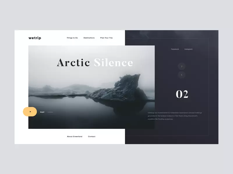
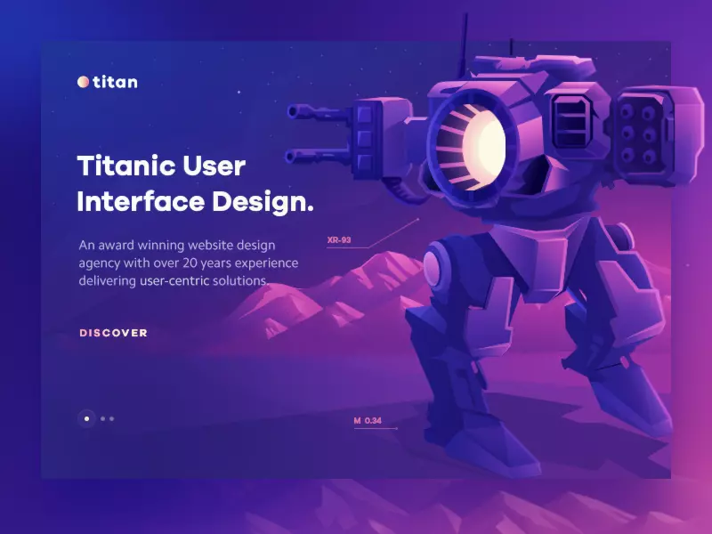
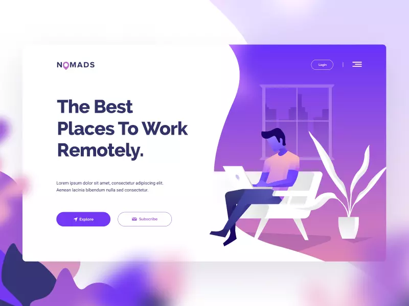
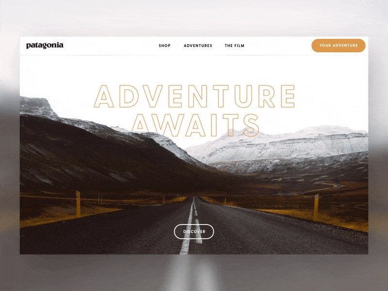
In the domain of web design, custom digital illustrations used as hero or theme images present one of the biggest trends of this year. Whatever is the day you open the feed of popular shots, you’ll see examples of a website or landing page with a big and catchy illustration. In most cases, it is placed in the left half of the screen while the right part presents the copy content. In other cases, the image may split the page diagonally. One more popular way is using digital artworks as title images for blog articles; in this case, you will probably find them in the top part of the page.
Original graphics are a good way to add a flair of uniqueness to the web layout. What’s more, pictures are perceived faster than text, so illustrations raise the chances of attracting users’ attention to the theme of the resource or benefits of the offered products and services.

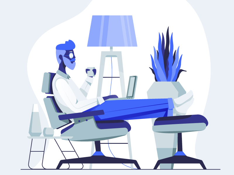
Theme illustration for InVision educational project Design Genome: here it presents the research about design in Google.
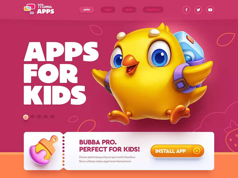
The landing page by Mike Creative Mints presents a mobile app for kids setting the visual accents on bold typography and big catchy illustration of a friendly mascot.
The home page concept by Dmitri Kharchenko for a social service applies big theme illustration to set the needed mood and give the message about the nature of the service at once.
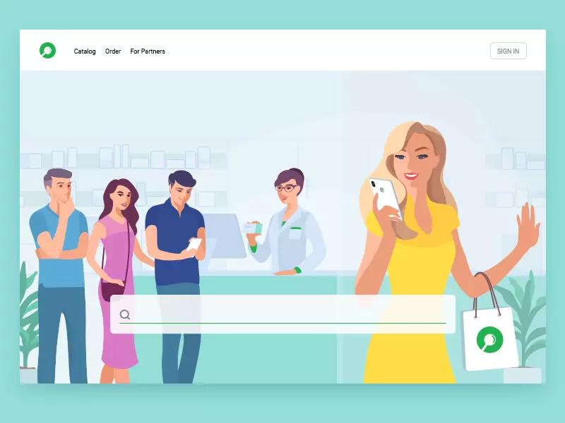
For this web design concept, the designer Ksenia Shokorova applies the custom theme illustration as a full-screen background image.
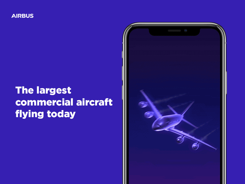
2. Custom Illustrations for Mobile
The trend of using custom graphics is steadily growing in mobile interfaces as well. Featured in a variety of styles, illustrations are supportive of storytelling as a part of navigation and onboarding.
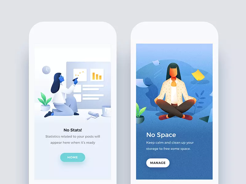
Illustrations by Nimasha Perera support notifications which users get from the system
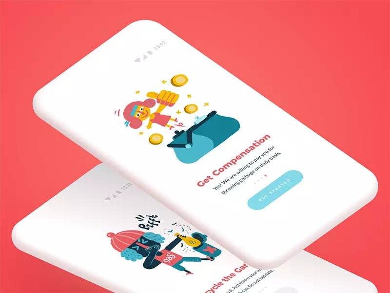
Funny illustrations by Icons8 enhance the messages in an onboarding tutorial of the app.
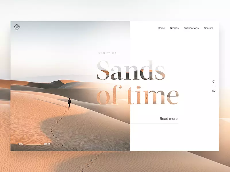
3. Split Screens
Split screens are often found in Dribbble shots of this year. The screens or pages may be divided by a split for different reasons, such as:
- setting catchy color contrast
- separating different content
- separating different interactive zones
- presenting the duality of options
- making the content more responsive-friendly.
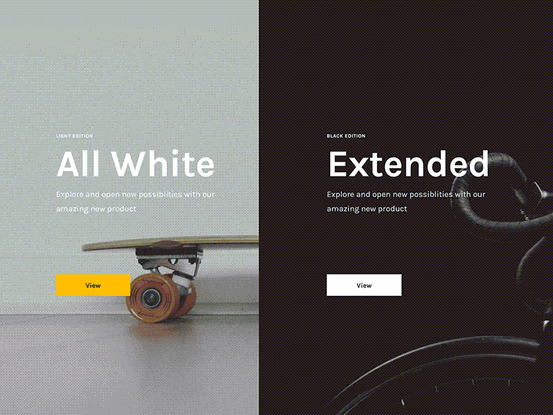
Here the web design concept by UI8 applies the split screen for a visual presentation of the duality of options.
The web design concept by Giga Tamarashvili uses the split background as a basis of stylish contrast in the minimalist interface with the limited color palette. The video and copy content overlayed on the split background unite the composition.
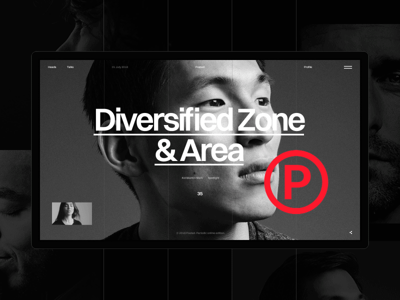
4. Bold and Catchy Typography
Well-designed and attractive typography doesn’t lose its positions on the list of trends. It opens the diversity of ways to make the text content not only meaningful but also beautiful. Carefully chosen fonts transfer the needed mood and build up the strong visual hierarchy. And Dribbble shots show that designers aren’t tired to play with fonts.
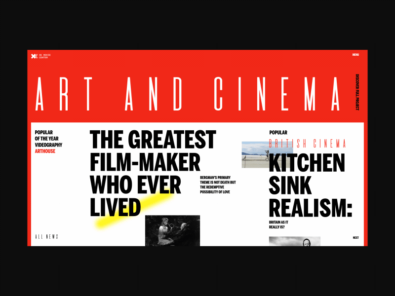
The design concept of the homepage for a movie center by Zhenya Rynzhuk is built mostly around bold typography. It gives the page the poster-like looks and makes the headlines readable due to the good balance of white space.
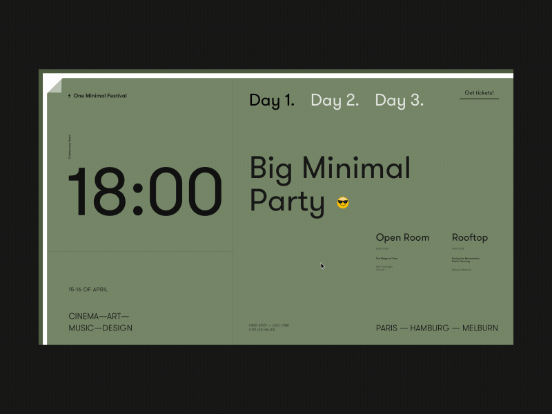
One more typography-based concept by Zhenya Rynzhuk: no images, only copy, building up all the design elegance around fonts and slick animation.
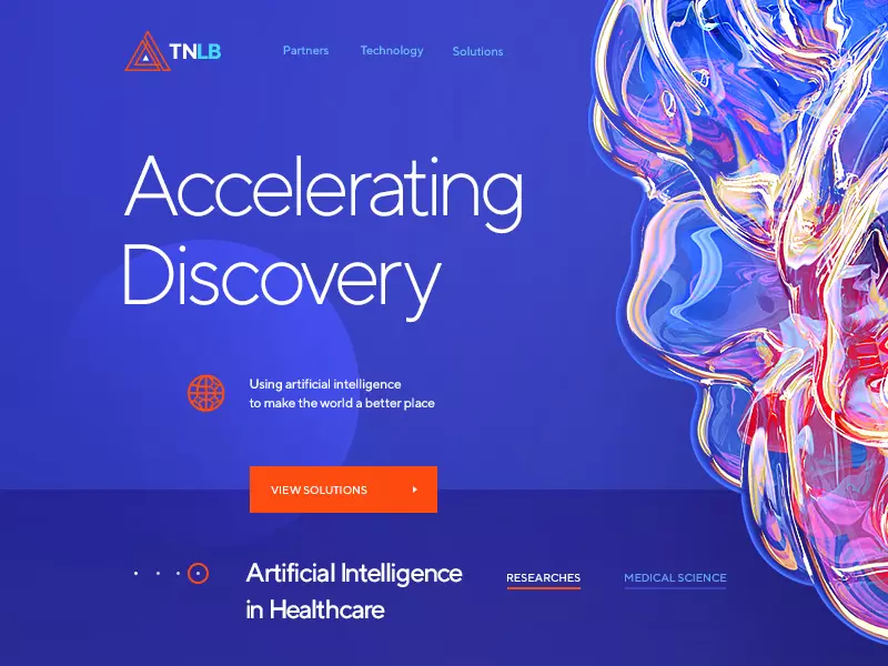
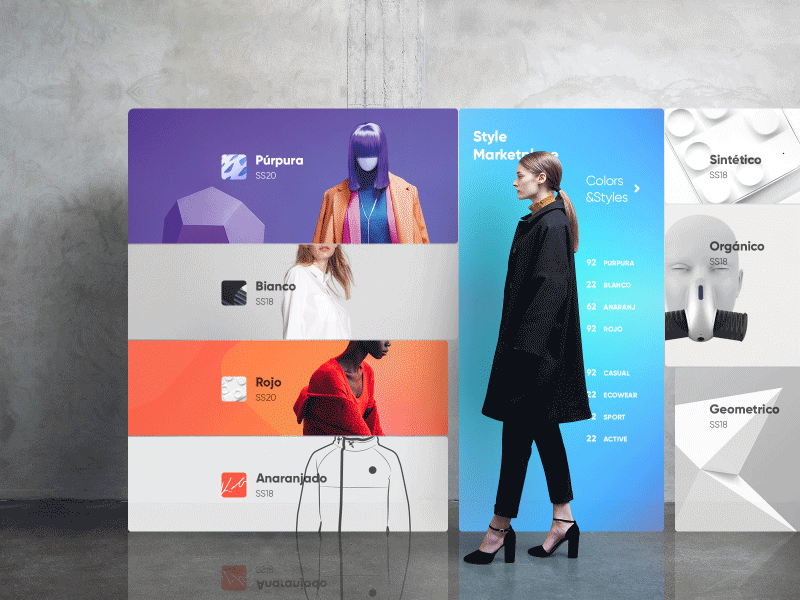
5. Many Shades of Purple
As for trends in color choices, purple palettes take a big share. In color psychology, it is referred to as the one associated with luxury (royalty and wealth), passion, and mystery; it’s described as the color combining the stability of blue and the energy of red. I wouldn’t bet to say that this is the reason why so many designers turn to this color now – or just because it’s stylish. Anyway, this year, it’s on top in a variety of shades, tones, and gradients. However, it’s also worth mentioning that the trend rocketing at the beginning of the year is not that fast to grow now in the summer, giving more space to other color choices.
The webpage concept by Zahidul with a prominent theme illustration based around purple palette with bright accents.
The web page concept by Walid Beno combines the trendy purple with big hero illustration.
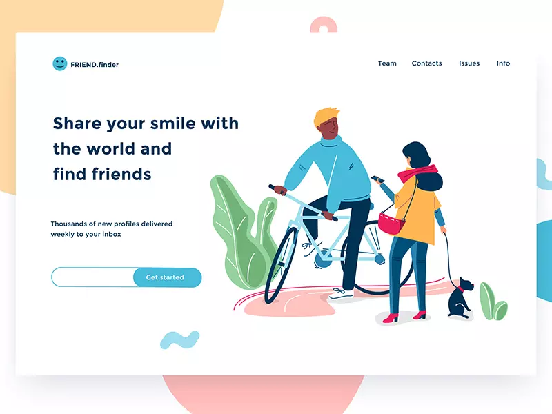
The concept of a landing page by Ted Kulakevich also applies theme illustration to the left half of the screen and uses the purple palette for it. Here the illustration allows the designer to split the screen into two content zones and make the contrast more vivid.
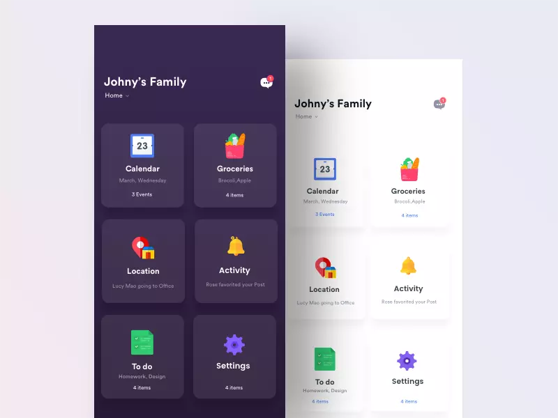
The family mobile app concept by Johny Vino offers users two options of the background: light and deep purple. In real apps, that’s now a popular step to personalization of user experience.
6. Animated Graphics
This year the creative experiments on the crossroads of animation and illustration are becoming more and more daring. To make the pages or screens stand out, designers add sophisticated motion to visuals from icons to logos and complex illustrations. Although the necessity and practicability of UI animation is still the theme of hot debates, Dribbble presents the demonstration trail daily updated with new pieces of catchy motion designs.
Animated icons by Icons8 for sharing content to social networks
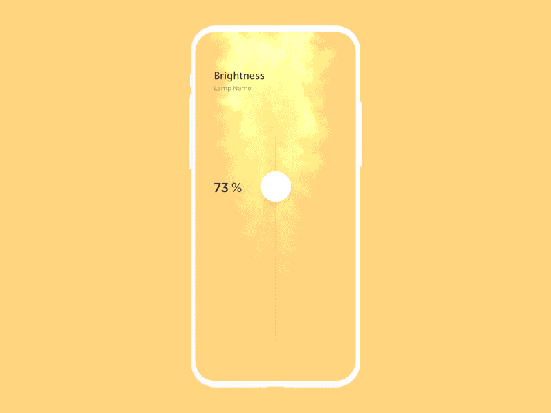
Experimental UI animation for the light controller by Cuberto. God save developers.
The onboarding UI exploration by Gleb Kuznetsov with complex animation of graphic content to support storytelling and add style to the screen.
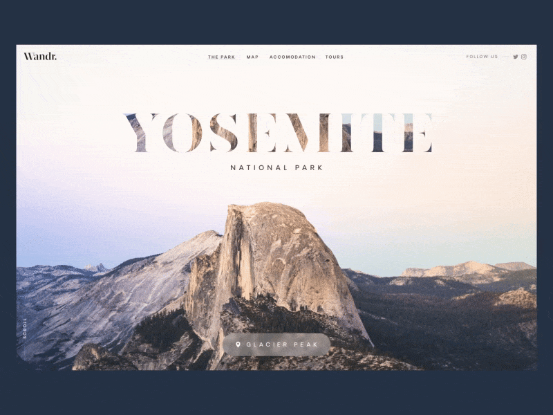
7. Image-Filled Copy
Another UI trend of this year is text filled with a background image. To make it work, it’s usually applied to the most prominent word or phrase—a product or company name, heading, tagline, slogan, and the like. This trick supports the integrity of the composition and adds sophistication to the text.
The web concept by Green Chameleon features split screens mentioned above combined with the image-filled heading. This way the minimalist composition looks stylish and integral.
One more concept for web interactions by Green Chameleon combines two popular trends: full-screen background photo and image-filled keyword.
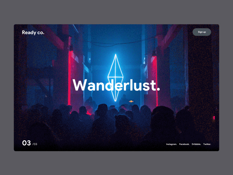
8. Full-Screen Background Image
Another frequently found trend is applying a full-screen image, setting the theme and atmosphere as a background. In most cases, they are high-quality photos, but also they can be 2D or 3D compositions rendered specially for the project. Again, this technique is the step towards poster-like web pages.
The concept for an event landing page by Dennis Shnelleberg sets the theme immediately with a background image and makes the page look like the big event poster.
Web interactions concept by Nathan Riley uses the full-screen background photo for the home page transforming in the process of elegant parallax.
The animated concept of an online magazine for designers by Kate Laguta combines techniques of digital and print design and also uses the full-screen image for the home page.
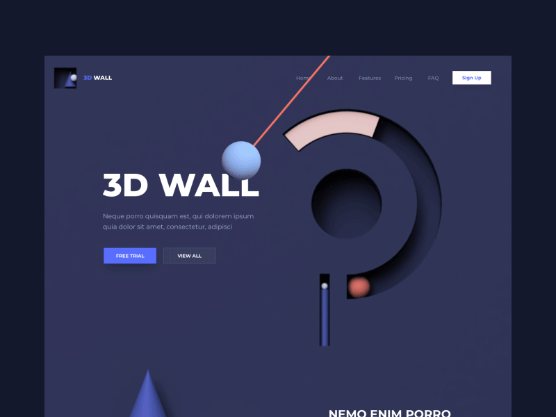
9. Skeuomorphic Elements
It’s early to say that skeuomorphism is back, but as judged by Dribbble, it seems to be rising from the ashes. More and more shots feature 3D graphics added to interfaces, mostly the ones for the web. Sure, this approach demands specific skills, artistic eye, and taste to be accomplished properly. What’s more, it must be more time-consuming—but it’s definitely attractive.
The web design concept by Mike Creative Mints for a research lab with the impressive 3D illustration.
Experimental preloader concept by Roman Klčo features bright effect of plasma motion
The creative and funny concept of a landing page applying animated 3D elements by Outcrowd will obviously catch users’ attention.
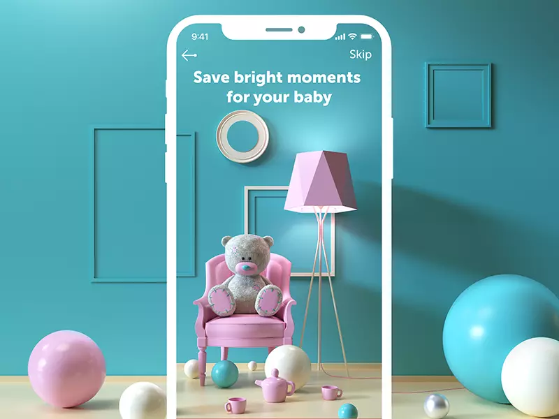
The mobile UI concept of onboarding tutorial applying cute 3D illustrations by Tubik
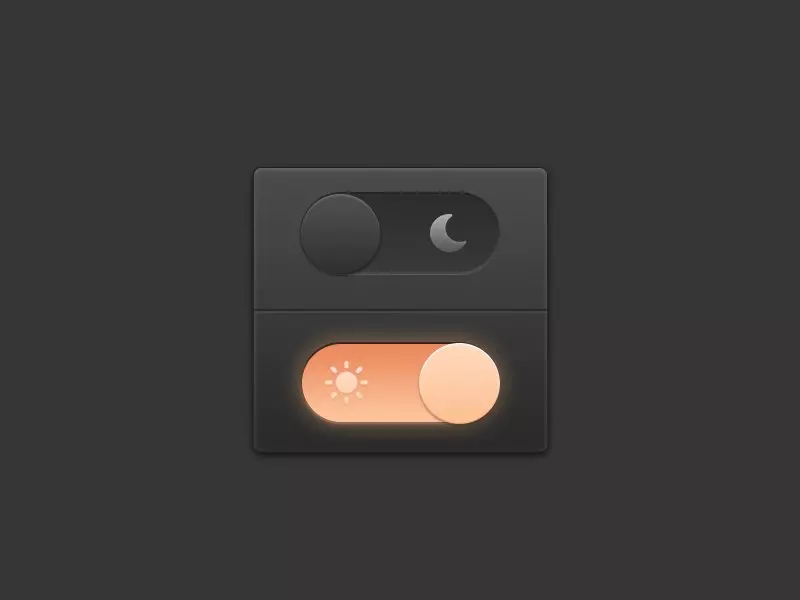
The skeuomorphic concept of the switch for the day/night mode by Adi Setyo Chrisworo.
10. Experiments with Transitions
Dribbble has always been the fruitful soil for creative experiments, and now we can often observe them in the domain of transitions between screens or pages.
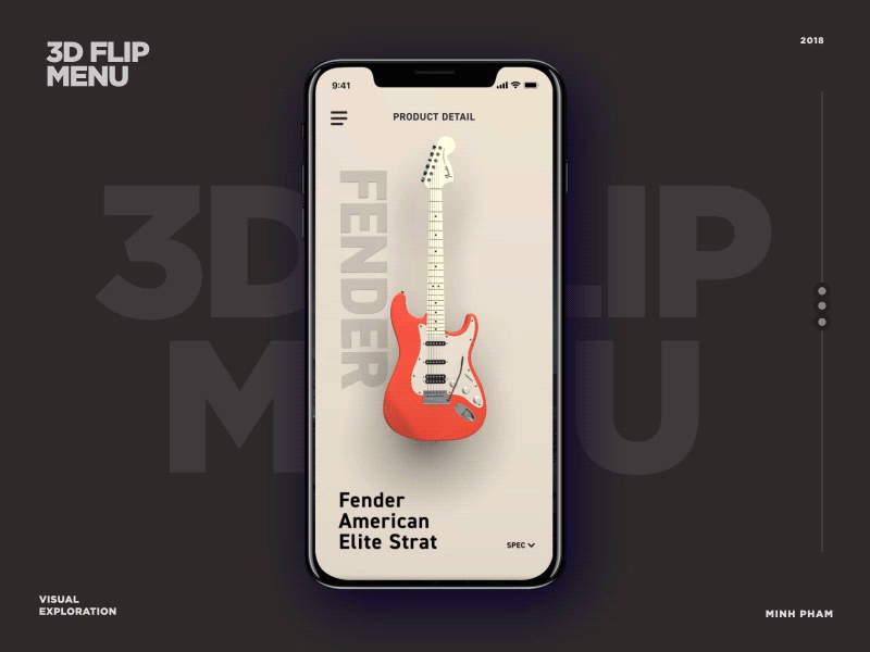
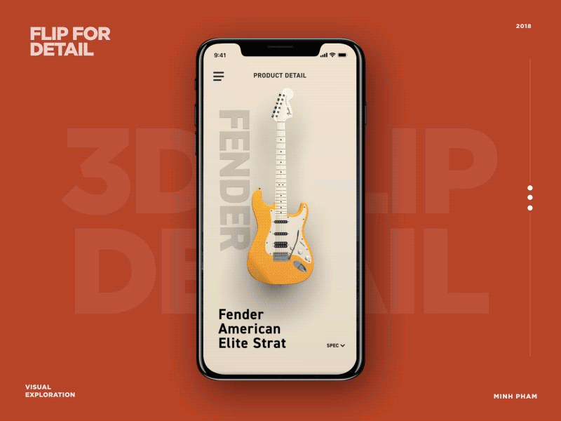
These bright UI concepts by Ming Pham combine skeuomorphic visuals with 3D effects applied for transitions between the screens.
Experiments with transitions on human-size UI by Cosmin Capitanu
Experiments on web interactions by UI8 feature a cool way of building up the solid visual hierarchy and lively microinteractions.
Not all the trends are going to become widely used. However, all creative experiments have their value: they push the limits, and they allow designers to try and discuss new tricks, techniques, and approaches. To grow, we have to dare, probe, and analyze. Who knows which trends will bring the best looks for the favorite products of the future?
Do you have any favorites in this set of design trends? Or perhaps you feel there’s a trend unfairly missed in the list? Let’s discuss this in the comments.
Don’t miss the collection of hot UI trends on Dribbble in 2019 and top UI/UX trends on Dribbble in 2020
Check Ouch, the collection of free vector illustrations for UX
Review the top graphic design trends on Dribbble, the most hated UI patterns of 2018, and read about dark UX patterns in advertising.
About the author
Marina Yalanska, tech/design writer and researcher, editor of Icons8 Blog
Title illustration by Nick Slater